classes & workshops
you are here [x]: Scarlet Star Studios > the Scarlet Letters > classes & workshops
June 26, 2009
wiping the slate clean
by gl. at 6:15 pm
it's been a very long time since i've posted, and it looks to me like if i wait for the perfect time to give each item the post it deserves, i will never post again.
during the holidays, at the masarie curry party, marta said i changed her life: she attended a collage night once and makes one every day now. it's not often you get to hear something so dramatic or sincere!
but it's been hard because a bunch of awkward things happened at once. my focus has shifted to include arts organizations. i've been spending a surprising amount of time & energy supporting medical causes. my own art has re-embraced theatre. a lot of people have died (including lane, my mom & sven's grandfather). my primary art support group collapsed. my photo routine is broken. the economy shook us. in short, things are in flux.
since sven & i are about to go on a long summer trip, i'd like to tie up some loose ends so when i return, i can start with a clean slate: i'm still searching for the next surge of momentum but i can't move forward if i'm still looking back. so here are some things that have happened over the last year i'm not going to write much about but that are worth mentioning & recording:
events: shu-ju in the rare books room, gems of small press show, red bat & loaded hips show at iprc, white bird dance series, open studios (cirocco moody's raven), shawn demarest's shows, trillium holiday show, handmade nw, little things show, coraline premiere, a puppetlove show, apollo, how to disappear completely, hidden portland book launch, crazy enough, inviting desire w/ bridget, an afternoon on dayna's boat "rapture." plus, dayna went to italy & brought back treats: a fish placemat from volterra in in the cinque terre, yellow italian paper (used to wrap purchaes, in art, as placemats, etc.), a menu with cool image, favorite yogurt jar, a sugar packet, a piece of broken window from abandoned house in tuscany(!) wrapped in italian newspaper, red & white rocks from cinque terre, beach glass from the amalfi coast, a bookmark from assisi, and a metal botanical tag from flea market. then ann gave me a subscription to “where women create” magazine, which is like a “lifestyles of the rich & creative."
teaching: i had a great time teaching gocco at the iprc until the iprc could no longer offer them due to the shortage of supplies. (however, i still provide private gocco lessons, like the one i did with dot.) so i've been teaching creative business classes at the iprc, the library & trillium/scrap. that may come to an end soon, too. i've been re-offering workshops at the studio without being responsible for promotion & registration.
classes: when i first decided i wanted to dip my toe back into the theatre waters, i took a theatre/coaching class: it was a really rocky way to start because she did not believe in encouraging students. so i was both relieved & sad to leave. i had better luck at the 100th monkey's "ninja sewing" series (where i learned about threading, knotting, warp/weft, running stitch, gathering stitch, back stitch, buttons, hem stitch, blanket stitch, cross stitch, whipstitch, chain stitch, split stitch, french knots) and have been happy to be able to make and repair very simple things.
art: "where the sidewalk ends" photo series, "5 reasons" book, comparing down to earth "smoke rings" a year later, "writing our bellies full" reading, fidelio, last big gocco supply order, cast as an extra in TNT's "leverage" (so was trixie!), opsfest, dayna's art buddy invitational (my buddy, sven's buddy).
at the little things show, i picked up a prayer flag by jennifer mercedes because of its title: "a prayer for an inspiring future." yes, please. see you soon.
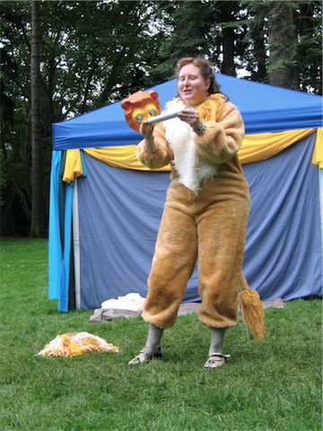
[gl. as The Lyon in A Midsommer Nights Dreame]
posted by gl. | permalink | categories: administrivia, classes & workshops, exhibits & events, miscellany, other art, printing, trixie, writing
March 29, 2009
"dramatist's toolbox" class wraps up
by sven at 7:40 pm
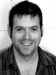
When my friend Kristen mentioned that she was going to take a playwriting class, I felt a sudden, powerful wave of envy. I want to take that class too!
If I were being good, the time probably ought to have gone toward completing Let Sleeping Gods Lie. But for the past year I’ve obsessively studied books about how to create stories for stage, screen, and literary publication… The opportunity to put theory into practice was just too good to miss.
So I signed up for director/playwright Matt Zrebski's “Dramatist's Toolbox” class, offered through Portland Center Stage’s GreenHouse program. For eight weeks, from January 31 to March 21, we gathered on the third floor of the Armory each Saturday morning at 9:00AM… And I had a blast!
Each week we had to write a 10-minute play. My first few attempts didn't quite gel… But by the end, I had four that satisfied me as being complete, coherent pieces.
Last weekend was the final class. As a means of bringing the experience to closure, I'm putting my plays into booklet format. I'll be giving them away as freebies to blog readers in the near future -- stay tuned!
Matt teaches a sequence of three classes: "Dramatist's Toolbox," "Play Sculpture," and "Play Tuning." If you're interested in getting theatrical ink onto paper, I recommend them. Matt's fun, his classes are affordable, and he doesn't waste any time getting you into motion. Hurry -- his next class begins April 6!
posted by sven | permalink | categories: classes & workshops
February 11, 2009
learning ceramics with sara swink
by sven at 7:00 am
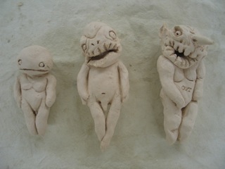
On Jan 17 & 18 I took a class from local ceramic sculptor Sara Swink titled "Two-Day Creative Process Workshop." Highly recommended!
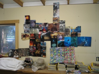
Most of our time on the first day of the workshop was devoted to doing intuitive collages. Being familiar with the exercise, wherein you collect images without trying to figure out why they appeal to you, I decided to try a bold new experiment: collaging outward without boundaries.
I'm pleased with the end result... But not quite sure what to do with it now. Sara demonstrated cutting your collage into pieces and making a book with them. I can't quite bring myself to dismember the thing yet.
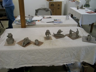
The point of collaging is to begin developing a "personal vocabulary" of images. On day two, we started with doodling exercises -- then moved into sculpting ideas from our collages in clay.
At first I was frustrated, because I didn't feel emotionally connected to what I was making. Two thoughts helped: (1) the idea that I could "doodle in clay" rather than trying to translate inherently 2D concepts to 3D; and (2) remembering that cel animators think about their characters in terms of underlying volumes, not just outlines.
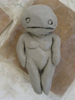
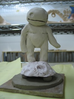
Here's the first character I made that I felt happy with. "Babi" (pronounced "baby") is a reference to a drawing I did way back in high school. I'm not sure how to explain what "babis" are... They're generally blobby child-proportioned critters that live in the realm of dreams and the subconscious, hopping from one person's mind to another without anyone being aware.
The "babi" series that's emerged is very pleasing -- I'd like to see these characters turned into stopmo puppets.
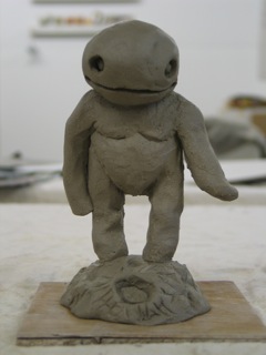
I was attracted to the "creative process" class for a number of reasons...
I've never done much with water-based clay, and wanted to add ceramics to my skill set. Learning about clay with a sculptor rather than a potter seemed like the way to go.
I'm looking at clay as the sculptor's pencil: the fastest, cheapest way to rough out 3D ideas. I want use this medium for stopmo character development. Drawn sketches are useful, but not as illuminating as maquettes; Super Sculpey maquettes are too expensive to make en masse.
Also, as an artist, I'm very interested in process. This class, with its focus on developing one's "personal vocabulary" of images particularly excited me, because I feel like my analytical tendencies sometimes undermine connection to the content I'm developing.
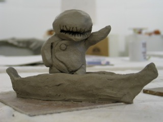
Since the weekend class, I've gone back to Sara's studio for two more work sessions. My original seven sculptures -- plus an additional one from the following weekend -- have now been bisque fired. (That's the initial firing you do to make the clay hard and strong... Glazes are added in a second pass.)
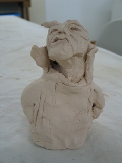
For the sake of getting the full ceramics experience, I'm going to go ahead and glaze most of the pieces. This bust I made, however, is going to be painted with acrylics. If I wind up bisque firing clay character sketches in the future, I imagine I'll opt to just paint them, rather than glazing.
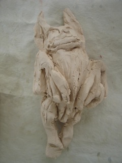
The bust was the very first piece I made, and I don't like it much. My second piece was this bat, which I like a good deal more -- but it still didn't really feel like "me" when it came out. It's going to be a wall-hanging with a black-brown glaze.
(Every time I look at the bat, it makes me think of Shu-Ju Wang -- a local book arts friend who's very into our nocturnal, flying companions.)
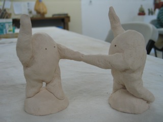
Sara has ongoing drop-in classes on Saturdays, where you get individualized attention and can work at your own pace. For a while, it looked like I'd be going directly from my Saturday morning playwriting classes over to Sara's studio....
Unfortunately, I'm feeling very pinched for time now, so ceramics work is going to have to be sporadic for a while. Even so, I'm really glad that I grabbed the opportunity to take the process class when I had it. Very inspiring -- I strongly recommend taking it if you have the opportunity.
posted by sven | permalink | categories: classes & workshops, sculpture
June 7, 2008
clown classes update
by sven at 4:40 pm
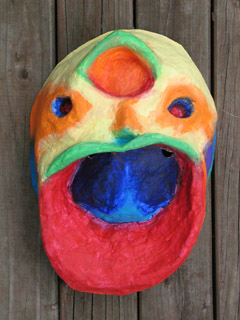
The clowning classes I was taking from Barnaby King have basically wrapped up. There's talk about doing a performance sometime in August... But I'll believe it when plans are a bit more concrete.
I've learned so much from these classes. This particular school of clowning is probably not what you'd expect... There's essentially zero discussion of gags, slapstick, and physical comedy. Instead, the classes have been all about finding an emotion, amplifying it, connecting with the audience, and sharing your moment-to-moment experience. That's stuff that's relevant to stopmo, theatrical acting, and novel-writing as well as clown.
Outside of the class, I found myself writing copiously in my journal, trying to digest the ideas. At the end of the main sequence of classes, I formatted all this text into a 46-page booklet/zine as a gift for my classmates and teacher. And still I find myself writing more.
The mask you see above was a project from one of the weekend intensives. It was a neat process. We sculpted lumps of clay with our eyes closed, then papier mached over the forms to make a mask. Painting was a similarly intuitive process, where we felt the shape with our eyes closed, and found all the areas that should be red, all the areas that should be orange, and so on... The product: A mask that we perform in just once, for the purpose of adding a new emotional color to our personal palette.
Barnaby's going to be moving to Chicago at the end of the summer -- but before he goes, there's going to be one more weekend class on August 9 & 10. For anyone who has an interest in performance -- in any style -- I can't recommend this class highly enough!
posted by sven | permalink | categories: classes & workshops
May 24, 2008
new collage on woodstock
by gl. at 5:32 pm
 by the way, a new collage & diy lounge opened on woodstock this week! it's at 4429 se woodstock in the safeway shopping center. i'm so excited to have an art store & workshop space to bike to!
last week i helped collage their counter (all the scarlet stars are my influence ;). there were several of us there, including ms. bridget. if you want to come see for yourself, their grand opening is next saturday, may 31. see you there!
posted by gl. | permalink | categories: classes & workshops, exhibits & events, miscellany
April 27, 2008
poetic license
by gl. at 5:23 pm
it must be national poetry month! i've attended a plethora of wordly events this month:
i started out the month by attending the poemcrazy workshop. we collected words from books & "word tickets" and pooled them together, words like orphans, orchestra, pandora, vigil, eve, mistletoe, rose, admit, doctor, moon, roof, roll, orpheus, fallen, angel, moment, ghost, venus, dark, wine, rumour, grace, plum, devotion, glow, tedium, terror, window, daylight, grim, heretic, dwell, love, clouds, atoms, hollow, swallow, honor, translate, clutter, promise, binge, and trouble.
we spun in place and sat down to try to write to such prompts as i am/i am not/i used to be/i want to be/i love/i remember/i forget, combined with chanting things like my heart says/my mind says/my soul says/my mother says/the door says/the moon says/the river says, and inserting lines like can't give you up/come back to me, later when it's over. we could answer questions like what's an object in the first place you remember living? what container would you be? what source of light would you be? what scares you?
that was a lot to deal with in a short amount of time, and then it was time for lunch! one of the great things about a workshop at innerstandings is that a hot lunch is provided for you (spanikopita, cucumber salad, and tiny cups of ben & jerry's ice cream).
after lunch we gathering objects outside in a little box to use as inspiration for our next writing prompt. we ended the workshop writing about contrast: sleep/awake or inside/outside, like this:
"inside i am raining. outside i am another moon. inside i am columns that support a hall of justice. outside i am a mouse. i am an orphan inside, safe while invisible, a wordless winter. outside i am true, even in the summer sun. stars appear like fairy tales. inside i am a frozen ocean. when i breathe it's like thunder. outside, a yellow bird vanishes. i shiver. safety is written in tiny letters. inside i am a maze of rooms connected by a path of broken china. outside, a golden field rustling against the mountains."
in our spare time we could look at a huge collection of poetry books, read her manuscripts, and look through her photos of boxes & journals.
she thought i had beautiful, if illegible, handwriting. this became important because instead of us reading what we wrote aloud, she read it so we could hear it from someone else's voice. my handwriting is definitely influenced by calligraphy, but the artist's way morning pages style has also affected it: you can't write fast and pretty at the same time.
dayna wrote about her experience at this workshop, too.later in the month i went to see lucille clifton. "breaklight" was the first poem i remember saving in high school. i didn't expect her to hear my telepathic request for her to read it, and she didn't. but of course, what she did read was great. dot hearn wrote about the experience on her blog.
then i took michaelmas to the "secrets & lies" show at 23 sandy. all the books there are poetry, even if they're narrative in nature. i really love book shows at 23 sandy because she has a "hands on" policy, and a book show that doesn't let you handle the books is essentially a sculpture show.
last night i attended vox: a spoken-word chorus. they took a handful of actors and had them speak a dozen or so poems in chorus. sometimes the arrangements were straightforward, and sometimes they were heavily rearranged. "howl" is quite good like this. and e.e. cummings is also very conducive to this sort of arrangement, and so it was no surprise that they featured three poems by him, one of two repeated poets. awesome space: an odd little corner of a shambling industrial building by the railroad tracks by the fremont bridge.
finally, "wolf moon" has been published at counterpunch. it's part of a series of poems i'm writing about the old names for the full moon.
posted by gl. | permalink | categories: classes & workshops, exhibits & events, writing
April 10, 2008
creative ways to mend the self
by gl. at 6:06 pm
last month i attended a workshop called "creative ways to mend the self" facilitated by kazz artis at the 100th monkey. it was primarily about compassion fatigue for people working in healing professions like therapy & social services. she recommends the book "transforming the pain."
after a brief presentation, we worked on matchbox shrines. i've made one with dayna before, but i like creating things several times because it illuminates something new each time.
i'm always interested in the inside/outside juxtaposition when making boxes, so though this has muted colors and somber moons on the outside...
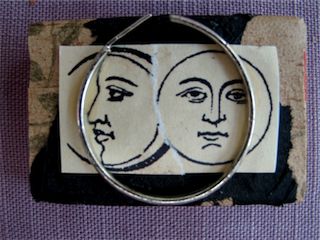
it has colorful paper and shiny pop-up stars on the inside. i have a fondness for pearls because they are such miracles (and "gretchin" means "little pearl" in german), so i left them loose w/ the rosy star to rattle around in the box (that's a trick i got from dayna).
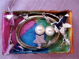
i'm also interested in the visible/invisible dichotomy, so the inside box is lined w/ copper tape to indicate strength, and beneath it lies a miniature "justice" tarot card. it's highly unlikely anyone will see it, but i like knowing they're there.
posted by gl. | permalink | categories: classes & workshops
March 31, 2008
clown classes
by sven at 7:00 am

Rather unexpectedly, I find myself taking a 9 week class on clowning.
The particular form of clown that I'll be exploring is a fusion of European and Native American traditions that was founded by Richard Pochinko in Canada. Sue Morrison is his successor; she taught Barnaby King, who'll be my teacher.
Why am I taking the class?
Well, I've been dipping my toe into theater lately... This past fall I was part of a short-lived theater exploration group called "Play." Some of the participants talked about clown... And then I saw Barnaby perform at ScratchPDX and was impressed with his presence... And then I saw a flyer for the class, and had a powerful impulse to give it a try.
During the past year I helped produce a book (Monster Month), and I've been intensely focussed on animating. On a human level, I'd like to spend some time now with an art form that's a little more immediate -- something not so very distanced from living in the moment.
Also, from what I've read online, I see spiritual elements of clown that I deeply resonate with...
"In native American concept of clown, they say that if you ever faced all directions of yourself at once you could just laugh at the beauty of your own ridiculousness. You're already not perfect. You are ridiculous. It's our struggle to be with some status in the world that is ridiculous." --Sue Morrison
"Once Richard spoke in his sleep of being in a spaceship along with others, some that we knew, some we had yet to meet. As we flew over the earth we saw people. At first he thought we were waving. As we came closer, he gasped, 'No, they're trying to get out, they're all inside glass jars struggling to get out. Our mission is to release them, to break down the glass and let them free.'
This became Richard's work: helping people to release themselves. He freed us to face our essential uniqueness and encouraged us to love and celebrate it. He called it the clown." --Gabriel Manseau
Last week I took my first class. Me, being who I am, I naturally had to write up my insights in the form of an essay. I'm sure my understanding will change during the course of the class...
Note: For anyone who might be interested in taking clown classes for themselves, Barnaby says he will be teaching another 9 week class later this summer (as yet unannounced on the website).
A FIRST RESPONSE TO CLOWNING
03.25.08
This is a transcription of what I wrote in my journal the morning following my first Clown Class with Barnaby King. It's unedited, with the exception of adding section headings.
WHAT A CLOWN DOES
"Clown" is about connection -- connecting with the audience. It is a form of improv, where you get up on stage and then react to the moment. However, there can also be composition, where certain points are known in advance. It is not a performance where you are making lots of gestures -- the vast majority of emotion is expressed through the face.
The conceit of the form is that you are turning your internal emotional life inside-out and making it external. It is as if you put every nerve ending on the exterior of your body, so you let yourself react emotionally to every moment and let it all be seen, playing out on your face.
It is not about connecting with the audience only through happy/light emotion -- it is OK and good to allow grim/dark emotions to express, too.
If you bump into a doorway as you're leaving, that's an event -- you don't ignore it and pretend it didn't happen -- you respond to it too.
THE CLOWN RITUAL
How I understand why we do this...
The clown performance is a sort of ritual. The time period during which you're "in clown" is separate from profane time/space; for your brief time on stage you step into a sacred/divine space. [I'm drawing on the title of a book I read in Religion 101 at Reed titled "The Sacred and the Profane.]
The separation between sacred and profane is marked by putting on the clown's red nose -- it is a sacred ritual object. Whenever you put on the nose, there is a tradition that you must also put on a hat. You will be channeling all sorts of gods... Like how in Voodoo a person becomes a "horse" that a deity might "ride." The hat, I think, helps keep you from losing your own personal, profane self to the gods and demons that you let speak through you. If the nose is simply the marker between sacred and profane space, then the hat lets you be someone other than yourself during the ritual -- as if it will baffle the spirits, so they won't recognize you when you take it and the nose off and return to normal space.
But why become a priest? Why initiate this ritual for the village/audience? Because we live life behind armor and faces that are business masks.
We all have a naked emotional self inside of the shell of our body, but the conventions of society don't allow us to let them out to be seen. Each of us is slowly suffocating inside these shells. Many people use the ritual of getting drunk as their ceremonial means of stepping out of the armor... But this strategy has a lot of problems with it.
The clown, by intentionally becoming emotionally naked in front of the audience, gives them a hero which they can briefly empathize with and live through.
When the audience/village give the clown/priest permission to step into divine space, he is also given license to temporarily break the normal rules of society. This means reaching out with the eyes and establishing a real connection with the individuals of the audience. The clown simply reacts to what he is seeing with authenticity -- which can be a profound experience for the person he is witnessing.
PRIVACY BUBBLES
In normal space, there is not only an imaginary bubble around each of us which represents our inviolable personal physical space -- there is also an imaginary privacy bubble around our emotions.
A clown amplifies their emotional presence and connection to the world -- and it is amazing to witness how almost every thought plays out across the face and is truly legible to the audience. To a large extent, this is also true with people living in normal space... Their thoughts and emotions are playing out across their faces at every moment. We think that our faces are neutral until we intend to show something -- but this is less the case than we believe. Even when a person is trying very hard to maintain a poker face, "tells" frequently flit across the face.
In order to keep society running, there is an unspoken contract that we will not react to each other's faces -- the text of what we say out loud is the currency of our social transactions. It almost never happens -- but when someone explicitly reacts to the tone of what we say rather than the text, or starts talking about the emotions on our face, it tends to be experienced as a violation of personal space. The imaginary privacy bubble has been ripped away, and we feel naked and exposed, extremely vulnerable because we can't control the fact that our thoughts are playing out over our faces.
So the emotional privacy bubble exists to give us some safety to think and feel what we do without threat of being called to account. But the bubble also exists because the daily business of living has to get done. When I go to the grocery store, my interaction with the cashier must be formulaic. If I suddenly broke into divine space and connected with them as if I could see their naked soul and they could see mine, and a conversation was occurring... Well, the line of other patrons behind me would get quite irate at the wait.
However, while privacy bubbles are necessary for emotional safety and getting the business of life done, they also have a negative side effect: they increasingly make us feel invisible and isolated. It's as if no one can actually see us -- at least not the "real" us. It becomes lonely inside our armor... And then the crazy notion that we don't really exist can even creep in, as we internalize the apparent message of people ignoring our "real" selves.
Because society has no healthy outlets for darker, more problematic facets of ourselves (rage, jealousy, grief, trauma), the internal censor which helps keep these emotions reasonably hidden inside the bubble can begin to reinforce the boundary with a sense of shame. This is profoundly unhealthy -- and while professional therapy can help allow people to air out their armor, it is also true that professional therapists are required to establish boundaries (e.g. the 50 minute hour, emotional detachment and distance) which can make it difficult or impossible for a client's divine self/selves to come out and be witnessed.
It is also worth noting that some people use the privacy bubbles for personal gain... Knowing that most people accept the convention of only interacting with each other through text, these individuals use tone in malicious ways, and act in the silent spaces for personal advantage. Given how challenging it is to break normalcy and name something that's happening as problematic, it's extremely easy to get away with shit if you're willing to disregard the conventions of polite social transactions.
CLOWN ETHICS
Back to clown. As I've said, the clown is like a priest in a special ritual. He is given license to break the normal rules. He strips off his personal emotional privacy bubble and shows the audience his naked soul reacting to them. This is a profound sort of truth telling... And yet, the clown is not given license to simply say (verbally or non-verbally) whatever comes to mind.
There is an ethics of kindness which must be in one's heart if one presumes to claim the role of clown. Clown is not buffoon, where you make fun of your audience. The clown's ethic embraces all facets of his own personality (and the souls of his witnesses) light and dark, and laughs -- kindly -- at the absurdity of existence.
The clown allows the audience to briefly live through his own emotional freedom -- but also pierces through the fourth wall and the individual witnesses' privacy bubbles, and lets himself really see them too. Being truly seen by kind eyes is a gift to the audience members which, for brief instants during a performance, pulls them out of their stifling armor.
LIFE DURING THE TIMESPAN OF PERFORMANCE
One of the most fascinating aspects of the clown to me is that he is a mayfly...
The clown is essentially born in the instant he steps onto stage -- which is part of how the performer is able to step into their "beginner's mind" (to borrow a term from Zen). But the clown also only lives until they step off stage; stepping into darkness is like letting go and falling into the arms of death. The clown's turn on stage, thus, is a microcosm for living life.
This raises further interesting questions about the quality of interactions with audience members during that brief life in the spotlight. There is the possibility of feeling quasi-romantic/erotic attraction to particular audience members while you're on stage. What do you do with that experience?
In giving oneself permission to expose radical authenticity, it seems that this possibility must be allowed... But there's also a responsibility after reaching out to individuals in the audience to come back into oneself and share what one has felt with the audience as a whole.
Another strategy, besides returning to self-awareness, might be to not exhaust the interaction with whomever you're connecting with, but rather to feel that energy and then move with it to another individual, seeing what happens when the thought is carried along into a new interaction.
It must be kept in mind that the clown's brief divine life on stage is not the same as a profane life. There is an element of composition that occurs, so that when you step out of the stage lights and into the clown's death, there are no promises of more to come. There's no promise to any of the witnesses that "I'll come back and give you more attention later" or "I'll be back for an encore if you clap enough." The clown, due to the psychological requirements for coming on stage entirely in the present of their emotional nakedness, must find contentment with what occurs during their brief stay, and "die" knowing that's all there is to it.
THE ACTOR WHO BECOMES CLOWN
I've written about the clown as priest... But this is only half of the picture -- because there is also the profane person who makes the decision in normal space to let themselves be possessed by clown.
Why do it?
Because there's a selfish motive of wanting to get to take the armor off and feel emotionally alive in a very intense way.
The clown-priest, I think, in essence is a healer... So there's probably a messianic impulse too...
But the theatrical actor who does clown performances probably ought not to give too much credence to the thought that what they are doing is "holy" or "healing" work. The performance is a brilliant moment -- but when it is over, any lasting effect on the audience is almost purely accidental.
The performance is what it is, during the moment it exists, and then it is over. The ritual of clown, therefore, must be undertaken primarily for the sake of enjoying doing it.
posted by sven | permalink | categories: classes & workshops
February 26, 2008
a meeting of the muses
by gl. at 1:15 am
this month i had planned to have a "romancing your muse" workshop near valentine's day that would include wine, chocolate, music & flowers to entice and relax participants as they reviewed ways to increase visits from their muse for the rest of the year. i thought i could target the "hip chicks do wine" culture i see a lot in portland, so i was hugely surprised when nobody signed up for the workshop: this is the first workshop that's happened to.
fortunately i talked with serena & bridget at the monster month book release party about the poor attendance and came up with a better idea. so i scrambled to create a new event: "a meeting of the muses," where i invited the kindest, most generous muses i know over for a fireside chat.
we don't have a fireside, but i borrowed a chocolate fountain from linda. since i invited the muses with less than a week's notice, many of them regretfully declined, but i had a lot of fun with those who came! call it a "beta test," if you will.
we dipped strawberries & cookies into flowing chocolate, drank wine & pear brandy, and chatted about things i can't usually talk about with anyone: creating workshops that don't require "widgets," art & soul, certification, useful feedback & recent art therapy legislation, just to name a few topics. there was even an impromptu song about credentials and credibility. several muses met each other for the first time. i thought we would make art, too, and so i created a "love letters" exercise, but we just spent 3 hours talking instead! at the end of the event everyone took a rose home with them.
we had such a good time that this may become a quarterly event rotating to different studios. i know i'll host it again! i love it when i can transform an event from potential failure to success. (for instance, guided intent was created when meetup began charging for its services; instead of giving up the free collage night, i created a regular paying event to cover it.) i'm definitely looking forward to the next meeting of the muses!
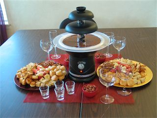
[chocolate fountain setup]
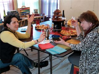
[bridget & serena commiserating]
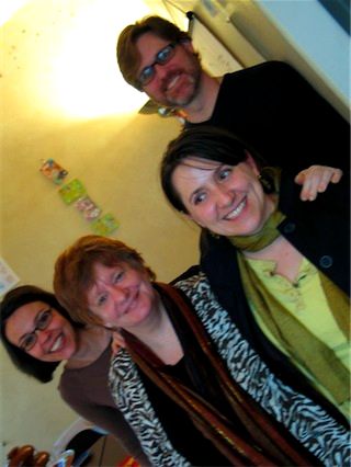
[other muses: consu, serena, bridget & mark. i may have been a little tipsy at this point.]
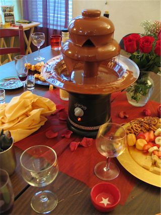
[chocolate fountain aftermath]
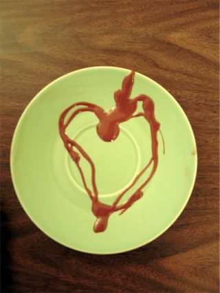
[love]
posted by gl. | permalink | categories: classes & workshops
January 15, 2008
vicki lind's "don't think! paint!"
by gl. at 11:51 pm
we hosted our third round of "don't think! paint!" and i was surprised that we got two out-of-state participants for this class: one from denver, the other from louisiana. for vicki's last class we had someone from california. it looks like everyone both near & far had a good time, though. the sun came out for the first time in a week, so it seemed like an especially cheerful group. they even ate all the snacks! i serve a plate of apples, rice crackers, almonds & havarti cheese for every workshop, and for those that are scheduled over lunch, i refill the plate and bring in olives & truffles.
the studio got a microwave for christmas, both as a way to serve workshops that are scheduled over lunch (since we don't have anything in walking distance) and to complete our vision of using the studio as a personal retreat and guesthouse. sven rigged up a way for it to stabilize on top of the refrigerator using washers and labels (really!) and it worked fantastically for this this class.
one funny thing happened: the kitchen is our primary art supply storage space, so we use the oven to store the letterpress typecases; the refrigerator to store clay, epoxies & sometimes gocco screens/supplies; and the dishwasher holds our assortment of various art dishes that are to be used for art and not eaten from: baskets, paper plates, assorted jars & boxes, lids, yogurt cups, milk jugs, condiment cups, etc. someone in this workshop wanted to be helpful and set the dishwasher running, so by the time i noticed it was too late to salvage anything made out of paper (and some of the wood boxes are a little warped). everything else had an inch or two of water in it. i had to lay towels all over the tables, take everything out of the dishwasher and let it dry out on the towels. oops! we really ought to disconnect the water there, perhaps. :)
posted by gl. | permalink | categories: classes & workshops
December 14, 2007
the strong silent type
by gl. at 11:56 pm
the last workshop of the year at scarlet star studios was the strong silent type: creating your own wordwear, which i cofacilitated w/ bridget benton. this was the first time i have tried to explain to people what i do and how i do it!
even better: i only know one way to make wordwear (string it on a sillk cord), but bridget brought her vast jewelry-making skills to share, allowing each piece to be as unique and meaningful as the words that were chosen. also, we have two different styles of creating: i'm small & precise, while bridget is free and loose. that allowed us to show different methods of letterstamping using different tools. most people tried both ways and found the style that worked best for them. yay!
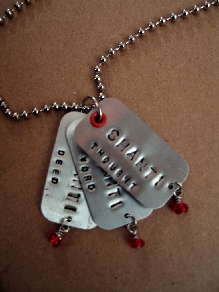
[aurora's "shanti" necklace: click to see some other creations]
i really enjoyed this workshop in part because i wanted to encourage people to use words that were their own, rather than quotes from another source. so i facilitated a series of 10-minute, stream-of-consciousness writing prompts to generate and highlight words that were meaningful for them:
- write about all the advice you've ever gotten
- what did you do this year that surprised or delighted you?
- what do you wish for when you see the first star?
i participated in the writings but was too busy afterwards to make any jewelry. i was not terribly surprised to find myself writing about astronomy again and using it as an analogy for people.
i was asked more than once if i thought people might buy less wordwear because they could make it themselves. that would actually make me happy! the scenario that would make me sad is someone who thinks "i could make that so i won't buy it" -- but then never makes it.
still, if i make a wordwear of my own soon, it may be a set of instructions:
- dream
- explore
- create
posted by gl. | permalink | categories: classes & workshops
November 20, 2007
one event may hide another
by gl. at 11:59 pm
on saturday i took a "found poetry" class at the 100th monkey, the title of which is based on the beautiful poem "one train may hide another", inspired by a sign the author saw in kenya.
our first exercise was in the format of a "lost" ad:
lost: free time. last seen summer of 2004. may be in the company of homemade meals and long walks on the springwater corridor trail. if found, please contact gretchin@scarletstarstudios... and i will try to arrange a pickup time in the next few weeks.
afterwards, i thought i might write a companion piece called "free to good home: to-do list." :)
the next exercise was finding a sign at the studio to write about: i'm always intrigued by the "we reserve the right to refuse service to anyone" signs, but we didn't really write a poem based on it.
then we did an exercise where the facilitator asked us to listen and write down what we heard as he slowly moved his way up the AM dial: we could use those words, and those words only, for the next poem we wrote:
an open field
how long ago was that?
no return
solid state now
we were told
we could only go
forward
he also briefly covered a technique called "widows & orphans," which is similar to the above technique. widows and orphans are typesetting terms for the dangling words left morosely at the bottom and top of book pages: you gather a bunch of those and use only those words to make a poem (but again, we didn't write anything based on that technique).
finally we created "blackout poems" like those found on humument. this could have been a workshop all to itself! we found a page in a book or a magazine, highlighted words that together suggested a poem, blacked out everything else with a marker or sharpie, then created art atop it. i copied a page from a book about constellations and found this poem in it:
the goddess screamed.
vengeance gives names
to dark shapes.
but abandon pain
believe in lilies:
gifts of immortality,
the pathway of souls.
amusingly, one of the women i met at this workshop i saw later that night at the iprc text ball, a story about an event that has yet to be told.
posted by gl. | permalink | categories: classes & workshops, writing
November 12, 2007
it's hip to be squared
by gl. at 2:11 pm
two weeks ago i attended shu-ju's "print with your food gocco class" at the iprc. some of you may remember what a fine time i had making poetry crepes at the edible book tea in march, so i'm always up to try more food printing! there was just one other person but i'm glad the iprc chose to run it anyway. the people who weren't in the class were simply astounded at what were were doing and kept taking pictures. :)
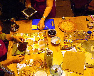
[trying lots of different printing surfaces (photo via shuju)]
we printed on fig newtons, mini pancakes, puff pastry, cookies, apple slices, and lunchmeat. i also brought homemade dessert crepes to print onto for sven's 36th birthday breakfast later in the week. crepes are a great printing surface, but i was really impressed with the clarity of printing on puff pasty! mini pancakes print well, too, and are very visually appealing objects (someday maybe i'll do one letter on each pancake. so cute!). shu-ju offered us a few different printing "inks": i was so happy with the peanut butter/chocolate syrup combination that i didn't try "shu-ju's secret sauce," a blend of nutella & balsamic vinegar (sweet & tangy!). the chocolate/peanut butter ink is easier to make and a better consistency than the one i created for the edible book tea, which was just chocolate syrup & powdered sugar.
this was my first time using our new laser printer to create a gocco screen! despite not blow-drying the print and forgetting to use the blue filter, the screen came out beautifully. that thrills me. however, i need to learn to put cardstock on the print bed when i'm flashing a screen, or the print bed pattern shows (fortunately, when printed, it's light enough that the ink spread just squooshes over it). to make the screens more durable and washable, we ripped the screens apart & taped them together. i wish i had thought about putting plastic wrap over the print bed for the edible book tea; it would have saved me a lot of cleanup!
btw, shu-ju wrote about the print with your food class a while back. :)
so i surprised sven with a "branded" birthday: i printed the 62 logo on breakfast, his present, the card & cake!

[crepes & puf pastry squared]

[reverse: crepes & puf pastry squared]

[apple squared]

[birthday breakfast squared]

[cake squared: no gocco, just icing]
posted by gl. | permalink | categories: classes & workshops, printing
November 4, 2007
pressing business
by gl. at 11:59 pm
october was a month o' letterpress! i got the chance to attend three letterpress classes in one week at the iprc:
how type is made
sven and i have had a crazy fantasy that between my love for letters and his developing metalworking skills, we might make our own type someday. after going to this workshop, i think we were cured of that notion. i was hoping for more explanation about what's involved in each of the steps of typemaking, but i now know difference between monotype & linotype, categories which were previously blurred for me. fascinating fact: the development of linotype apparently was what prompted the printer's union to accept women, who were frequently linotype operators.
introduction to letterpress
this is the class i've been trying to get into for months! i took this class a few years ago, before chas gave me his press, but i wanted a refresher because i knew there were things i was unclear on, notably in the lockup process.this class was very helpful in allowing me to solidify some of those concepts. i thought the point of lockup was to pack as much furniture into the chase as possible, so it became tedious and rather tetris-like. but the rule is furniture doesn't touch! you're looking for a pyramid effect, with the largest pieces out on the edges and the smallest pieces against the form. that will immensely simplify my lockup process (and hopefully give me better prints!).

["a sample of a most perfect lockup": click to see it larger]i am totally envious of this furniture storage case, as my furniture & reglets are in a giant jumbled shoebox:

[everything in its place]also, my little 3x5 kelsey doesn't use quoins, it uses metal plates (otherwise known as lockup slugs/lead). i had been using the long one, but not the short one! i hope that using both will immediately give me better prints, too. :)
i finally understood the difference between "packing" vs "make ready" in this class. i had entirely forgotten about the make ready process, in fact. print on a piece of tracing paper: this is your make ready. then puncture three dots through the make ready and the tympan to register it. put a tiny piece of tissue paper over the letters that aren't printing on the make ready, then realign it behind the tympan and print again. the tiny pieces of tissue should provide a tiny bit more pressure on those spots; it doesn't take much. check the results. if letters are still dropping, repeat the process.
miscellaneous: in addition, i was excited to learn about beaver engraving, a portland business who's willing to make magnesium plates from illustrator files for what i consider to be a reasonable fee.
there aren't enough letterpresses for everyone, of course, so we ended up teaming up. because i've taken it before, i let my partner take the lead on most things. so this is her quote:
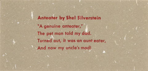
Anteater by Shel Silverstein
"A genuine anteater,"
The pet man told my dad.
Turned out, it was an aunt eater,
And now my uncle's mad!i "fixed" a grammatical issue (using "my" instead of the original "me") because i didn't know shel actually wrote it like that. oops. that extra comma after "turned out" drives me crazy, too, but that's original, as well.
i believe this is 10-point type but i have forgotten the face (darn!). 6 pt slugs on top & bottom, with at least an em quad on either side of the lines for stability and 4pt leading between lines (two 2pt leads). we used 5-to-the-em spacing because there was more of it in our point size than there were 4-to-the-em spaces.
care & maintenance of your tabletop press
this was a class i was very much looking forward to, and i was thrilled that they encouraged me to bring my own press in so i could work directly on it! i was determined to discover whether my press was defective in some way, so i'd finally know whether my unsuccessful printing attempts have been my fault or or the fault of the press. i don't mind if it's my fault, but i don't want to waste a lot of effort and frustration if it's something that could be easily fixed by noticing the press is missing a whoozits or by adjusting the whatzits.but it turns out my press is fine (yay!). all the pieces are there and are in good shape. i still need to clean it of the grime it accumulated after years of living through colorado seasons in a box under chas' porch. and i replaced the rollers before the workshop (from n.a. graphics in silverton!) just so that wouldn't be an issue. when i spoke with fritz, he said it was likely the pitting i had on the former composition rollers were actually little mice teethmarks! that's what hide glue gets you, i guess. i have rubber rollers now, thank you.
so because i brought my own tabletop press, it meant that everyone got their own press to examine, which i quite liked. i picked up some tips & vocabulary to help me talk about letterpress more clearly, like:
labeling & differentiating rollers, trucks & rails
locating the oil & oil holes in most presses (my tiny kelsey doesn't have any, though i'm welcome to oil the parts where metal meets metal. now i just have to find a tiny oilcan!)
labeling the platen/tympan bar (a "bale")
making sense of grippers (i had them on backwards and not tightened), though nobody has been able to tell me what the gripper bar spring does
discovering a whole pack of what i thought were dark postcards was in fact pressboard, meant to be used as packing
also: craftsman apparently makes good presses. kelseys are bottom of the barrel, but i don't care! also, i discovered that only 1/3 print area on any press is consistently usable, which on a 3x5 press is pretty substantial (gocco is like that, too: you get your clearest image transfer in the center).
finally, we adjusted the platen, a process i had done after consulting the manual, but that never seemed to have any effect. i found that it's probably because it's so sensitive: a quarter-turn of the screw can make a big difference.
i found this to be a fairly time-consuming & tedious process, in part because we had to set up a form to test it, and this made the class run about 1/2 hour longer than expected. but the process make a lot of sense:
set up four corners of a form with the letter "O," preferably in a larger type size. check to make sure all the type you're using isn't worn and is exactly type-high by using a type-high gauge (also handy for checking the depth of wood/linocuts). set the form something like this:
then you print (in this case, a dry print so we didn't have cleanup), see which Os are not printing, and then adjust the screw nearest the O a little bit at a time to see the effects. only adjust one screw at a time. repeat until all four Os are printing clearly. when you adjust the platen pressure, the standard is to set it for heavy stock, which is why you add packing for lighter stock. i wasn't having much luck with this part, and though we were running so far behind, the instructor still spared some time after everyone had left to make sure the platen screws on my press were properly adjusted. good thing you don't have to do that very often (once a year or less).
so i feel much more confident in my letterpress skills now. i really hope it makes a difference when i get a chance to print again!
posted by gl. | permalink | categories: classes & workshops, printing
October 22, 2007
mark gundry: transforming the dark through charcoal alchemy
by gl. at 2:11 pm
two saturdays ago we hosted a new workshop: transforming the dark through charcoal alchemy. mark is a quiet, kind and knowledgeable guide. people who came with darkness left with light. i love that potential transformative experience, and mark is particularly gifted in bringing that out of people.
we hammered black foamcore to the walls to protect them and i was pleased with how well that worked and how professional it looked. i was also suprised that all of the floor covering i used actually served to protect the floor: i know how charcoal dust gets everywhere! it's a strange balance: we have carpet on the floor because it's more comfortable for artist's way, but in the workshops i usually tell people "it's a studio; we expect it to get dirty" so that people don't feel compelled to make tiny, careful movements or fear dropping/spilling things. despite over three years of artmaking, the carpet still looks remarkably good. *knocks wood*
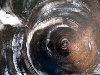
[one of the pieces from the workshop]
next month's workshop is "not just a pretty face," our first 2-day workshop! the first time we hosted it was a lot of fun and we all made a lot of progress, but it was a litle overwhelming for first-time painters. so we decided to give people plenty of time to study the masters the first day, create rough drafts & get comfortable with the materials, then dive into the final portrait the next day after a night to sleep on it. i know i work better that way, anyway!
posted by gl. | permalink | categories: classes & workshops
September 23, 2007
matt & toni tabora-roberts: generate, create, communicate
by gl. at 11:33 pm
generate, create, communicate was another successful workshop! i know how hard it is to sell performing arts to an audience that is primarily visual arts, but i remain committed to offering a variety of workshops to increase the creative vocabulary of artists, develop appreciation for different kinds of art & artists, and to have fun!
it sounded like a lot of fun from the other side of the wall, too. lots of movement, laughing and clapping. matt & toni are two very likable, flexible people with an enormous wealth of skill & knowledge. they moved here from san francisco and i was thrilled to give them an opportunity to teach what they love here in portland.
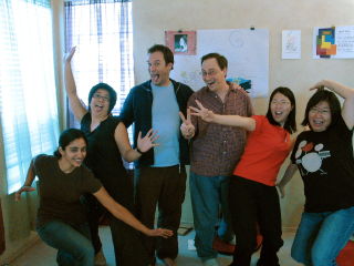
["not serious" at the end of the workshop]
i'm looking forward to the next workshop, "transforming the dark through charcoal alchemy." it's an appropriate theme to explore in the month of october, especially, i think, though i like exploring light and dark anytime. :)
posted by gl. | permalink | categories: classes & workshops
August 22, 2007
ocac: "pushing the gocco envelope"
by gl. at 3:28 pm
last week i assisted shu-ju wang, local gocco artisté extraordinare, with a 3-day class she taught at the oregon college of art & craft, "pushing the gocco envelope."
the class was pretty packed, so in addition to handling questions, i tried to be invisibly helpful: i brought in a bunch of supplies to share when we were running low, i took pictures for shu-ju, i staggered my work/lunch times so there was always someone available to answer questions, i took half a day to spend with people in the computer lab, i pulled an extra print for the person who let us use the computer lab, i cleaned the classroom even better than it was when we started. i tried not to ask too many questions myself, and i tried not to even wince when the students voted to come to class an hour earlier, even though i live on the opposite side of the planet as ocac which made for some long days.
it definitely felt different to assist a class than to facilitate one. i kind of liked it; i could be helpful without being the ultimate authority or having as much responsibility. just like at my art events, though, i was worried that i wouldn't actually be able to finish making the art! i started off slowly as people needed more help earlier on in the process, but fortunately i caught up on the last day.
i've owned "little miss gocco" for a couple of years now but have done regrettably little with it other than note cards and poetry crepes. so beyond the altruistic desire to assist a fellow artist, i was happy to get the chance to do more goccoing! unfortunately, my computer had a fatal hard drive crash on the first day of class, so i had to create something fairly simple quickly on sven's laptop.
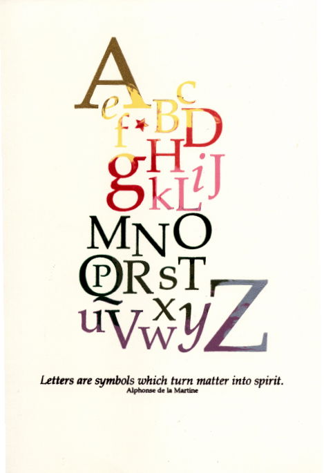
[letters are symbols which turn matter into spirit]
this print took two gocco screens (which was the point of the class, to create a piece bigger than the standard b6 print bed). the "a" is in gold, "the "z" is in silver. the darker parts in the middle are actually 3 different colors of green (the bottom is brown). if i was going to do it over again i'd reverse the color on the bottom screen (leaving brown as the base color).
i didn't pull any prints i thought were completely perfect, but it was good to do it with shu-ju around. for instance, i was surprised to find i wasn't using enough ink a great deal of the time, even when it felt like i had a lot. i also discovered i press too hard. i wasted several prints by not using the mylar registration technique (lesson learned!). but the marbling happened mostly the way i imagined, even if it took a lot of test prints to start the ink migration process.
at the end of the class we hosted an exchange, where we got a copy of everything everyone else made. whee! that's one of the best things about printmaking! there were some delicious prints, cute cards, and imaginative booklets.
posted by gl. | permalink | categories: classes & workshops, printing
June 26, 2007
bonnie ward's "making fairy furniture"
by gl. at 3:06 pm
we hosted bonnie ward's "making fairy furniture" jun16. ever since i saw her do this workshop at the last create the world, i knew this would make a great studio event. we had to wait almost a year to get the scheduling to work, but i'm glad it did!
bonnie has an almost indescribably large collection of plant materials to use: we had to set it up a couple of days before to make sure we had room for it all!
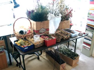
[just one of several tables: click the image to see what they made!]
she was also incredibly organized: everyone got their own low-temp glue gun (and a power strip for them all) and a pruner. because it takes so much space, we had a smaller class size than normal, but it filled and they created a lot of pieces. :) it was a lovely introduction to summer. and this has been the only workshop where i've been able to compost the bits left behind! ;)
this was the final workshop before my creative hiatus in july & august. in september, i'll be hosting an improvosation & movement workhsop by two lovely people, matt & toni tabora. see you then!
posted by gl. | permalink | categories: classes & workshops
June 19, 2007
"down to earth"
by gl. at 1:03 pm
i facilitated "down to earth," the andy goldsworthy-inspired workshop i've been dreaming of for years, at the mount hood arts cabins june 9.
there was so much uncertainty about it for a while i wasn't sure it was going to happen: a project fell through that forced me to make the workshop a 1/2 day instead of a full day, though i initially thought i'd have to cancel it, and then there was an insurance snafu which i got a waiver for but may affect future workshops there. which is too bad, because it's a lovely location:
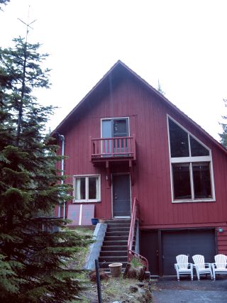
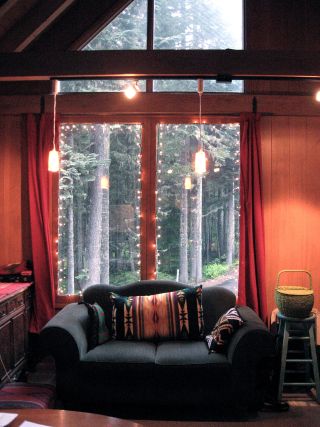
of course, when i first saw it in march, it was snowing!
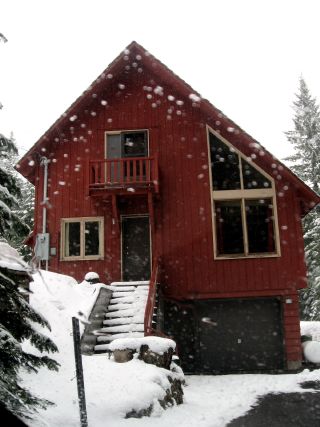
so i was glad it wasn't snowing for the workshop, but it did rain like mad in portland the morning of the workshop & i was afraid it would keep people from coming. fortunately, it didn't rain much at the arts cabin until after the workshop: it rained very lightly off & on all day, but mostly mist and nothing terribly distracting, especially if you were working under trees.
besides the beautiful cabin & forest location, one of the reasons i loved this location was how much room we had to roam:
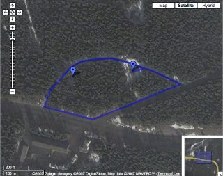
[arts cabin boundaries: click the image for the google map]
even better, they were gladly willing to let us tromp around anywhere and gather as much as we wanted. powell butte, which is another location i would have liked to have hosted this because it's right outside my front door, is very strict about staying on the trail. the only complaint was that because it was so close to highway 26, even though it wasn't visible, you could still hear it. i think the location is so ideal & rare otherwise that it was a small price to pay, and i didn't even notice it until someone pointed it out.
so after introductions and a brief discussion of goldsworthy principles, land use & history, we all disappeared into the forest for 3 hours. i wanted to stick around the cabin in case something came up, but i was surprised that only two of the participants wandered very far from the cabin at all! four of us stayed within 100 feet or less of the arts cabin. then we met together and walked to each person's site so we could talk about what we did & take pictures, then we met back at the cabin to write. the writings were surprisingly deep for such a short writing, so i could tell the whole experience was very affecting.
i usually have a few false starts when creating art at an art workshop, and this was no exception. i tried a variety of locations and plant materials, but nothing spoke to me. with just 45 minutes left, i discovered a hollow, lightning-stuck tree and everything suddenly clicked. all its bark had fallen off, leaving a big blank canvas on its back side. i wanted to use the leftover charcoal from the burned tree to draw something: initially, i thought i would draw flames, but the texture wasn't very conducive to figurative drawing or illustration. so i began to outline the hole, and it turned out that the charcoal made the best marks if i followed the contours of that hole.
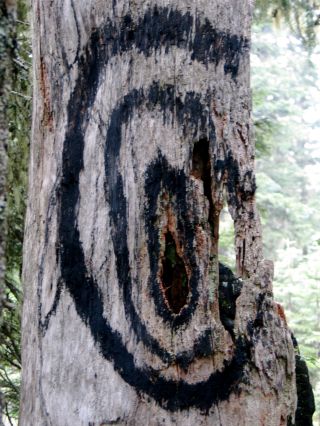
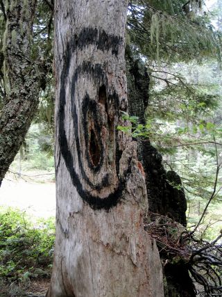
[smoke rings: click the images to see the other participants' pictures]
i was so happy to have made this. it felt right as soon as i saw the tree and the charcoal. it definitely stands out: everyone else made more "natural" creations which were quite beautiful. but i loved this. i loved working with the materials, i loved the result, i love all its meanings: it could represent a target, a physical manifestation of the fire spreading, the fire breaks firefighters use to keep fires from spreading, the sorts of fire rings you camp next to, or, as i wrote at the end of the workshop, "a ward to keep away fire, death & rot. it's too late for me, but let me be a warning for you all."
after the workshop, one of the benefits about hosting at the arts cabins was that as an instructor, i got to stay overnight. so after cleaning up and making dinner, i settled into a long night of reading "indian tales," a native american version of 1,001 arabian nights that must have been written in the 1930s. at midnight i turned off all the lights, sat on the porch and listened to the rain in the trees.
still todo: i plan on sending the pictures to apple to print little booklets and sending them to the participants so that their ephemeral exploration has a tangible outcome. and finally, i need to approach the art cabins w/ future proposals: we could have a lot of fun up there! i envision writing & art retreats, labyrinths and more.
update jul20.2007: i just got the little books i made via iphoto back from apple: they look great! it's the smallest size they offer, which is just a bit bigger than a business card. it's just the right size for a little memento!
posted by gl. | permalink | categories: classes & workshops
April 29, 2007
serena barton's "not just a pretty face"
by gl. at 4:54 pm
last week we hosted a portrait workshop, "not just a pretty face." i also attended this workshop, in part because one of the possibilities was using water-soluable oil paints, and i've never used oil paints before. it turns out the drying time drives me crazy, and i am very content to use acryclics for the rest of my life. :)
one of the other things i discovered is that i don't actually like painting faces. i like drawing faces, i like inking faces, and maybe tinting them w/ watercolor, but painting faces feels clumsy and thick and vague. my paint never goes where i want it to or how i want it to. during my first one i was really frustrated: i thought i was going to cry, but i told myself to just grit my teeth and stick with it for the next few hours. by the third one i was feeling much better, though i still can't say i feel very fond of the process.
we did two studies and a "final" portrait during the workshop. we probably had 30-45 minutes to do the studies and 1-1.5 hours to do the final. even so, we ran way over time. when we offer this class again, it will be our first 2-day workshop. :)
we picked several possible portraits from "the masters," but i ended up working on the same one each time: manet's "berthe morisot with a bouquet of violets." i tend to need repetition for reinforcement & progress, so even while i cringe to show them, i'm still pleased at this sequence:
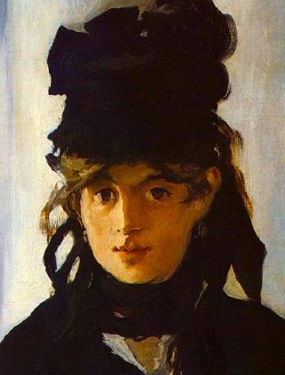
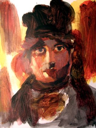
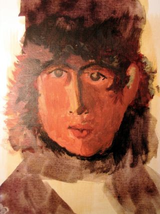

the first is the orginal, the next two are studies, and the last is the final portrait i was working towards. nobody gets it when i say i think my second study looks like a female version of neil gaiman. ;) with the last one i was using much thinner paint, almost like layers of glazes or watercolors, rather than full-strength acryclics. there's plenty to critcize about each of them, but it is both a relief & a pleasure to see progress and development over the sequence. i'll never be manet, but i feel i learned something, and that's important to me.
the next workshop is another version of vicki lind's "don't think! paint!" that was so popular in november. we've already had a good response for it, but i'm a little nervous because it's the first workshop i won't be there for at all, even next door. i have another (exciting!) appointment i must attend that day instead (and which i expect to write more about later...!).
posted by gl. | permalink | categories: classes & workshops
April 7, 2007
serena barton's "layers of memory & imagination"
by gl. at 5:51 pm
we hosted the collage workshop "layers of memory & imagination" a couple of weeks ago. it was a small but fun class. for the first time in a while, i was actually a participant as well as a host! serena is a gifted, caring facilitator who managed to be both accessible and non-intrusive.
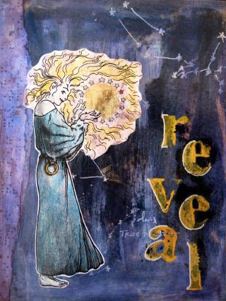

[a couple of my collages from the workshop; click each to see them larger]
we were asked to bring images to work with that we found personally meaningful. most people brought family photos, but i brought these illustrations from stories i've carried with me for years. the first collage includes an image of yvaine from stardust; the second is silent bianca from the collection the girl who cried flowers. the first collage has gold leaf, braille, and a transfer of the august stars. the second has photocopies of an 1800s marriage contract i found in a dusty box on the floor of a used bookstore in England.
though i think everyone who came had a good time, i was surprised there wasn't more interest in this workshop. collage is our mainstay event, but it's very casual and short, so i thought people would jump at the chance to do it with an experienced instructor and a longer, deeper focus. and i wanted a good turnout for serena, because she rearranged her schedule to accomodate a student for another class (as well as an instructor who flaked on me).
i am more hopeful about serena's next workshop, "not just a pretty face". it involves oil paints and canvas, which makes me nervous (and nervous is often a sign i should go ahead & take the class, too :). at the moment we only have two more spaces left!
posted by gl. | permalink | categories: classes & workshops
January 18, 2007
zigzag's "discover your calling"
by gl. at 12:29 am
despite the instructor oversleeping and an icy hill that proved difficult to scale, the "discover your calling" workshop went extremely well. it was the perfect workshop to start the new year and zigzag said this was the best group she had ever worked with. the biggest annoyance was probably that the clippies didn't want to work on the freshly painted walls.
this was the longest (and therefore the most expensive) workshop we've offered, but i wanted to push that boundary a little, and i wanted to make sure everyone had an opportunity to do art, so zigzag asked them to create a thematic collage at the end.
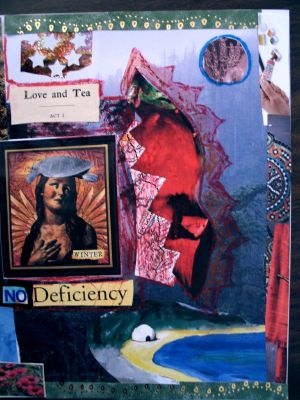
[one of the collages from the workshop]
i wasn't present at most of this workshop again, but i'm getting better at the sequencing. i welcome people at the beginning and chat, i introduce myself and the studio and the proposed sequence of events. if the workshop is long, i come in at lunch to refill the almonds, apples & cheese, add olives & truffles, and ask if anyone needs anything. at the end i take pictures and collect evaluations and payments. the timing is never perfect because nobody runs on an exact schedule, but i am pretty good at remaining unobtrusive when i need to be. i still can't entirely relax when i hear a workshop happening on the other side of the wall.
i'm very excited about the february workshop! not only does it feature a fabulous friend, it was created to fulfill a wish for a participant. so be careful what you wish for: i have the means to make it come true! :)
posted by gl. | permalink | categories: classes & workshops
December 22, 2006
ann rogers-williams' "if not now, when? beginning your memoir today"
by gl. at 7:12 pm
i'm playing catch-up; this event was hosted dec02.
as our second workshops in this series, i was thrilled that ann rogers-williams' "if not now, when? beginning your memoir today," was also a tremendous success! i advertised on soapstone this time, too, but didn't need it because we were already full by the time those responses came along.
i had taken a precursor to this workshop at the multnomah senior center and knew ann would be a good fit for our studio. ann is a total sweetheart but really knows her stuff. she has a gentle but energetic presence. in this workshop she covered the different forms of memoir, led the participants through writing exercises, then had each person create a "wisdom card" as a focus and inspiration for the memoir they planned to write after the workshop (this was just a "beginning" memoir class; no memoir can be written in two hours! :).
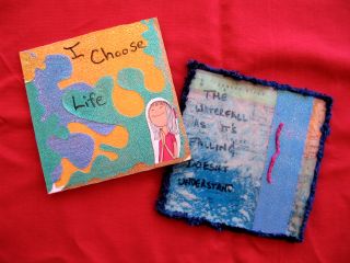
[marguerite & sven's wisdom cards]
i wasn't present at most of this workshop, just at the beginning for greeting & introductions, and at the end for evaluations and payment. it was a little weird to hear people laugh on the other side of the wall. next time i will work on my instructor introduction, which was remarkably lame for this workshop. oh, and remember to introduce myself. :)
we currently have workshops booked through june! i'm excited this has been so successful. i try to pick different types of classes and instructors i think are a good match for the studio. so stay tuned for future details; i'm just about to announce our january workshop.
posted by gl. | permalink | categories: classes & workshops
December 3, 2006
vicki lind's "don't think! paint!"
by gl. at 11:39 pm
vicki's lind's "don't think! paint!," the first in a series of workshops led by other instructors, was simply smashing! though i won't always be present, i actually participated in this session in part to experience the kind of things that would come up (it's been a while since we hosted joanne's "writer's harvest" workshop a couple of years ago).
in essense, the goal of the class was to paint your way out of a stuck part of your life. you were not expected to know how to paint (in fact, prior painters could only attend if they will park their prior knowledge of art techniques at the door! vicki literally asked us to write some preconceptions, put them in a basket, and set them outside before we began the workshop).
we used tempera to create two paintings during the workshop, one that represented the barrier to your goal and the other that represented the resources you bring to solve that problem. there wasn't a writing component, though three of us spontaneously grabbed journals and began writing, anyway. my challenge: to make time for myself to rest & dream.
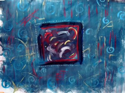
[barrier]
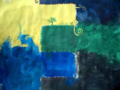
[resources]
since vicki was spending a lot of time just hanging out while we painted, she developed a neat technique she called "whispers": if one of us was stuck, she'd come up to us and whisper something provocative or inspirational in our ear. you can think of the "whispers" like that talmud angel: grow, grow! once she said to me "the thing that really pisses me off is...", which inspired the small white dots around the barrier box: what really pisses me off is feeling invisible despite doing all this work.
everyone was incredibly enthusiastic about this workshop both before and after. the only disappointment is that i just barely have enough room for 8 people doing large paintings. we were constrained to a horizontal or vertical orientation depending on where we were at the table because it wasn't big enough for everyone to have a horizontal page. :(
and it would be nice to have a good clock everyone can see. i personally love the aesthetic of this clock, but i don't think it would actually be helpful.
posted by gl. | permalink | categories: classes & workshops
May 12, 2006
kim graham sculpting class
by sven at 12:32 am
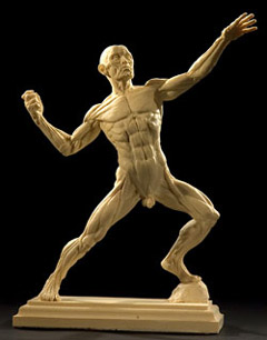
I just tonight discovered that Kim Graham is running a "Sculpting the Human Body" class Saturdays 10-2pm, June 3-24. In a heartbeat, I knew: I must be in that class!
Kim's studio is up in Georgetown, WA -- a three hour drive from where I live. But this is a person I'd eagerly travel great distances to learn from.
I met Kim last November at the art marketing workshop by Marty Rudolph. Kim's work is magnificent, gorgeous, astonishing. Her personality is electric.
I am so thrilled to have this opportunity!!
posted by sven | permalink | categories: classes & workshops, sculpture
March 24, 2006
mhcc calligraphy: class 10 (final project)
by gl. at 6:25 pm
today was the last calligraphy class at mount hood community college, which is the show & tell for final projects. i was worried because i got hit with a miserable cold this week that kept me on the couch for three days.
so when i finally roused myself into the studio last night after a trip to salem for a workshop i have yet to write about, i scrapped the amazingly dynamic nietzsche quote i had been planning on using and instead used a quote shaedra mentioned seeing at a friend's house. (at the time, she said, "oh, YOU could do that!" and my artist's way voice was, "no, YOU can do that!" because hey, who says you can't? :) but i thought this would be a neat little suprise when next we see her so i sure hope she's not reading this!).
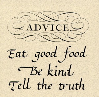
["advice": what you don't see is the amazing shine on the "advice" & its swirls, nor the sparkles in the paper.]
because i was already feeling like i had to do something incredibly simple, i wanted to try a new technique (which isn't new to professional calligraphers or the newpaper person i was in a former life): a paste-up version, where i don't try to create a perfect original, but instead write the elements a bajillion times, pick the best ones, paste the elements together & photocopy it. this allowed me some flexibility in layout and control of the elements & the ability to add graphics.
even so, after doing originals for so long it's hard not to think of it as cheating, especially when, influenced by the amazing "hall of best knowledge" series, i decided to stretch it even further by adding the "advice" element taken from the universal penman (the original of which i got to see at the getty and its original, official title is outrageously long: The universal penman: or, The art of writing made useful to the gentleman and scholar, as well as the man of business. Exemplified in all the useful and ornamental branches of modern penmanship; with some necessary observations on the excellency of the pen, and a large number of select sentences in prose and verse; various forms of business, relating to merchandize and trade; letters on several occasions; accurate specimens of the oriental languages, and alphabets in all the hands now practis'd / written, with the friendly assistance of several of the most eminent masters, and engrav'd by Geo. Bickham. The whole embelish'd with beautiful decorations for the amusement of the curious.)
ahem. anyway. calligraphic exif: tape 2 nib w/ sumi on a fox river tablet, reduced 20% on brown sparkly paper, graphic element reduced 50%, then (and this is the part that wowed 'em in class) a layer of gold laser foil (that i bought from paper direct probably over 10 years ago) was applied over "advice" to make it look like a foil stamp (man, i wish the scanner would pick up shiny. i like shiny! i am such a magpie.).
sven worked his magic again and painted the edges of a 4x4 tile black (except all his recent metalworking also dusted the black with minute brass filings, adding to the sparkly effect), added a sawtooth hanger to the back and mounted the finished piece this morning while i was still unconscious on the couch, overcome with the effects of sleep deprivation and flu. thanks, sven!
the next round of mhcc calligraphy is uncial/blackletter/spanish round gothic, which i've already done, so i think i'll be taking a break for a while. i'm pleased to have done a whole year of study, but i slacked on this last class more than i should have (as you can probably tell from the lack of posts). i might get back into a PCC class in fall or take a PSC lettering workshop. either way, i should brush up on some skills before the October AOCC with denis brown! *sighs dreamily*
posted by gl. | permalink | categories: calligraphy, classes & workshops
March 21, 2006
art updates
by gl. at 11:52 pm
i've added art to several of the CREATA workshop entries:
- communicating through visual symbols
- self-care for therapists
- dreams, active imagination & creativity
- exploring creative arts therapies modalities
- children's graphic development
- intro to art therapy
also, another weathergram:

now me & my sick self will toddle off to bed. today at creative job club we developed a major paradigm shift for artist's way promotional activities, but it'll be a few months before it becomes something tangible...
posted by gl. | permalink | categories: administrivia, calligraphy, classes & workshops
March 13, 2006
creata: healthy vibrations
by gl. at 12:47 am
this is the eleventh and final in a series of posts about workshops sponsored by CREATA during Creative Arts Therapy week. i'll go back & add images to these afterwards. session date mar09.
this intro to music therapy was an energetic & lighthearted session to end the conference with. the same music therapist from "establishing a private practice" facilitated.
we had about 12 more people than usual -- a pacific university instructor had brought her students and they trickled in late for the first 15 minutes and many looked like they'd rather be somewhere else, especially the boys, of whom there was a larger proportion than i would have expected.
all the toys came out for this session: several baskets of drums & rattles & maracas & tambourines & sticks & spoons & ratchets & bells & and oddly shaped unknown instruments were offered for us to choose from in the middle of the room. i chose a paddle drum because i'd never seen one before and i wanted to see how they sounded: if i ever wanted to buy some, they'd sure take up a lot less space in the studio than the cylinder drums i keep thinking of getting.
i've not had success w/ music exercises yet, but i'm relieved that this workshop gave me some ideas about how i could go about it next time:
warm up by making sounds from pictures: screaming, barking, sleeping, etc.
let people choose their own instruments. let them feel & explore the instrument. ask them to explain why they chose them. for people who aren't very comfortable playing w/ music, having an intermediary in the form of an instrument is important, especially as the instrument they choose will be their "voice" for the rest of the exercise. (this also means one must have a variety of instruments to choose from, which could get expensive. if everyone contributes one, this might be a good birthday present request....)
play for a bit individually: play regularly, play loudly, play softly.
go around the circle, each person saying "hello" to the person next to them just with their instrument.
play 4 beats at a time together, then 4 beats with one person solo: take turns going around the circle 4 beats together, 4 beats solo.
then move into a full-fledge drum circle, where you add a person every four beats until everyone is playing at once. drum circles i can do. :)
the opportunity to play as a chorus and then small solos is quite a nice technique. if you move into non-mediated music (i.e. clapping, voice, etc.), begin with a chant (hers was "welcome to our sacred space/thank you for our sacred space" but i'd have to think of something else :), then move to clapping & snapping (lap, lap, clap, clap, snap, snap, beat), then do the clapping and the chanting together. you can model a hey-ey-ey-o sort of call and response while doing the drum circle, too, and add sign language to translate singing to movement.
during the "establishing a private practice" presentation she showed us a video with an instrument that intrigued me and she remembered my interest and brought them in for us to play with! tone chimes are freaking awesome: portable, one-handed and with a beautiful sound, i would buy some today if they didn't cost (wait for it) $700. still, it was a lot of fun to play with them. since our tables were in a horseshoe shape, she grouped them into 5-note chords ("this is where your music theory comes in handy," she said) for each of the three sides and she orchestrated our chimes to ring while we sang "peace like a river." since there weren't enough tone chimes to go around, for the next verse i handed it to one of the boys next to me, and he was amused but also delighted at how delighted i was. by the end of the session, everyone was smiling.
posted by gl. | permalink | categories: classes & workshops
March 12, 2006
creata: communicating through visual symbols
by gl. at 10:04 pm
this is the tenth in a series of posts about workshops sponsored by CREATA during Creative Arts Therapy week. just one more to go! session date mar09.
the rest of the title for this session was "The Use of Stimulus Objects in Working with Cognitively Frail Individuals" and it should have been my first clue to skip it: by "cognitively frail," she mainly meant "geriatric." a speaker from vancouver, she had an odd affect and i couldn't often tell when she was being funny or serious. with her red hair and tall boots, it was like being lectured by tori amos. but the most frustrating part was that we didn't seem to get to "communicating through visual symbols;" after talking about the causes & effects of dementia, we only talked about "the use of stimulus objects" -- participants finish a half-drawn image or make a story/relationship between two images. we were given a HUGE packet about memory disorders and after a guided meditation through a museum, we were asked to draw a statue that represented how we were feeling right then:
posted by gl. | permalink | categories: classes & workshops
creata: establishing a private practice
by gl. at 7:02 pm
this is the ninth in a series of posts about workshops sponsored by CREATA during Creative Arts Therapy week. just two more to go! session date mar09.
when i saw there was a to be a panel on "establishing a private practice" i was very excited. however, i expected more than two people on the panel, one of whom it turns out i already know -- one of the people running the unitarian artist's way! the other was a very gregarious music therapist.
i learned a little more about the unitarian artist's way facilitator, who also has ties to penn state, may be connected to pwcl, and left a job that had her feel like she was wearing blinders, simply moving from crisis to crisis. and the music therapist will be an excellent resource, i think -- later she came in for a separate music therapy session that was very useful.
but this particular session was less practical than i thought it would be. some bits from the art therapist:
- spent the first 1-3 years advertising: flyers w/ cards at ocac, pcc among others
- 3-5 years later still getting calls
- it takes seeing your name 7-9 times before they remember you (if i use a garden metaphor, this is like preparing the soil & planting; germination time is different for all plants)
- $80/hour, though can slides to $30
- comfortably at half-time, resisting the urge to fight for more, more
- "groups seemed like a good idea at the time, but sometimes they're a little difficult to pull together." (amen, sister!)
some bits from the music therapist:
- use score, a resource for small businesses
- music therapists don't have nearly as much of a gauntlet to practice in an official capacity as other art therapists: they just need a BA in music, a 6-month clinical internship & passing an exam.
- she recommends the use of an llc instead of a sole proprietorship
- find an advocate
- always tell people what you do
- speak everywhere and be bold: when can we schedule a time to meet w/ you and your group? (this made me think about speaking at rob's class; having a clear, approachable topic i know well is a good way to begin. how many people could benefit from knowing more about the morning pages concept?)
the music therapist took a metaview that is similar to what vicki asks us to do in the creative job club: why are you doing what you're doing? if you know that, you can evaluate all your decisions based on whether they further that goal or not. hers is "to serve."
both panelists recommended staying connected w/ "your community," and that's where i have trouble, because i don't feel i have one yet. art therapists are what i consider a "sympathetic industry," but i'm not an art therapist (though creata is inclusive and specifically values having people involved who are not art therapists). artist's way facilitators tend to only do artist's way part time and/or are too flaky to be considered a community; i've tried getting us together before without any success.
none of the other topics felt particularly advanced to me, but this one was thick w/ a soup of acronyms & clinical terms & references to education programs & licensure requirements (i learned that one of the reasons you might want to be licensed is so that you can accept insurance payment & referals -- though insurance payments are apparently their own nests of unhappiness).
posted by gl. | permalink | categories: classes & workshops
March 10, 2006
creata: self-care for therapists
by gl. at 11:41 pm
this is the eighth in a series of posts about workshops sponsored by CREATA during Creative Arts Therapy week. just three more to go! session date mar09.
i went to this session in part because i figured some of it would be adaptable to artist's way participants, as one of the artist's way goals is learning how to treat yourself well. checkov says, "if you want to work on your art, work on your life," and i say that if you want to explore creative self expression, first you need a self to express. but i also went because i know the presenter and after recovering from a major surgery, i was glad to see her up & around again.
many places have a culture of competitive deprivation: who's working hardest? who's staying latest? who's too busy to take sick leave or vacation? certainly i did my share of that at csusm before i fled san diego. what would happen if we competed for self-care? apparently one of the other participants had a 3-month focus at her workplace: everyone got charts & stars & rewards, along with breaks for yoga and access to massage. i'm alternately amused and appalled that while i treat myself better than i did when i was in academic technology, i'm still incredibly busy, working from deadline to deadline, rarely stopping to rest or dream (or, um, exercise). blogging is a form of self-care for me: not only does it help keep my creativity newtonian, but it forces me to acknowledge everything i've done so far, giving myself credit for what i have done instead focusing on what i haven't done.
i like the way this was worded: consider setbacks a form of feedback rather than failure. and i smiled today when i realized that if i was going to attend a workshop w/ plenty of glue sticks & neatly-labeled supplies, this would be the place.
the experiential exercise was creating a "permission slip" for us to use when we needed it. instead, i created several cards that could be tucked away into my daily file or for sven to set gently atop celeste: "can gretchin come out to play?" "get out of jail free," "breathe," "powell butte misses you," "stop and smell the roses." i could see creating a pack (31?) of these to make sure i do something each day. they're really kind of cute, sort of like oblique permissions.
 2.
2. 
3.  4.
4. 
5.  6.
6.
melanie, you would have really liked this session because the presenter brought all her art journals to share and they were very good. one of them was a journal inspired by lynda barry's one! hundred! demons!. she also recommended twyla tharp's the creative habit which has been on my wishlist for a while now, and visual journaling: going deeper than words, which is the first visual journal book i had seen and my artist's way facilitator pamela used. also: what is art for?, art is a way of knowing and creativity: flow and the psychology of discovery and invention.
posted by gl. | permalink | categories: artist's way, classes & workshops
March 9, 2006
creata: dreams, active imagination & creativity
by gl. at 11:34 pm
this is the seventh in a series of posts about workshops sponsored by CREATA during Creative Arts Therapy week. session date mar07.
i was really hopeful about this session so in some ways it was the most disappointing when it turned out to be fairly uninspiring, in part because the experiential piece could have been a concrete supplement to her abstract outline and confusing powerpoint presentation, but instead it ended up as a simple "recall a dream & draw it" exercise. we didn't even try to work through the worksheet she gave us, which would have at least acclimated us to her process. also, the presenter's partner typed on his laptop while she was presenting and while we were working: very distracting!
luckily, i had two dreams the night before. the first was about this very large collective of angry cats in my garage, and i knew if they got out it would be Very Bad:
the second was about opening door after door after door in the closet beneath the stairs:
these aren't supposed to be amazing drawings. one of the great things about art therapy techniques is that they are less about developing your visual acuity and more about developing your personal visual vocabulary. every art you do helps with your primary art: these are the seeds of poems and further art exploration. starter culture, if you will.
posted by gl. | permalink | categories: classes & workshops
creata: exploring creative arts therapies modalities
by gl. at 10:32 pm
this is the sixth in a series of posts about workshops sponsored by CREATA during Creative Arts Therapy week. session date mar07.
originally a session titled, "when words heal: writing together through cancer," this was re-engineered at the last minute because the instructor had a conflict. this caused panic amongst the therapists, many of whom were counting on it to complete their ceu requirements. getting a new AATA-approved course together within a day seemed unfeasable, but creata somehow managed a miracle and while it suffered a little for its rushed creation, it all worked out pretty well. attendance was about half what it was in previous sessions, though.
first we listened to the beatles' the long and winding road and were asked to create a visual piece in response to it. [as an aside: i just read a quote from paul mccartney that's amusingly relevant to the workshop: "It's rather a sad song. I like writing sad songs, it's a good bag to get into because you can actually acknowledge some deeper feelings of your own and put them in it. It's a good vehicle, it saves having to go to a psychiatrist …" hee. :)]
then we were asked to create a scribble drawing, which i haven't done since the first creata workshops though it's an exercise i often give to artist's way participants. a scribble drawing involves simply putting a squiggle down on paper and then squinting at it until it becomes something the way you you do w/ clouds, then filling in the details. i drew a random squiggle that became a stained-glass heron.
then we had a choice of creating a response to that piece in a medium we were uncomfortable with, creating a story from a list of words, or continuing to work on the piece. i chose to create a music piece because it's the medium i'm least comfortable with. alas, none of the musical instruments really spoke to me (sticks, rattle), so i ended up creating a soundscape that was meant to be vaguely episodic for the heron. each episode was transitioned by a chime:
- water lapping at the shore (water poured between two cups)
- the rustling of tall grasses (sugar packets shaken)
- ducks flying overhead (our squeaky table shaken a particular way)
- water lapping at the shore again
- frogs (the squeaky table shaken from a different angle)
- water lapping at the shore
- silence
i was pretty self-conscious while doing this: it's sort of silly and i wanted to be unobtrusive, which was difficult since i was the only one in the room doing a piece with sound. and even though i know it definitely sounds silly, i think it turned out better than i expected.
afterwards, i asked if anyone there had had a successful music/sound exercise, and nobody had, but there was some handwaving about how that would be the domain of music therapy. i forgot to mention that art therapists are also divided by specialized domains: "art therapy" primarily means "visual art," while "creative arts therapy" applies to the other flavours, like dance therapy, drama therapy, music therapy & poetry therapy. i prefer "expressive arts therapy" as an umbrella term to mean any sort of art one can use to express one's self, but some people reserve it as a term to attach to drama & dance.
everyone has their niche, but i believe in a very multimodal approach to artist's way (and, well, pretty much anything, really), so i always want to know about all the art therapies.
posted by gl. | permalink | categories: classes & workshops
March 8, 2006
creata: writing to health
by gl. at 9:59 pm
this is the fifth in a series of posts about workshops sponsored by CREATA during Creative Arts Therapy week. session date mar07.
the most dynamic and interesting presentation so far was from the well arts institute, which talked about a project called "performing wellness," developed from a artists repertory theatre outreach project. essentially, members of a targeted population (e.g., cancer survivors) learn to write plays about their stories, at which point, with the input of the author, they are professionally cast, directed & publically staged, providing an opportunity for catharsis and witnessing.
one of the primary tools they use is something they call "wild child writing," which is very similar to the morning page exercise i just did w/ rob's class). wild-child writing is topic-directed, stream-of-consciousness writing. the goal is to write right past the barriers their internal censors try to erect, to write despite their self-criticism, to learn how to recognize their own voices. at that point, they can begin to work on their plays. there is no critiquing of the work done in this project, nor can a participant use words they may have already written about the event.
during the workshop, we tried the wild-child writing three times: once with the prompt "right now i am feeling," then with the prompt "i am water" and finally with the prompt "i am earth." then we highlighted three words and three phrases in each writing and using only those combined words, created a poem:
i am earth
i make breath and dreams
creatures you have yet to meet
i keep you from the sky and you resent that
but i have no quarrel with the sky
my mountains pin me to her
because she has no hands to hold me.wait. this quake grows slow, thunderous.
what is this language i speak?
it is the rising and falling of breathing
heaving like birth
the taste of sour and salt.
blood, moon, heart.
one of the things the presenter wanted to make clear was that while "performing wellness" is therapeutic, it is not therapy (have you heard that somewhere before?) and they had a great document i may need to adapt for my own therapy vs therapeutic statement:
the creative process vs therapy
differentiating performing wellness from therapy
- we approach each person as a writer or an artist, not a client or patient.
- the focus is on creating something, not what it means or even what it says.
- the facilitator has no expectation on outcome and is there as an artistic leader.
- the artist can be the audience to his/her story (vs. the focus of the story)
- the stories extend beyond the [individual] to the public. it is shared by a community.
as someone with a theatre degree that's just sitting around gathering dust, this presentation made me realize that what i've been waiting for in theatre is a culture of compassion rather than competition. there is something amazingly powerful in acting and telling someone else's story, and egos just get in the way.
in artist's way we do an exercise inspired by playback theatre, and it's always an unexpected delight for the players & the teller to work together. it's a late-stage exercise after participants have developed trust in each other, so there's a fair amount of empathy & benevolence instead of pride & prejudice (ha! please forgive me the pun), which creates a very satisfying experience for all involved.
i was so impressed with this presentation i offered to volunteer for the well arts institute: i gave the presenter my card and she wants me to send her a resume. wish me luck!
(also recommended by one of the very nice people i connected with at the conference (hi, alecia!): what i want my words to do to you, a film about a similar program for women inmates.)
posted by gl. | permalink | categories: artist's way, classes & workshops, writing
creata: hitec phototherapy group
by gl. at 4:09 pm
this is the fourth in a series of posts about workshops sponsored by CREATA during Creative Arts Therapy week. session date mar06.
arts therapy is a field primarily dominated by women. the presenter for the hitec phototherapy group is the only male presenter this whole week, and was the first to run his entire lecture from a powerpoint presentation in that style i hate: reading each of the slides to the audience. he obviously knew his stuff, but engaged with the computer more than he engaged w/ us.
this was, however, the first session that brought tears to my eyes. the phototherapy group targets troubled children ages 4-13 (average age=7 or 8) and has them create pictures or videos that represent their past, present & future. most of the children have been traumatized and abused and create gut-wrenching images. a particularly tragic sequence involved dolls: the title for the past was "i am scared." when i saw the present image and its title "i am the worst kid," my heart simply broke.
the presenter says he keeps the groups limited to four and says that teenagers in a group with younger children are a "disaster." ironically, though he's very firm about doing the entire still photography process manually, videos are created on an imac. he says he has a knack for how to write grants to fund this, and i felt everyone else in the room sigh wistfully.
posted by gl. | permalink | categories: classes & workshops
March 7, 2006
creata: holding memories in clay
by gl. at 7:37 pm
this is the third in a series of posts about workshops sponsored by CREATA during Creative Arts Therapy week. session date mar06.
this presenter projected a casually intense presence (if you can grock the contradiction), both warm and strong, and she walked us through a couple of exercises using crayola model magic.
we began with a small white ball and integrated chunks of red, blue & yellow to it -- and then we were asked to remove the chunks, but of course you can't, not anymore than you can remove the trauma that's occured to someone. so then we made an object that represented someone or something we had lost. initially i began with an odd creature roboamn might have made, but ended up with a mobius strip that resembled something brian gave me once, which eventually became a ball like a tangled knot.
model magic is weird and kinda cool: it's squishy like foam and pulls apart like a marshmallow circus peanut. you can blend colors and it moves & sticks well. its biggest fault is that it smells a little funny, though mine mostly smelled like bbq after lunch. ;) and even just handling the texture makes my teeth itch. you're supposed to be able to paint it when it dries, but mine's still a little soft over a day later.
(random: an interesting distinction between mourning and grieving: mourning is visible, grief is internal.)
posted by gl. | permalink | categories: classes & workshops
creata: children's graphic development
by gl. at 9:49 am
this is the second in a series of posts about workshops sponsored by CREATA during Creative Arts Therapy week. session date mar06.
this was a much better presentation -- the woman who presented it really knew & loved her stuff. this is the same woman fror whom i dropped off my flyers for the information table when her dog bit me, and the first thing she wanted to do was check out my hand, which is doing pretty well by this point. the irony here is that by this time i had discovered the flyers weren't on the information table, so it was a good thing i had brought more with me! :D
there was an interesting bit about choosing different types of mediums for different intents, or "prescriptive materials," and it's things like this that are the reason why i attend CAT week. on a continuum of controlled to expressive/fluid, different activities & mediums & colors & positions & tools evoke different emotions for participants and choosing the rights ones is a big part of your job. also, there's a difference between "uncovering" and "building" activities and what sorts of themes they tend to evoke. i knew this intuitively, but it was nice to see it all laid out.
i knew many of the best practices for children could be adopted or adapted for adults, including this excerpt from "conditions for creative growth," which i feel very much guide the ways in which i've tried to use the studio for artist's way:
- appropriate & maintained materials
- appropriate & welcoming space
- predictable times & ritual
- order, consistency & privacy in space & supplies
- physical safety (non-toxic materials & sturdy furniture) & emotional safety
- respect for & interest in each person's individual creative process & art (no "rescuing")
- encouraging expression rather than performance: "convey that you believe pleasure [in art] is possible and powerful."
the experiential part of the program had us approximate the drawing style of a particular age group. this is where pix would come in handy, because some of the stuff i made is awesome, but we didn't have enough time to do all the stages so we just did three. :)
drawing earlier than these stages doesn't mean your child's a genius, and in fact, given too much praise, your child may begin to view art as a performance rather than a source of creative self-expression.
at some point, the presenter was talking about "accessing information available in your non-dominant hand" and then caught my eye and surprised me by saying, "right, gretchin? gretchin teaches an artist's way class and she has some flyers available on the table." *blush*
posted by gl. | permalink | categories: artist's way, classes & workshops
creata: intro to art therapy
by gl. at 12:24 am
this is the first in a series of posts about workshops sponsored by CREATA during Creative Arts Therapy week. session date mar06.
this year we're at the kennedy school, and it's great to have everything in one location. and with mcmenamin's emphasis on art, this is a pretty ideal space. i've gone to CAT week for three years now (i went to the first one the first year i moved to portland!) and even just last year we all fit around a conference table at the davis business center. this year there are consistently about 35 people in the room for each session (4 sessions today).
we began by introducing ourselves, and i'm so glad creative job club has helped me hone my introductory speech. a surprising number of people are here just for the continuing education credits and another surprising number of people said things like "i don't have a creative bone in my body," or stated they weren't artistic, which made me wince. if the art therapist doesn't believe, who will?
i was disheartened when the very first question from the audience was "can you call yourself an art therapist without a degree?" because if you've paid $30,000 for your art therapy degree from marylhurst, you're not going to say yes! this is a very touchy subject for art therapists, who are trying to pass licensure laws to prevent exactly this sort of thing, which is why i try to be clear that I Am Not A Therapist though i believe Art Is Therapeutic. anyway, for this question to be the first one asked felt like it set a defensive tone for the rest of the workshop and the presenter brought it up more than once during the presentation.
speaking of which, the presenter for this session was low affect and read frequently from her notes; her handouts had no citations or bibliography. she mentioned a couple of times that she doesn't like working with teens, never expected to be doing it, but that's what she's currently doing. a shaky way to begin the morning.
the experiental exercise was to pick a medium you don't usually work with (in my case it was markers) and draw a representation of your name. after initally choosing to represent my name with letters (because hey, i like letters!), i took another piece of paper and worked w/ my intial signature in a sort of fractal pattern:
posted by gl. | permalink | categories: classes & workshops
January 29, 2006
now showing: "Experiments in Super8" and "Two Men, One Pair of Glasses"
by sven at 12:30 am
You can finally see the work I did for my Super 8mm Filmmaking class!
Here's my final project, "Explorations in Super8". It's 3min 14sec in length, so expect a long wait while downloading. Sadly, more image quality was lost when I went from Super8 to DV. Sigh... I knew going into this project that I was working in a lossy medium.
I've previously written in-depth descriptions about how each effect was achieved. You may want to refer back:
Amusing / irritating note: When the film was finally developed, I discovered that in several shots the camera is zooming out. I didn't do that. What happened? There was a knob on the lens that you would rotate to adjust the zoom. While I was shooting, its own weight would cause it to slowly and imperceptibly descend from its initial position -- thus causing the zoom effect!
As a bonus, here's the "Two Men, One Pair of Glasses" film that Andy Weinstein and I made as a quick in-class exercise. No one else wanted it, so I figured I'd use the reel for practice doing video transfer -- before potentially chewing up or melting my own precious celluloid. This is also 3min 14sec in length.
It's out of focus a lot of the time... Let's you and me say that was intentional: the camera man needed glasses too. ;-)
How did I get the Super8 footage digitized? Here's a shot of me setting up the video transfer. Inside that black box is a mirror, so the light from the Super8 projector can shoot directly into the DV cam. Very fussy work, trying to get everything lined up correctly and in focus. ...And then you turn off the lights.
posted by sven | permalink | categories: classes & workshops, movies, stopmo
January 24, 2006
scrap workshop: art journaling
by gl. at 12:45 am
on saturday sven & i attended an art journaling workshop at scrap taught by none other than fellow portland artist's way meetup member melanie sage. dayna & her daughter also came, so half the class was artist's way folks!
i got this altered book at first impression while i was flyering earlier in the month: it was definitely one of those purchases i knew i would regret not getting, even though it took me a while to figure out why it was cut in such an odd shape...
...but it's a star when it opens up! how could i resist?
what you're seeing here is the first exercise we did in the workshop, where we were told to pick out 10 things from the benevolence of the scrap warehouse -- and then immediately trade them w/ the next table (meh!). we then had five minutes to add items to the pages (memo to self: always bring your own glue stick to an art workshop, and if you're hosting the workshop, carry twice as many as you think could possibly be needed :). it was very similar to the exuberant collage excercise i do the first day of artist's way: don't think, just DO! then we wrote about "letting go" and added acrylic paint.
this piece needs more work to add depth & texture -- even though we wrote, hardly any of it shows through. of course, the great thing about art journaling is that you can completely paint over any pages you don't like (which is, in fact, what sven did on one of his pieces, and it worked!).
as these pages dried we got to pass around several yummy art journals melanie brought: i wish i could have had more time w/ them. her work is personal and vulnerable w/ layers & doors & hidden bits. you know i can't resist the hidden bits! :)
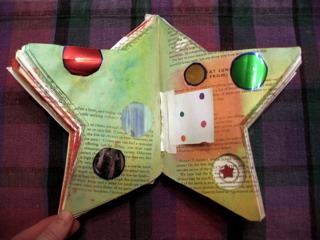
this was the second exercise, where we picked up three different colors from peerless watercolor cards (i've loved those for years and it was nice to see someone else in love w/ them, too!), then added words & phrases we had cut from old book pages. alas, the star book pages are so thin they were easily saturated with water and stayed so wet so long the words wouldn't stick. so instead, i added the shiny metallic dots and tried playing with a hinged door. i also punched out a big hole in several pages in the lower leftmost corner and collaged a spiral & star beneath it. i was trying to use the eyelet setter, too, but the paper was still too wet and it just ended up tearing a hole (right tip of star).
so alas, as you can tell, this awesome star-shaped book doesn't have very much usable page room and the pages are so thin water tears them up pretty easily, so i see some book alterations in my future. melanie suggested gesso (which will also help cover the text: half-visible text would ordinarily be cool, but this is apparently a diet book and a whole journal of it will drive me nuts), gluing several pages together for strength, and possibly tearing some out to allow for thicker pages.
it was good to meet melanie & i see possibilities for the star journal. you can't beat scrap's price & they have a pretty good working space for individuals -- but it wasn't a good setup for 8 people. four people, yes; 8 people doing messy collage work, definitely not. but i sure am glad i wore art clothes! sven brought an apron. :)
afterwards, dayna walked away with a load of great found paint & stamping supplies; i left with some fabric samples and a tiny green carpet square that said "grass!" to me; and sven walked away w/ a million dollars worth of foam core & colored sand & colored grass/raffia & plastic tubs for, like, $5. hooray for scrap!
posted by gl. | permalink | categories: classes & workshops, sketchbook
January 20, 2006
mhcc calligraphy: class 2
by gl. at 11:46 pm
i had a little epiphany about italic today: many of the letters are just one stroke! in most calligraphic hands, each letter is composed of multiple strokes: for instance, the "a" is three strokes, the "g" is four strokes. but in italic, the "a" can be done in one stoke and the "g" in two! doing them with reduced strokes not only makes them vastly quicker to write, but it immediately affects the counters & spacing and automagically produces sweeter, thinner upstrokes. it's completely counterintuitive, though, because ordinarily you're taught only to pull a stoke, never to push it (except maybe in copperplate).
i've been using zig markers because they're a lot easier to travel with, but i really miss the crisp flow of ink, so i think i'm going to try a fountain pen next week.
i was feeling restless today and left a bit early because i've already created the magic book twice and still have leftover bubble paper from last time. turning right instead of left puts you on the historic columbia highway, which i took all the way past horsetail falls. thanks to the all the recent rain, that whole network of waterfalls is particularly stunning and new ones are tumbling from the rocks in abundance.
posted by gl. | permalink | categories: calligraphy, classes & workshops
January 18, 2006
mhcc calligraphy: class 1
by gl. at 11:11 pm
i'm taking the third class in the three-round cycle of mt. hood community college calligraphy classes, this time in italic. i've never actually taken an italic class before and after years of trying to train myself out of a slant, i need to become familiar with the 5-degree slant that makes italic both quick & elegant.
below is a monoline italic, which means i'm not doing it w/ a chiseled nib to give it the appropriate thicks & thins, but a blue sparkly gel pen instead. i'm surprised & relieved to find italic's basic letterforms are easier than expected:

and in fact, if i were using a copperplate nib instead of a gel pen, the letterforms aren't really that much different.
i know the gashlycrumb tinies so well that i often use it for calligraphy practice, but i think i'm going to begin learning gorey's "utter zoo alphabet" as an additional abecedarium.
posted by gl. | permalink | categories: calligraphy, classes & workshops
January 11, 2006
explorations in super8
by sven at 12:05 am
So, Monday I finally began shooting my reel of Super8 film.
Ultimately, I decided that I'd have to be crazy to shoot animation I care about on Super8. As I stood in the kitchen Sunday night, thinking about this project -- which might turn out blurry, will be very difficult to get online, and could take up to 20 hours to shoot -- the exact words that went through my head were: "Do I hate myself?"
...So instead of wasting my "Mud & Metal" script on this project, I decided to film a series of improvised experiments in animation. It'll still take me a hella lot of time -- but at least this way there's no risk of heartbreak.
Title: "Explorations in Super8." ...I'd meant to title it "Experiments in Super8", and when I got to the end of animating the first word, found myself wondering why the letters didn't fit as planned!
posted by sven | permalink | categories: classes & workshops, movies, stopmo
December 16, 2005
mhcc calligraphy: class 10
by gl. at 10:08 pm
i'm so tired my tongue feels thick and my hands disembodied. but finally, the final project is finished! i showed you the draft, but the final piece is done with a tape 1 nib and a "firefly" pen, which is the manufactured form of my favorite tool, the soda pop pen. the roman caps are lettered w/ calli scarlet on arches text wove (i know! after i disavowed it! but this ink surprisingly works fine w/ this fickle paper); the red stain is four different flavours of red inks with surprisingly different hues & gold leaf in its center.
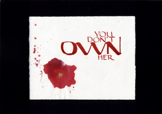
[it looks so small surrounded by black. click for the larger version.]
even though i began this project earlier in the week, i finished the last of 21 attempts at 5:30 this morning. as i was detailing & packing the piece to take to class this afternoon, everything went wrong. while erasing the lines, one tiny dot smudged. i stopped and scraped it away w/ an exacto. while blowing some loose fibers away from the scraped spot, the gold leaf blew right off the red stain and off the table. i got up, got some glue and gently wiggled another piece of gold leaf in place. as i was leaving the studio, i dropped my sturdy cardboard portfolio and managed to gouge a ragged chunk from the "N" in "own" -- fortunately, not in a way that really distorted the letterform, as the gouge occured in the middle of the leftmost downstroke and the folded pen uses a lot of ink.
i don't normally do this, but i've actually used a little photoshop to edit some of the obvious blemishes because it was so heartbreaking to have it fall apart on me like this. will i make another? i don't know. probably not. i think the smarter thing to do is follow the "notes on making art" model and just create another: quality through quantity. still, it would be nice to use it for a portfolio piece....
it was difficult to share this in class because it is so obviously a "statement" and most calligraphers scribe innocuous song lyrics or bible verses. i've invoked him before, but i keep having to remind myself of charles pearce: calligraphers should write in their own words; calligraphers should develop their unique & possibly even political voice. afterwards i had one positive response from a woman i've been talking to over the term, but everyone else obviously didn't know what to say and a couple of people looked like they were afraid to look at it directly lest it infect them.
and now to sleep, perchance to dream...
posted by gl. | permalink | categories: calligraphy, classes & workshops
December 8, 2005
Super8 class takes a long break
by sven at 5:01 pm
Last night the Super 8mm Filmmaking class met for just an hour. We watched the two one-reel films that the class made two weeks ago. [We were supposed to have seen them last week, but the film didn't get sent out for developing on time.] ...The film I helped make looked pretty good: good continuity of action, decent lighting -- a few out-of-focus shots, though; and pixelation with three-shots-per-pose was jerkier than I'd hoped.
Film equipment was distributed. Now folks go off to do their final projects. Having second thoughts, I took a couple of lamps to help with lighting whatever animation I settle on doing.
We decided when we'll meet next. It turns out that we're not going to meet again until January 11, when we'll learn how to do editing. January 18 is tentatively the day when we'll all meet to view our final projects. So, the latest we can turn in our film for developing is December 29.
... I'm kinda appalled that we're going to be meeting in January. When I signed up for this class, I understood it to be a five week class. Originally, we were supposed to be done by Dec. 7! I don't think I have any conflicts, and I consented to the new dates -- but I'm shocked that the class schedule was not actually set in advance.
I suppose I shouldn't be surprised. When I showed up for what was supposed to be the first night of class I discovered that the class had been pushed back a week, and by some snafu I hadn't been notified. I only signed up for the class because I wanted to get a general sense of what it's like to work with real celluloid -- and I've gotten that. But -- and I'm sorry to say it -- I think this is probably the most poorly organized class I've every participated in.
posted by sven | permalink | categories: classes & workshops, movies, stopmo
December 6, 2005
mhcc calligraphy: class 9
by gl. at 11:26 pm
when xmas & blogging collide: we create gilded versals at last week's mhcc class. guess who's getting a gilded versal for xmas? :D fortunately, i'm guessing michaelmas will find the information here interesting & worth "tarnishing" the surprise. the scanner doesn't show shine so well, though. ergh.

this is considered in draft status until i clean up the edges, reoutline it & burnish it. gilding looks easy, but of course it isn't. it's time-consuming & fussy & messy. even with fake gold leaf kits (as opposed to shell gold, which is more authentic and costs proportionally more), there are several laborious steps after you draw your versal:
- bulk up a layer of gesso
- let it dry
- add a layer of adhesive
- let it dry
- no, really. let it dry. or when you add gold leaf, it will come up, and you will have to lather, rinse, repeat.
- when tacky, gently float a thin sheet of gold leaf over your piece, trying to get as few wrinkles as possible
- place a piece of paper over it & burnish w/ a bone folder, trying to get the gold leaf to cover all the adhesive elements
- brush off the leaf excess with a softsoft brush
- scrape up the edges of ragged gold and excess adhesive w/ tinytiny xacto strokes to expose your versal lines
- brush away all the bits
- re-ink
- place a very soft cloth over the piece and use a burnisher (or a bone folder) to make the bits shine.
- keep burnishing
- keep burnishing
- pause
- keep burnishing
- tada! pretty, huh? breathe. try to focus anywhere further away than your nose.
when i created this versal at mhcc, it was originally an asymetric design w/ just an M and a B in its right counter. but i drew it on a separate piece of paper because i don't feel confident enough to draw directly onto an original. i rarely do. then i did a basic graphite transfer -- which reversed the B and became the basis for the backwards S (michael's middle name is stuart). i loved the balance & playfulness this created. sweet, sweet serendipity!
also, i was inspired last week to create an artistic response to a political issue (alas, this is one case i could have done without inspiration, though):
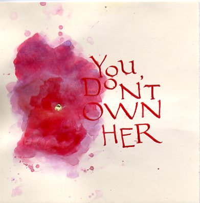
this is also a draft, but i see a lot of potential in it. that's four different colors of red ink.
and we don't usually post links (why not?), but here are two i find totally worth mentioning:
keri smith posts a template for a "magic book," which is how marti has us make the abecedariums at the beginning of each term. i'm thrilled to have the instructions because i can just barely do it when marti's there to show us, and it is definitely a cool technique to know.
the gocco is definitely my kind of cute & convenient, but this "cheap screen printing tutorial" wins super mega bonus points for being clever, easy, cheap & equally non toxic.
posted by gl. | permalink | categories: calligraphy, classes & workshops, links, printing
December 2, 2005
super8 class @ radius studio
by sven at 6:02 pm
So, I'm taking a "Super 8mm Filmmaking" class taught by Mark Brandau at radius studio.
I'm a digital boy; digital is what finally made filmmaking accessable to me. But there's a sense of lacking street cred -- I wanted to take this class so I'd have a more tangible sense of what it means to shoot on real film and to edit celluloid by actually cutting and taping it together.
Plus, the price was right. Only $130 for five 2-hour classes, and the cost of film and developing is covered. That last bit's the knock-out. I've always dreaded not knowing how much the cost of real film would add up to... With Super8, I now know that we're talking about $12 for a roll of film, and about $16 to develop it. That's for just three and a half minutes -- fifty feet of celluloid, yo. Maybe not as bad as I imagined -- but still, it's comforting to have it covered on my first, experimental outing.
I've been to three classes so far. It's very informal. Mark has a collection of maybe ten cameras that he's gotten off of eBay and from thrift stores. The first night, we leapt in, and each got to shoot thirty seconds. It was supposed to be developed by our next meeting, but someone simply forgot to mail out the rolls (they have to go to Seattle). Still, not a bad start to the class. My one complaint is that the seven students weren't given a period for introducing ourselves. Anonymity is an odd dynamic to start off on, even if there's just ten hours of class time.
For the second class we broke up into two groups, each got a roll of film, and we shot a story that night. A few folks didn't show up, so there were just two of us in my group. We came up with a story about two men who share one pair of glasses. Man A wakes up, drives to the meeting point, hands his glasses to Man B, and then Man B drives home and goes to bed. The driving sequences were done with pixelation (my idea, of course) -- and I managed to break a chair while scooting around. Oops.
The third night, I'm sorry to say, was just awful. Mark showed us how to hand-process film. It's like developing photographic film... You put it in a light-fast container, and sequentially add and drain chemicals. It's a neat thing to know how to do -- but 45 minutes of just watching Mark shake a plastic container nearly killed me.
Next Wednesday we meet briefly to view the films we shot during the second class, and most students will pick the camera they want to use for their final project. Me, I knew what I wanted and checked out a camera at the end of this week's class...
I gotta to do something with animation. It's a childhood dream. King Kong, Ray Harryhausen -- if I'm only ever going to do Super8 once, then I have to try walking in the footsteps of the masters.
The cameras are all different models. Me, I'm holding a Canon 310XL. I'll be shooting on Kodak Tri-X Reversal Film. I also borrowed a remote shutter release cord, so I don't have to touch the camera itself and inadvertantly muck up the shot -- which matters, if you're doing animation.
Ee! I'm excited to finally try something I've always wanted to do. Also a little dismayed at the imprecision of it... I'm really worried about getting the shots in focus and adequately lit. It's difficult, but I'm trying to find a good emotional balance between going hog-wild -- and not getting too invested in a product that might come out really crappy.
posted by sven | permalink | categories: classes & workshops, movies, stopmo
November 22, 2005
mhcc calligraphy: class 8
by gl. at 10:07 pm
we did some versals in this session, but i was much more interested in seeing how the pastepaper we made in the last session turned out.
pastepaper is just acrylic paint mixed into cellulose-based art paste and applied to paper: in this case, arches text wove, which i find frustrating for calligraphy but excellent for pastepaper. pastepaper is often designed to be used in bits & pieces, but i find i am fondest of the ones that seem to be complete pieces in and of themselves.
it turns out i made 16 pieces. i can't scan three of the blue ones because i made the mistake of adding a copious amount of glitter to them, which makes them sparkle like a frosty winter twilight (the intended effect), but also gets on the other pieces and the scanner and the floor and the table and my clothes (the unintended effect). in fact, the pieces you see here all had some glitter shed on them, and since it was large salt-flake sized glitter, often it would pool, creating tiny dark rings and light spots where i wouldn't want them. and then they'd flake off and i would have to dust the scanner between each piece.
none of these were planned compositions; i just mixed colors and put them on the paper to see what happened.
yellow wave (excerpt): this was the first piece i made and the paper is probably 4-8 times bigger than this. interesting note: all the pieces below were done with the same red, blue & yellow you see here.
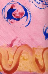
purple noodle (excerpt): this is another excerpt before i began tearing the paper into smaller pieces to be able to experiment faster. ("get through your first 50 failures as quickly as possible."). the pattern is just fingerpainting with some plastic fork happening in the lower left corner.
greengold center: that's gold leaf in the middle. i was surprised to discover it stayed on remarkably well with just water & art paste.
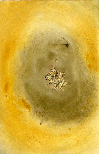
red flowers: i wasn't tearing the paper especially carefully. :) if i could make changes to this one i would remove the odd brown streak angling from the blue swirls, because otherwise i'm quite fond of the composition. another experiment in gold leaf at the bottom, though the red spots have gold paint centers.
flag: i brought some silver ink and wanted to see what it would do.
fish stamp: marti brought some stamps so i played with them. i used something called "colorblock" on top of the fish, hoping it would let me paint on top of it and later peel off like frisket. alas, that didn't work, and when we used the hot press to flatten the pieces, it melted and stuck to the press padding. so what's colorblock good for? i have no idea.
secret: more playing w/ stamps, this time a letter block i used -after- put color down, trying to achieve a subtle tone-on-tone effect. then i tried writing a word in it, then i tried drawing a heart and adding gold leaf to it. none of these effects worked as planned, and it was especially embarassing to discover i had drawn the heart upside down.
noise: undaunted, i tried laying the alphabet stamp block down first (using leftover paintpaste from "secret"). much better. there's a subtle gold wash in the center.
abc: i wanted to try writing in the paste again. much better. this is bookhand, btw. i know the "b" is a little wide & the bowl is sloppy.
soundwaves: i decided to try a traditional pastepaper tool: a notched comb with squared teeth. i don't usually like the texture it makes, but in this case i'm quite fond of the overlapping ripples.
yellow weave: another "traditional" pastepaper approach, i was charmed by its sunny simplicity. somebody set their dark blue piece to dry too close to mine, so it has some bluegreen edges.
yellow stripes: one last try with the comb. eh.
raspberry swirl: nothing special here: i think i used a plastic fork for the swirls but it wasn't as pretty as i'd hoped.
of course, now i have to use all this somehow; i still have three pieces of pastepaper from when i first made pastepaper in san diego. i'm hoping that because i made much more this time, i won't feel each piece is as precious and i'll be able to find interesting ways to use it.
posted by gl. | permalink | categories: calligraphy, classes & workshops, other art
November 14, 2005
pan: holiday gocco printing
by gl. at 4:04 pm
eeeeee! yesterday i finally got to take a gocco class w/ shu-ju wang, something i've been wanting to do since the portland open studio tour. she even recognized me, due also in part to my subscribing to her gocco print test lab, pudding. (mph, why do all the best things have "pudding" in them? maybe sven & i should rename ourselves "scarlet pudding studios.")
print arts northwest hosted the workshop and fortunately (for us) there were few enough students so that we each got our own gocco press. i took a gocco workshop at the iprc several months ago, and as much as I (heart) the iprc, shu-ju's class had a lot more hands-on time and i walked away with a more complete picture of the whole process (but then, it cost 4 times more, too).
i totally missed that this was supposed to be for "holiday cards." i wanted to use the einstein piece to create cards, but its subtle tonal variations make lousy photocopies & therefore lousy gocco screens (i could play w/ the contrast in photoshop or iphoto, though, i think). so instead i used my blind contour self-portrait, leaving enough room beneath for a little calligraphy. when i used just black ink, it didn't look much different than a photocopy, but when i used three colors it was much better. (using different inks on the same screen is one of gocco's many advantages compared to traditional screenprinting.)
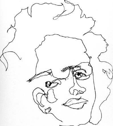 |  | 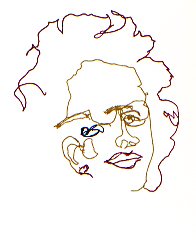 |
| [original] | [gocco screen] | [gocco print] |
so now i have 21 small cards in white & mustard (the gold ink disappears at the right angles on the mustard card, making most of my face disappear) and 12 small portrait-sized pieces i don't know what to do with yet. (though i suspect my parents will get one for xmas. good thing they don't read this, right? ;)
gocco competes with letterpress for my attention (and my limited $ for supplies): i adore handling type and the feel of letterpress pieces, but gocco is much quicker, easier, more versatile, and more importantly, a lot less toxic to use & clean up. i suspect gocco will win, at least in the short term.
posted by gl. | permalink | categories: classes & workshops, printing
November 13, 2005
art marketing workshop by Marty Rudolph
by sven at 9:54 pm
This weekend, both yesterday and today, I was at a two-day art marketing workshop. It was presented by marketer-extraordinaire Marty Rudolph. Overall evaluation: excellent -- well worth the money.
I went into this knowing that I don't yet have a body of work that's ready for marketing. But I wanted to understand the big picture now, so if/when I do get to that point I'll know what to do.
I was pleased to discover that the overall strategy for marketing is nearly identical to fundraising for non-profits -- something I already have a decent grasp on. You have a story to tell; you get people excited about that story; you throw special events; you get them on your mailing list.
I get the sense that there is a three-step ladder to becoming a well-recognized artist: (1) start with a home show, (2) move on to street shows, and then (3) get shown in galleries. Marty made the process for getting into a gallery seem very tangible, very doable. Go to all the galleries, figure out which one you fit in, then make a pitch to the owners. Getting shown in galleries in other cities seems to be an outgrowth of doing roadtrips to do out-of-state street shows -- when you're in another town, you check out all of its galleries, just like you would on your home turf. Apparently there's a must-buy periodical called "art calendar" that collects all of the street shows' dates. Don't go to a gallery until you've sold on your own.
Galleries and agents both seem like things I'll want to avoid. Galleries take a lot of the profit, and they're not necessarily going to work hard to sell your stuff; they want an easy sell. In that sense, they sound a lot like book publishers. Agents, apparently, are only interested in representing you when you're already doing well selling things. It makes sense: both galleries and agents are all about finding someone who has a sellable product, bargaining control of it away from them, and selling the thing for their own profit. If they actually saved me labor it might be worth enlisting their help -- but it sounds like even when you get a deal, you still have to be your own best publicist. No thanks!
Repeated messages:
- You are your art; you're selling you, not just objects; you become the brand name -- just like "Oprah" or "Martha Stewart".
- You have to be prolific; there has to be a constantly renewing body of work; you have to have "inventory" to replace what sells.
- What people want: personal connection, authenticity, trust.
- When people see your work, above all present consistency -- twenty pieces that all look like they belong to a set.
- Set a price and stick to it; never discount, or people will wait for you to lower the price, hoping for a better deal.
- Don't mix marketing time and creating time. Commit to regularly spending time on the business end of things.
I tend to look at workshops of this sort as meditations... During the whole time there'll only be a few insights that really go "click" in my head -- but I'm forced to spend two days grappling with a particular problem. Being forced to really think about marketing, I'm beginning to see who I could sell some of my stuff to...
The "witch" and "pajama dreamer" style could appeal to folks doing collaging, art dolls, and scrapping. I think it would do well in cafes. Possibly Lunar Boy gallery in Astoria, the Angry Fairy gallery in Portland, or shops that deal with urban vinyl / designer toys. Folks who like Dave McKean, Maurice Sendak, Winsor McCay. Marty suggests that divorced women may also be a target audience for this sort of whimsical stuff...
At the same time, I think I also sort of flummoxed Marty. I'm enough on the boundaries of existing art forms, doing my own thing, that I'm going to have to create my own markets. That means starting with people I know, and trying to enlist them as "evangelists" who'll help connect me to other people. [To be fair, I probably didn't have enough examples of work for Marty to really evaluate, either.]
Besides the fine art thread of my work, I also showed the Let Sleeping Gods Lie teaser and my "elder hat" sculpture. I'm beginning to realize that there's a pretty good market out there for this project, once it's done. H.P. Lovecraft is a thriving niche. Plus there are all the sci-fi and gaming conventions to go to. The folks who did a silent film version of "Call of Cthulhu" this year are marketing globally -- translating the title cards to Portuguese, Korean, etc. I could certainly do that too, if I got ambitious.
Unfortunately, coming home from this workshop, another take-home message was that I'm too diversified right now. Do I want to focus on sculpture? filmmaking? essay writing? I don't want to just dump any one of my talents -- but without sacrificing something, how am I going to build the necessary body of work? get to the point where I have an inventory of product that's ready to push?
Sigh... Such a dilemma...
posted by sven | permalink | categories: classes & workshops
November 12, 2005
mhcc calligraphy: class 7
by gl. at 5:23 pm
we didn't have class yesterday because of veteran's day, but marti offered a pastepaper workshop today to make up for it. she supplied most everything, but i brought most of the rest of my arches text wove and donated it to the cause. i want people to have stuff they'll use if i'm not using it, and not having it around means i can find other paper that works for me without feeling guilty about not using the stuff i have.
i started off doing larger designs & patterns, but inspired by sven's "notes on making art" (especially "get through your first 50 failures as quickly as possible"), i tore the sheets into 16 smaller bits so i could try more techniques more quickly, which felt much more creative and made me much less invested in any particualr piece. pastepaper should have a subtle pattern one could write on later, but my favorite pastepaper tends to be the ones that look like finished pieces on their own.
[update 11.22: i've added pastepaper pix & comments on a separate post.]
posted by gl. | permalink | categories: classes & workshops
November 8, 2005
west side stories
by gl. at 11:45 pm
last night i attended, rather than hosted, a collage night! after travelling towards a studio buried in the west hills, it was nice to create without feeling like i was neglecting my hostess duties, as well as glean ideas & tips about supplies and structure. but it wasn't worth $20, though, which is what i paid to be there. scarlet star studios hosts an equally good (if not better) collage night for free. and the facilitator, who seemed pretty nice, had a disturbing tendency to interrupt me and tell me what to do or not do with my collage, even going so far as to remove an element (!), which i view as a fairly appalling facilitator violation.
i kind of like the collage that came out of it, though. it's larger than my normal size and collaged onto matteboard:

["wanting more"]
the star in the middle is mars at its spectacular 2003 perihelic opposition, which is very appropriate as that's the star & event scarlet star studios is named for. :)
posted by gl. | permalink | categories: classes & workshops
November 5, 2005
mhcc calligraphy: class 6
by gl. at 1:19 pm
below is a bookhand layout using color for emphasis. the ink is actually much greyer than the scan makes it look: i watered down sumi fairly heavily to make the red stand out more. (and i like the whole grey/red thing. can you tell? ;)
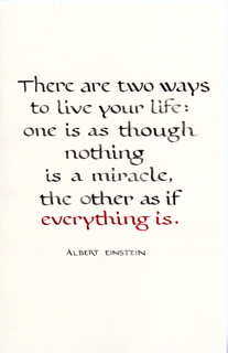
[click for a larger verion]
my least favorite thing about calligraphy is struggling with materials. and i hate doing projects for classes which aren't actually functional -- why put in all that work if i can't actually display it or give it away as a gift or sell it? that's why the artist's way open studios have been working well for me, because at the end of the night i have created not just art, but a card i could give to someone.
i struggled w/ "two ways" because my typical card stock proved to be troublesome with the size of nib i had to use (a tape 1). the nib skipped and shook and wavered more than a nib even a half size larger. even turning the card inside out to use the hot press side didn't help. so the time i'd rather be spending tweaking layout and lettering got swallowed by debugging instead, making a 4-hour process 8 hours long.
so i frantically scrambled through all my papers for a smoother grain. what i should be using because i bought it specifically for this purpose is arches text wove, which i bought because the amazing teri martin recommended it during the sdfc coloring books workshop. i think teri uses gouache & acrylic, though: every single ink i've tried to use on arches text wove has feathered & spread: even sumi spreads a little. it's part of the trouble i was having with joanne's wedding comission earlier this year. i have about $75 worth of arches text wove in the flatfiles but if i can't use it, what's the point? i ended up using cheap paper from a strathmore drawing pad.
the sdfc did a paper sample workshop which was really interesting, but at this point, though i still have the samples, i don't what they are anymore (though i have some sort of vague memory that i was impressed w/ fabriano). and really, all i want is a good off-white text weight and cardstock/envelopes that work w/ inks & a variety of pen sizes. i got recommendations from the advanced calligraphers in the backof the class (aquarius 2 & fox hill), and i think i may be due for a paper & ink or daniel smith shopping trip.
we won't be meeting next week or the week of thanksgiving, though we may be doing a pastepaper workshop on saturday.
posted by gl. | permalink | categories: calligraphy, classes & workshops
October 29, 2005
mhcc calligraphy: class 5
by gl. at 5:06 pm
we must be about halfway through now, though we won't be meeting for two weeks in november. as promised, a layout w/ bookhand & roman caps:
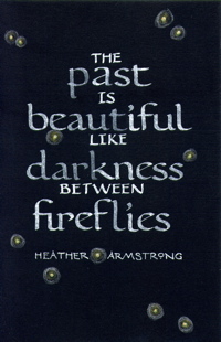
[click the image for a much larger version]
after weeks of using zig markers for practice, i was happy to discover that tape nibs give me lovely hairlines when using sumi. here i've used higgins white and it very much sucks, immediately absorbing into the black card stock. in this case, i liked the ghostly & faded historical metaphor effect (which is actually sort of mitigated in the scan), so i kept it. the lettering required three different nibs: tape 2, tape 1 & a random pointed pen. the fireflies are three different colored pencil and you probably can't tell, even on the larger version, that the fireflies have tiny gilded centers. i like using gold dots on things, but they never scan well. i embossed the background lines this time so they are even more invisible than the pencil lines i used in "born": great for ink, but not for colored pencils, which explains why the fireflies look like they have black lines through them. oops.
if anyone reading this also reads dooce, yes, it's that heather armstrong. when i read that line on one of her posts, i knew i wanted to use it in a piece somehow.
next week: a layout using color as emphasis.
posted by gl. | permalink | categories: calligraphy, classes & workshops
October 22, 2005
mhcc calligraphy: classes 1-4!
by gl. at 1:17 am
yi! i can't believe i've forgotten to mention i've been taking another mhcc calligraphy class. in fall they do bookhand, which i've never attempted, but it is pretty nice, really, and very legible. it's hard not to want do spanish round gothic, especially for some of the lovely combined letterforms.
one of the biggest changes this term: to keep my packing simple, i bought myself a slew of the best available calligraphy markers and carry them and a folder for my handouts & practice sheets, as opposed to the largish bag w/ inks, nibs, pen holders, large notebook, tsquare, pen holder, rubber backing, eraser, handkerchief, etc., etc. carrying markers instead of ink also means i don't have to change into special clothes in case of spills. the zig markers have both 2mm and 5mm ends, and the 2mm more-or-less is the size of a speedball c3 nib, but i still have to create my own lined practice paper because the instructor rules for a c2 nib, which is bigger. the zig 5mm is really, really big. i have no idea what i'd use it for.
this week we threw in some roman caps, too, though i preferred the ones i learned in san diego. the limitations of the otherwise competent zig markers become apparent at a 15-degree angle and crossbars look remarkably flat. but there's so much pen twisting, anyway (since bookhand is at 30 degrees and many of the roman caps diagonal strokes often change to 30 or even 45 degrees), it shouldn't phase me. next week i have a layout due, so instead of subjecting you to pictures of practice sheets, perhaps i'll just scan that instead.
today was such a beautifully blue & blustery autumn day that i walked on the path behind the college to the creek. the cottage-style art studios are especially charming surrounded by blazing trees and glowing golden carpets of fallen leaves.
posted by gl. | permalink | categories: classes & workshops
June 10, 2005
mhcc calligraphy: class 10
by gl. at 7:46 pm
all we did today was display & briefly discuss our final projects. my project was the first few lines of the poem i wrote for maya's birth on the sink marbled-paper. it's rotunda primarily using a tape 2 nib and accented w/ a tape .5 nib w/ j. herbin grey pearlescent ink on arches text wove. (see? even calligraphers have their version of exif geekiness. ;)

[click on the image for a larger version]
after the wedding commission, it was a relief to have all the materials cooperate this time, and i'm really pleased w/ the result, especially since sven created a terrific dimensional frame made entirely of black foam core and copper wire. the only issues were that i discovered i couldn't erase the pencil marks without also lifting the black from the background, and the pencil lines were very difficult to see in the grey/black contrast. this turned out to be a project that took about 15-20 hours of my time, but i don't mind working hard on something if there's hope at the end of it. most of lettering for me is finding the right line spacing, especially as i tend to design calligraphy as if it were typography. but between the wedding commission and this project, my right hand is actually swollen; i've never had that happen before, not even when i stayed up all night making christmas cards while michaelmas talked to me over the phone.
throughout this project i kept thinking of the time michaelmas & i went to an sdfc meeting when charles pearce was lecturing, and he talked about how, if you're going to do a piece, it ought to be a piece based on your own words, in part because calligraphers are almost always copying the words of others (especially in the form of quotations). he talked about it in terms of having a unique and potentially political voice, but having just spent so much time with just 4 lines of my poem, it had better be words i want to be heard.
posted by gl. | permalink | categories: calligraphy, classes & workshops
June 4, 2005
mhcc calligraphy: class 9
by gl. at 11:43 pm
created a pangram book, gold leaf. the next class is the last one.
i broke a nib in frustration while trying to get ink to come out before i decided to check the ink. lesson learned: this blend of cast-off inks will finally be tossed.
posted by gl. | permalink | categories: calligraphy, classes & workshops
May 27, 2005
mhcc calligraphy: class 8
by gl. at 11:20 pm
more on blackletter. i still really like it, but it seems too formal for most of the projects i want to make, like something for maya or the commission i'm currently doing for joanne. we also did some dry embossing (stars for me, of course!) & i got samples of silver & copper foil that i missed when i was sick.
posted by gl. | permalink | categories: calligraphy, classes & workshops
May 21, 2005
mhcc calligraphy: class 7
by gl. at 2:51 pm
it rained so hard we got leaks yesterday. combine that with the monotonous strokes of blackletter, and it's like chinese water torture. :) actually, i like blackletter; it comes out of my fingers really easily and in a rhythm unmatched by any other hand.
it also turns out we were not doing spanish round gothic last time (though the handout said we were); instead, we were doing "rotunda," and this week we did spanish round gothic. the ironic part is that spanish round gothic is a "rounder" hand than rotunda.
during the last half of the class we carved stamps, the neat part of which was coloring them w/ crayola markers instead of using a stamp pad. in this case, it turns out the second impression is much more detailed and beautiful than the first one.
there's a calligraphy show july in gresham. the instructor has asked me to bring in some of my stuff next week to possibly submit. ee!
posted by gl. | permalink | categories: calligraphy, classes & workshops, exhibits & events
May 17, 2005
mhcc calligraphy: class 6
by gl. at 4:59 pm
eep! almost forgot to write about the last calligraphy class! we covered versals, which i always love, (especially roman capital versals), and i smiled a little at the juxtaposition of using fluorescent gel pens to create ancient letterforms. we also began spanish round gothic, which also has a wide pen manipulation (from 30-90 degrees), but it's not as schizophrenic as rustics and really has a flow and density that's similar to uncials. i've been jonesing to practice it for the last few days.
we also got to go to the student art show. some very nice calligraphy books and pieces, but the work that really got me was a boxy installation covered with pine boughs, and the inside was red and lit and as huge as a giant's heart. two doorways were flanked with maroon velvet curtains and inside were golden buckets filled with inky blackness and a crack in the ceiling had text i don't remember peeking out.
posted by gl. | permalink | categories: calligraphy, classes & workshops, exhibits & events
May 11, 2005
iprc: gocco printing
by gl. at 9:14 pm
tonight i went to iprc's gocco printing class. i've been interested in gocco printers since the summit scribes had a christmas card exchange and many of the fabulous ones had been printed with a gocco printer.
making a gocco print is like creating a cross between a silkscreen and a stamp, but also endearingly includes a tiny explosion: first you create a screen based on a photocopied image, then dab ink onto it, then squish the screen against the object of your desire. several times. you can get a heck of a lot of prints out of an inking. afterwards, it looks like this:
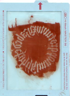
a used gocco screen
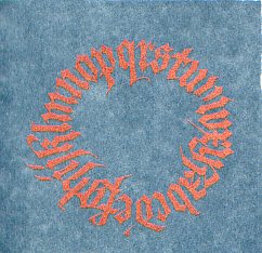
a gocco print: bronze ink on sage linen
i even saw someone do a photograph, and there were examples of printing directly onto a blank cd and paint swatches! so now i'm really intrigued and i'm glad to see dick blick carries them with a reasonable selection of accessory stuffs, as the workshop instructors said they were difficult to get and one had to be referred to "the gocco lady" to find one. think ink also looks like a good supplier, especially since they offer metallic inks, which i had fantastic results with. the fabric kit, which is really what makes the whole thing into a giant stamp, would be an essential add-on. of course, i'm looking at the b6 kits, not the huge b5 kits with the price tags to match. yikes.
one of the instructors was using the gocco to make flyers for her typewriter party may 29! god, i love portland. it will give me an incentive to get a new ribbon for the typewriter i got via freecycle....
[update may 12: that ribbon has been discontinued. i've just ordered this one. and i forgot to mention i left iprc a box of decorative border tape i got from chas when i picked up his letterpress. i can't imagine a better home for it.]
posted by gl. | permalink | categories: classes & workshops, printing
May 6, 2005
mhcc calligraphy: class 5
by gl. at 10:42 pm
i was sick! i didn't agonize over it too much because i have no interest in rustics, anyway, but it means i missed my chance to contribute to the student art show. meh.
posted by gl. | permalink | categories: calligraphy, classes & workshops
May 1, 2005
mhcc calligraphy: class 4
by gl. at 4:26 pm
we're beginning rustic letters, and i -hate- them. hate hate hate. they don't like me much, either. they're 7.5 penwidths tall and as awkward as a fawn learning to walk but not nearly as cute. it's got a steep angle and there's major pen manipulation involved, which in my opinion is an advanced topic.
however, i used sven's unbirthday card as my uncial project due last friday. the instructor liked it so much she asked me to participate in the student art show next month. she also spoke a little disparagingly about calligraphers who deliberately write illegibly. my most recent work w/ the soda pop pen falls into that category, so i wonder if she'll accept "tongue far from heart" or "a grace it had, devouring"?
posted by gl. | permalink | categories: calligraphy, classes & workshops
April 17, 2005
mhcc calligraphy: class 3
by gl. at 4:21 pm
more uncial, a wonky revised syllabus, & bubble paper. happier w/ my "n"s and "w"s, though i still need more practice in making things vertical instead of slanted to the left. next week i have a finished layout to present. yeep!
posted by gl. | permalink | categories: calligraphy, classes & workshops
April 2, 2005
drawing studio: last class!
by gl. at 9:35 pm
today we watched a video documenting pablo picasso's painting process, meant to show how many times he changed his mind, even in the middle of large paintings. then we drew a face made of body parts from different pictures. for whatever reason, i became convinced it was going to become a horrible piece anyway and started writing all over it in the big sloppy way i do with a soda pop pen, naming all the body parts that were supposed to be in the piece (lips! right eye, left eye, hair hair hair hair hair hair hair, nose, an ear, ear #2, chin, invisible bones). from afar it was a grey shapeless mess, but up close it warranted enough interest to be nominated as one of the best pieces of the day by other members of the class.
during the picasso video i also realized calligraphy has no margin for error: if you make a mistake, you start over again. so now that i'm trying different flavours of art like collage, charcoal & pastel, i'm finding it easier to work in more forgiving mediums than i am with the crisp sharp lines of calligraphy (unless it's meant to be sloppy, like the soda pop pens).
posted by gl. | permalink | categories: classes & workshops
April 1, 2005
mhcc calligraphy: class 1
by gl. at 10:11 pm
gosh, the mhcc cottage studios are neat. huge skylights providing even, soft natural lighting. lovely large tables that tilted at any angle, with good stools and solid footrests. it's making me rethink the table setup i have now. the teacher, who is in her late 60s or mid 70s, says she's a friend of jacqueline svaren (who i gather may still teach at pcc!) and that they were both students of reed's own calligraphic demigod lloyd reynolds. we were taught about calligraphy materials & how to line a page using pen-widths instead of standards units, both things i already knew about, but next week we start uncials! yum. i don't have a regular practice time yet, but knowing myself as i do, it would behoove me to front-load some practice in case i slack later.
all of the other students are enrolled in more than one mhcc class, and most are in a degree program. about 10 other people, 3 of which are boys, which is a pretty good ratio, though one of them left on break and never came back. i met a girl who does pottery and poetry and has always been interested in calligraphy -- she is interested in combining psychology and art, so we talked a fair amount about art therapy and i'm trying to put her in contact with some of the people i met at the creata workshops.
a huge hail storm on the way, there, though! even so, i got there about 20 minutes early and so went looking for rob in the library. afterwards i took stark all the way to the historic columbia river highway (crossed the stark street bridge!) and head to springdale, then turned around and followed it to halsey and took halsey home.
posted by gl. | permalink | categories: calligraphy, classes & workshops
March 19, 2005
drawing studio: week 9
by gl. at 11:12 pm
today we met the notorious jeff, one of phil's coteachers. he was late so i got a chance to ask the person who's been hanging around taking notes why she's been taking notes. apparently she wants to publicize phil's methods and use them while working with troubled teens; she's especially interested in the young girl (12? 13?) who comes to class with her father.
this was our second (and i believe last) session working with a model, who i was pleased to see was male this time 'round. jeff had us go through 6 or 7 gesture exercises on the same page; then he told us to imagine a shapeful object like a tennis ball or a quart of milk and apply those shapes to the model; then he gave a us a couple of 20-minutes poses with the model. i experimented with the "just make marks you like" technique to some success, but just when i was really getting into it we switched poses. i completely lost track of the last piece, smudging most of it out and beginning again with the face during the last 5 minutes.
weird. i thought i had at least one other post about the drawing studio on this blog, but i guess they must all be on the blogspot blog. anyway, still no art. by the time i get any drawing studio pictures up, the class will be over!
posted by gl. | permalink | categories: classes & workshops
March 13, 2005
creata: the creative process
by gl. at 7:58 pm
alas, i didn't pick up on the fact that i had attended this same session last year, so there went $12 and 2 hours of my life i could have used right before fleeing to eugene for the laurie anderson concert. otoh, some of it made more sense. the articles she used as handouts are dense.
quick notes:
what happens during "flow" (and its counterpart, ebb.)
creative process cycle:
1. incubation
2. preparation
3. insight
4. evaluation
5. elaborationart interventions=
1. art as healing
2. art as therapy
3. art in therapy
this was another session where the discussion between participants picked up a bit. still, i was tired and anxious about getting to eugene on time, and my eyelids were extremely heavy. i think it ought to have been a beginning-of-the-week session rather than the last session of the week.
still managed some mild artist's way promotion, though. the facilitator talked about it after i had mentioned it a couple of times, said she had heard good things about it.
posted by gl. | permalink | categories: classes & workshops
creata: the therapeutic aspects of blogging
by gl. at 7:54 pm
who better than me to attend a session about the therapeutic affect of blogs, right? alas, her history was full of innaccuracies and her assessments of the "first" blogging tools or the "first bloggers" were obviously influenced by popular rather than historical items.
you can tell she's studying to be an art therapist because she had us do an experiential exercise even though it was probably inappropriate for this context: we wrote something on a piece of paper we might not tell someone face to face, then she read one out loud, and everyone wrote something they might say to that person on another sheet of paper. obviously this was designed to mimic the blog/comment process, but the instructions were so vague and separated from the medium that it felt hollow and pointless (plus, the particpants being mostly art therapists, their comments were often things like, "i hear that you're frustrated. what can you do to change things?" ha!). not that she had any idea if any of us blogged: she asked if we all knew what a blog was, waited for us to nod, and then hurried on.
her thesis is about whether blogging is therapy, and her research consists of 40(!) surveys sent to bloggers (and with a 100% success rate i suspect she knew all of them), asking questions like, "if a major life event occured, would you be more likely to blog about it instead of or before going to therapy?" i'm paraphrasing because she didn't include a copy of the survey.
she wants to be a famous blogger. apparently her photoblog, which i ran across by accident, was mentioned in wired, but i can 't find a reference to it.
she seems very enthusiastic and passionate about the subject, though, and it was the first session where a genuine discussion took place. it also drew a younger crowd than is typical for the art therapy week. her drive is to find ways to create safer therapy spaces for bloggers. she wants to "read and write for the field," an unusual research inclination for an art therapist. she creating a found poem (a "poetic transcription" as a way to "display" qualitative data. interesting term: anonymous witnesses.
posted by gl. | permalink | categories: classes & workshops
March 11, 2005
creata: creating soul
by gl. at 10:46 pm
taught by an art therapist from spokane, washington. guided meditation: a heathered hill in ireland, fading sunset to a full moon, a black panther, a beach, a cliff above the sea. do you want to walk to the moon? or do you want to dance with her?
one of the interesting things about doing the creata thing the second time around is that i've been able to actually make some contacts. the organizer recognizes me from last year and said it was interesting to hear more about my story. i've met two student art therapists because we've all been to the same sessions and they're both interested in the possibility of artist's way (it's too bad it will start in fall, which is forever from now!).
the other interesting thing is that i've managed to find another field where people care about the letters after your name more than they care about your experience. licensing art therapists is a hot topic, and this was the first facilitator to say it didn't matter and i could feel people cringe. and you might, too, if you had spent over $30,000 for an art therapy degree from marylhurst.
i wish i had a more streamlined way of getting art from paper to blog. i want to add more images to posts (especially on the ART blog...!) but it seems like so many steps for so little gain. camera/scanner > tweak, tweak > tweak some more > save image > upload > link.
posted by gl. | permalink | categories: administrivia, artist's way, classes & workshops
March 9, 2005
creata: dancing from the core
by gl. at 11:49 pm
an hour and a half of dancing and i still feel like i need to stretch. :) no processing, no sense of its relation to or place in art therapy, but i had a pretty good time. interesting timing after the authentic dance session from the last artist's way; we even did mirroring!
posted by gl. | permalink | categories: classes & workshops
March 6, 2005
creata: directive vs. open studio
by gl. at 10:56 pm
not much to say: i've identified artist's way as a fairly directed activity, not just because of the book but because all the art sessions associated with them are detailed by me and are often designed with something particular in mind. i had never considered having an open studio session, though, and i might give that a go.
our directed activity was, essentially, to draw our happy place: i drew a summer night on the springwater corridor trail, with a full moon rising over mt. hood and a scarlet star twinkling in the sky. i was the only one with a night scene. :)
posted by gl. | permalink | categories: artist's way, classes & workshops
iprc: transfer printing
by gl. at 10:33 pm
i was 20 minutes late because i thought i was 10 minutes early, but all the techniques were demonstrated (and they are all reverse transfer techniques, so text needs to be mirrored first):
carbon transfer: trace item onto tracing paper using bold soft pencil. place carbon side down onto surface and burnish the image off.
crayon transfer: using water soluable crayons or possibly oil pastels or something of that ilk, color a block (or multiple blocks) on the -other- side of the image. place the crayon side down against the surface and trace the image.
ink blotting (mono print): use ink (or other mediums, but hurry!) on tracing paper over graphic. tape the tracing paper to the graphic and also to paper you want to transfer to, forming a hinge, then flip it over to the other piece of paper to "print" it.
oil transfer: add a thin layer of oil or acrylic or bodied ink on glass w/ brayer; a carboard frame bigger than your image but smaller than the glass; place paper on top of frame, place graphic on top of paper & trace it w/ a dry ballpoint or stylus. it should press the oil against the bottom of the paper as you draw.
ghost print: remove the paper frame from the oil transfer; press paper flat against the ink for the negative image.
heat transfer: color the surface of your graphic w/ fabric crayons, if you want. place graphic face-down against surface. set an iron to 5/6 (cotton) and press hard to transfer the graphic.
solvent transfer: place the graphic face down on the surface. add a small amount of solvent (like acetone -- fingernail polish remover -- or goof off, or a colorless blender pen, or citrisolve, the least toxic option) to a cotton ball & dab at the graphic with the cotton balls until the whole image has been moistened but not soaked. then burnish the image with a bone folder. (i've done this before and it never turns out as well as i'd like, but citrisolve worked great!).
caulking transfer: quickly paint clear caulk on a piece (this is especially good on a non-paper items like wood, canvas, etc), add your graphic face down onto the calk, let dry. when completely dry, soak the item in water to remove the original paper; the transfer will now live in the flexible caulk.
posted by gl. | permalink | categories: classes & workshops
March 5, 2005
glad to have a photocopier!
by gl. at 11:55 pm
i just photocopied "several high-contrast images" for tomorrow's iprc workshop. whee!
posted by gl. | permalink | categories: classes & workshops
