studio space
you are here [x]: Scarlet Star Studios > the Scarlet Letters > studio space
December 27, 2011
the great leap forward: from analog to hdtv
by sven at 5:10 pm
If you check the electronics section of your local department store, it's clear that society has transitioned from Cathode Ray Tube (CRT) televisions to High Definition flat screens. I have pretty mixed feelings about this. But now that I'm running the NW Animation Festival, I finally have compelling reasons to catch up with the times. Both for better and for worse.
THE GOOD
Here's what excites me. After maybe a decade and a half of slow development and format wars, HD standards have finally solidified. Every filmmaker should be producing work with Blu-ray resolution in mind: 16:9 aspect ratio, 1920x1080 pixels, 24 frames per second, progressive. I reel reasonably confident that this standard will hold for the next ten years.
I'm thrilled that the standards for television and cinema have begun to converge. A 16:9 aspect ratio is nearly identical to the most common one for screens in movie theaters: 1.85:1. Regrettably, digital broadcast television remains based on the old 30fps NTSC standard; however, Blu-ray and most HDTVs now have native support for 24fps—the same frame rate used for celluloid. Coming from the other direction, big chain movie theaters are rapidly transitioning from celluloid to digital projection. One well-regarded industry report forecasts that by 2015, 35mm film will be projected on only 17% of screens, globally.
As a filmmaker, I crave to make films that screen equally well on a home TV or in a movie theatre. Good riddance to 4:3 aspect ratios, 30fps, and interlacing!
THE BAD
Now here's the bad news. Despite the hype, Hi Def televisions are still an adolescent technology. And it really shows. Analog televisions have been in our homes since roughly the 1930s. They are dependable, predictable, and fairly forgiving. HDTVs look vastly superior when you play a well-authored Blu-ray disc—but can make anything less look damnably awful.
A poor broadcast signal will lead to huge blocks of stuttering pixels. A poorly compressed film of any sort has artifacts that look like mosquitos. Movies that were shot on film, often lose their cinematic quality when displayed on an HDTV, instead having that "too crisp" look of video. Digital media are much less forgiving of audio clipping, which becomes a harsh buzz. While Blu-ray players are backwards-compatible for playing DVDs, most of my (considerable) collection now looks muddy and pixelated unless I sit far back from the screen.
As I said, the technology is in its adolescence. Given another 5-10 years, it ought to be easy enough to compensate for these awkward translations of data. I'm not sure that the industry is interested in improving quality, though. By making anything less than Hi Def data nearly unwatchable, society is forced to abandon DVDs and the like, and adopt the best new formats. It just seems a bit mean-spirited when the majority of digital content currently looks like crap.
"Upgrading" to HDTV, I feel like we've now caught up with where society is going... But with the understanding that we haven't really evolved to a higher level of being—rather, we're all going to go through some rocky technological times together.
OUR CHOICE
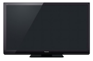
At least I feel confident that we made the best selection possible at this point in time. We went for a Panasonic VIERA TC-P42ST30 42-Inch 1080p 3D Plasma HDTV.
There are three major flat screen technologies at present: plasma, LCD, and LED. Of them, plasma has been around the longest and is best developed. One indicator of this is refresh rate. A typical plasma refresh rate is 600Hz, whereas many LCDs are still only 60Hz. LED is the newest hybrid technology, which has the best brightness—but gives uneven luminance because the LEDs are only positioned around the edges of the picture frame.
Among producers of plasma TVs, Panasonic is currently the industry leader. Plasma TVs are noticeably dimmer than LCDs, but also have the ability to show blacker blacks. Plasmas are viewable from a wider range of angles than LCDs. There's a danger with Plasma that images will burn a permanent afterimage into the screen if you leave them on too long. However, we don't really play video games or watch TV channels with logos in the corners, and "neo plasma" technologies have lessened the problem—so this wasn't a big concern.
Ultimately, what I'm most looking forward to is running film jurying sessions for the NW Animation Festival, where I can run a single cable from my laptop to the TV and show films at full resolution. (And without having to be concerned about TV-safe areas!) I'm also excited to see the 1920x1080 version of my film Mutate displayed at full resolution for the first time.
It's curious... Technology has moved "forward"—in the process making the majority of available content look much worse. It cools my desire to be a media consumer—but simultaneously fuels my interest in creating new content that will look excellent using the new tools at hand.
posted by sven | permalink | categories: nw animation festival, studio space
August 27, 2009
machine shop improvements
by sven at 7:00 am
During the past few months I've made some improvements in the machining area of my studio space. Here's a little guided tour.
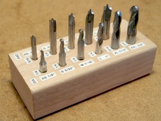
I've made sure that I have a complete set of the ball-nosed and corner-rounding end mills that I need for making armature joints. I've also created a handy wooden holder for them with easy-to-read labels for quick reference.
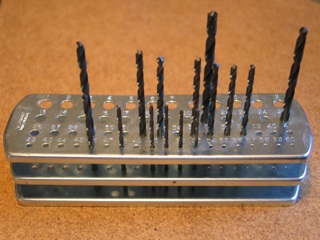
For a long time I only had the numbered drill bits that one needs for making threaded holes…
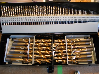
I finally decided that in order to run a serious machine shop, I really needed to have a full library of drills on hand. Thanks to Harbor Freight, I was able to get this 115 Piece Titanium Nitride Coated HSS set for just over $40!
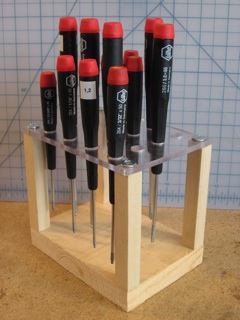
I fell in love with Wiha screwdrivers while working at Bent Image Lab. They feel like velvet… They don't do much good, however, if you can't find what you're looking for when you need it. So I built this pretty organizer for the set.
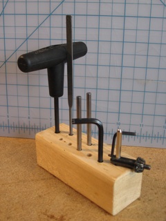
Simple but useful: I built this little organizer to hold the hex keys, chuck keys, and tommy bars needed for tightening and untightening my milling machine.
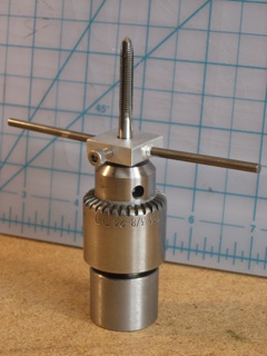
When you're threading a hole by hand, there's a risk that the tap won't go into the hole straight, and a risk that you'll accidentally break the tap.
Two books -- "Tabletop Machining" by Joe Martin and "Machine Shop Essentials" by Frank Marlowe -- show a tap holder design that solves this problem. The general idea is that you keep the tap vertical by holding it loosely in the drill chuck of a drill press or milling machine. Then, you build a special tap holder that keeps the tap in place with a screw.
Good idea! Except, the design in the books is -- in my opinion -- overly complicated. There's no reason why you need to make the tap holder from a 2" disk and then knurl the sides!
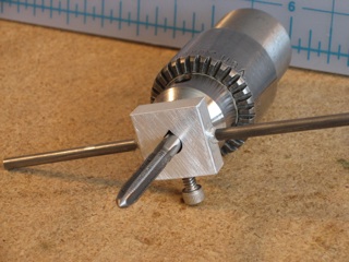
The design you see here is my simplification of Martin and Barlowe's design… And it works like a charm. It's pretty self-explanatory. The one important thing to point out is that I've filed the through-hole into a teardrop shape. That's essential -- it gives a better grip and thus helps keep the tap from shifting in its seat.
This tool has been so useful, in fact, I've built two version: one for size 4 taps and under, and one for size 10 and under.
Highly recommended.
posted by sven | permalink | categories: studio space
May 22, 2009
studio organization
by sven at 7:00 am
In preparation for work on The Whisperer in Darkness, I've been doing some major re-organization of my studio room.
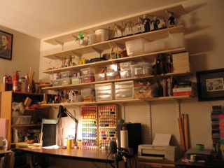
I already had 48 feet worth of track shelving on the north wall. I've just installed shelves on the south wall, for another 40 feet of storage space. (It fills up so quickly!)
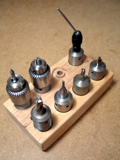
It's not a typo. To shape metal, a milling machine uses end mills -- which are like extra-sturdy drill bits. End mills can either be held in place by a collet or an end mill holder. End mill holders are much faster to switch out, so I've collected a few… Thus ultimately necessitating an end mill holder holder.
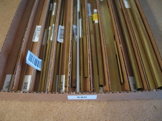
K&S brand brass tubing is extremely useful… But it's frustrating to hunt through a jar for the specific size you need. So, I took a piece of flat cardboard and used hot glue to construct a box with dividers. Now I've got separate bins for 1/16", 3/32", 1/8", 5/32", 3/16", 7/32", 1/4", 3/8", and 1/2" stock.
(Guh! Can you imagine how much more intuitive that list would be if the fractions were all just listed in 32nds?)
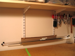
To put the raw steel stock I need close at hand -- yet out of the way -- I created this simple hanging rack. It's a cardboard tube that's had 1/3 of its material cut away. Little brass hooks (anchored in bits of wood) allow it to hang from the track shelving's rails.
OK! All organized! Now… GO!
posted by sven | permalink | categories: studio space
June 27, 2008
our house is red and purple!
by sven at 10:58 pm
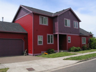
We've painted the house... Now it's red and purple!
The house was built in 2000, and due for recaulking and repainting. At last: our opportunity to get rid of that horrible, bland gray!
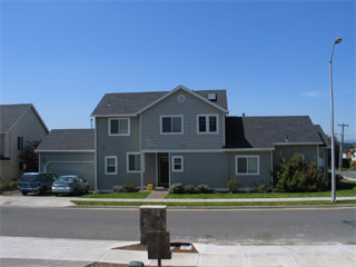
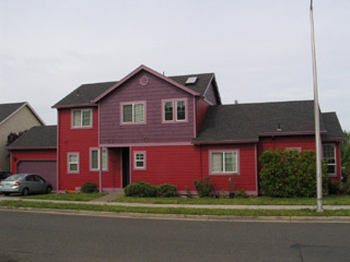
Selecting the colors was nerve-wracking. I spent hours and hours sitting on the corner across the street, holding up paint chips, trying to visualize the possibilities. Paint colors are like house guests... I really wanted to get to know the folks who'd be coming to stay with us -- intimately -- before they moved in.
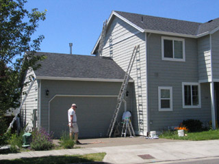
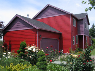
As the first coats of "caliente" red started going up, the neighbors were dubious. They'd drive around the corner slowly, and shout questions out their car windows:
"Did you pick that color yourself?"
Yes.
"It's... Bold."
But, as the "kalamata" purple peaks and "aplomb" lavender trim started going up, I sensed people starting to warm to it. The best comment we got: "I like the color! The less beige in this neighborhood, the better!"
Amen, brother!
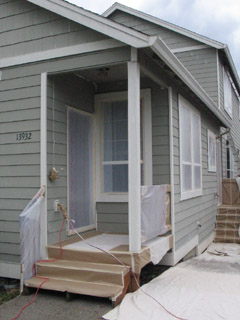
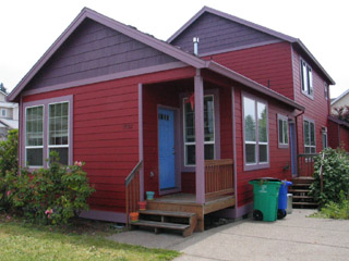
Most of the houses in this neighborhood were built all at the same time. Block after block of gray, pale tan, pale yellow, white trim... They're all going to be needing new coats of paint pretty soon. We're more or less the first to repaint -- and it would delight us to no end if it our "bold" choice inspired others to also get a little daring.
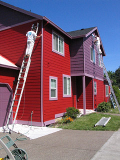
Besides wanting delicious new colors, we also decided that we wanted to go Earth-friendly. The paints that we used are from the Benjamin Moore "Affinity" line. They're a bit more expensive... But they're low VOC (volatile organic compound), last extra long, and are extra resistant to fading.
The paint job was done by Paintegrity -- whom we have nothing but praise for.
- they specialize in Earth-friendly house painting
- they did the whole job in just five days (!!)
- they took care to do a good caulk job (almost more important than the paint)
- they were exceptionally detail-oriented
- they gave everything at least two coats of paint, to guarantee durability
- they didn't leave behind any mess at all
- good, decent people -- pleasant to have around
I'd be happy to send more business their way... They're the kind of group that I really want to see stick around and flourish.
posted by sven | permalink | categories: studio space
June 24, 2008
keeping the computer cool
by sven at 8:00 am
This is another "B project" that I did recently while waiting for some animation to render.
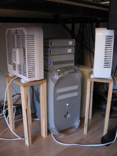
Last year, when the weather got hot, Gretchin helped me by setting up some fans pointed at my hard drives. The boxes that the fans have been standing on were a bit precarious, so I finally went ahead and built little wooden tables to replace them.
Ah! Much less prone to being accidentally kicked over. :D
posted by sven | permalink | categories: studio space
June 8, 2008
studio shelves
by sven at 7:00 am
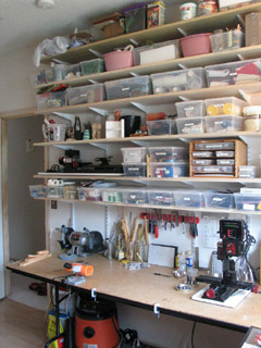
Two weeks ago, while waiting for a big render to finish, I finally got around to building shelves for my studio room.
At last, everything is off the floor and easy to find. I've put all my tools and art supplies into stackable clear plastic bins -- and labeled the bins. What a pleasure!
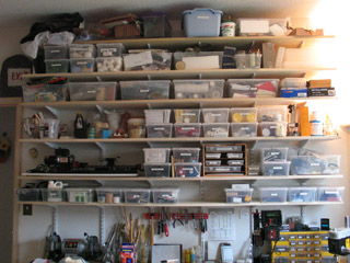
The shelves are 8 feet wide, 12 inches deep, poplar wood. The ceiling is 9 feet up, so I need a little step ladder when I want to get things down from the top.
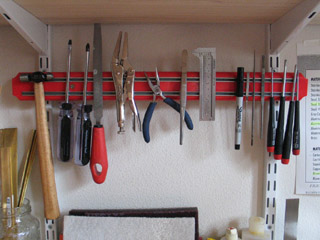
A related project: I installed this magnetic tool rack to organize my most frequently used hand tools. The rack is store-bought -- but in order to make it hangable, I had to engineer little brass brackets protruding from a piece of scrap wood. I'm pretty pleased that it worked.
posted by sven | permalink | categories: studio space
November 11, 2007
paint storage boxes
by sven at 3:15 pm
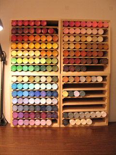
While you're painting, it makes an incredible difference to be able to easily see all your available colors at once. Alesia Zorn gifted Scarlet Star Studios with a paint storage box that really transformed the experience of painting for me... But now I have more paints than it can hold, so I set out to make some customized storage boxes.
I'm using 2oz bottles of Delta Ceramcoat acrylic paints which I get at Craft Warehouse for $1.29 each. This isn't an "artist's quality" brand... But for most of my purposes, having an abundance of colors to choose from -- and feeling like I don't have to worry about wasting expensive materials -- outweighs any quality concerns.
The paint bottles' diameter is approx. 1.5", and they're 4" tall.
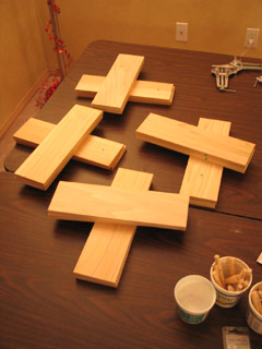
Each paint storage box holds 56 bottles of paint. I could have made a single 2'x2' box that accommodates more than 200 bottles at once... But paint is heavy. It would have been a bear to move; shelves bowing would have been a concern; and it would have been more difficult to organize the rows by color.
The silhouette of each box is 12" wide by 13" tall. That means the interior space is 11" wide by 12" tall. This very neatly makes room for 7 shelf spaces, each exactly 1.5" tall.
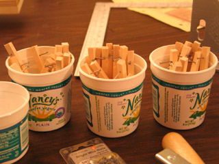
The boxes are made from poplar that I bought at Home Depot. The sides of a box are 1/2" thick. The shelves are 1/4" thick. The backing for a box is 1/8" thick hardboard.
The boxes are 3.5" deep. The wood I purchased was listed as 4" wide -- but the reality is that 1/4" gets planed off either side of that at the factory.
The shelves sit on 1/4"x1/4" rails, and are removable. The rails are each attached using two 5/8" long #16 wire nails.
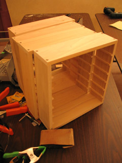
Home Depot sells 2' lengths of Poplar that were very convenient, in terms of not having to make many cuts.
The stuff that's 1/2" thick cost $2.48 and each box requires 2 pieces. The stuff that's 1/4" thick cost $2.09 and each box requires 3 pieces. Rails that are 3' long cost $.69 each. A 2'x4' piece of hardboard costs $2.48. Thus, materials for each box cost approximately $13.
My prototype took 3 hours to build. I did a batch of 4 more all at once, which took 9 hours -- thus only 2:15 hours each. (One box is going to be a gift. Who for? My lips are sealed.)
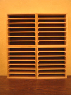
Process-wise, there were a few things that really helped make this project turn out nicely... I used a miter saw to cut the wood, giving me really clean and straight cuts. I used corner clamps to hold the box sides at 90 degree angles while putting them together -- and 2' long clamps to hold the pieces tightly together during drilling. I inset the screws so they wouldn't scratch anything... I drilled pilot holes for the screws, then drilled into the same hole again with a larger bit -- but only went about 1/8" deep the second time.
Oooh... It is such a thrill to sit in front of my "wall of paint" now! Looking at all those colors just makes me lust to create something!
posted by sven | permalink | categories: painting, studio space
October 26, 2007
the portable art gallery
by sven at 3:19 pm
Gretchin is curating a "4x4" show at the All Oregon Calligraphers Conference this Saturday. I volunteered to construct a display for her for the art pieces.
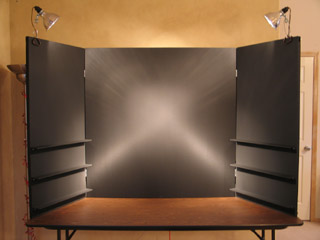
I tend to like short-term intensive projects... Our main design meeting was on Friday night, I went shopping for materials Saturday, did carpentry on Sunday and Monday, painted on Tuesday, and put the finishing bits of hardware on Wednesday afternoon.
The main "wall" is 4'x4'; two hinged panels fold out, each 2' wide. We want to give the art -- all of which is 4"x4" -- lots of breathing room... So I assumed 8"x8" for each piece: 1" of "whitespace" above, 3" below, 2" on each side. That's room for 72 pieces of art, potentially.
The walls are made of .25" thick hardboard (AKA masonite). The hardboard has framing braces behind it made from .75"x1.5" pieces of poplar. Pine would have been cheaper -- but I wanted something of better quality, with fewer knots and less warping.
Looking at the calligraphy that's been submitted so far, some of it is on paper and some of it is on small canvases. Thus, it was important to have some shelves for the dimensional pieces. The shelves are .25"x2.5"x2' pieces of poplar, supported by .5"x.5"x2' rails, which attach to the frame using long screws and wing nuts (2 per shelf)
A word of advice: If you ever build a portable display that needs nuts and bolts, use wing nuts! They are sooo much easier to deal with when you're on site!
Everything that was .25" thick got assembled using 5/8" #16 wire nails. The frame was assembled with some massive wood screws for strength.
I used "black black" matte latex house paint, applied with a roller. Before this, I tried black gesso -- but felt that it smudged too much. The finish I got is very good... But I'm still wondering if enamel paint would have been more durable. The toxicity of that stuff is higher, though -- which made me loath to work with it.
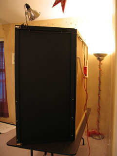
The love, though, is really in the details.
People are going to walk up from the sides, so I made sure to paint the backsides of the fold-out panels as well as the frontsides that are going to display art. It looks like we're going to use clip-on lamps for lighting -- so I put hooks in back to help route the cords. Distracting light would come through the cracks where the hinges are -- so I added black canvas there as a shield (painted with acrylics for extra opaqueness).
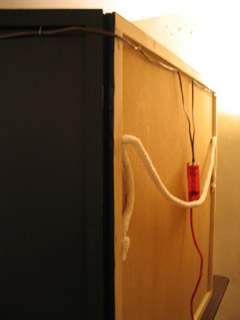
Transporting the display is going to be a bit awkward no matter what -- but I've tried to make it as easy as possible. There's a shoulder strap in back -- not rope, but this crazy cotton ribbing (I don't know the proper word for it) that gets sewn into furniture. You put that strap over your shoulder -- and then there are side loops to grip onto for extra control. The front "doors" latch shut using the sort of latches you find on a trunk.
All told, I'm pretty darned happy with how this thing turned out. Can't wait to see it in action!
posted by sven | permalink | categories: calligraphy, exhibits & events, studio space
January 14, 2007
new floor in sven's lab
by sven at 5:52 pm
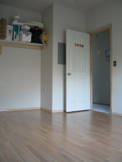
On Wednesday, Jan. 10, I got new flooring in my studio room ("the lab"). It's a laminate, Wilsonart, "natural anagre" pattern. My contractor advised that Wilsonart is one of the hardest laminates -- which is important, since I don't want metal chips to scratch it up too immediately...
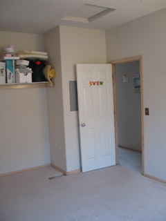
Carpet just made no sense in this room. With paint and clay and metal-working going on? Nuh-uh.
I had hoped that the carpet could get reused after being torn out, but apparently The Rebuilding Center has stopped taking carpet donations. They pointed me toward the East County Recycling Center, which does recycle the stuff. I hate the idea of just throwing all that carpet away... It was worth $24 to me to have a clean(er) conscience.
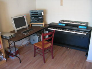
In the nook where I recently had the closet torn out, I've now got the workhorse computer and the electric piano set up.
(Um, btw, I'm cheating a little with these photos. I'm showing you what the room looked like after I got the major elements back in... But before I brought most of the clutter back.)
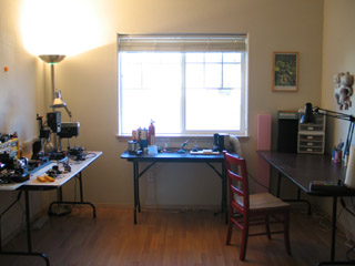
Here's what you can see of the rest of the room when you're standing at the computer: the metalworking station (left), the soldering/brazing station (center), the drawing/sculpting station (right).
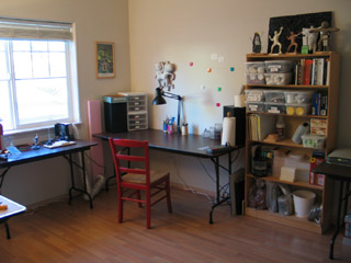
I didn't foresee that the bookshelf could fit between the drawing table and the computer -- but it seems to work out fairly nicely there.
On the right hand side of the table, you can (just barely) see a power-strip. Let me tell ya: it's really sweet to have it there on the desktop, so you can just plug electric tools in whenever you need -- without having to crawl around underneath, on the floor.
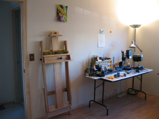
This side of the room is where the most work remains to be done. That's a 5 foot table, and it's too small for the tools I need there. I just yestereday picked up an 8 foot table that ought to solve the problem.
The final renovation project, I believe, will be putting some bracket shelves up on this wall. I make so many 3D objects now, and have no good place to keep them. Shelving all the way up to the ceiling ought to do the trick. No clear plan about how and when to proceed on this yet, though.
posted by sven | permalink | categories: studio space
January 13, 2007
unhook the stars
by gl. at 2:36 pm
a short story:
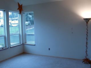
[before]
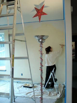
[during]
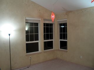
[after]
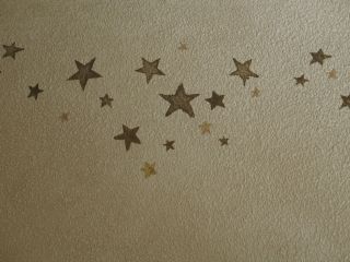
[stars!]
i had this done last month! consider this to be an unabashed plug for fine line painting, who took my only instructions ("sort of like charles vess") and made them magical & real. as fine line describes it in their portfolio, "A parchment faux finish and antiqued star trail add subtle whimsy to this artist studio." madeleine is amazing: professional, talented, hard-working, responsive & kind. i'm convinced she can do anything you asked her to do!
i had wanted to paint the main meeting room for quite some time, but i was too afraid (and don't have enough patience) to do it myself. the result is warmer & has more character than our white rental walls did. i love that the hanging star lamps now have some context (and some friends!). it looks even better with the furniture back in place. :)
posted by gl. | permalink | categories: studio space
December 10, 2006
closet torn out
by sven at 8:00 am
Lots of studio renovation going on. Gretchin's in the midst of getting the main meeting room painted... And I'll be getting new flooring for my laboratory of art maybe as early as next week... So exciting!
The closet project in my room is now done -- and I'm pleased with the results.
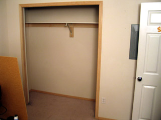
What good was the closet doing me? All it did was take up precious wall space.
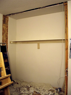
Crash, boom! Insert dynamite and stand back...
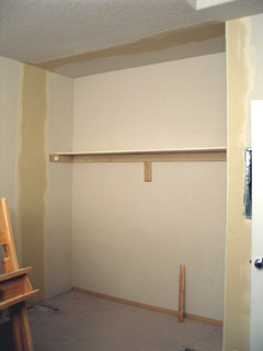
The sheetrock guy did a superb job (though he left some mess behind). After painting, you can't tell at all where the hole was.
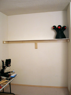
Huzzah! Complete! Now I can put the electric piano into that nook, and snug the workhorse computer up next to it. That means I'll be able to put everything that involves fumes next to the window -- where it rightly belongs -- and have space for an additional metalworking table.
Soon I'll have the ability to destroy entire planets...
Um. Artistically, I mean. Yeah.
posted by sven | permalink | categories: studio space
December 8, 2006
trickle down
by gl. at 12:46 pm
trying to put the "retreat" into "a retreat for art exploration and creative self-expression," i finally found a small water fountain i could live with at a price i wasn't appalled at.
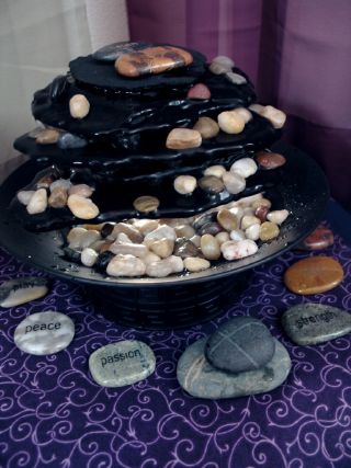
i know, it sounds like i'm damning it with faint praise, but i do like water-soaked stones and i hope the sound will mask some of the outside noises, especially when spring comes.
posted by gl. | permalink | categories: studio space
November 20, 2006
studio renovation: closet nook
by gl. at 1:14 pm
there are bone-rattling sounds coming from the studio. someone's using a massive power tool over there to remove the closet from the bedroom so sven will get an extra nook to put equipment into. the construction guy is nice: he let me pry off some of the internal frame. this is exciting & scary, and only the beginning of a series of renovations. yeek!
posted by gl. | permalink | categories: studio space
June 14, 2006
setting up a small machines shop
by sven at 1:00 am
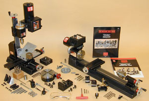
I'm actually doing it: I'm setting up a small machines shop!
I've just ordered three vital tools: a mill, a lathe, and a drill press.
In my initial research on milling machines it looked like I was going to go with a MicroLux. However, that machine's 110 pounds... I just can't accommodate it in my work space. And certainly not if I'm going to have other machines, too. What I need is a group of small machines.
For a long time I kept trying to find a way to avoid purchasing multiple machines. I've finally accepted that the mill, lathe, and drill press all have their own specialized functions. It's like a kitchen: an oven, a stove, and a kitchen mixer all serve different functions... You can get by without them -- but, oh!, the things you can cook up when you are fully equipped with proper tools!
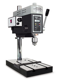
What do these machines do?
A drill press drills perfectly vertical holes; it's quick and easy to plunge the drill bit into your work piece.
A mill allows you to shave metal off of a work piece that is held still. Although it looks a lot like a drill press, the mill is designed to take sideways stress that would break a drill press (and take out your eye in the process!). A mill is designed to do very, very precise work; it's not the best tool for just drilling a quick hole.
A lathe is like the opposite of a mill: instead of holding the work piece still and cutting it with a spinning tool, the work piece is what spins while the cutting device remains still.
...With luck, the machines that I've just purchased will be the only big purchases that I ever need to make for metalworking. And, if I understand the relative sizes of these machines, they should all fit on one table.
There's a lot of learning still to do, about how to properly use these devices -- but it seems to me that 90% of making metalworking projects is just having the appropriate tools available. And now, I'm going to have those tools.
Exciting! Intimidating! Liberating!
posted by sven | permalink | categories: sculpture, stopmo, studio space
May 27, 2006
our fantastical future history
by sven at 8:00 am
At our "house adoption" party we handed out comment cards printed with this mesage:
Please write about an outrageous fictional event that will happen at our new house sometime during the next ten years. A little after 8pm we'll be walking over to the studio side of the house, and then we'll read aloud the fantastical future history.
The foretold events have now been meticulously assembled into their proper chronological order... At last the story can be told!
1.
Fueled by the success of Sven's film at the HPL film festival, the house becomes a gathering point for Lovecraft fans. Each fall, dozens of people from across the country camp out on the lawn. Eventually, when an argument over how to pronounce "ftagn" erupts into fisticuffs, the police put an end to the shantytown.
2.
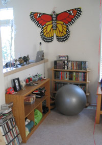
The spirit of Mothra possesses the giant butterfly on the wall and proceeds to fly around the neighborhood, dive-bombing at random.
the aforementioned butterfly
3.
You will be visited by an unruly llama from northern Peru. You will need to devise inventive ways to pacify him. (Fortunately, he happened to arrive on the day of your annual goat cheese festival.) Alas, the fabulous feta has soothed the savage beast, and he'll remain with you for the following years in which you'll knit colorful socks and scarves from his wool.
4.
All of the shirts in your closets will wake in the night and sneak out to go dancing on the butte with the food they steal from the fridge!
5.
In the year 2010, Gretchin will walk downstairs to boil her morning tea. She will find massive cracks running through the vinyl and carpeting, and the ground pushing through. Out of these gaping holes will pour seething masses of ants. Ants as thick as ocean waves. Raging and roiling heaps of them, opening the fridge and investigating every corner of the house. In horror, Gretchin will move about the house by standing on one chair and then positioning a second chair and stepping onto it. Sven decides to buy a blowtorch to rid them of the pestilence. When he torches the ants, only more pour out from the depths of ant Hell. Eventually Sven and Gretchin capitalize on their misfortune and start selling ant pies. Ant soap. Ant soup. Ant shampoo... Lots of organic ant products.
6.
4:45am, 2012
Gretchin is awoken by an odd beeping noise. She walks the house seeking the source.5:07am
Unable to find the source, Gretchin wakes Sven. She explains that the beeping has changed tone and frequency a few times and seems to originate from the vicinity of the garage. As they descend the stairs, the beeping takes on a musical quality.5:13am
Sven and Gretchin open the door to the crawl space under the house and find it flooded with a rich, color-shifting light that is synched with the now nearly erratic beeping. Their eyes adjust and they make out the small metallic object hovering a foot off the ground.Gretchin is shocked to realize the visitor is an alien robot...
...Sven is shocked to realize he can understand the robot, and begins to formulate his response...
7.
In 2012, Sven and Gretchin run for president, vowing to co-facilitate the nation with fairness and Collage Nights for all. Once again at the forefront of the digital revolution, the campaign is orchestrated entirely from Powell Butte via the art blog "Scarlet Letters." The "Svetchin" party's overwhelming victory inaugurates a new golden age of American creativity... Which lasts until the artists dissolve all countries and planet Earth joins an intergalactic federation of planets.
8.
At 3am the Russian mafiyah bursts into the house and dances a mazurka.
9.
There will be a fab musical theater production put on by a visiting theater/dance troupe, sort of like a vaudeville troupe, from another galaxy. Sven and Gretchin will like them so much that they will go on tour with them for a year.
10.
After the alien abduction Sven and Gretchin aren't quite the same. To restore normality, they purchase 3472 rolls of aluminum foil and 97 tubes of crazy glue to redecorate both the inside and outside of the house. Their plan works beautifully and they make the cover of Modern Art magazine.
11.
Willie Nelson on his 80th birthday tour gets lost while trying to find I-205 to go South to his next concert in Silverton. Somehow his bus ends up going East on Holgate and then up Raymond. He finally, even though he is still a man, gets out at [our street address] to ask directions.
[Editor's note: Willie Nelson was born April 30, 1933. Presumably, then, this event takes place in 2013.]
12.
"Gretchin?" Sven called out distractedly --
"Yes?"
"Did ya remember to curb the winsnippets?"
It was the tenth anniversary of the Centaurian occupation, and the whole street was abuzz with preparations for Enunciator Day.
"Damn!" cried Gretchin, "I did not!"
"But the hognobbets are coming to visit! An uncurbed winsnippet... And zoola in the midst of his cyclic!"
"Not to worry," called Gretchin, "I'll just swap them with the Eeklamorphs!"
13.
A gnome will return and live in the attic, creating havoc and many eerie bumps in the night.
Mari, hunter of gnomes
14.
Just as you are about to pay off the house [in 2036], a host of angels in 3-piece suits come to the door. You let them stay in the studio, where they defeat the Nigerian spam syndicate. The world rejoices and there is peace on Earth, good will to men.
posted by sven | permalink | categories: miscellany, studio space
May 6, 2006
house adoption party
by gl. at 10:47 pm
we had a marvellous house adoption party monday to celebrate "adopting" the house and studio after living here for years and finally buying them (may 01 is our official date!).
we had savory snacks and waited for everyone to arrive, at which point we toasted the house with a game and a poem. then we all walked next door and toasted the studio, partaking of sweet snacks and sharing outrageous fictional futures (and later, exploring the handmade books and andy goldsworthy library).
since dan couldn't attend, he sent us a sweet little poem:
Check your attic
for a gnarly gnome
before you dare
to call it home
this became the basis for the "gnarly gnome hunt" to let people explore the house. we photocopied this gnome onto card stock and hid him:

we also read a great poem dayna contributed from afar: "house-keeping" by marge piercy.
in addition to poetry & games, we had an "enforced creativity" exercise: as each person arrived, sven asked them to write a fantastical fictional future for us in the house. this was met with some dubiousness, but when we shared them in the studio later (we each read someone else's future), they were all daring and imaginative and funny. in the next 10 years sven & i will apparently encounter intergalactic visitors, willie nelson, the spirit of mothra, the russian mafiyah, an unruly llama and another gnome. in addition, our home will host a shanty town for hp lovecraft devotees, a mysterious alien robot and angels in 3-piece suits who will rid the world of nigerian spam. the shirts from our closet will go dancing on powell butte and our foil-lined house will be featured in modern art magazine. we will travel with an intergalactic musical theatre troupe, begin to sell organic ant products and run for president, ushering in a new golden age of american creativity. see? we'll always have something to look forward to! even better, we now have a rich supply of unexpected imagery and poetry to work with in the future.
and though we did not ask for physical gifts, we got some wonderful ones, anyway. for instance, we received an amazing hand-made alphabet block print from alex:

and a hand-painted card from his wife, amelia.
jalex brought us a cutting of a plant that's been with her for as long as sven's known her, and it even used to live in the studio when it was jalex's home. we also received experimental fondue cheeses from laura; kristen & todd brought marscapone to share; colleen brought homemade chocolate cupcakes; and michaelmas brought two of everything saint cupcake had left except for the banana chocolate-chip cupcakes (because c'mon! who likes those?).
thanks to all, near & far, who contributed to our house adoption party! you are the heart of the studio!
posted by gl. | permalink | categories: studio space
April 27, 2006
our house
by sven at 1:42 pm
The house is really ours!
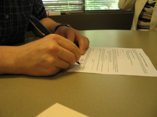
Today we went in to the title company and I wrote my signature (or initials) sixty-two times. ...Yes, we counted. :-D
Officially, the sale will be recorded on May 1st. We actually could have signed a few days earlier -- but wanted to hold off... May 1st makes for a more memorable day, in terms of looking back. (And it's my unbirthday.)
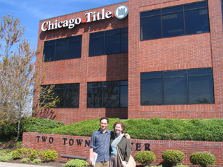
I know you're going to ask: "How does it feel?"
It feels... Kinda unreal. Having been living in the house already, not much is actually changing. Going into all of this I realized that we're missing a lot of the usual rituals: searching high and low for a house, packing and moving all the stuff, getting the house key. In some ways this has been a lot more like refinancing. After all this work, the only thing that's tangibly different is that I have a six inch stack of papers beside my desk.
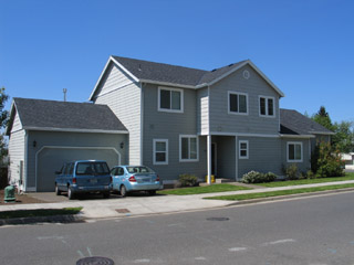
Oh, but I'm not really that jaded! There's also a sense of elation. And: "Wow, really?" ...Pinching ourselves to see if we're dreaming might not be a bad image here.
Part of me feels like I'm becoming the groundskeeper at a school. It's now my job to make sure that this place -- this living architecture and soil -- is maintained. So I feel like I'm taking on new "responsibility"... Not in the sense that I'm any more "adult" than I've ever been -- but as if there's maybe a new kitten in the household for us to take care of. (Um, a 50,000 pound baby kitten...)
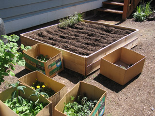
This past week I created wooden boxes for raised-bed gardens in the backyard. The house itself may be the same... But in the backyard -- here's an area where it feels like we're just beginning to move in. And when we ultimately paint the house -- then I think we'll feel like we're making our mark, making this place ours.
Planting our new garden: nice metaphor, don'tcha think?
posted by sven | permalink | categories: studio space
April 5, 2006
buying the house!
by sven at 10:41 pm
We're going to buy the house!
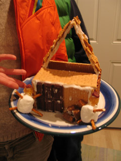
We've been renting. Back in December the landlord offered to sell us the house -- which includes both the unit we live in and the Scarlet Star Studios space. It took a veeeeerrry long time to decide whether or not we wanted to purchase. But finally, we decided to go for it.
Yesterday we made our offer -- and it was accepted on the same day! And today, we signed paperwork accepting the seller's, um, acceptance. Still in shock. Once things are set in motion, everthing goes so fast! ...Assuming no unforseen problems arise, we'll close May 1st. OMG!!!
Jacque and Mari -- being just too cool -- dropped by last night and gave us a ceremonial gingerbread house, which they whipped up immediately after getting my phone call. (Note the little cranberry hats!)
...Thanks guys!!!
posted by sven | permalink | categories: studio space
January 28, 2006
mhcc calligraphy: class 3 (and artist's way prep)
by gl. at 12:18 am
shhhhh! i skipped calligraphy class today! i was on the way there and turned around about stark and came back home. well, actually i stopped at fred meyer first for some curtain rods for the curtains i bought at craft warehouse that i want to hang in the studio -- except it turns out that i just bought giant fabric, not curtains at all. heh.
i have the first artist's way independent study student of the new year coming over tomorrow, which means the studio had to get a shakedown today. we do pretty well keeping the studio clean when we run classes and host events, but if it sits too long between guests we pile things up and don't dust, so when classes begin again i have to mop & wipe the counters & clean the sinks (ink in sinks!) & dust, etc. etc. earlier in the week sven rented a steam cleaner so all the carpets are clean.
each time i run the artist's way creative clusters or host an event, we tend to make improvements to the studio. for instance, for the first cluster in this studio sven made the flat files and hung the star lamps in the living room. for the fall clusters we added a scarlet star lamp on the porch and a small red cd player, along with clearly labeled, consolidated & organized art supplies in the kitchen. this time the spring clusters will get pretty, colorful pots on the steps and a "scarlet star studios" sign below the window, as well as a large "pocket" curtain holding an array of small treasures & delights. the kitchen now holds colorful glasses, mugs, plates & special tea.
posted by gl. | permalink | categories: artist's way, calligraphy, studio space
November 21, 2005
studio gets pegboard for tools
by sven at 11:19 pm
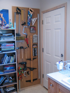
For a long time we've been talking about putting up a pegboard for carpentry tools in the kitchen... Saturday I finally got together all the materials I needed and did the job.
The new pegboard resides by the backdoor and holds nearly all the tools we have. The powertools don't fit -- but that's OK: the cords look like hell when you mount them on the wall. It's 30 inches wide, and 7 feet tall; an inch up from the floor molding, and an inch over from the corner of the wall. I'd intended to have it crammed right into that corner, to maximize space -- but there's wood immediately behind the drywall there, so I had to move it over.
Creating this thing was a little tricky. First you build a frame out of 1"x2"x8' pieces of wood, matching the size of the pegboard exactly. Remember: you need space behind the pegboard so the hooks have somewhere to go! Drill supports into the wall, then attach the frame to them. Next you attach the pegboard itself to the frame. Put hooks in, and you're done!
Hm. When I write it out, the job sounds easier than it actually was...
Total work time (including buying parts): about six hours.
posted by sven | permalink | categories: studio space
October 20, 2005
hangable shelf
by sven at 9:06 am
Oh, yes, we enjoy the art on the Portland Open Studios tour. (But really it's the storage space ideas that we're after.)
Something we've been talking about for quite some time is the need for small shelves in the studio that we can display sculptures and knickknacks on. One of my personal hang-ups about this has been that I'm loath to commit to installing a shelf permanently in any one place. In a studio, you need to be able to move things around, rotate the art.
I didn't see anything on the tour that was what I wanted -- but the creative stimulation/fertilization did the trick nonetheless. I got it into my head that one could build a hangable shelf. Monday night I dove into the project... Three hours (plus drying time) later, this is what I got:
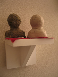
In the initial design I was connecting two eyebolts directly to the picture-hanging hooks on the wall. The problem there was that you have to get your hooks perfectly level with each other, or the shelf will tilt. So I added two more eyebolts and looped a bit of wire through them. Now the shelf hangs from the wire -- since it's a loop, there's a tiny bit of slack and you can adjust. Placing the hooks on the wall can also be done by eye-balling now, rather than having to measure. Here, take a look:
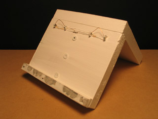
Since the shelf hangs out from the wall, I also needed to add a little lip on the back at the bottom to make it hang even with the wall. That's the other bit you're seeing here.
...Not bad! I didn't want to get too fancy on this first attempt -- but now that I've got proof-of-concept, I can see potentially making a longer shelf to keep around, too. Three feet wide, maybe?
posted by sven | permalink | categories: sculpture, studio space
September 8, 2005
final descent
by gl. at 11:34 pm
my sixth fall registration today was my first contact in july, who found me via the first round of flyering sven did for me at the wild oats on division. another one for wednesday morning, no less, for a total of 5 in that cluster!
alas, with only two MAC registrations, lori & i chose to cancel that class rather than spend the energy packing, travelling, teaching, packing and returning once a week. perhaps the 13-week version was too long for them; i'm happy to revise it to make it more palatable to its members and i think i'll get another shot for its next term, so though it was a surprise, i don't feel too badly about it. and i have wednesday evening free again!
we are heavily into studio cleaning & tinkering now. we're borrowing a steam cleaner from laura tomorrow and sven put a lot of work today into clearly labeling & arranging the supplies in the kitchen. next up is more star lamps, art, cleaning the floors, etc. i've been looking for a cute cd player since the purple translucent one michaelmas gave me over 3 or 4 years ago is finally dying, but i've checked fred meyers, best buy, circuit city and even amazon with no success. boomboxes just aren't hip anymore, i guess. it might be time for me to look at those cool jbl speakers for your ipod.
posted by gl. | permalink | categories: artist's way, studio space
August 28, 2005
renovations
by gl. at 9:06 pm
we consolidated a lot of art supplies in the kitchen, in part because our potential storage is underutilized, in part to help give sven some space in "the lab," and in part to share the often-duplicate supplies we have like glue, tape & markers. so some of the kitchen cabinet doors came off and the art we were storing in the bathroom came to live in the main house and the pantry was rearranged.
additional good news: sven hammered the letterpress arm that was bent enough for me to replace the rollers! i suspect these rollers aren't any good anymore because they're gummy, but i'm glad it's now a complete unit. i still don't have a good letterpress setup yet, but this is a huge step closer than i was in march. i am amused to note that the typecases for the letterpress fit perfectly in the oven; finding places for the letterpress supplies & the power tools gives us a lot more counter space.
things that still need to be solved:
- we only have one shelf left in the flat files that isn't designated for something
- my poetry & plays are still living in boxes, though we moved them to the bathroom
- the tools are lots better, but they really need a more permanent home
- we need a better system for cloth bits
- some of the kitchen cabinets are mysterious shapes that wait empty until we figure out what could possibly fit there
- non-shareable things for artist's way & open studio should be marked such or moved
- a better bed/couch system for guests or just hanging out
- i'd really like to see the main room painted
posted by gl. | permalink | categories: printing, studio space
March 6, 2005
letterpress unbound!
by gl. at 11:03 pm
doing a workshop at the iprc probably prompted this, but i spent tonight finally unpacking the letterpress chas gave me over thanksgiving! three boxes later, and i have an almost-functional press and the use of one of my studio's kitchen counters again! i was thrilled to find two "new" rollers to replace the ones that had disintegrated, but dismayed to discover one of the "hook" arms to hold the rollers is bent in such a way that i can't pull it down far enough to add a new roller. i tried to bend it back, but this stuff is solid & old and made of iron or steel and isn't budging. i can't imagine what made it bend to begin with. so i'm stuck for a bit.
looks like i still need a brayer & a planer, too, but these aren't big deals at all.
getting rid of a lot of the letterpress clutter in the kitchen makes me feel less intimidated by the press (it's so cute!) and about the kitchen space. in general, we don't use the appliances very well in the studio, so they take up a lot of room i'd rather be using for storage. i'm considering storing the typecases in the oven. :)
posted by gl. | permalink | categories: printing, studio space
February 27, 2005
New flat files!
by sven at 10:00 pm
Seems like every artist's studio has to have flat files. When we went on the Portland Open Studios tour in October, everyone had them... You know -- the immense but shallow drawers that you might keep maps in?
Gretchin has wanted a set of flat files forever. They're exactly what you need in order to store big flat pieces of art. But they cost maybe $300 - $600, depending on whether you're buying used or new. Eep!
So I decided to make them myself.
...But where to put them? My "ah-ha!" moment (Jan 18) was when I realized that we had the perfect niche in the studio, right under our noses -- if we moved out the washer/dryer!
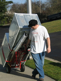
I had hoped to get the flat files completed before our first Artist's Way class began, on Jan 24. Not much time at all, from when the inspiration had struck -- but I've worked miracles before. I dove in, headlong, and made a glorious creative mess...
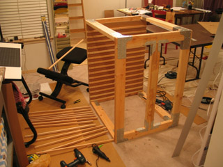
No miracle this time. I hit a major snag in the wee hours of Jan 24. See, I had used these nice sturdy joints for the frame -- but their bolts stuck out a little too much on the inside. If I had kept that design, some shelves would have to be narrower than others. I had to clean everything up and put the project away, incomplete.
I finally got back to construction on Friday (Feb 25). One corner at a time, I replaced each one of the offending parts with two joints that would sit on the outside surface. Take a look in this picture at how the corners have changed:
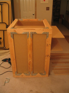
Another interesting aspect of the design, that you can see here, is that the shelves are longer than the actual frame. The reason for this is that I had to be able to get the frame through doors and the hallway comfortably. The frame is 30" deep; the shelves are 40" deep. So, once the bulky frame is in its nook, the shelves can be tipped into place on their rails with ease.
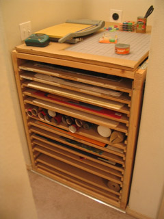
Anyway, I just finished the flat files tonight and loaded them up with art and big sheets of paper. Here's the final product:
Bottom Line:
I'm happy!
Conception-to-completion, the project took almost exactly 40 hours of work time, including shopping runs to Home Depot and Ace Hardware. Cost of materials was $185, not including the first set of joints (which I hope to return) or some new tools that I got during the project.
I think it's a pretty good value. If you try to assign a monetary value to the time I put in, then maybe not -- but I had a lot of (exhausting) fun doing it, so I prefer not to factor that in. Besides which, most flat file systems only have 5 shelves; ours have 15 -- and you can remove shelves if you want more vertical space. ...And they fit perfectly into our nook!
I mean, how cool is that?
posted by sven | permalink | categories: studio space
