you are here [x]: Scarlet Star Studios > the Scarlet Letters > stopmo aesthetics
<< before
monster month book for sale!
after >>
a very toby kissmas
December 28, 2007
stopmo aesthetics
by sven at 12:35 am
On 12.22.07 Neil Gaiman released a sneak peek at the upcoming Coraline film that Henry Selick and Laika are producing. The clip is astonishing. For a particular style of stopmo, it's establishing a new standard for perfection.
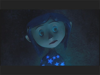
However, the animation is so good it's rather disconcerting. At first, a lot of people aren't sure if they're looking at stopmo or CG. Both among friends and at SMA, there's a discussion going on about the "hand-made look" versus the "CG look" and which one each of us prefers.
I'm troubled, because there are tangled undertones in these conversations: Resentment that Laika is setting a standard that no hobbyist will ever be able to match. A reactionary sense of superiority, that stopmo which bears the marks of human imperfection has more soul. A sense of betrayal, because Coraline's aesthetic is reminiscent of CG... Because among stopmoes, CG is the bad guy: it literally killed the use of stopmo for photo-realistic monster effects (e.g. Jurassic Park, King Kong) -- and seems to have a strangle-hold on mainstream cinema that keeps stopmo in general marginalized.
Me, I'm very interested in the visual style that's being established for Coraline. I'm excited to discuss it with other people... But I want a more expansive conversation than "hand-made" vs. "CG." The way that I see it, the spectrum of stopmo aesthetics is much broader than that.
So this is how I'm choosing to respond to the discussion -- with an essay that considers eight or more distinct stopmo aesthetics.
I. MOTHER ART FORMS
While there may be earlier precursors, stopmo is an art form that was essentially developed during the 20th century. It's new. So naturally, visual styles have been borrowed from other art forms. That's my thesis: stopmo has borrowed its various "looks" from other arts.
I feel this is a pretty easy idea to demonstrate... Off the top of my head I can think of quite a few films whose influences are blatant. But, of course, there are going to be plenty of films that are more difficult to categorize. Artists, being who we are, like to mix and match.
Also, besides "mix and match," I think that stopmo styles evolve through a sort of "imitative drift." Certain artists establish a style which is much imitated -- but with each iteration, the concept becomes mutated (sometimes for better, sometimes for worse). The Rankin & Bass look is a good example. It established a recognizable style... Which people are still copying today -- sometimes embellishing upon it, sometimes just making shoddy rip-offs.
OK, so let's consider the spectrum of aesthetics. Here are the the mother art forms that I've been able to identify:
- Puppetry
- Cartoons
- Miniatures / Models / Dolls
- Assemblage / Found Objects
- Photo Realism
- Living Toys
- CG / Vinyl
- 2D Illustration
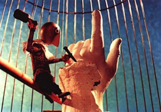
1. Puppetry
Eastern Europe, particularly Czechoslovakia, has a strong tradition of puppetry. Stopmo films coming from the Czechs (particularly older films) have the flavor of marionette shows without the strings. The puppet heads are made from carved wood, the story-telling feels like it's based on the traditions of live performances of puppetry, rather than cinematic conventions...
Example: Jiri Trnka
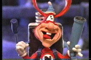
2. Cartoons
Some stopmo films attempt to be a traditional cartoon film -- but in 3D. What is the "cartoon look"? Probably the most distinguishing "cartoony" quality is that the film's world seems to be made entirely out of squishy-springy rubber. This look usually has an emphasis on squash-and-stretch. Sometimes you can see puppet designs even imitating the "ball and rubber-hose" construction of early black and white cartoons (e.g. Steamboat Willie).
Example: Will Vinton's "Noid" (for Dominos Pizza)
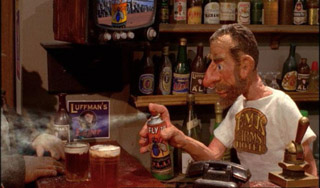
3. Miniatures / Models / Dolls
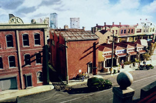
There's a tradition of trying to make exact replicas of real world objects -- only in miniature. Think of dioramas that you see in museums, model ships, and fancy doll houses. Some stopmo tries to accomplish just this. There might be slight stylizations -- but these are incidental. The artist has tried to copy the look of the real world in miniature to the best of their ability.
Example: Nick Hilligoss' "Good Riddance" series
4. Assemblage / Found Objects
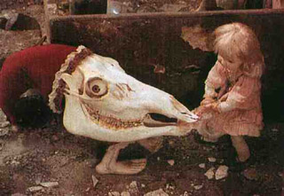
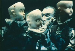
There is a sculptural tradition of making "assemblages" out of found objects. Some stopmo films derive from this aesthetic. The worlds we peek into look as if they are built of dust, old wood, broken bits of machinery... If there are "puppets" at all, they aren't intended to fool us into believing they're creatures with souls. Even when human-shaped puppets are moving, the footage looks like "object animation." The puppet animation seems to be an extension of the original impulse to make recognizably inanimate objects move, rather than an attempt to make miniature actors give a performance.
Examples: Svankmajer, The Brothers Quay
5. Photo-Realism
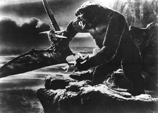
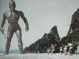
Photo-realistic stopmo descends from trick photography, like the old supposed photographs of fairies. The point is to make stopmo footage which will blend seamlessly with live actors. Unlike most stopmo, which gives us whole worlds, stopmo done with this aesthetic is usually interjected into live-action sequences. Its greatest success is when we can't tell where the live action ends and the stopmo begins.
Examples: Willis O'Brien, Ray Harryhausen, Phil Tippet

6. Living Toys
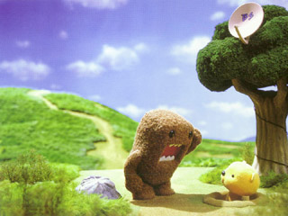
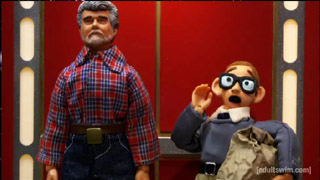
Who hasn't wished that their toys could come to life? Stopmo gives us the ability to make that happen. The puppets are appealing because they look like things that we own. (Which is different than film productions where toy tie-ins are made after the fact.) Maybe they're "girl toys" (stuffed animals, perhaps); maybe they're "boy toys" (e.g. collectible action figures). Both come from the same impulse.
Examples: Domokun, Robot Chicken
7. CG / Vinyl
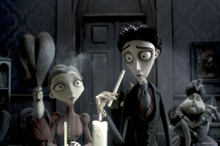
Computer Generated animation has a recognizable look to it, which is the result of the tools used in its creation. Both the motions of the characters and the textures of their world are noticeably smooth. The CG look has a strong relationship with the use of vector graphics in the world of design and with the urban vinyl / designer toys movement (which sometimes uses 3D printers). In all three cases, these are images and objects that have been created using mathematical forms.
It's a fairly new phenomenon, but some stopmo seems to be trying to imitate the look of CG.
Examples: The Corpse Bride, Otafuku Rex
8. 2D Illustration
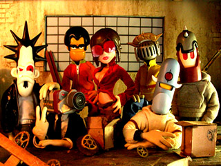
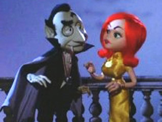
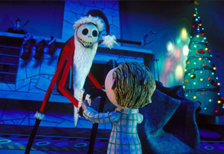
The world of illustration has countless visual styles (or at least, more than I've been able to wrap my mind around). Illustrations for comic books, children's books, magazines... Some stopmo attempts to capture the style of a 2D illustrator and translate it into a 3D living world. Rankin & Bass' "Mad Monster Party," for example, was an attempt to translate the works of artists who produced Mad Magazine. Or, consider "The Nightmare Before Christmas": it's based on a storybook written by Tim Burton... No animator would ever have initiated a character design as problematic as Jack Skellington's!
Examples: Rankin & Bass' Mad Monster Party, The Nightmare Before Christmas
II. MATERIALITY
It seems to me that the various stopmo aesthetics are clearly descended from other art forms: puppetry, cartoons, model-building, assemblage, photography, children's toys, computer animation, and 2D illustration. However, I would be remiss if I didn't also discuss the ways in which the materiality of stopmo also plays into its aesthetics.
Wood
Puppets with wooden heads are generally somewhat inscrutable. If they seem to have an internal emotional life, then this has to be conveyed with pantomime. Because wood puppets make for...wooden actors...there is an inherent distance between the "actors" and the audience. Rather than focussing on the puppets' internal worlds, the artist is compelled to tell broader stories where the characters are more archetypal -- fables and myths being apt material.
Clay
Squash and stretch is difficult to do with most puppet-making materials -- but it's very well suited to clay animation. Hence, there is a natural affinity between clay and the cartoon style. Similarly, cel-animation tends to use flat colors -- which again, is easily reproduced with clay.
Foam Latex
Foam latex is based on an organic material: latex sap is harvested from trees... Both liquid latex and foam latex do a good job of simulating flesh... Hence, they're well suited for the needs of Photo-Realistic animation, where the puppets are supposed to impersonate animals.
Resin
Casting resins are, in some ways, an evolutionary leap up from using wood for puppets. By doing detailed sculpts in clay, taking molds, and then making castings, much more complex shapes can be created. This process is well-suited to the needs of an artist who is trying to translate 2D illustrations into 3D puppets.
Silicone
Silicone, vinyl, and CG lend themselves to the needs of industrial production and mass-marketing. With these materials, you can design a character using vector mathematics, which can then be reproduced with absolute accuracy for either either film media, print media, or consumer-oriented toys. When you're mass-producing dreams, uniformity is is the goal...
III. PUPPET PHILOSOPHY: FROM THE LIVING DEAD TO THE ILLUSION OF LIFE
Visual aesthetics aren't merely surface styles -- they're also motivated by philosophies about what it is that we're trying to do with stopmo as an Art. (Yes, that's Art with a capital "A".)
Here are some questions to ponder: What is the purpose of the puppet? How emotionally close to or distant from the puppets should the audience feel? To what extent are animators breathing a soul into their characters -- versus eerily pushing around objects which were never alive and never will be?
It seems to me that there are a limited number of possible philosophies underlying the aesthetics of stopmo. Really I only see four.
1. Puppets Are The Living Dead
The Brothers Quay don't try to invest soul into their puppets. The dolls and assemblages of found objects which they move about in their films remain essentially inanimate. If they have a life, it is a life which we cannot understand -- if they have dreams, they are the dreams of scissors and broken dolls.
Animatronic dummies often are close to looking like humans -- and yet, narrowly fail in their impersonation in a way that creeps us out. This phenomenon is sometimes referred to as the "uncanny valley," a place which lies between laughable failure and success. At times, this is precisely where the Quays want to put the audience... The epitome of this thought is to animate meat: the object is not simply being animated -- it's being eerily reanimated.
2. Puppets Are Stand-Ins For Archetypes
With the wooden-headed czech puppets, there's no way to mistake the puppets for actual living things... And yet, we are intended to use our imaginations to project thoughts and feelings into the puppets. This is exactly the same experience that we have when watching a traditional puppet show. Having stopmo puppets move without strings merely removes some of the technicalities of puppetry (e.g. strings) which might otherwise distract us from the story's telling. Yet, even so, the burden of putting life into the puppets falls on the audience.
3. Puppets Are Trick Photography
When we watch photo-realistic foam latex monsters interacting with live action actors, the audience is meant to believe that the puppets are real living things. The audience shouldn't have to do any work investing life into the Kraken in Clash of the Titans -- Uncle Ray has managed to accomplish that illusion for us.
But what is Harryhausen's own relationship with the puppet? He's often talked about how the animator is like a magician, who shouldn't reveal how he accomplishes his tricks. The puppet is a prop, a special effect. Even when Ray makes one of his creatures give a convincing performance, at the end of the day his puppets are only meant to be a foil for the film's live-action protagonists.
4. Puppets Are Miniature Costumes
Henry Selick is known for treating his animators like actors, whose job is to deliver a performance. When you watch documentaries about the making of "Curse of the Were-Rabbit," you can see Nick Park acting out the mannerisms of different characters with his animators. The puppet is essentially a tiny costume which the animator puts on.
In this approach to stopmo, the whole point is for the artist to put themselves inside of the puppet's body. You're supposed to be able to physically feel in your own body the way that the puppet moves. It's an existentially unnerving experience: trading hours of time in your life to create seconds in the life of the puppet. You are very literally sacrificing some of your life, putting it into this inanimate object, in order to temporarily give it a soul.
IV. AN OBLIGATORY CLOSING STATEMENT
After this encyclopedic survey, I feel obliged to confess my own preferences.
Puppetry, cartoons, miniatures, assemblage, photo-realism, living toys, CG, 2D illustration... When I consider the stopmo films derived from each of these "mother art forms," I can usually find examples that are truly great. If there is no truly great film in a category yet, then I hold onto the hope that it simply hasn't been made yet. Thus I refuse to weigh in on the polarized "hand-made" versus "CG" debate.
As a multi-media artist-animator, I think my favorite visual aesthetic is Illustration. To me, beginning with drawings, and then creating a stylized, immersive fantasy world is the ultimate in creativity. That's what I want to do.
Consequently, I'm drawn to resin and foam latex as my primary fabrication materials. I want puppets that have been cast, because it gives me excellent control of visual details. Where possible, I'll use hard parts (resin), because it maintains its carefully sculpted form even better than a soft material. I am strongly attracted to the longevity of silicone for flexible areas of the puppet -- but the difficulties of giving its surface a painterly look are a significant hurdle.
In terms of puppet philosophy, I'm most drawn to dealing with puppets as if they are costumes and I am the actor. This shouldn't be too surprising -- in general most people are attracted to narrative stories with strong protagonists and linear, comprehensible plots. I do have an irrational fondness for monsters... But for me, wanting to connect with the emotions and inner worlds of characters is even more important.
In conclusion: My hope is that having read this far, fellow animators will get some sparks of inspiration that help them to better triangulate their own aspirations for art-making... And in the process also find greater tolerance/empathy for folks who are pursuing aesthetics different from their own.
posted by sven | December 28, 2007 12:35 AM | categories: stopmo