you are here [x]: Scarlet Star Studios > the Scarlet Letters > the portable art gallery
<< before
gregory says 'hello'
after >>
W - The Whipping Molesque
October 26, 2007
the portable art gallery
by sven at 3:19 pm
Gretchin is curating a "4x4" show at the All Oregon Calligraphers Conference this Saturday. I volunteered to construct a display for her for the art pieces.

I tend to like short-term intensive projects... Our main design meeting was on Friday night, I went shopping for materials Saturday, did carpentry on Sunday and Monday, painted on Tuesday, and put the finishing bits of hardware on Wednesday afternoon.
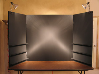
The main "wall" is 4'x4'; two hinged panels fold out, each 2' wide. We want to give the art -- all of which is 4"x4" -- lots of breathing room... So I assumed 8"x8" for each piece: 1" of "whitespace" above, 3" below, 2" on each side. That's room for 72 pieces of art, potentially.
The walls are made of .25" thick hardboard (AKA masonite). The hardboard has framing braces behind it made from .75"x1.5" pieces of poplar. Pine would have been cheaper -- but I wanted something of better quality, with fewer knots and less warping.
Looking at the calligraphy that's been submitted so far, some of it is on paper and some of it is on small canvases. Thus, it was important to have some shelves for the dimensional pieces. The shelves are .25"x2.5"x2' pieces of poplar, supported by .5"x.5"x2' rails, which attach to the frame using long screws and wing nuts (2 per shelf)
A word of advice: If you ever build a portable display that needs nuts and bolts, use wing nuts! They are sooo much easier to deal with when you're on site!
Everything that was .25" thick got assembled using 5/8" #16 wire nails. The frame was assembled with some massive wood screws for strength.
I used "black black" matte latex house paint, applied with a roller. Before this, I tried black gesso -- but felt that it smudged too much. The finish I got is very good... But I'm still wondering if enamel paint would have been more durable. The toxicity of that stuff is higher, though -- which made me loath to work with it.

The love, though, is really in the details.
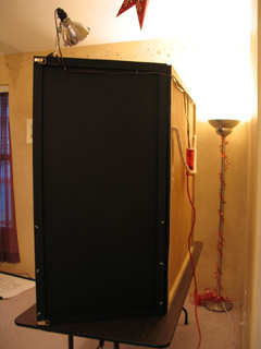
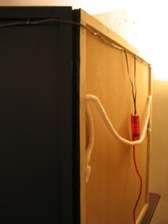
People are going to walk up from the sides, so I made sure to paint the backsides of the fold-out panels as well as the frontsides that are going to display art. It looks like we're going to use clip-on lamps for lighting -- so I put hooks in back to help route the cords. Distracting light would come through the cracks where the hinges are -- so I added black canvas there as a shield (painted with acrylics for extra opaqueness).

Transporting the display is going to be a bit awkward no matter what -- but I've tried to make it as easy as possible. There's a shoulder strap in back -- not rope, but this crazy cotton ribbing (I don't know the proper word for it) that gets sewn into furniture. You put that strap over your shoulder -- and then there are side loops to grip onto for extra control. The front "doors" latch shut using the sort of latches you find on a trunk.
All told, I'm pretty darned happy with how this thing turned out. Can't wait to see it in action!
posted by sven | October 26, 2007 3:19 PM | categories: calligraphy, exhibits & events, studio space