July 2007 archives
you are here [x]: Scarlet Star Studios > the Scarlet Letters > July 2007
<< before
June 2007
after >>
August 2007
July 31, 2007
lsgl: act 2?
by sven at 11:59 pm
Work has been getting increasingly miserable. The shots I've produced this past week don't look any good to me. The tentacles refuse to do what I want them to. And thinking about nothing but the film is finally turning my brain to mush.
I think there are only about six shots left to do for Act 3... Unfortunately, they're all really difficult ones.
So, rather than continuing to hit my head against this wall, I'm switching focus for a while.
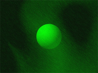
I'm doing development work on Act 2: the distress beacon's message -- which explains why the Elder Things are in the cave, and preps the audience to understand what's happening when the Shoggoth arrives. I've already cut the epilogue from the film... But I don't think the story can hold together without Act 2.
My anxiety about Act 3 -- a lot of it is probably actually due to Act 2. I just don't have a firm grip on Act 2 yet... So when I've tried to imagine what I'll be working on after Act 3's done, the future's been a big horrifying unknown.
What's Act 2 look like? What's the story? Can I get it done in time?
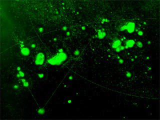
Act 2 is the only part of the film that has a voice-over. I've been re-writing the script again, trying to get it down to bare essentials. Based on my most recent drafts (which I'm not happy with yet), it looks like Act 2 will be around 30 seconds long. Maybe 40. ...Doesn't sound like much -- but it's potentially a lifetime in animation.
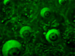
There are a number of ideas that I need to communicate:
- the Elder Things come from outer space
- they had a whole civilization on Earth, with multiple cities
- they had slaves: huge gelatinous blobs called Shoggoths
- almost all of the Elders were wiped out during an uprising
- all of this happened millions of years ago
- the Elders in the cave are hiding, waiting for rescue, forever hunted by the Shoggoths
Trying to come up with a script that says all this quickly and compellingly has been sort of like writing lines of poetry.
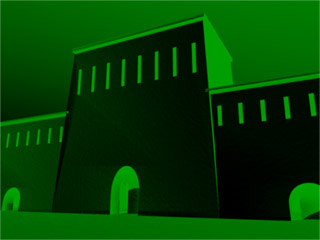
The visual look of Act 2 is still being developed, too. My main thoughts right now are that I want everything green and distressed with static. The shot that I'm most excited about involves an army of Shoggoths climbing up the walls of an enormous city. Exactly what this city is going to look like is still up in the air -- but I've been looking at pictures from the original Astounding Stories publication for inspiration.
posted by sven | permalink | categories: let sleeping gods lie
July 25, 2007
lsgl: shoggoth eyes
by sven at 11:59 pm
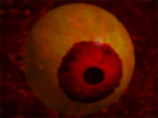
Today's work... Two clips: The eyes of the Shoggoth assessing the Elder Things' stampede -- and selecting a victim.
The Shoggoth eyes are recycled Elder Thing eyes which have been hue-shifted. Shoggoths were grown in a vat -- so it makes some sense that the Elders may have used their own DNA to get things started. (Sorta like sour dough bread.)
Getting that watery/gelatinous feeling required huge amounts of gaussian blur -- and then a symmetrical ripple on top of the whole thang.
posted by sven | permalink | categories: let sleeping gods lie
July 24, 2007
lsgl: enter the shoggoth
by sven at 11:59 pm
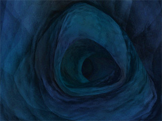
The Shoggoth sees the distress beacon, barrels toward the cave, and then down into the depths of the mountain.
Flying through a tunnel is sort of a CG cliche -- and that bothers me. But I really felt like I needed to connect the outside arctic world to the interior cave world, and a Shoggoth POV shot was the way to do it.
For a few weeks I was a bit flummoxed about how to accomplish this shot... Then I found inspiration: the opening credits for Fraggle Rock. The fragglers had a camera fly through a window into a workshop, down through a hole in the wall into a cave system, and out into the Gorg's garden... And I think it was all accomplished with nothing more complicated than dissolves. ...Ah-ha!
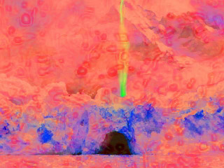
Here's a "monster cam" clip that I wound up rejecting.
I thought for a long time that my "monster cam" shot was going to have interesting distortion -- like in so many Dr. Who episodes. But ultimately I think those kinds of shots only work when you're repeatedly forced to wonder who's lurking, peeping at the main characters. It's a suspense-building tactic... And my film's just too short to put that element into play.
Too bad this shot didn't work out -- I really dig the colors! The hot pink, peach, and lavender reminds me of old oil paintings of sunsets that pioneers made as they headed west, trying to communicate to the east coast what's out here in the wilds. It's not a color pallete that I think I've ever seen in a video.
Incidentally, the zoom in the rejected clip was done just by increasing the image's scale. I tried and tried, but I couldn't seem to make the speed of the "camera" feel right using this method. So ultimately I brought the clip into LightWave, projected it onto a flat panel, and had a virtual camera fly toward and through it. Much better results.
...There's a general principle here that I've been discovering: It's usually very difficult to simulate Z-axis travel using only 2D animation software. If at all possible, try to use 3D software when you need an object to appear as if it's moving toward or away from you.
posted by sven | permalink | categories: let sleeping gods lie
July 22, 2007
good things come in threes
by gl. at 11:59 pm
three art events this weekend:
- gadzooks! amazing books by northwest artists
shu-ju was exhibiting several pieces at gadzooks; the reception was yesterday and it was a good excuse to visit the maryhill museum w/ michaelmas, todd & kristen. it's a long journey there & back again, but we were rewarded by beautiful books (though they were, alas, behind glass).
in addition to shu-ju's work, i was impressed by douglas schafer's delicate & bold venerius didymus, mar gorman's intricate and compelling songs my mother taught me and diane jacobs' socially astute pair of woven portraits, ann and veda.
muse talk
today i picked up my pieces from fat straw, which means the show is officially over. can't beat a piña colada fat straw smoothie, though. :)contemporary craft museum block party
big day in the north park blocks today: the contemporary craft museum hosted a block party for its grand opening, as well as for the four other galleries who are also sharing that block (two of which have moved from other locations: when i saw grace's work, i suddenly realized i was at the augen!).
all the cool kids were there, including very busy craft tables heroically hosted by diy lounge (ATCs w/ melissa woolsey), church of craft (felt bracelets w/ diane gilleand) and pdx super crafty (matchbox shrines w/ susan stars). i donated some stuff to diane earlier in the week, but i wasn't sure i'd get to go to the event because a friend is visiting from colorado. (it turns out she was in ashland this weekend, which mean i could go do art stuff instead!).
random: i wonder if the CCM "lab" is available for anyone to use. and a funny story: i heard a woman ask her friend, "is antique better than retro now?" the friend said, "no....!"
i had an epiphany while checking out the ccm, though: there's a type of art snobbery that criticizes museum gift shops, implying that only "tourists" visit the gift shop because they can't possibly understand the actual art in the museum. but after 20 minutes of being repeatedly reminded that "Touching Harms The Art," i was thrilled to get to the gift shop so i could touch & hold the bowls, jewelry, clocks, chairs and art i was forbidden to get too close to in the actual museum. that's why gift shops are so popular, because they allows you to physically engage with art in a way that's not possible with most museums & art shows.
posted by gl. | permalink | categories: exhibits & events
July 21, 2007
sign of the times
by gl. at 11:59 pm
after four years of trixie provoking stares, smiles & random poetry , i finally got around to making a sign for her:
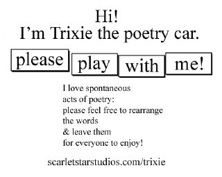
it immediately worked at the gas station before i left for shu-ju's show at the maryhill museum (more on that later): one of the men combined an "as" and an "s" to turn michael5000's "lick that butter" into "lick that butter ass." it's a fairly common way to arrange those letters.
posted by gl. | permalink | categories: trixie
July 20, 2007
lsgl: pseudopods ahoy!
by sven at 11:59 pm
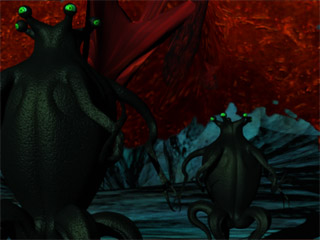
This is the first shot where we see the Shoggoth's pseudopods emerge and start smacking down Elder Things. It took four agonizing days to pull together this 2.5 second shot.
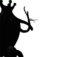
The first thing I had to do was create a new animation for the falling Elder Thing.
The galloping Elders use a run cycle. Their legs go in circles endlessly, and when I move their whole body forward at the right pace, it looks like their legs are responsible for propelling them. If I were to add keyframes into this animation, it would break the run cycle -- so the falling animation had to be done separately...
At the instant when the Elder Thing gets hit by the pseudopod, I pull a fast switch. The running elder suddenly pops over 90 feet stage right, and I put the falling elder in its place.
I really don't like this fall very much... But given that it's only on screen for such a brief moment, it's passable.
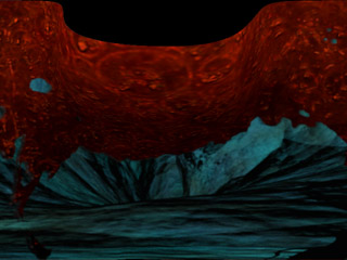
Working on this shot, I've come to see the Shoggoth as having three body sections: the wet part that sticks to the walls, the main mass, and the pseudopods.
To make it look like the mass of the Shoggoth is beginning to bulge into the room, I first composited a 2D clip of the wet blob on the cave wall using AfterEffects... Then, I projected this clip onto a flat panel in Lightwave 3D, and deformed the panel. (The photo above hopefully gives you a sense of how I'm pushing the image outward into the third dimension.)
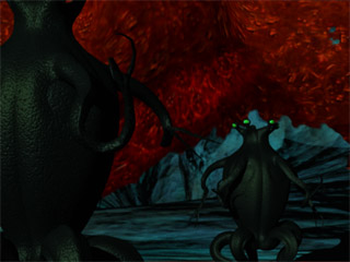
I tried and rejected a lot of different ways of making the pseudopods. I had really hoped to be able to do them using 2D compositing in AfterEffects... But there was just no way to get an adequate sense of depth, the feeling that these things are shooting out at you. The clip above should give you a sense of how flat the compositing approach was turning out.
The pseudopod design that I settled on, incidentally, is largely inspired by the lake monster just outside the door to the mines of Moria in Ralph Bakshi's 1978 cartoon version of Lord of the Rings ("speak 'friend' and enter").
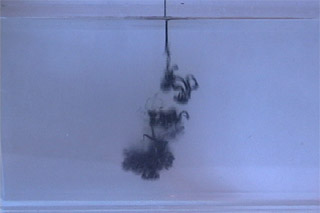
It looks like most of the water tank footage I shot won't get used in Let Sleeping Gods Lie. Drat. One exception: some of the out-takes can be used to simulate the Elder Things bleeding.
I am so glad to have this shot done! Now that I've established the look of the pseudopods, I ought to be able to do the rest of Act III without any more big hitches.
...I'm a bit worried, though. When I string the shots that I have together, they go by really fast. I may have to create a number of quick little interstitial shots which I hadn't planned on -- partly to pad the length of the climax, partly to help orient the viewer to where they're supposed to be standing in the stampede at any particular moment.
posted by sven | permalink | categories: let sleeping gods lie
July 19, 2007
travellers & scholars
by gl. at 11:59 pm
i got a chance to meet kelly roberge today, an art therapy student from arizona who included scarlet star studios in a national survey of expressive arts studios earlier this year! alas, she was visiting portland during my self-imposed creative hiatus, so though i didn't have a general event she could attend, she came over to be introduced to the studio & collage. i finally got to see her thesis, which includes a very kind acknowledgement of me (and which i hope she puts online soon). :)
kelly hopes to create her own expressive arts studio in arizona and then create an international expressive arts confederate where we work together instead of competing in order to help contribute to a cultural understanding of what we do and a desire for our support. go, kelly, go!
posted by gl. | permalink | categories: miscellany
July 16, 2007
stay awake
by gl. at 10:03 pm
way, way back in december, a former artist's way client asked if sven & i would sing a song for an album she was making, an album of lullabyes for her friend's young son. carol brought us a copy of the album when we hosted the edible book tea in march, and we were delighted and proud (and a little self-conscious) to listen to the CD.
we chose to sing "stay awake" from mary poppins, based on an acappella version by suzanne vega. though sven plays a spirited piano, neither of us are professional singers and it shows, but carol was a total sweetheart to work with. we sang it at least 4 or 5 times, even trying a version where sven tried to harmonize by listening to a recording of me singing alone.
and while i still find it a little embarrasing, i chose to sing and i offer it here for two reasons:
i want to support people who want to make things. so if someone wants me to sing, who am i to refuse? i'm thrilled carol created this album; anything to help her make music is a gift i'm happy to provide.
i think we should all do creative things from time to time that we feel we can't do: not in public, not where other people might see, not in front of an audience!
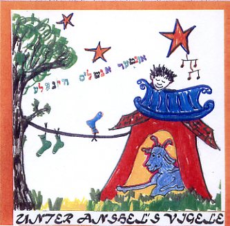
[unter anshel's vigele: click the image to hear "stay awake"!]
posted by gl. | permalink | categories: artist's way, other art
July 15, 2007
lsgl: smack-downs for all
by sven at 11:59 pm
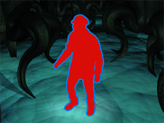
This is the last shot of Carl before he gets smacked down.
Lighting was a big problem. With Carl dead-center in the shot, it seemed that wherever I put the lights, they were going to cast awkward Elder shadows across him. Solution: I fell back on my "sometimes the explorers emit light" rationale. Given that Carl's about to bite it, it sorta seemed emotionally right for him to have one last moment of brilliance.
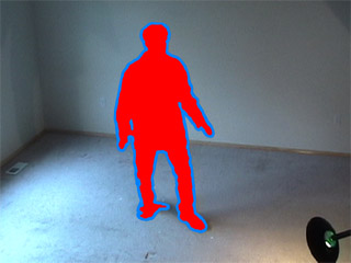
While working on Carl's shot, I realized that I'd never tried putting the lavamen back in the livingroom where they were born. I thought it looked interesting, and wanted to share. [In the final shot, I flipped the clip horizontally and did some cleanup on the lavaman fx.]
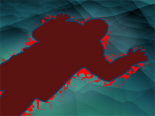
Here's Andrew getting smacked down.
I'm conflicted about whether or not I'm actually going to use this shot as-is. If I do, then I'm committing to killing off Andrew. My original plan was to have him be the sole survivor. I feel like there needs to be a witness to the carnage at the end of the film -- a quiet epilogue. Trouble is, I'm running out of time.
One good thing about killing Andrew off at this point in the film is that it lets me get the pay-off for the lavaman effect out of the way: at some point, we've got to see the hot body cool off, and the red bleed out.
I might do two versions of Andrew's smack-down: this one, where he dies -- and one where he's merely knocked out. ...Given that I only need an "Andrew lives" version if there's going to be time for an epilogue, though, I'll probably put that job off for a while.
One thing that drives me nuts about this shot is that there aren't Elder Thing legs in frame. Having an open patch of floor makes for a good composition -- but it doesn't feel right given the chaos we've been seeing in previous shots. Trouble is, it's just about impossible to get an Elder in the shot without it stepping on Andrew. Or, if I try to put it in the foreground, the camera winds up being actually inside the Elder. Hopefully the shot's fast enough that people just won't even think about it.
Guh... Gotta just keep moving. Next on the to-do list: shots that involve the Shoggoth's pseudopods.
posted by sven | permalink | categories: let sleeping gods lie
July 13, 2007
trixie's summer vacation
by gl. at 11:07 pm
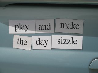
[play and make the day sizzle]
trixie's having a fine summer vacation so far. she just had her first-year anniversary of being completely paid off, so i got her detailed, which took off years of playa dust that had lingered on the dash. that means the magnets got cleaned, too, and then rearranged so we have new poetry again. a couple of my favorites so far are "embrace life but let us face sad days together" and "give our sad fire creature a drink."
just a few days ago a tourist i met at the delicious sahagun chocolates (which also makes a fantastic rose soda) saw trixie from the window and ran outside to take her picture.
but then i got out to the car yesterday and someone had thrown sticky, half-eaten cherries on her. why? i don't know. fortunately, trixie is forgiving and benevolent. :)
posted by gl. | permalink | categories: trixie
July 12, 2007
lsgl: layers upon layers
by sven at 11:59 pm
I thought that I'd completed the most complex shot in the film. ...I should know better than to say such things!
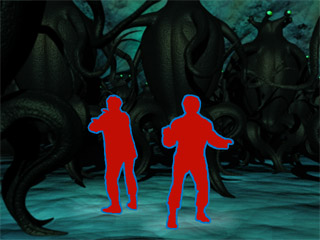
This shot has 20 Elder Things in it. The file was so huge, I had a 5 minute lag time just to select an item in the scene -- forget about modifying it! So, by necessity, I broke the shot up into parts.
I wound up having to do four separate renders out of LightWave. Let me walk you through 'em...
[Huh. Now that I think about it, I realize that it actually took me less time to render 20 elders using 4 passes than it did to render out 15 in 2 passes: 7 hrs 15 min vs. ~13 hrs. Interesting! It looks like there's a tipping-point at which managing too many calculations gums up the machine's ability to process them. ...Too bad that doing multiple renders requires babysitting the computer. I'll have to look into this further.]
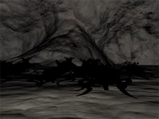
This is what the cave looks like before I color-shift and hyper-saturate it in AfterEffects. Early on I tried to create a surface texture within LightWave that was this vivid -- but couldn't do it.
The shadows belong to the midground Elders. The models are actually in this scene -- I've just made them invisible.
I figured that the shadows of the background Elders would mostly be occluded, so there was no point in wasting render time on them. The shadows of the foreground Elders, on the other hand, would have fallen directly across the explorers -- so I decided to cheat the shot and have them not casting shadows either -- for the sake of a good visual composition.
Render time: ~165 min.
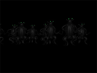
I kind of like how the background Elder Things turned out... I'm wondering if I could recycle this animation during the "deep history" segment (Act II)?
Render time: ~117 min.
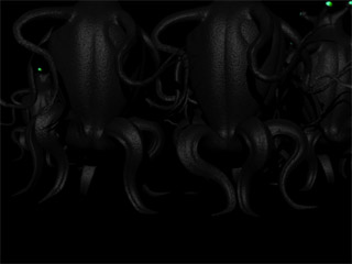
Once again, I did choreography using lo-poly stand-ins. Choreography took about 5 hours. Programming the choreography into the animated models took about another 2 hours. Doing the initial set-up -- matching the virtual camera angle to the real world camera angle -- that was ~2 hours, too.
In the midground, I put one Elder that's going faster than all the others to help create the feeling that these clones are actually unique Things. There's also an Elder that's about to pass really close to Andrew -- which sets up the next three shots, where Andrew's getting knocked down.
Render time: ~150 min.
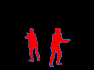
The explorers are done entirely in AfterEffects -- which means essentially no render time to wait out.
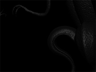
The front two Elders were the quickest to render...
Render time: ~30 min.
...After I had these five layers of animation, I composited them all together in AfterEffects. Color correction happens at this stage: I revved up the cave, and gave each layer a green tint. Actually, there are two shades of green going on -- "spring" and "seafoam." I've felt that simply tinting the room with one color gives too flat a result. (I'm lovin' what you can do with luma keying! Maybe I'll write about that later.)
Doing a depth-of-field effect in LightWave is extremely render-intensive. To simulate it "for cheap," in AfterEffects I applied a mild gaussian blur to the foreground layer.
Having a foreground layer hugely helps glue the explorers into their environment. Yet, when I watched a test clip, they still didn't feel as in-the-world as I wanted. So, I used a two duplicate layers of the cave backdrop that were brightened and masked off with feathered ovals to simulate gentle spotlights on Carl and Andrew. ...It's an effect that I've used "judiciously" rather than consistently: a suggestion that the "lavamen" actually emit light onto their environment.
Compositing time: ~1.5 hrs.
During the renders, I could usually go do other things. So... Amount of focussed attention on this shot: 13.5 hrs.
Amount of time the shot's on screen? Forty-eight frames -- about a second and a half.
But it's a really GREAT second-and-a-half, dammit! I'm proud of this shot. I think it's probably the best I've done.
posted by sven | permalink | categories: let sleeping gods lie
July 10, 2007
lsgl: the heat is on
by sven at 11:59 pm
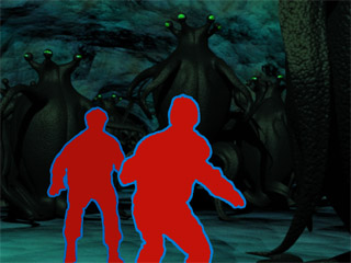
Here's the sequence where the explorers get surprised by the hive waking up around them.
Act III is all about quick-cuts... But I found that these two shots have to go in slo-mo, nonetheless. There's only 65 frames here (two days' work); when squeezed in between other quick-cuts, there wasn't enough time to even process what you were seeing.
Plus, y'know, I want the audience to have a moment to really feel what it's like to have something 13-feet-tall galloping directly at you.

It was supposed to get up to 106 degrees in Portland today. Don't know if it actually got that high outside, but it did hit 95 in the studio for a couple of hours.
As a preventative measure, Gretchin improvised some extra cooling for the 'puters: two fans pointed directly at the machines. Thank you gl.!!!
How many machines have I gone through while working on Let Sleeping Gods Lie? I think I've had two LaCie external hard drives die on me -- and last summer the power supply on the G4 burnt out, necessitating a new hard drive in the process. Another hardware failure at this point in the game would be no good at all...
posted by sven | permalink | categories: let sleeping gods lie
July 9, 2007
recent shows
by gl. at 4:19 pm
last week was a busy art week: i saw 6 shows in 3 days! these are all up through the end of the month:
linda womack: "above and beyond"
linda has a solo show at city hall: i've seen much of her work before, but it's always great to see it in a new context and see some finished works i had previously seen in a transitional stage. it was also lovely to see the titles: i think titles are really invaluable to focus & interpret art: it helps make the art meaningful to the viewer. linda has a great post about the difference in her studio walls between one day & the next!alesia zorn: "when calligraphy meets mixed media"
alesia has a show at berbati's pan. she does such beautiful work (often with shiny!) and i was completely smitten w/ "solstice," a piece she created during denis brown's gilding workshop. berbati's pan is disarmingly close to voodoo doughnut, so i had to stop & get an apple fritter afterwards.sven bonnichsen: "men's show"
sven showed "pajama dreamer" at 100th monkey. we were surprised to see alex, amelia & miles there! i was disappointed sven's awesome artist statement wasn't posted, though several others were. in addition to sven's work, i also enjoyed troy john mccray's iceland photos, but we must have missed the "artisan beer."christine tandy: "starscapes"
with a name likes "starscapes," of course i had to go see this show! christine loves space, clouds & stargazer lillies, and so do i. :) serena barton hosted this show, which was small but sweet. this was the first time serena had been introduced to trixie!shu-ju wang: "sense & sensuality"
i went to see shu-ju's book "calypso" because she had managed to make gocco ink out of powdered eye shadow! but the whole show was simply stunning. and 23 sandy was considerate enough to provide gloves so we could handle the books, because "art books beg to be fondled."
some of my favorites included (hooray! the entire catalog is online!):
- nicole dextras: myths (which included aphrodite, atlas, narcissus, icarus, persephone, poseidon, zeus, & the muses)
- malina gupta: the story of o (i love letters, but i also loved how the translucence actually helps tell the 'story')
- rutherford witthus: 3 kisses (which is striking in its contrast between almost-empty pages and packed visual pages)
- sue collard: camera obscura (it looks twenty times better in person than the photo)
- pamela paulsurd: touchstones (it's almost ridiculous how appealing these are!)
also, i got a chance to meet laura russell, who is enthusiastic, smart, talented & kind. 23 sandy is still a newish gallery, but she has some plans for her studio space that delight me -- and you can even rent it yourself!
- darlene schaper: "inside out"
darlene curated a show for the opening of Hands on Medicine. a combination of paint, digital compositions & at least one sculpture, elayna alexandera flodin's art is uniquely suited for a doctor's office, since it explores her own health and medical issues. darlene also has some of her own playful pieces as a permanent part of the children's room.
posted by gl. | permalink | categories: exhibits & events
July 8, 2007
lsgl: stampede choreography
by sven at 11:59 pm
Woo-hoo! I've just finished the most complex shot of the film!
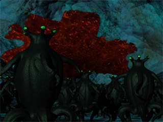
I think I like it. ...But then, it's been more than 2 weeks since I last completed a shot -- so a lot of that emotion might just be relief.
The final render for the stampeding Elder Things took more than 13 hours. Due to how I've chosen to deal with colors, rendering shadows would have to be done in a second pass. I'm hoping that for just this one scene I can cheat the shot and omit shadows. I want to believe that the chaos of motion will distract folks from looking at the ground too closely.
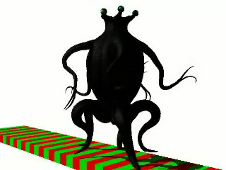
Here's the final galloping Elder Thing animation. It's not perfect -- but ought to be plenty good enough. It looks best from the side; I'm less happy with the front view, which seems a bit flat and mechanical. There's also a little a little a little stutter, which seems to only be visible from the front. I'll cope. :-)
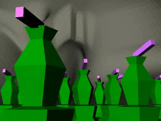
With 15 fully-animated Elder Things, the stampede shot is krazee complicated. The stats:
- objects: 888
- points: 1,355,686
- polys: 2,375,522
- bones: 7275
- IK chains: 165
If I tried to animate all that at once, the computer would totally bog down and give me killer lag times... So to get around that, I did all the choreography using lo-poly stand-ins.
The green objects in the clip above simulate the Elder Things' silhouettes. The clapping pink bars on top represent the rhythm of the 25 frame run cycle. It would look ridiculous if all of the Elders were running in lock-step -- so I had to put a good deal of thought into how to stagger the cycles, trying to make them look naturalistic.
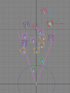
Here's what the stand-in Elders look like from above. I color-coded them into groups, so I could plan out sending them toward the camera in waves.
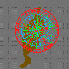
When I select all of the objects, bones and controllers that collectively make up a single Elder Thing, the highlighted bits create a baffling tangle of indicator lines. In this case, however, I was delighted to see that that the indicator lines happen to create a scarlet star. Smile.
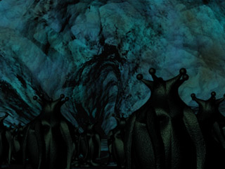
In the stampede shot, the Shoggoth is supposed to be oozing in through the hive's only exit. Since I decided to make the Shoggoth opaque, I'm not sure that the concept "reads" anymore.
To rectify the situation, I put together a "before" shot, so we can get a good look at the exit. ...After all the agony involved in getting the stampede assembled, arranging and rendering a simple still shot was bliss!
posted by sven | permalink | categories: let sleeping gods lie
July 6, 2007
"pajama dreamer" at 100th monkey studio
by sven at 9:15 pm
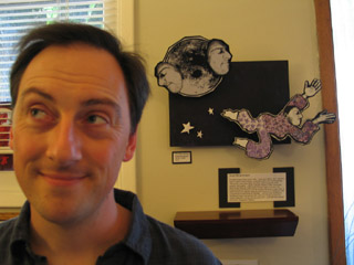
My 3D collage "pajama dreamer" is hanging in a gallery this month... It was selected for inclusion in the 100th Monkey Studio's "First Annual Men's Show."
The show opened tonight, and runs until July 31st. If you want to check it out, 100th Monkey is at 110 SE 16th Ave @ Ankeny.
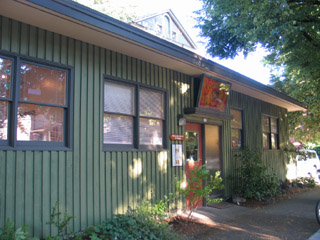
Huge thanks to Gretchin, who suggested that I submit, and then managed communication with 100th Monkey for me. I am extremely grateful for this help! Consumed as I am with getting Let Sleeping Gods Lie done, I'd never have considered submitting to a show right now -- were it not for Gretchin's generous offer to take care of the details. Thank you!!
posted by sven | permalink | categories: exhibits & events, sculpture
July 5, 2007
lsgl: a three-legged dog with training wheels
by sven at 11:59 pm
I'm working on the most difficult shot of the film right now. We see the Shoggoth blocking the cave's only exit and dozens of just-woken-up Elder Things stampeding away.
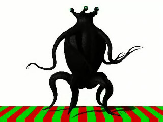
I've finally got the Elders' legs doing a satisfactory gallop. How does a five-legged Thing run? Imagine a three-legged dog with training wheels being ridden by a watermelon jockey... That's what worked for me.
There are quibbles to be had with this gallop... The feet hit ground with their delicate tips, rather than with a more load-bearing part of the "foot." The mid-leg doesn't have as much of a "shock absorber" reaction as I'd like. And there's a moment where the rear three legs are all off the ground at the same time, which doesn't seem plausible. ...But it looks OK to me at this speed -- and that's good enough.
The arms are still giving me grief, though. I still haven't quite wrapped my mind around how they should move.
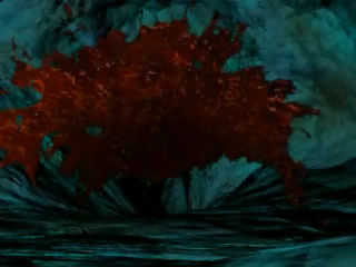
Here's your first glimpse of the Shoggoth. There'll be some minor tweaking, but I'm pretty happy with it as-is. (Unfortunately compression for the web has made this clip muddy.)
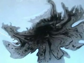
The silhouette for the Shoggoth was created by throwing some india ink into a wet sink.
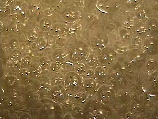
The texture of the Shoggoth is boiling sugar... Which is then layered upon itself and hyper-saturated. Hot spots get color-keyed out.
I originally thought that the shoggoth would be translucent in this shot. Turns out that it looks better if it's opaque. Maybe we'll be able to see a bit of the protoplasm's translucence in later shots when the pseudopods are smacking down Elder Things .
A little less than two months left until the deadline! EEEEEEE!
posted by sven | permalink | categories: let sleeping gods lie
July 2, 2007
animated installations at PLATFORM
by sven at 3:30 pm
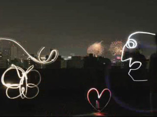
I confess, when I heard that the PLATFORM animation festival was going to include animated installations, I felt dubious. I imagined it would just be films being projected onto gallery walls, nothing special. Boy, was I in for a surprise! The installation show turned out to be the most mind-blowing aspect of the entire fest!
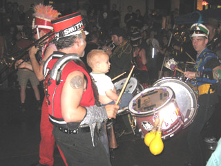
Thursday night, as Competition Program 5 was ending, the "voice of god" announced that we should follow the marching band outside to the Walking Tour of Animated Installations. ...And as we streamed out of the Portland Center for the Performing Arts, there it was: the March Fourth marching band, already playing their raucous tunes. A joyous crowd followed the stiltwalkers, drums, and brass for at least 10-15 blocks. What a brilliant way to help lead a crowd from point A to point B!

As we arrived at the PNCA (the Pacific Northwest College of Art), Pika Pika started up their performance. What this group does is live animation...
A camera takes a photo of the performers using about a 30 second exposure. The performers draw shapes in the air using multi-colored flashlights. The lights' trails show up as glowing lines on the film. After taking a series of maybe 30 still frames like this, they use a computer to play back the images they've created, thus making an animation.
The animation is very rough, but personally I found it stunning. When a film of Pika Pika's animation showed earlier, during one of the competition programs, the phrase that went through my mind was "paralyzing beauty." It literally took my breath away.
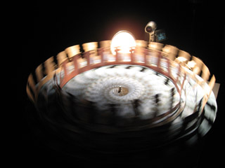
When I went into the PNCA building, the first installation that grabbed me was "Copenhagen Cycles." There were three large spinning disks with paper cut-outs attached to them being filmed by video cameras. The principle is similar to that of a zoetrope -- but the images were actually three-dimensional, and the animation was accomplished by matching the disk's rpm to the camera's fps.
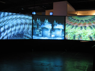
When I discovered the spinning disks, I could only see the animation by looking into the little 2" square viewscreens of the video cameras. I thought this was really cool... Then I walked around the partitioning wall and discovered that the images were actually being projected onto three ten-foot-tall screens! Wow!
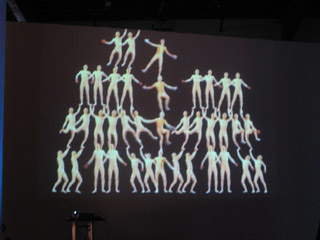
The animation titled "Balance" was being projected on a 2-story-tall wall nearby. It was a fairly static piece... It created the illusion of 38 acrobats standing in a human pyramid. The detail that really made this piece work for me was that the uppermost acrobats appeared to be holding onto the railing of the second story balcony in order to keep their balance. A pretty amusing illusion, I thought.
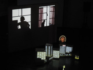
"Dream of Lucidly Living" was a performance art piece by Miwa Matreyek, a student from Cal Arts. Animated images were projected onto a flat screen -- both from in front and from behind. Matreyek would sometimes walk behind the screen, and her silhouette would become incorporated in the images. For instance, her shadow seemed to pet an animated cat; and, at another point, a beating heart was projected onto her shadow's chest -- so it was as if we were seeing an X-ray. At other points, she was in front of the screen arranging white boxes, which were transformed into skyscrapers by front-projection.
The music for "Dream of Lucidly Living" was by a band which Matreyek is a part of; she herself was the singer in the recording.
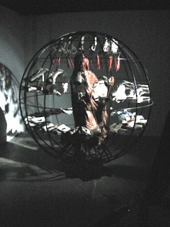
The most stunning installation of all was "No Never Alone" by Gregory Barsamian. As you entered a darkened room, you saw before you a living sculpture.
It was a seven-foot-tall spherical cage. In the center of the cage was a life-sized human figure, motionless, covered by a shroud. Around the figure, there were two rings of hands. The upper ring was (I'd guess) 24 pairs of hands, each crumpling and uncrumpling eye charts. A lower ring of 48 hands was opening and closing books which showed pictures of hands clapping. At the top of the cage, carrots swung gently back and fourth.
Everyone who walked into the room was transfixed. It was hypnotic, and you just stood there wondering how this living sculpture could possibly exist...
The trick: The spherical cage was actually rotating at about 15 miles per hour. A strobe light was flashing at the precise rhythm required to make the sets of hands seem to exist in stationary positions. I overheard someone refer to this as a "strobascope." Fantastic!
...
In all, there were 18 installations in the show. By necessity, of course, I'm only sharing my favorites. I think one more is worth mentioning, though.
During the installation show, there was a car that was driving around the neighborhood. As it was in motion, it was projecting images of a running tiger onto the sides of the buildings it passed -- creating the illusion of a tiger actually running through the neighborhood. Sadly, I never actually got to see this one in person.
posted by sven | permalink | categories: exhibits & events, movies
impressions from the PLATFORM festival
by sven at 8:00 am
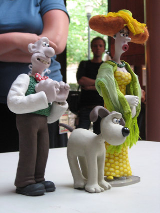
After going to my last screening on Saturday, I walked out into the Performing Arts Center lobby. I just stood there for a moment and looked around the room.
There was Henry Selick having a conversation with Peter Lord. Behind them was Joan Gratz talking with some friends. "Spike," from the Spike & Mike festival, walked by. And just outside I could see Will Vinton sitting at a table.
That moment was emblematic of the festival for me.
What films did I go see at the festival?
- all seven of the primary Competition Programs (which included the "TV for Children" and "Adults Only" blocks)
- two Student Showcase programs
- the Internet Competition - short films that were made for the internet
- the two "Best of Pictoplasma" programs
- "World Animation for Kids"
- "Films By Kids For Kids"
- Tekkon Kinkreet - a gorgeous feature-length anime
- "Creature Comforts" - an unaired episode from the cancelled U.S. version
- "Sita Sings the Blues" - a work-in-progress by Nina Paley
- "Hey, Check Out My Pes Collection" - a Pes retrospective
- "Portland Animation Showcase" - films by Portlanders
- the last 20 minutes of "Princess Iron Fan"
- one of the two Open Screenings (the one that my films were in!)
I prioritized going to screenings of films rather than going to presentations. Nonetheless, I also made it to the following presentations:
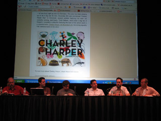
- "Attack Of The Blog: Meet The Bloggers" - a panel discussion
- "Aardman Animation: Genesis to Revelations" - by David Sproxton
- "Aardman: Soft Clay, Hard Work, & Lucky Breaks" - by Peter Lord
- "An Afternoon With Henry Selick"
Profoundly exhausting!
The first showing of the day was often at 9:30am, so I'd be getting up at 7:30 in order to eat, shower, drive across town, and find parking. The last showing would often run til 1:00am -- so by the time I'd driven home, caught my breath, and gotten to bed, it was usually heading toward 2:30 or 3:00am.
Everyone was similarly tired. I managed to stay awake... But I did have to give a friend a little nudge at one point, when he'd nodded off.
There reaches a point where the exhaustion just makes you stop caring. You know that what you're seeing is amazing animation -- but you're just too tired and numb to feel anything.
In addition to the sleep dep, sitting still for six days is also a bit of a marathon. It's physically demanding to have to stay still that long -- it's like taking a cross-country flight every day. There were screenings where every-other-film I'd have to switch which cheek I was sitting on.
There were fewer films that had characters and a beginning, middle, and end than I would have expected. Often if a film had humans in it, they didn't speak, and were somewhat inscrutable. I'm not sure if this was numerically the case, but it felt like a majority of films weren't story-based at all... I was surprised by my own reaction: it felt like the films that did have story had an inherent advantage, that they were able to engage me and draw me into their world in a way that artsier stuff just couldn't.
For the competition programs, audience members were given ballots as they entered the theater. After each short, the lights would come up and an announcer (the "voice of god," I quipped) would say the name of the next film and what category it was in. Filmmakers were encouraged to stand up and be recognized during these pauses.
I had the impression that these pauses are something that happens at other festivals -- an etiquette that PLATFORM's organizers have chosen to emulate. It never felt like the audience (and filmmakers) really got comfortable with it. For the first program, I don't think any filmmakers stood up -- which just left the audience futilely craning their necks, searching the room.
One of the categories that the "voice of god" would announce was "Best Film Over $50,000." I think, to an extent, we were expected to feel impressed -- like we were in the presence of celebrity... But every time "Best Film Over $50,000" was mentioned, what I perceived was uncomfortable, mildly embarrassed chuckles and shuffling in the audience.
During the awards ceremony, legendary animator Marv Newland was one of the presenters. At one point he appeared to "break from script" and commented on the money-based categories... Saying that they were somewhat ridiculous, that the finances for independent films are always rather muddy, and that he had "literally" stolen the money to make one of his films. ...It was a surprising moment of on-stage criticism.
The award ceremony was really a curious beast.
Bill Plympton was the emcee. He was great -- he really had the gravitas to do the role justice.
There was an on-stage band, Portland's own "3 Leg Torso" -- which was also an excellent choice. An accordion, cello, violin, xylophone, and percussion... A sophisticated mix of klezmer, tango, and chamber music.
Children all dressed in white (under age 12, I'd guess) were in charge of handing the awards to the competition winners. (Personally, I rather liked this choice. Much better than using supposedly sexxxy women, imho.)
The award itself was a designer vinyl toy called "the god of animation." It's a hot pink, six-armed, three-eyed cartoonish character. Me, I think I'd feel more honored with something made out of bronze or glass... But I gotta hand it to the festival organizers: it's a unique and daring design.
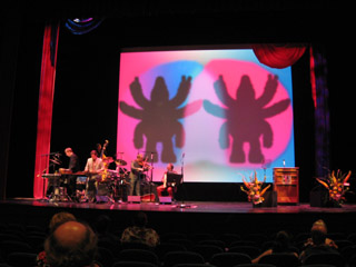
There were at least three big TV cameras, presumably for Cartoon Network. There was a sense that this event was maybe supposed to be a black-tie gala...
But animators don't glitter.
Most of the animators who got up on stage were in jeans; some in T-shirts. They were awkward and self-effacing. Animators aren't celebrities. They get up on stage and remain... Geeks.
The makers of "I Met The Walrus" won the award for Best Sound. A little baffled, as they accepted the award they pointed out that there actually wasn't any sound design in the film -- it used a tape of John Lennon being interviewed by a high school kid who snuck into his hotel.
Don Hertzfeldt won the "Best Film Under $5000" award for "Everything Will Be OK." When he got up on stage, he talked bout how strange this was... How he'd just been asleep, and literally only woke up minutes before! He said he was able to make his film so cheaply because a friend of his had won at several international festivals that award Kodak film stock. But the friend is a computer animator! ...So he simply gave the film stock to Don.
The anecdote about receiving a useless gift symbolized for me a disconnect between money/status-driven festivals and animators. Animators are so often scrounging to get by, and are used to being in a poorly understood/disrespected profession. After years of slaving away like this, a moment in the gilded spotlight seems kinda bittersweet. There's a tinge of... Not exactly resentment... But perhaps a sense of the facade?
It's hard to explain the vibe at the awards ceremony without it sounding like I'm putting down PLATFORM. Let me be clear: PLATFORM was wonderful! What I want to convey is the disconnect between animators and the trappings of celebrity.
Gregory Barsamian, who created the astonishing and transfixing installation piece "No Never Alone," as he was accepting his Grand Prix/Installation award made a lovely comment on who we are as animators... He referenced the film, "Freaks," and its famous line "one of us." The animators filling the auditorium: freaks. Wonderful freaks.
At the very end of this (at times oddly awkward) awards ceremony, PLATFORM festival director Irene Kotlarz was brought to center stage and given a huge bouquet of roses. (They never see it coming!) The audience gave her a standing ovation -- the first and only standing ovation of the festival, I believe. After three years of bringing the event to life, she wept at the recognition.
It sounds so predictable... But the moment was authentic. It made my eyes tear up. The man standing beside me teared up, too.
posted by sven | permalink | categories: exhibits & events, movies
July 1, 2007
praise for the PLATFORM International Animation Festival
by sven at 11:59 pm

The first PLATFORM International Animation Festival was a triumph.
Understand, this was the premiere of the ONLY major animation festival in the U.S. -- an event of historic importance.
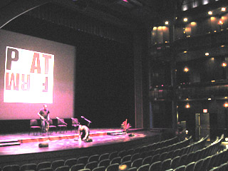
The organizers did a simply phenomenal job...
The scope of the festival was visionary. It included not only traditional short films, but also animation designed for emerging platforms (hence the festival's name) such as the internet and cell phones. It made a bridge to the broader world of art by including an exhibit of animated installation artworks. And, while looking to the future, there was also honor for animation's history -- embodied by the showing of Snow White (with guest speaker Marge Champion, who was Snow White's movement model) and the earliest feature-length animated film produced in Asia ("Princess Iron Fan", 1941).
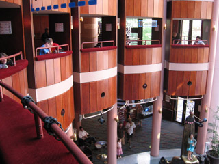
The orchestration of the event itself was excellent. The Portland Center for the Performing Arts -- the main venue for the festival -- was beautiful, and well laid-out to accommodate several films running at the same time. Each day's program of screenings (from an attendee's perspective) ran extremely smoothly.
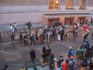
One organizational choice that I think was particularly brilliant: It's maybe a ten block walk from where the film screenings are to the Pacific Northwest College of Art, where the installation pieces are set up. How do you get everyone from point A to point B? Get the March Fourth marching band to lead everyone there!
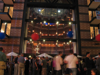
Cartoon Network was the financial force behind PLATFORM -- but the company was remarkably reserved about making its presence felt.
This was a "no logo" event. With the exception of the organizers verbally thanking Cartoon Network for its support, you could easily have missed that the company had anything to do with the festival at all. It was a very classy choice on CN's part. Supporting the animation community without shoving a lot of self-promotion down our throats engendered a lot of good will toward the company. (At least among those who attended.)
Let's hope that all involved see this festival as a triumph, and that it becomes an annual institution. ...I eagerly look forward to attending again next year.
posted by sven | permalink | categories: exhibits & events, movies