you are here [x]: Scarlet Star Studios > the Scarlet Letters > making of "the great escape"
<< before
meet toby!
after >>
artist's way guided intent (january)
January 3, 2007
making of "the great escape"
by sven at 10:25 pm
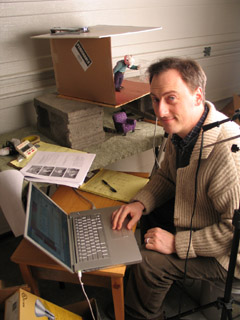
I want to fill in some details about the process of making The Great Escape...
1. the computer
I was using my PowerBook G4 to capture frames... Boy, was I glad to have a laptop in this instance! It was really helpful being able to easily move the computer around, depending upon where the camera and set needed to be.
2. the framegrabber
I used FrameThief as my framegrabber. Just prior to this project I spent a bunch of time play-testing the main framegrabber options for the Mac: FrameThief, AnimAideXT, and iStopMotion. I'd like to write a more in-depth review, but here's the short version...
There are two functions that are absolutely critical for a framegrabber: (1) it has to let you do onion-skinning, and (2) it has to let you check your work against a sound clip. FrameThief is getting a little antiquated, but it's the only one that can do both of these things adequately. AnimAideXT has exciting potential, but was buggy for me when it came to onion-skinning. Boinx's iStopMotion has a great interface and support -- but you have to pay $400 for the pro version if you want to work with sound.
FrameThief did crash on me a few times. However, I remain impressed with this workhorse software: I never lost any data -- all I had to do was re-start the program, and I was back in the game.
3. the camera
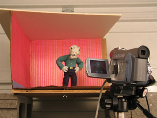
I used a Canon ZR45 DV cam to capture frames. This cam has given me so much grief...
When I was shooting footage for Let Sleeping Gods Lie, it would turn itself off (to conserve power) whenever I kept it on pause for 5 minutes. Since most of the shots took longer than 5min to set up, this was really irritating...
On this project, the horrible realization was that even though I manually set the exposure to 1/60, everytime Jimmy's white shirt came on screen, the picture would darken to compensate -- resulting in awful flicker.
Sin #3: Even though I had a brilliantly colorful set and excellent lighting, the camera sucked a huge amount of color and luminescence out of my shots. In post I did some brute-force color correction by adding saturation and brightness universally -- but I still couldn't get the quality that I had when shooting the photo animatic with my still cam.
Potential solutions: Get a 3CCD DV cam. (Pretty expensive.) Or use the still cam... Which will require an analog-to-digital converter in order to interact with the framegrabber -- and has an expected life-span of 50 to 70 minutes of animation before conking out from over-use.
4. the tripod
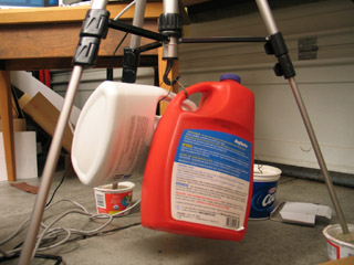
I've been told by several sources that sand is the professional choice for how to weigh down your tripod... Yet, I wasn't sure how to do it in practice. I tried putting the feet of the tripod into yogurt tubs filled with sand. Useless. Filling plastic bottles (with handles) up with sand, and then making wire loops so they could hang from the tripod's hook -- that worked pretty well.
Technically water in those jugs would have worked just as well. But I'm glad that I went to the hardware store and bought some sandbox sand, nonetheless. The thought of those jugs, if filled with water, dropping and cracking open -- well, let's just say that I think sand would do less overall damage.
Even with the sand, though, the head of the camera could still be moved some with a good bump. There's play in the gear that raises and lowers the camera that I don't know how to fix.
5. the set
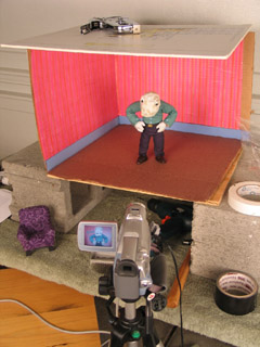
The set was constructed from a cardboard box, which I then staple-gunned to a piece of plywood. The plywood sat atop two cinderblocks so I could get at the tie-down screws. The ceiling was a piece of white foamcore that wasn't actually attached -- just weighted down. The wallpaper was gift-wrapping paper, and the carpet was felt.
The cardboard walls worked satisfactorily through most of the film. The only problem came at the end when Jimmy pokes out from behind the painting. At that point, he's actually pushing against the walls and they flex. Next time: Rigid walls made out of hardboard or MDF.
The plywood base is adequately rigid, but splinters when I drill holes for the tie-down screws. MDF -- medium density fiberboard -- would be better. It's made out of glue and fine sawdust, which shouldn't be able to splinter at all.
On a couple of occasions I managed to bump the set and shift it on the cinderblocks. Next go around, I plan to build a proper animating table, like the one Justin Rasch has just made, and which Marc Spess shows you how to build in his eBook Secrets of Clay Animation Revealed.
6. props
I'm fairly happy with the look of the comfy chair, which is just fabric glued over insulation foam, with foamcore feet. However, I made two fundamental mistakes here.
One: The foamcore legs were too squishy, and led to the chair moving around while I was animating. I tried using hot glue and pinning it to the floor -- but to little avail. Next time, furniture needs to use MDF for its frame, and there need to be threaded holes for tie-down screws.
Two: Scale! The room was one scale, the pups were another, and the furniture was a third. This was particularly a problem with the comfy chair, which was supposed to be huge -- but was barely big enough to seat Jimmy. Next time, pick a scale and stick to it!
7. lights
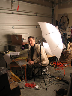
I used two 500 watt lamps that I got at a photography supply store, along with umbrellas to diffuse the light. I ran into terrible problems with the lights burning out. I suspect that this had to do with the lights being so hot and the garage being so cold.
The lights get freakishly hot! When one of them burned out, the broken filiment actually burned a pin-sized hole through the glass. With another, the glass of the bulb melted into a bulge!
For the living room set I wanted lots and lots of light -- a bright, saturated, jubilant environent. So the lamps were really necessary. On future projects, though, I'm thinking I'll probably use more colored lights and gobos -- which may mean I need to get some more fresnells and stands.
In the cave set, I'd intended to use xmas lights hidden behind the arches. It proved to be too much trouble. I just went with shining a single light down the tunnel. Less magical -- but oh well.
8. puppets
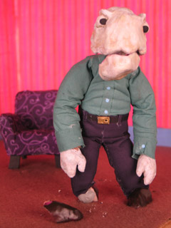
I used Super Sculpey for the heads, hands, and shoes of the puppet. I ran into problems with it cracking. Jimmy's head had a big crack in it from the get-go, and it wasn't firmly attached to the epoxy putty skull. At the very end of the film, Dad's shoe shattered. Little bits of Super Sculpey would flake off around the wrists. Next time, I think I'll be using Magic Sculpt (a fine-grained epoxy putty for artists) for hands and feet; possibly resin for heads.
The most glaring flaw in the puppets' design was in the necks and wrists. Or rather, the lack thereof. One solution would be to wrap these bits in string and then paint them with liquid latex. I've also heard of latex rubber tubing being used for necks -- partly because you can make a hole in the base of the skull that conceals the join.
(Btw: I'd like to tip my hat to Grant Goans -- the idea for Dad's flapping jaw comes directly from his Vitruvius project.)
9. armatures
The sculptor's armature wire (annealed aluminum) didn't break. Huzzah!
Dad was pretty fun to animate; Jimmy was much harder, due to the smaller armature. Note to self: larger wire armatures are easier to articulate.
I keep on making my pups' necks too short. Dad was pretty much neckless; Jimmy was better, but still couldn't lean his head back far enough at one point.
Dad really didn't want to twist in the middle. More wires in his spine would have helped; but given the amount of foam that had to be moved, I'm not really sure how much more a build-up puppet could be improved.
10. costumes
Instead of sewing the costumes, I used Fabri-Tac glue to attach cloth directly to the foam body mass. This seems to have worked out OK on the pants -- but the arms of the shirts tore out of the shoulders.
I'd really like to know a better solution for the shoulders of shirts. I'll probably try hand-sewing the costumes next time. But even then, I know there's a problem with the sleeves and shirt bottom riding up when a pup lifts their arms. Anyone have any ideas here?
I also didn't bother to fold the fabric over when I attached it. It looked fine at first -- but I was getting some fairly serious fraying toward the end of the film, and had to keep cuticle scizzors on set.
11. lipsync
I used Papagayo to do lipsync. Magpie's the industry standard and costs a pretty penny -- whereas Papagayo is free... So I was a bit dubious when I started out. However, while there are some niceties missing, I found Papagayo was very easy to use, and quite satisfactory for my purposes. I strongly recommend giving it try.
A big discovery: It was much easier for me to animate puppets when I was matching movement to dialogue. It made the entire animation process much more managable when knew exactly how many frames I needed for any one shot. But beyond that, I found that my characters' movements were much more motivated when there was speaking. For each word, I thought about what gesture ought to accompany it. I avoided having the words and gestures match up perfectly -- but just working through how the pups' thoughts should be pantomimed really made them more alive.
12. trick shots
There were a few useful tricks I utilized to get the shots I wanted.
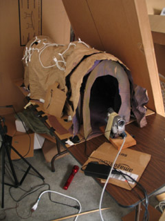
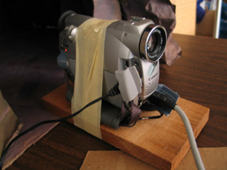
In order to get a point-of-view shot for Jimmy running through the cave tunnel, I made a little wooden sled for the camera... Well, actually, I just picked up a piece of scrap wood and wrapped masking tape around it and the cam. When it got far enough into the cave set, I used a stick to keep pushing it farther in, an inch at a time.
I put screws into Jimmy's feet for tie-downs... But as it turns out, he never stands up in the story! In order to have him not jitter around too much while he was sitting, I stuck pins right through him and into the chair.
(Thanks to Shelley Noble for the pins that I was using!)
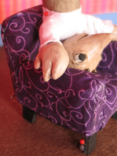
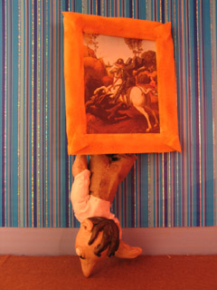
When Jimmy had to get out of the chair, I didn't have any easy way to secure him... So I wound up just holding him in my hand. The same was true for when he pokes out from behind the painting at the end: no way to secure him, so I was holding him in my right hand from behind the set, and setting off the shutter release with my left.
Consequently, when I concluded the shot, the poor boy fell out. Right on his nose.
13. post-production
I started working on this film back in October. But when December rolled around, xmas preparations kept me from getting down to business until the 26th -- at which point I pushed everything else aside in order to get this done. On the 30th/31st I worked for 30 contiguous hours without stop... Possibly the longest single stretch of my life (so far).
Post-production took a surprising 18 hours to complete. What really saved me was that at the outset I made up a master list of fixes, and then worked that list. Keeping copious notes on my thought process as I went, problem-solving one thing at a time. Here's the outline:
- assemble the clips so they sync to the audio track
- fix problem clips
- add/cut shots
- add titles/credits
- edit timing - must be absolutely finalized
- record additional sound, edit the mix
- color correction (if there's time)
- compress
Since I'd assembled the photo animatic in iMovie, I thought it would be easy enough to just replace the still images with my new animation clips. Not so! Because I filmed at 15fps -- but the animatic was 30fps -- iMovie simply wouldn't let me edit my clips to single-frame accuracy. That threw the whole audio sync off, which would have ruined the film. [Yes, even though the dialogue is in mumblephonics.] I tried out a whole bunch of potential work-arounds, but nothing did the job. So I switched to AfterEffects for final assembly -- which treated me much better.
I discovered that I had the heads of pins showing in several shots. I went through and fixed each frame by hand in PhotoShop. ...Actually, this wasn't a bad experience at all. I think I may use this process more in future projects -- particularly for flying and jumping effects.
At 320x240 pixels, the final render of the film was 752.9MB. It took a lot of fooling around, but I finally got it compressed down to a more manageable 6.8MB. The magic was to use the Sorenson3 codec at medium quality, with all options set on auto...
And then for sound, it turned out that the QDesign Music 2 codec was working out better than QualComm PureVoice. My settings were: best / 44.1 / best / 48 kbit. Bad sound just kills me... The sound quality I wound up with is not everything I could wish for, but it's at least tolerable.
Jason Gottlieb's tutorial, How to compress a movie for the web using QuickTime Pro, was once again very helpful. If you haven't seen it already, I strongly recommend it.
[Reminder to self: Rendering the image and the sound out from AfterEffects in two separate passes has consistently worked best. Make it standard practice.]
...
And there you have it! More than you ever wanted to know about the making of my little 2 minute film!
posted by sven | January 3, 2007 10:25 PM | categories: movies, stopmo