January 2007 archives
you are here [x]: Scarlet Star Studios > the Scarlet Letters > January 2007
<< before
December 2006
after >>
February 2007
January 27, 2007
quality time
by gl. at 11:56 pm
i spent today with the letterpress! i desperately wanted to take another workshop at the iprc, but the letterpress classes fill quickly, and by the time someone responded to the email i sent, they were already full. i had hoped the phone call that woke me up this morning was them calling to say a spot had opened up, but whoever called didn't leave a message.
so i decided to make today a letterpress day, anyway. it's been quietly sitting in the studio kitchen for months (*cough*years*cough*) and one of my new year's resolution is to spend more time with gocco and letterpress (and less time with calligraphy).
so much of the inertia around the letterpress is still not knowing exactly what i have and don't have. chas owned Artemesia Press when he was younger and was kind enough to donate the letterpress & accoutrements when i stopped by on a trip to colorado a couple of years ago. it had been stored for years in less-than-ideal conditions and just getting the stuff put away was a huge deal. but i still haven't found the time to sort through -- or identify -- all the pieces yet.
so i read through all the manuals & documents, matching what i was reading to what i was seeing on the press. i reseated the rollers and made sure everything moved like it seemed like it ought. i thought one of the grippers was missing but i found it later in a box of random metal bits and replaced it. i moved everything into new boxes and packaged like with like. i repackaged all the decorative cuts into one box with lots of little cups to group related cuts together. i found the furniture and the reglets. i found the chase and even managed to fit it on the chase bed. i tested all the inks, which are in remarkably good shape.
most importantly, i finally unpacked the four typecases which have been living in the studio oven, a task i had been dreading because they are dirty and heavy and have so many small bits floating around inside. i was delighted to discover that they are, by and large, in much better shape than i expected. three of the typecases were wrapped together: two of those are in excellent shape, the other is rickety but okay. but the fourth was exposed to elements and bugs and dust and it's really a mess; i don't know what to do to clean it. finally, i also have an egg carton that seems like it contains another set of type, and a small glass jar which has even more type; i don't know how i'll deal with those yet. and while i haven't thoroughly checked the type assortment, in general, the type seems relatively intact. lot of italics for some reason. :)
i could still use a planar and i suspect i'll need to order new rollers, after all; the replacement rollers are pitted and a little gummy. but at this point, i'm finally ready to assemble type and put it in the chase!
posted by gl. | permalink | categories: printing
January 23, 2007
read it and weep
by gl. at 9:01 pm
just in time for national handwriting day (today!), chas has sent us a link to the palaeography tutorial at the uk national archives. palaeography is the study of old handwriting, and the tutorial is especially focused on the typically illegible (but fascinating) documents between 1500 and 1800. it contains tips on reading and transcribing documents, a reference page, a tutorial with 10 levels of difficulty, a ducking stool drill game ("i'm not a witch!") and documents for further practice. it also includes the ability to download all the reference materials as high-resolution pdfs. thanks, chas!
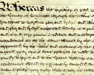
[An Act of Parliament for amending and widening the road from Falmouth to Marazion, Cornwall, 1760. Click the image to see the full tutorial.]
posted by gl. | permalink | categories: calligraphy, links
January 22, 2007
last chance to find your muse (aka artist's way)
by gl. at 11:32 pm
i can't believe i haven't posted about the next round of artist's way yet. technically, the rsvp deadline for this is tomorrow, but i'll (obviously) be extending it. :)
this is essentially what i've been promoting:
Give yourself the time & space this year to find your muse at our abundant and inspiring studio! Whether you love visual, literary or performing arts, when you commit to finding your muse you will also find confidence, courage and compassionate companions. Your facilitator, Gretchin Lair, is a creative advocate known for her "splendid mix of art and honesty" and "quiet leadership."
"Find Your Muse" is based on The Artist's Way (if you've tried to get through The Artist's Way alone, come join us!). But we go far beyond the book, actively exploring a wide range of art activities designed to encourage your muse and stretch every aspect of your creativity. After you find your muse you'll be ready to create fearlessly & truthfully!
Two choices for Spring 2007: only $260 for 13 weeks!
(RSVP and $130 deposit due by January 23)Tuesday nights
6:30-9 p.m.
January 30-April 24Wednesday mornings
10 a.m.-12:30 p.m.
January 31-April 25for more about my Portland Artist's Way oppportunities, please visit:
http://www.scarletstarstudios.com/artistsway/(If a creative cluster doesn't work for you this time, there's always our independent support option, where you can find your muse on your own schedule!)
this year i hired posterchild to do the flyering since i hate that so very much. next time i'll probably do the same but with a much longer lead time: my reach is broader than she expected. :)
i also did the usual rounds of lists, craft calendars, meetup, wweek, mercury, craigslist, etc. my perpetual agony is that google refuses to rank us within the first 500 hits for a "portland artist's way" search. why, google, why? everything else you link to links to us, but we're buried on page 10. i just discovered the unitarian church finally got their class schedule up for the first time this year, and they're right at the top of the list. how does that happen? (google also won't show scarlet star studios as a useful hit when searching for "gretchin lair," either. between that and spam filters marking our mail as spam, it's difficult to have the faith in the internet i once had.)
posted by gl. | permalink | categories: artist's way
January 21, 2007
wayward
by gl. at 9:06 pm
i just discovered this homage to trixie from wayward waif:
"It's a magnetic poetry Toyota. On so many levels, and for so many reasons, the owner of the magnetic poetry car prompts me to see the world as a much more friendly place than I normally view it. An actual car with magnetic poetry pieces. Uber awe-inspiring in a way that I can not adequately describe in words."
yay! which is a good excuse to finally post some of the poetry we got while traveling through canada this summer. i was surprised to discover that until we reached edmonton, most canadians looked at trixie with suspicion. i had expected her acceptance to be greater there than it is here. and even those who chose to play with her played roughly, showing a disturbing tendency to rip words apart to create the sentence they wanted.
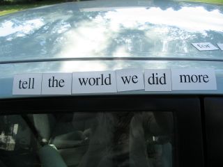
[tell the world we did more]

[recall rust goes through sad hair]

[he drinks & i run]

[have sizzle in the world]

[worship skin and sizzle fire]

[man wants woman but she wants creatures of the night]
that last one has probably been our longest and most complete sentence so far. click on the image to see it larger.
posted by gl. | permalink | categories: trixie
January 19, 2007
artist's way virtual open studio review
by gl. at 1:37 am
i cancelled the usual collage event because yesterday i was worried that the ice at the bottom of the hill would be unsafe. but it was our first open studio of the new year, and i didn't want to start it with NOT making art, so i decided to try a virtual open studio instead.
i am pleased to say i think it was a smashing success! we had twice as many participants as the studio can normally hold, and we reached people who are usually unable to attend studio events. i told them they didn't have to limit themselves to collage (but that they should make a collage if they wanted or if they were spending too much time thinking about what art they should be working on). it was fun to keep the momentum up the whole day. i asked them to send a picture after they were done, which most of them did. i couldn't believe the range of contributions!
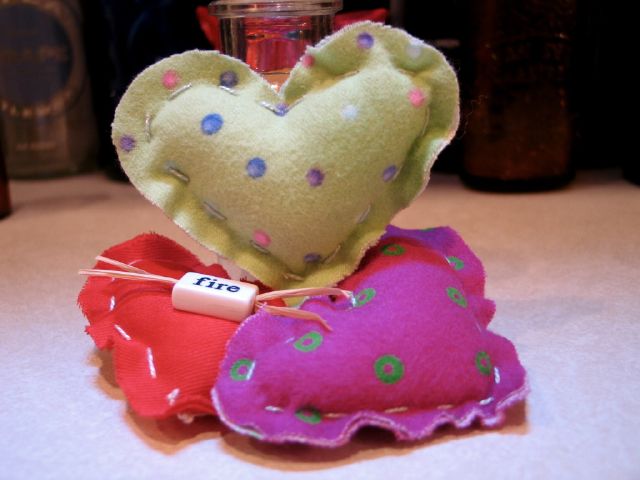
[3 of hearts: click the image to see the other amazing pieces]
for instance, these are three small stuffed hearts about the size of my palm. i have no idea what sort of fabrics these are, but i've been saving them forever because they are soft & pretty. the red heart has a poetry bead sewn onto it w/ raffia: once i can start adding words to things, my kung fu will be unstoppable! bridget mentioned i could use iron-on transfers, and i'm thinking about the gocco fabric kit. yeee!
this looks small, but you have no idea how much this tickles me. toby primarily made this possible, but i was also inspired by seeing some charming felt-based hearts with rustic stitching a while back. i would never have actually tried them had it not been for my success w/ toby, though. i have discovered if i can sew with a blunt tapestry needle with a wide eye, that solves many of my prior grudges against sewing. i may never get anything delicate & elaborate out of this arrangement, but i can make cute things now, which is not something i ever expected to do. hoorah!
posted by gl. | permalink | categories: artist's way
January 18, 2007
zigzag's "discover your calling"
by gl. at 12:29 am
despite the instructor oversleeping and an icy hill that proved difficult to scale, the "discover your calling" workshop went extremely well. it was the perfect workshop to start the new year and zigzag said this was the best group she had ever worked with. the biggest annoyance was probably that the clippies didn't want to work on the freshly painted walls.
this was the longest (and therefore the most expensive) workshop we've offered, but i wanted to push that boundary a little, and i wanted to make sure everyone had an opportunity to do art, so zigzag asked them to create a thematic collage at the end.
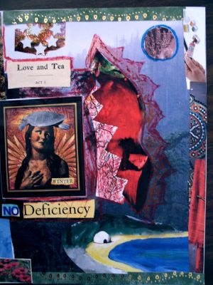
[one of the collages from the workshop]
i wasn't present at most of this workshop again, but i'm getting better at the sequencing. i welcome people at the beginning and chat, i introduce myself and the studio and the proposed sequence of events. if the workshop is long, i come in at lunch to refill the almonds, apples & cheese, add olives & truffles, and ask if anyone needs anything. at the end i take pictures and collect evaluations and payments. the timing is never perfect because nobody runs on an exact schedule, but i am pretty good at remaining unobtrusive when i need to be. i still can't entirely relax when i hear a workshop happening on the other side of the wall.
i'm very excited about the february workshop! not only does it feature a fabulous friend, it was created to fulfill a wish for a participant. so be careful what you wish for: i have the means to make it come true! :)
posted by gl. | permalink | categories: classes & workshops
January 17, 2007
snow angel
by gl. at 6:20 pm
i had forgotten i've written about toby before, so i can write about what toby did during our snow day yesterday:
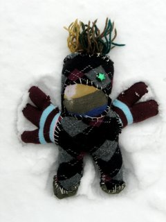
[toby flaps his arms & legs]
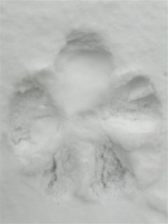
[toby gets up carefully]
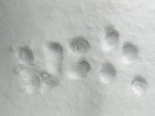
[toby runs inside to get warm]
posted by gl. | permalink | categories: miscellany, toby
January 16, 2007
product review: mini cut-off saws
by sven at 8:00 am
For making armatures, a mini cut-off saw is just about indispensable. It cuts through small brass or steel rod (or bars) quickly and cleanly. It's much, much faster than using a hacksaw. And the cuts are so clean, you don't even need to sand the rods' ends.
I've seen the following two models in use at two different animation studios, and have now had a chance to try out both.
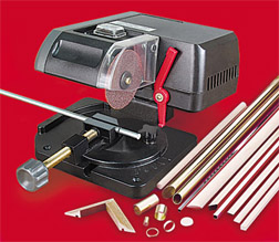
The Micro-Mark model costs $139.95, and can only be purchased online. The Harbor Freight model costs $23.99 -- and if there's a Harbor Freight store near you, you just can walk in and buy it in person.
I'm certain that I need one of these for my metalworking. Given cost and convenience difference between the two, I decided that I could risk buying the Harbor Freight model. If it didn't work out, it's not too big of a loss -- and if it did work out, the savings would be significant.
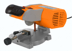
The Micro-Mark costs almost six times more than the Harbor Freight -- YOUCH! -- but it is also hands-down the better machine. I'll be ordering one soon.
What's the big difference? With the Harbor Freight cut-off saw, you can only get radial saws with teeth. When I was testing it, the the saw repeatedly got stuck on what it was cutting. Binding up is unacceptable (and rather frightening) behavior.
The Micro-Mark, by contrast, uses abrasive wheels. Instead of using teeth to make its cut, an abrasive wheel grinds material away. So there's basically no way for it to get stuck.
The Harbor Freight model -- while being a hideous color -- has a slightly better form factor. It has a convenient handle. And the safety latch is released with the press of a button, rather than that peculiar little lever.
...If only Harbor Freight made abrasive wheels for their tool, it'd easily be the better machine.
posted by sven | permalink | categories: stopmo
January 15, 2007
casting a resin head
by sven at 8:00 am
Friday was a "stopmo play day"... I put the newly renovated studio to good use, exploring mold-making and casting.
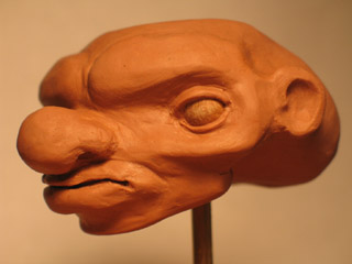
Back in early December, I had a spare hour or two after helping Gretchin with prep for one of her holiday sales. So I pulled out some "Chavant NSP - Medium, Brown" and sculpted this head.
I cleaned it up just a little bit on Friday, smoothing the surface with Brylcreem and a paint brush.
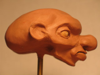
Here's some of what was going through my mind:
Just before Thanksgiving I had a little breakthrough, some insights about character design. Working in my sketchbook, I made rows of circles -- each one a blank face -- and then tried varying the facial features systematically.
Do I like big, medium, or small eyes the best? Do I like the eyes to be close to the nose, centered, or out toward the ears? Do I like the eyes to be high on the head, in the middle, or down around the jaw? ...Pages of variations like this gave me a much better sense of what sorts of characters I want to be creating.
This head was attempt to take some of those sketches into the third dimension.
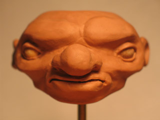
Also, during the past month or so, I've been putting some energy into studying anatomy. I learned a good deal when I was taking that sculpture class with Kim Graham last summer. I've now picked up some anatomy books, and have been making practice sketches of skulls and skeletons. I figure, the more anatomy you can put into a sculpt, the more realistic/plausible-looking your result will be.
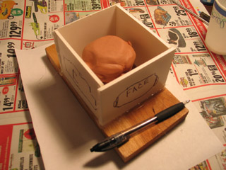
The head was sculpted without an armature. For the sake of making a mold, I put it on a piece of 3/16" brass rod, and fixed that into a piece of wood.
To make a mold box, I cut out pieces of foamcore and used hot glue to seal the edges together.
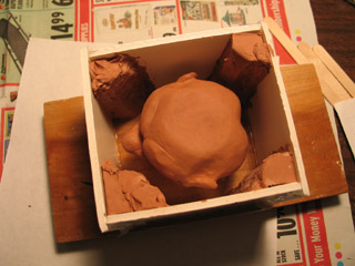
For this one-day project, I wanted to get my hands dirty -- and not get stuck over-thinking it. I knew at the outset that this might mean some significant screw-ups. But oftentimes getting a feel for mistakes gives you an even better grasp of how to do things right later on. So, I was prepared to see how things would go wrong.
Case in point: When I opened up my container of silicone base, I didn't have as much left as I'd remembered. I hastily put some wedges of clay into the mold box to take up space -- just hoping that I'd have enough silicone for the mold then.
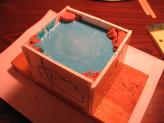
I'm using silicone from TAP Plastics. Why TAP? Because they have a storefront in town where I can browse, instead of having to buy online.
It took two batches of silicone to fill the box. The first was just silicone base plus the quick cure catalyst (6-8 hour demold time). I thought I'd try the trick where you make a hole in a paper cup and drizzle the silicone into your mold -- the idea being that the string of silicone will break up bubbles. The silicone was so viscous, though, it didn't really want to cooperate. It didn't really even want to fall out of the hole.
So, for my second batch, I mixed in 10% silicone thinner (which also functions as a filler). This poured a good deal more easily -- but at this point I forgot to try the hole-in-the-cup trick.
The silicone just barely managed to cover the head.
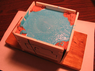
Silicone cures via a chemical reaction between the base and the catalyst. As such, it can be speeded up by adding heat. I've tried this with good results using DragonSkin. I decided to try it with the TAP silicone.
This one of those mistakes I alluded to earlier...
I put the mold in the oven on an old pizza pan. [We've dedicated the oven in the studio kitchen to chemical play.] The oven only goes as down to 170 degrees, so I had to prop open the door to take it lower. You can cure DragonSkin in 30 minutes at 150 degrees. I was indecisive and varied the temperature between 130 and 150 degrees during the baking period.
I left the mold in the oven for 2 hrs 15min -- and probably could have taken it out sooner. When I retrieved it, I discovered that the hot glue had melted and the mold walls had popped open. The clay space-fillers looked nearly liquified. ...And yet, the silicone mold itself seemed pretty OK.
[The top has a slight tackiness to it -- which I attribute to the silicone thinner. The sides are properly dry.]
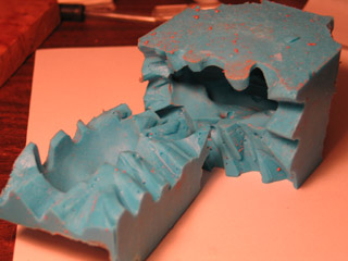
When you make a puppet body out of DragonSkin silicone, you're baking the silicone inside of a plaster mold. Nothing's going to melt. ...So, while I proved to myself that I could successfully speed up the curing time of a silicone mold by adding heat, I also discovered that this is inappropriate when your original is made out of oil-based clay and your mold box is made of materials that melt at low temperatures.
Surprisingly, the silicone took a pretty good impression -- even with the clay liquifying. However, because the clay head got melty, it left a lot of residue on the interior of the mold. I cleaned it out with an old paint brush and isopropyl alcohol -- but I still couldn't get every fleck.
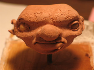
The original clay head was demolished because I put it into the oven. Next time, I think I'll put it in the refrigerator or freezer before pouring the silicone, and then just let the silicone cure at room temperature overnight.
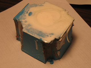
OK, now that the mold is made, it's time to make a casting.
I used TAP Quik-Cast Polyurethane Casting Resin, and mixed in microspheres to make the casting more lightweight. The pour hole is where the brass rod used to be; I enlarged it into a funnel with an X-Acto blade.
In terms of gooeyness, silicone is like slightly liquified peanut butter. Simply dreadful. Resin, on the other hand, pours very easily. It went through the pour hole without incident.
However, I didn't bother to drill a hole in the mold for air to vent out of -- so I did have to awkardly tip the mold around a lot, trying to get bubbles to come out.
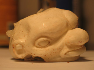
Despite all the mistakes I made, I got a surprisingly good casting out of this mold.
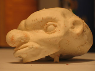
Because the silicone wasn't properly degassed, there were a lot of bubbles in the mold. The resin faithfully reproduced these bubbles in the casting.
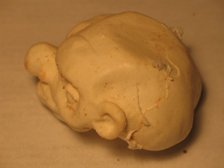
When I cut open the cured silicone, I tried to use a jeweler's cut -- making a zig-zag cut with an X-Acto blade. I was a little disappointed with the results. I got quite a bit of flashing along the split-line -- particularly at the top, where the silicone was too thin.
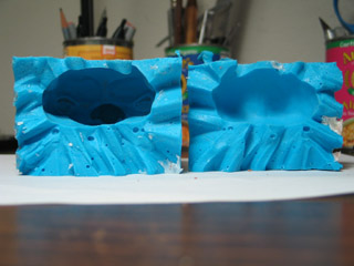
The resin seems to have cleaned out the remnants of clay left inside the mold. So, I've got a half-decent mold to play around with some more now.
I'm thinking that I want to try a hollow casting. I've seen this done in puppet animation to get a very lightweight head.
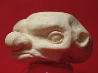
I'm also considering adding a venting hole in the chin. When I'm pouring resin, the chin is the highest point inside of the mold, and a big air bubble gets trapped there.
I didn't realize it immediately, but the casting actually came out with a hollow chin. As everything cooled off, the chin kinda shrivelled up. Now it looks like the head doesn't have a jaw at all.
Oh well. Plenty learned.
posted by sven | permalink | categories: sculpture, stopmo
January 14, 2007
new floor in sven's lab
by sven at 5:52 pm
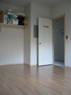
On Wednesday, Jan. 10, I got new flooring in my studio room ("the lab"). It's a laminate, Wilsonart, "natural anagre" pattern. My contractor advised that Wilsonart is one of the hardest laminates -- which is important, since I don't want metal chips to scratch it up too immediately...
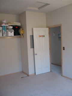
Carpet just made no sense in this room. With paint and clay and metal-working going on? Nuh-uh.
I had hoped that the carpet could get reused after being torn out, but apparently The Rebuilding Center has stopped taking carpet donations. They pointed me toward the East County Recycling Center, which does recycle the stuff. I hate the idea of just throwing all that carpet away... It was worth $24 to me to have a clean(er) conscience.
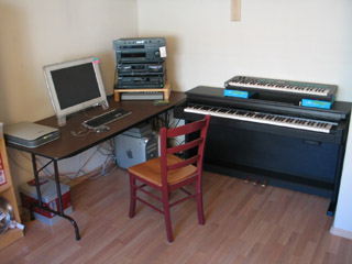
In the nook where I recently had the closet torn out, I've now got the workhorse computer and the electric piano set up.
(Um, btw, I'm cheating a little with these photos. I'm showing you what the room looked like after I got the major elements back in... But before I brought most of the clutter back.)
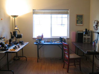
Here's what you can see of the rest of the room when you're standing at the computer: the metalworking station (left), the soldering/brazing station (center), the drawing/sculpting station (right).
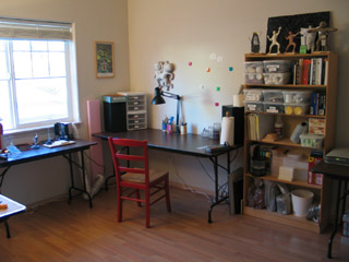
I didn't foresee that the bookshelf could fit between the drawing table and the computer -- but it seems to work out fairly nicely there.
On the right hand side of the table, you can (just barely) see a power-strip. Let me tell ya: it's really sweet to have it there on the desktop, so you can just plug electric tools in whenever you need -- without having to crawl around underneath, on the floor.
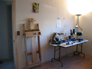
This side of the room is where the most work remains to be done. That's a 5 foot table, and it's too small for the tools I need there. I just yestereday picked up an 8 foot table that ought to solve the problem.
The final renovation project, I believe, will be putting some bracket shelves up on this wall. I make so many 3D objects now, and have no good place to keep them. Shelving all the way up to the ceiling ought to do the trick. No clear plan about how and when to proceed on this yet, though.
posted by sven | permalink | categories: studio space
January 13, 2007
unhook the stars
by gl. at 2:36 pm
a short story:
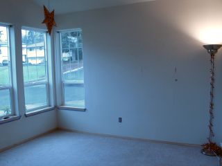
[before]
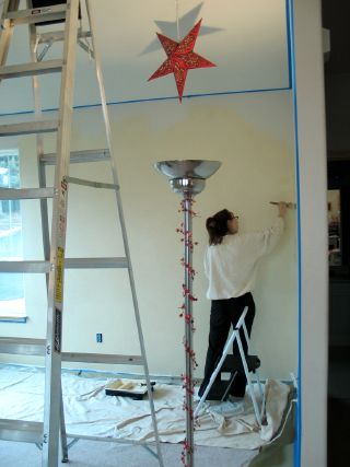
[during]
[after]
[stars!]
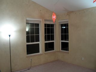
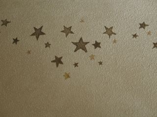
i had this done last month! consider this to be an unabashed plug for fine line painting, who took my only instructions ("sort of like charles vess") and made them magical & real. as fine line describes it in their portfolio, "A parchment faux finish and antiqued star trail add subtle whimsy to this artist studio." madeleine is amazing: professional, talented, hard-working, responsive & kind. i'm convinced she can do anything you asked her to do!
i had wanted to paint the main meeting room for quite some time, but i was too afraid (and don't have enough patience) to do it myself. the result is warmer & has more character than our white rental walls did. i love that the hanging star lamps now have some context (and some friends!). it looks even better with the furniture back in place. :)
posted by gl. | permalink | categories: studio space
January 10, 2007
star wars @ omsi: easter eggs!
by sven at 8:00 am
More about the recent Star Wars exhibit at OMSI...
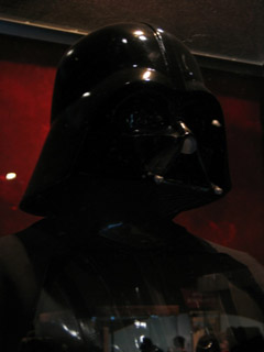
While at the exhibit, it occurred to me to check on a couple of things that I've always wondered about...
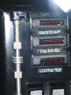
What's on Darth Vader's chest plate? Looks like Hebrew to me!
1/10 Update: I've run this by a Jewish friend who confirms it's Hebrew, and who's passing the photo on to folks who may be able to translate it for us!!
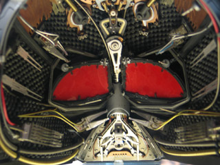
This was the helmet used in Revenge of the Sith...
I spit on the floor! We speak of it no more!
...Ahem. Even so, I was curious to see the insides up close.
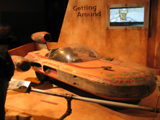
How did the sand speeder hover?
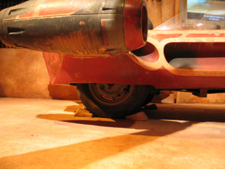
The speeder was built on the frame of an English 3-wheeled car. In the actual film there's a mirror set at a 45 degree angle toward the ground that covered all this up.
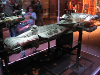
Lore has it that when the model makers at ILM built the Rebel Blockade Runner, they put a miniature poster of a "pin-up girl" in the control room. You can't see it on film...
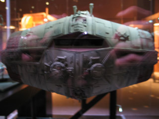
And you couldn't see it in the exhibit, either, given how the model was lit.
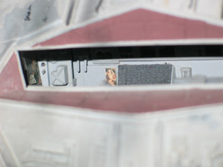
...But I had a thought: when my camera focuses in a dark room, it projects a little beam of light in order to gauge distances. I tried it out -- and sure enough! So I shot this photo with a flash.
Notice, also, on the left-hand wall a tiny Star Wars poster.
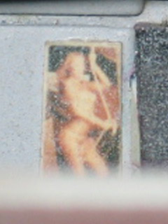
And, just because -- if you're like me -- you've always wondered... Here it is in close-up: the Rebel Blockade Runner "pin-up girl".
This concludes our virtual tour of the OMSI Star Wars exhibit. Thank you -- and please come again!
posted by sven | permalink | categories: exhibits & events
January 9, 2007
star wars @ omsi: spaceships
by sven at 8:00 am
More about the recent Star Wars exhibit at OMSI...
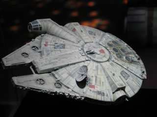
The amazing thing about the model spaceships I saw is that their detail looks good whether you're standing four feet away -- or four inches away. Many of the models weighed 70 pounds, 100 pounds, or more. Moving them could require several people helping.
The Millenium Falcon you see above was a special exception. It could fit in the palm of your hand. It was used for just one shot: the one where the Falcon is clinging to the back of a Star Destroyer in The Empire Strikes Back. It's a gorgeous piece of craftsmanship -- and I have absolutely no idea how it was constructed.
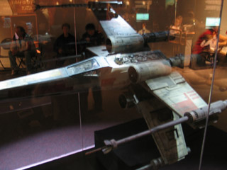
This X-wing is four feet long. The story goes that some of the crew were making it in their spare time... But the higher-ups heard about it, and then it got used in the film.
How do I know this stuff? The book Sculpting A Galaxy: Inside the Star Wars Model Shop was just released in November. It has a wealth of info and photos that haven't been available before. ...Uh, that and the fact that I'm a geek who's been soaking up details about Star Wars' special effects all my life.
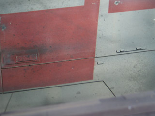
While at the exhibit, I became fascinated with trying to figure out how the surface textures of the spaceships were created. I'm pretty sure that what we're looking at here is just some spare bits of sheet styrene that have been glued on, and a good airbrush paint job.
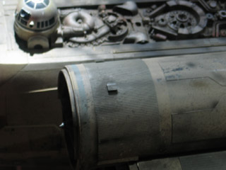
See that striated strip on the engine? That's also sheet styrene. I feel sure that I've seen patterned styrene like that at model railroad supply stores.
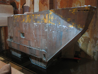
I believe this is the sandcrawler model that was made specially for the 1997 re-release of A New Hope...
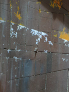
For this scale, rectangles and trapezoids of sheet styrene were cut out, then glued onto MDF. There are actual spaces between the pieces of styrene, to accentuate that "sheet metal welded together" feel.
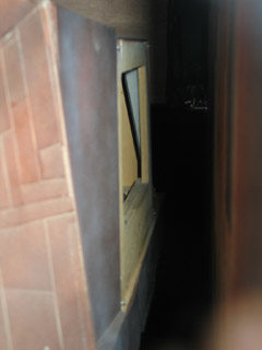
You're not supposed to be interested in the backside of the model... But I strained to get a good look. The frame for the sandcrawler is definitely MDF -- medium density fiberboard.
It's so exciting to see materials that I recognize!
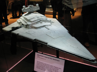
Of all the spaceships that were on display, the Star Destroyer is the one that is supposed to be the largest (relatively speaking) in the Star Wars universe. In real life, it was maybe a little over three feet long. However, the original Millenium Falcon model from A New Hope was by far the largest model exhibited. It was more like four feet in diameter. And it would take at least four people to lift it.
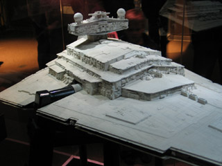
All of the large spaceship models were supported by big metal tubes (3" diameter?). These tubes are welded onto wheeled carts, so people setting up the Star Wars exhibit can move them around more easily.
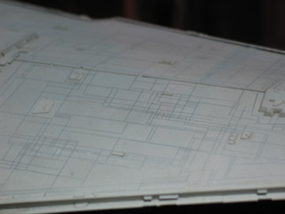
In essence, the star destroyer has the same "sheets of metal welded together" look that the sandcrawler has. However, the scale is different. The Star Destroyer is supposed to be around a mile long. So rather than cut out pieces of sheet styrene, it looks to me like the surface is one single sheet -- which has simply been scribed with an X-Acto blade.
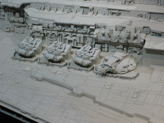
How did the model makers create all that amazing detail? "Kitbashing." They'd take hundreds of pre-made model kits, and use little bits and pieces in unrecognizable configurations.
The spheres on top of the control tower? I have a hunch that they're faceted plastic "crystals" that you use to make rainbows, which have been spray painted over.
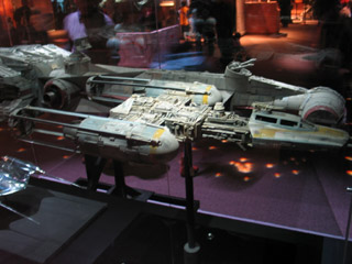
Talking about the exhibit with a friend, he asked me how good the kitbashing actually was. Could I recognize little bits and pieces as being from other things?
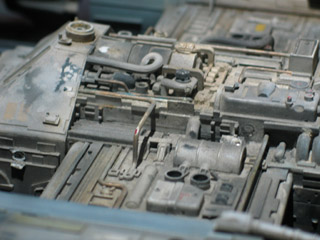
Nope! It was truly amazing. The only bit I ever recognized as being something, um, recognizable... was on the Y-wing. There's that little bit that was clearly a oil canister of some sort in its previous life.
This photo's also interesting because you can see a lot of rod -- most likely brass -- that's been carefully bent at right angles. You can probably do that with just a pair of pliers. I think there's also a tool available via Micro-Mark that helps you do that.
[to be continued]
posted by sven | permalink | categories: exhibits & events
January 8, 2007
star wars @ omsi: phil tippett - stopmo god
by sven at 8:42 pm

OMSI -- the Oregon Museum of Science and Industry -- just ended an exhibit of props from Star Wars. I managed to squeeze in a visit at the last minute, on Dec. 29.
Thanks to Linda Womack, encaustic artist extraordinaire, for reminding me about this! I'd been meaning to go for months -- but the xmas crunch had completely wiped my memory banks...
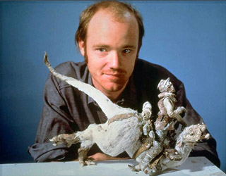
A huge thrill for me was getting to see some of the puppets that Phil Tippett animated. Among stopmoes, Tippett is widely viewed as the heir apparent for Ray Harryhausen's crown as greatest living puppet animator. ...Well, at least that was the case until Jurassic Park decapitated the tradition of photo-realistic stopmo monsters interacting with live actors.
Tippett's style has sometimes been referred to as "hyper-Harryhausen." He helped pioneer innovations such as go-motion, where tiny stepper motors move the puppet a little while the camera takes a shot, adding a more realistic motion-blur to the photo. He has his own company now, and remains one of the kingpins of the special effects industry.
[Incidentally: Marc Spess has a photo gallery with shots of Tippett and his works that I recommend. Also, Mike Brent has a collection of video clips to go see.]
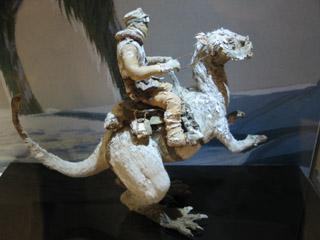
Phil was the animator who put life into the taun-taun in The Empire Strikes Back. My understanding is that he also did of much of the work constructing the puppet, too.
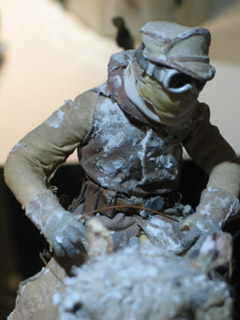
The taun-taun puppet can't be more than 18" tall -- but the detail is phenomenal. Everything about the Luke puppet looks properly in scale, including the texture of the fabric. ...I've no idea what they used to make that fake snow.
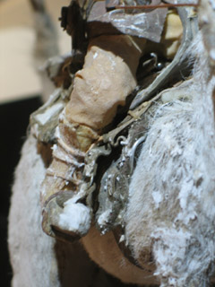
Look carefully at the edge of the saddle. You can see a little bit of 1/16" aluminum wire poking out. That gave me a thrill: to see a material that stopmoes use now, there in the taun-taun.
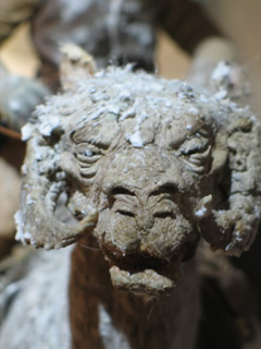
The taun-taun's face has amazing texture. The skin is pockmarked and pitted. I have to guess that we're looking at cast foam latex there.
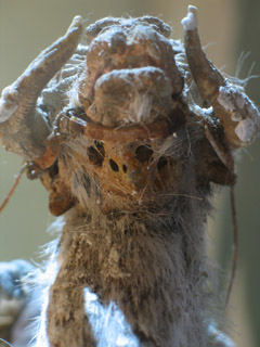
Underneath the taun-taun's head, you can see some decay in the puppet. It looks to me like rotting latex... But I'm not familiar enough with foam latex to say whether it was originally foam, or if it was liquid latex there.
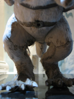
Here you can see that there was a little taxidermy going on. The animal pelt's seams are hidden on the insides of the legs.
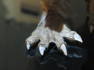
The feet look eerily real. Like they were cut off a real animal, dried, and sutured on. I'm sure that's not actually the case...
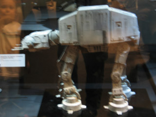
Phil also animated the AT-AT ("All Terrain Armored Transport") walkers in The Empire Strikes Back.
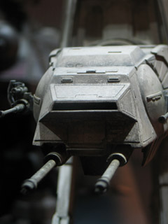
For me, part of the excitement with the AT-AT walker was trying to figure out how its armature was constructed. Tom St. Armand -- another god of stopmo -- built the armatures here.
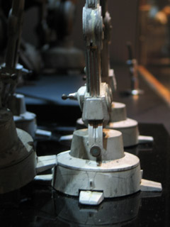
On the insides of the ankles, there were little... handles? I've never noticed these in photographs before. My best guess is that they helped give the animator a good place to grab the puppet. However, they might also be spring-loaded -- releasing tension on the feet joints so they can be re-positioned.
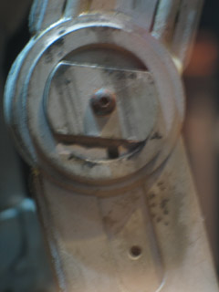
Ah-ha! As I looked closely at the AT-AT walker, I began to notice hexagonal holes here and there. That's where you insert a hex key to tighten a joint. Screws with hexagonal sockets are generally preferred to slotted or philips head screws -- no risk of stripping the screw.
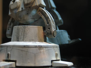
I was absolutely fascinated by the AT-AT's feet. See that half-circle of metal that forms the walker's ankle? I'm certain that's a piece of milled aluminum. You can see a slot in its center that allows it to rotate, and then be fixed in place with the tightening of a screw. In some of the other pictures you can see that there's a slit in the side, too, also for tensioning purposes.
[to be continued]
posted by sven | permalink | categories: exhibits & events, stopmo
January 7, 2007
2006: my first year in stopmo
by sven at 11:50 pm
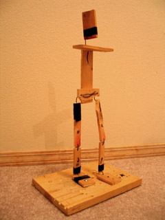
I mark my entry into stopmo puppet animation from December 7, 2005.
I was taking a class in Super8 filmmaking. I'd worked in digital animation before, but really wanted to get the experience of cutting actual celluloid. The class' final project was my opportunity to live out a childhood fantasy: using a remote shutter release cord to snap off shots of KONG, one frame at a time...
On Dec. 7 I threw together the wholly unsatisfactory armature you see above. And I thought to myself: "Huh. I wonder if there's maybe anything on the internet that could help?"
That night I discovered StopMotionAnimation.com -- and everything changed. I've been possessed by a blinding fever to learn this artform, puppet animation. Now, here we are, exactly 13 months later. Time for a progress check.
[Yeah, I would like to have written this post a month ago... But -- oy! -- December!?]
1. armatures
Of all the skills involved in making an animated film, this has really been the year of learning how to make armatures. Prior to February, I'd never cut metal before! Now I'm working with a mill and lathe, and using a torch to solder ("braze") things together at temperatures up to 5300 degrees Fahrenheit.
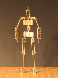
I've made six ball-jointed armatures. Three at home using brass and steel, three at Bent Image Lab using stainless steel.
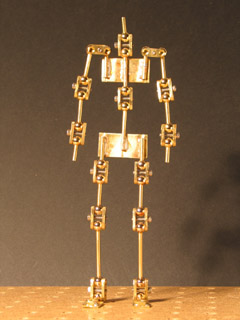
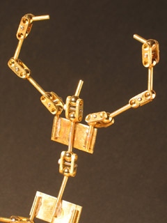
For my first armature, I made a big batch of generic joints, which allowed me to get a feel for proportions. "The Ambassature" made a trip down to California, so Shelley Noble could try giving a ball-jointed armature a test drive.
[Note: The elbows and knees aren't double-jointed. For each of those joints, I used solder to freeze one ball in place.]
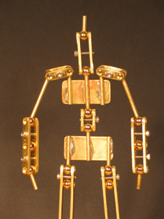
For the second armature, I used lead-free solder and made long sandwich plates with individualized proportions. The revised design feels more streamlined and intuitive in an animator's hands.
I wrote up a massive step-by-step tutorial on how to build one of these. Anthony Scott accepted it for inclusion in the StopMotionAnimation.com handbook -- but then he got hired to work on Coraline, and hasn't had time to get it up online.
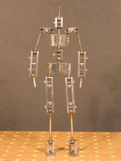
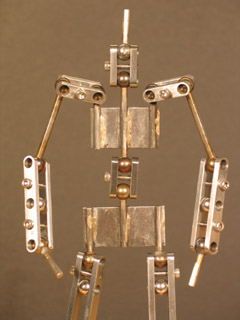
The man of steel duplicates the physical dimensions of the Ambassador II -- but working with steel is nothing like working with brass, and it required a completely different approach. This was my first big project using a mill and lathe.
Irritatingly, after finishing this project, I discovered a design flaw: the arms can't raise up from neutral to a "zombie sleepwalker" position without the shoulder joints getting in the way. An easy fix is to make a bend in the upper arm rod.

On the merit of the previous three armatures, I got a job at Bent Image Lab doing armatures for a music video where Regis Philbin sings "Rudolph the Red-Nosed Reindeer." I'd studied armature design enough so that I was pretty well prepared... But I did have some trouble with soldering flat surfaces to flat surfaces that took me a while to figure out.

As I understand it, Gelman is Regis Philbin's producer. My fifth ball-jointed armature was for a puppet of him. [And just to be clear: I only made the armatures inside these puppets -- not their exteriors.]
The Regis and Rudolph clip showed on national TV on Nov. 16, on the Live with Regis and Kelley show.
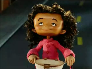
I made my sixth and final armature of the year as part of the same contract at Bent, for the little girl character in a music video of the song "Dirty Laundry" by Bitter:Sweet. This was the most sophisticated of all: with jointed feet, and a mere 6 5/8" tall. Additionally, time constraints meant that the sculpt and the armature had to be being made concurrently -- so I was responsible for drawing up a master blueprint that would be adhered to by everyone involved.
2. puppets
With my focus on learning armature building, there were surprisingly few puppets that I took to actual completion.
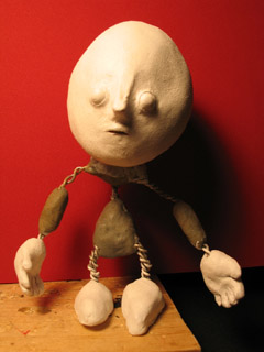
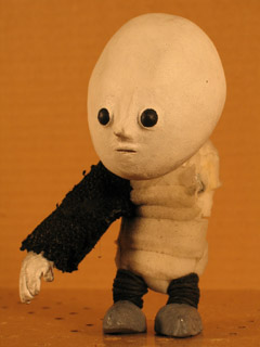
Poor Moon Baby -- my first attempt at a wire armature puppet -- broke before he was even completed. The first mistake was using foam insulation tape for musculature. The wire wasn't strong enough to force the bulk into a pose; it would all immediately spring back into neutral. I tried to cut seams into the foam... Mistake number two. That's probably when I nicked the wire, spelling doom for the poor babe.
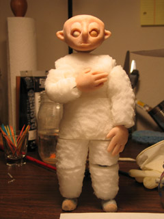
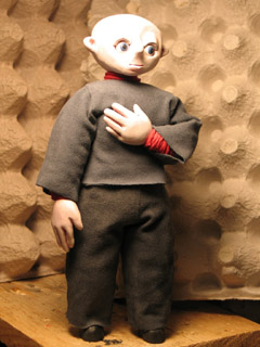
Percy 5 was begun February 5th and finished March 5th. This time I used spray adhesive and sandwiched the wire armature between thick blocks of cushion foam, which I then whittled into shape with cuticle scizzors. Paranoid about the armature's ability to hold a pose, I left big gaps between the blocks of foam... Consequently, when Percy bends over, his shirt lifts up and you can see his metal spine.
I did a few animation tests with this puppet -- but I was really frustrated by how difficult he was to work with. This is what spurred me to dive into making ball-jointed armatures.
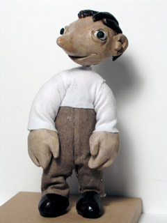
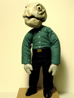
Almost seven months later, after having done the six ball-jointed armatures, I returned to wire armature puppets. For Jimmy and Dad, I cut long strips of 1/2" thick foam and wrapped them mummy-style. Then, I covered the foam with a layer of athletic underwrap. Much to my relief, this strategy for musculature -- at last -- worked very well.
3. films
I got three short films done this year -- only one of which is true puppet animation.

I put Do You Like Me? online a year ago today. The characters were just blocks with faces -- but it has a story and runs 1min 20sec. I'm still fond of this one...
Explorations in Super8 was the final project for my class in Super8 Filmmaking at Radius Studio. I spent countless hours trying to come up with a story idea that would utilize Moon Baby and/or similar puppets. Ultimately though, I decided to give up on that and instead do a storyless sampler of different animation techniques: sand on glass, paint on glass, shadow puppets, digital animation transfered to analog...
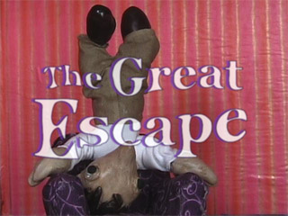
I finished The Great Escape on Dec. 31, just in time for the "stopmo haiku challenge" deadline at StopMoShorts.com. For this project I intentionally worked "quick and dirty" -- taking the story all the way from concept to completion, rather than getting hung up on getting any one part of the process "perfect."
When I watch this one, I see room for improvement in just about every area... But I'm very proud of it, and see a lot of life shining through the rough-hewn pups and their animation.
4. work
This year I did paid work in animation for the first time.
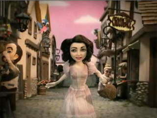
Back in July, the amazing photographer Grace Weston (a friend of Gretchin's via Job Club for Creatives) recommended me to Bent Image Lab. Thank you Grace! Because of her, I got a job casting cobblestone tiles out of hydrocal for the Lux soap commercial. And thus I was "in the door."

When that first job was done, I made sure to give photos to my producer to distribute -- so all of the producers at Bent would know the breadth of what I can do. At the end of September I got a call about maybe doing some armature work. I brought Percy and my three ball-jointed armatures to the interview, displayed in a "The Evolution of Man" tableau. And I got the job!
The first task they gave me was to build an armature for... (gulp!) ...a Regis Philbin puppet. Then they had me do a Gelman armature. They hired a second person to do the Trump and Kelley armatures. Luckily for me, I'd had a chance to study armature maps from previous puppets built at Bent -- because there was no one on site who could train me. Trial by fire!
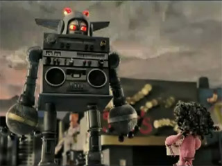
As part of that same contract, I got the job of making the armature for the little girl puppet in the "Dirty Laundry" music video. Very proud of the work I did on her. The director was really pleased with my work, too; it sounds like he wants me onboard for the next project he gets. Yay!
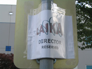
Another fantastic photographer friend of Gretchin's, Serena Davidson, got hired to take portraits at Laika on the Coraline shoot. Knowing my interest in Coraline, she invited me to be her assistant. Thank you Serena! On Dec. 13 and 14 I got to play sherpa, carrying around Serena's equipment... And boring into every detail of the Coraline shoot with my hungry eyes. I got to meet Henry Selick and Neil Gaiman (with whom I discussed my niece -- he's very fond of her). I got to see sculpts and puppets and costumes and sets.
It was a wish come true, just to get a glimpse inside of Coraline as it's being made.
5. thanks...
To quote Julia Cameron, "Creativity flourishes in a place of safety and acceptance. ... Creativity grows among friends, withers among enemies." And so, I'd just like to say:
Thank you to Anthony Scott, Marc Spess, Lionel Orozco, Nick Hilligoss, Eric Scott, Jason Gottlieb, and Mike Brent for your roles in creating and leading the online stopmo community!
Thank you to Grace Weston for getting me into Bent!
Thank you to Serena Davidson for giving me the chance to peek into Laika!
Thank you to stopmo buddies Alejo Accini, Mike Brent, Mark Fullerton, Grant Goans, Michael Granberry, Shelley Noble, and Jeffrey Roche for the constant support and encouragement!
And most of all, thank you Gretchin -- for connecting me with Grace and Serena, for being a fantastic artistic advocate and studio partner, for supporting me in my every ambition (and every obsession). "The greatest recognition I could ever receive is your love."
posted by sven | permalink | categories: stopmo
January 4, 2007
artist's way guided intent (january)
by gl. at 4:58 pm
an excellent group last night at the studio, and only one person didn't show! that was such a relief! we had four writing rounds where i asked them to pick from a pile of old photos vicki lind gave me for an artistic purpose. they picked a different photo for each round:
- stream of consciousness (good intro to the morning pages style)
- write as if you're the one taking the picture
- write as if...
- you miss them
- they've made you angry
- you're grateful
- they're sick & you don't know if they'll make it
- write about the relationship between the people in the photo
sometimes i know what the theme, the date & the basic activity for a guided intent is going to be, but i don't really know how it will happen in practice. since people pay for the guided intents and i'm terrible at improv, i can't just "wing it," but sometimes it takes me a while to figure out how i'm really going to run the event.
for this event, that process worked out pretty well. i finally sat down yesterday afternoon and worked out how many writing exercises we could fit in and in what order they should occur to maximize the buildup of time, perspective & emotional investment. during the event, when i realized we had a few more minutes at the end, i tried to throw in an extra improv writing activity which didn't make much sense to people, but we worked though it to get to a better idea that i'll use the next time i run this activity ("write as if you're the one taking the picture"). incidentally, this is one of the reasons why people not showing up affects the guided intent: one less person at an event could mean as much as 15 extra minutes at the end of the night.
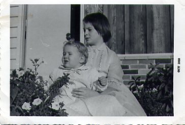
["diane remembers": click the picture to see the other photos]
this is one of the photos that inspired me during the last round. below is an excerpt from that writing. the girls here are cousins: the older one is named diane, the younger one is named megan.
diane is in a lonely place, simultaneously too young for her family and too old for this one. she'll remember carrying megan around carefully, around and around the living room until her arms ached. diane will remember chasing megan up and down the stairs, megan shrieking in delight. diane will remember holding megan in the bright october sunlight for what seemed like hours until everyone got the picture they were looking for. megan won't remember any of it. by the time she sees this photo in an album 30 years from now, she will have lost contact with that entire side of the family. didn't diane get into graphic design? or was she the one who became a born-again christian?
the next open studio is full & i'm slightly hopeful everyone will show up. i've taken to sending personal "don't forget!" messages a week and then a day beforehand to give people the opportunity to bow out if they're going to, still leaving me enough time to find the next person on the waiting list. i implemented a $5 first-time only fee, but i'm really uncomfortable with it and may instead switch to a confirmation request to first-timers: if i don't hear from them by a certain date, i will open their spot to another participant.
the next guided intent is one i've been waiting to announce since the Fabulous End-of-Summer August Art Swap! i'll get to use the featureless fabric dolls claudia brought for our next theme, which is self-protection. i'm feeling more confident about it after making toby!
posted by gl. | permalink | categories: artist's way
January 3, 2007
making of "the great escape"
by sven at 10:25 pm
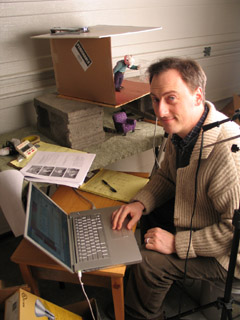
I want to fill in some details about the process of making The Great Escape...
1. the computer
I was using my PowerBook G4 to capture frames... Boy, was I glad to have a laptop in this instance! It was really helpful being able to easily move the computer around, depending upon where the camera and set needed to be.
2. the framegrabber
I used FrameThief as my framegrabber. Just prior to this project I spent a bunch of time play-testing the main framegrabber options for the Mac: FrameThief, AnimAideXT, and iStopMotion. I'd like to write a more in-depth review, but here's the short version...
There are two functions that are absolutely critical for a framegrabber: (1) it has to let you do onion-skinning, and (2) it has to let you check your work against a sound clip. FrameThief is getting a little antiquated, but it's the only one that can do both of these things adequately. AnimAideXT has exciting potential, but was buggy for me when it came to onion-skinning. Boinx's iStopMotion has a great interface and support -- but you have to pay $400 for the pro version if you want to work with sound.
FrameThief did crash on me a few times. However, I remain impressed with this workhorse software: I never lost any data -- all I had to do was re-start the program, and I was back in the game.
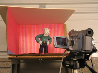
3. the camera
I used a Canon ZR45 DV cam to capture frames. This cam has given me so much grief...
When I was shooting footage for Let Sleeping Gods Lie, it would turn itself off (to conserve power) whenever I kept it on pause for 5 minutes. Since most of the shots took longer than 5min to set up, this was really irritating...
On this project, the horrible realization was that even though I manually set the exposure to 1/60, everytime Jimmy's white shirt came on screen, the picture would darken to compensate -- resulting in awful flicker.
Sin #3: Even though I had a brilliantly colorful set and excellent lighting, the camera sucked a huge amount of color and luminescence out of my shots. In post I did some brute-force color correction by adding saturation and brightness universally -- but I still couldn't get the quality that I had when shooting the photo animatic with my still cam.
Potential solutions: Get a 3CCD DV cam. (Pretty expensive.) Or use the still cam... Which will require an analog-to-digital converter in order to interact with the framegrabber -- and has an expected life-span of 50 to 70 minutes of animation before conking out from over-use.
4. the tripod
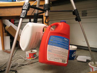
I've been told by several sources that sand is the professional choice for how to weigh down your tripod... Yet, I wasn't sure how to do it in practice. I tried putting the feet of the tripod into yogurt tubs filled with sand. Useless. Filling plastic bottles (with handles) up with sand, and then making wire loops so they could hang from the tripod's hook -- that worked pretty well.
Technically water in those jugs would have worked just as well. But I'm glad that I went to the hardware store and bought some sandbox sand, nonetheless. The thought of those jugs, if filled with water, dropping and cracking open -- well, let's just say that I think sand would do less overall damage.
Even with the sand, though, the head of the camera could still be moved some with a good bump. There's play in the gear that raises and lowers the camera that I don't know how to fix.
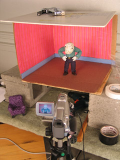
5. the set
The set was constructed from a cardboard box, which I then staple-gunned to a piece of plywood. The plywood sat atop two cinderblocks so I could get at the tie-down screws. The ceiling was a piece of white foamcore that wasn't actually attached -- just weighted down. The wallpaper was gift-wrapping paper, and the carpet was felt.
The cardboard walls worked satisfactorily through most of the film. The only problem came at the end when Jimmy pokes out from behind the painting. At that point, he's actually pushing against the walls and they flex. Next time: Rigid walls made out of hardboard or MDF.
The plywood base is adequately rigid, but splinters when I drill holes for the tie-down screws. MDF -- medium density fiberboard -- would be better. It's made out of glue and fine sawdust, which shouldn't be able to splinter at all.
On a couple of occasions I managed to bump the set and shift it on the cinderblocks. Next go around, I plan to build a proper animating table, like the one Justin Rasch has just made, and which Marc Spess shows you how to build in his eBook Secrets of Clay Animation Revealed.
6. props
I'm fairly happy with the look of the comfy chair, which is just fabric glued over insulation foam, with foamcore feet. However, I made two fundamental mistakes here.
One: The foamcore legs were too squishy, and led to the chair moving around while I was animating. I tried using hot glue and pinning it to the floor -- but to little avail. Next time, furniture needs to use MDF for its frame, and there need to be threaded holes for tie-down screws.
Two: Scale! The room was one scale, the pups were another, and the furniture was a third. This was particularly a problem with the comfy chair, which was supposed to be huge -- but was barely big enough to seat Jimmy. Next time, pick a scale and stick to it!
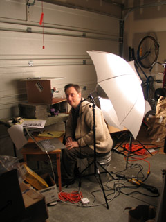
7. lights
I used two 500 watt lamps that I got at a photography supply store, along with umbrellas to diffuse the light. I ran into terrible problems with the lights burning out. I suspect that this had to do with the lights being so hot and the garage being so cold.
The lights get freakishly hot! When one of them burned out, the broken filiment actually burned a pin-sized hole through the glass. With another, the glass of the bulb melted into a bulge!
For the living room set I wanted lots and lots of light -- a bright, saturated, jubilant environent. So the lamps were really necessary. On future projects, though, I'm thinking I'll probably use more colored lights and gobos -- which may mean I need to get some more fresnells and stands.
In the cave set, I'd intended to use xmas lights hidden behind the arches. It proved to be too much trouble. I just went with shining a single light down the tunnel. Less magical -- but oh well.
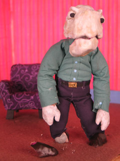
8. puppets
I used Super Sculpey for the heads, hands, and shoes of the puppet. I ran into problems with it cracking. Jimmy's head had a big crack in it from the get-go, and it wasn't firmly attached to the epoxy putty skull. At the very end of the film, Dad's shoe shattered. Little bits of Super Sculpey would flake off around the wrists. Next time, I think I'll be using Magic Sculpt (a fine-grained epoxy putty for artists) for hands and feet; possibly resin for heads.
The most glaring flaw in the puppets' design was in the necks and wrists. Or rather, the lack thereof. One solution would be to wrap these bits in string and then paint them with liquid latex. I've also heard of latex rubber tubing being used for necks -- partly because you can make a hole in the base of the skull that conceals the join.
(Btw: I'd like to tip my hat to Grant Goans -- the idea for Dad's flapping jaw comes directly from his Vitruvius project.)
9. armatures
The sculptor's armature wire (annealed aluminum) didn't break. Huzzah!
Dad was pretty fun to animate; Jimmy was much harder, due to the smaller armature. Note to self: larger wire armatures are easier to articulate.
I keep on making my pups' necks too short. Dad was pretty much neckless; Jimmy was better, but still couldn't lean his head back far enough at one point.
Dad really didn't want to twist in the middle. More wires in his spine would have helped; but given the amount of foam that had to be moved, I'm not really sure how much more a build-up puppet could be improved.
10. costumes
Instead of sewing the costumes, I used Fabri-Tac glue to attach cloth directly to the foam body mass. This seems to have worked out OK on the pants -- but the arms of the shirts tore out of the shoulders.
I'd really like to know a better solution for the shoulders of shirts. I'll probably try hand-sewing the costumes next time. But even then, I know there's a problem with the sleeves and shirt bottom riding up when a pup lifts their arms. Anyone have any ideas here?
I also didn't bother to fold the fabric over when I attached it. It looked fine at first -- but I was getting some fairly serious fraying toward the end of the film, and had to keep cuticle scizzors on set.
11. lipsync
I used Papagayo to do lipsync. Magpie's the industry standard and costs a pretty penny -- whereas Papagayo is free... So I was a bit dubious when I started out. However, while there are some niceties missing, I found Papagayo was very easy to use, and quite satisfactory for my purposes. I strongly recommend giving it try.
A big discovery: It was much easier for me to animate puppets when I was matching movement to dialogue. It made the entire animation process much more managable when knew exactly how many frames I needed for any one shot. But beyond that, I found that my characters' movements were much more motivated when there was speaking. For each word, I thought about what gesture ought to accompany it. I avoided having the words and gestures match up perfectly -- but just working through how the pups' thoughts should be pantomimed really made them more alive.
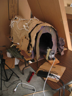
12. trick shots
There were a few useful tricks I utilized to get the shots I wanted.
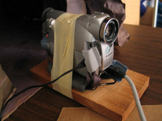
In order to get a point-of-view shot for Jimmy running through the cave tunnel, I made a little wooden sled for the camera... Well, actually, I just picked up a piece of scrap wood and wrapped masking tape around it and the cam. When it got far enough into the cave set, I used a stick to keep pushing it farther in, an inch at a time.
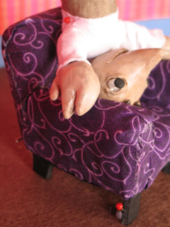
I put screws into Jimmy's feet for tie-downs... But as it turns out, he never stands up in the story! In order to have him not jitter around too much while he was sitting, I stuck pins right through him and into the chair.
(Thanks to Shelley Noble for the pins that I was using!)
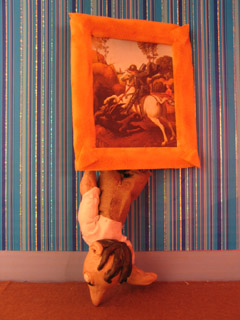
When Jimmy had to get out of the chair, I didn't have any easy way to secure him... So I wound up just holding him in my hand. The same was true for when he pokes out from behind the painting at the end: no way to secure him, so I was holding him in my right hand from behind the set, and setting off the shutter release with my left.
Consequently, when I concluded the shot, the poor boy fell out. Right on his nose.
13. post-production
I started working on this film back in October. But when December rolled around, xmas preparations kept me from getting down to business until the 26th -- at which point I pushed everything else aside in order to get this done. On the 30th/31st I worked for 30 contiguous hours without stop... Possibly the longest single stretch of my life (so far).
Post-production took a surprising 18 hours to complete. What really saved me was that at the outset I made up a master list of fixes, and then worked that list. Keeping copious notes on my thought process as I went, problem-solving one thing at a time. Here's the outline:
- assemble the clips so they sync to the audio track
- fix problem clips
- add/cut shots
- add titles/credits
- edit timing - must be absolutely finalized
- record additional sound, edit the mix
- color correction (if there's time)
- compress
Since I'd assembled the photo animatic in iMovie, I thought it would be easy enough to just replace the still images with my new animation clips. Not so! Because I filmed at 15fps -- but the animatic was 30fps -- iMovie simply wouldn't let me edit my clips to single-frame accuracy. That threw the whole audio sync off, which would have ruined the film. [Yes, even though the dialogue is in mumblephonics.] I tried out a whole bunch of potential work-arounds, but nothing did the job. So I switched to AfterEffects for final assembly -- which treated me much better.
I discovered that I had the heads of pins showing in several shots. I went through and fixed each frame by hand in PhotoShop. ...Actually, this wasn't a bad experience at all. I think I may use this process more in future projects -- particularly for flying and jumping effects.
At 320x240 pixels, the final render of the film was 752.9MB. It took a lot of fooling around, but I finally got it compressed down to a more manageable 6.8MB. The magic was to use the Sorenson3 codec at medium quality, with all options set on auto...
And then for sound, it turned out that the QDesign Music 2 codec was working out better than QualComm PureVoice. My settings were: best / 44.1 / best / 48 kbit. Bad sound just kills me... The sound quality I wound up with is not everything I could wish for, but it's at least tolerable.
Jason Gottlieb's tutorial, How to compress a movie for the web using QuickTime Pro, was once again very helpful. If you haven't seen it already, I strongly recommend it.
[Reminder to self: Rendering the image and the sound out from AfterEffects in two separate passes has consistently worked best. Make it standard practice.]
...
And there you have it! More than you ever wanted to know about the making of my little 2 minute film!
posted by sven | permalink | categories: movies, stopmo
January 2, 2007
meet toby!
by gl. at 11:16 am
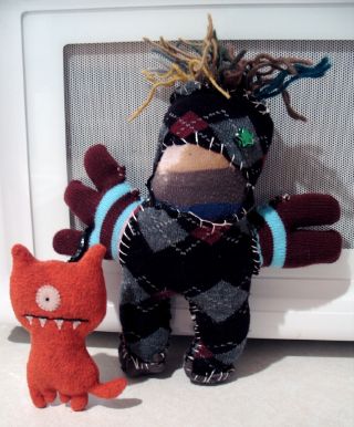
look who i met, i mean, made, monday. it's toby!
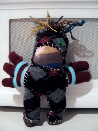
toby has a big mouth and wild gesticulating arms. he's forever shouting in a loud british accent, much like robin leach or gerard manley hopkins (or at least, that's how i pretend to hear gerard manley hopkins' voice in my head). toby comes from a species that has four arms, so he's a freak even among freaks. but he has a heart almost as big as his armspan and he just needs "a little help, please!" to stand upright.
someone in another meetup group invited me to create stupid sock creatures last night. there were a million reasons not to go (not the smallest of which is that i had to create and print 200 artist's way flyers for the next day). but i was curious because when i had saw the original stupid sock creatures site a year or two ago i began saving up my holey socks (which striped socks, especially, develop at an alarming rate). and i have a guided art night next month that will incorporate the fluffy faceless dolls from the art swap, so i wanted to see how someone else ran a fiber art event.
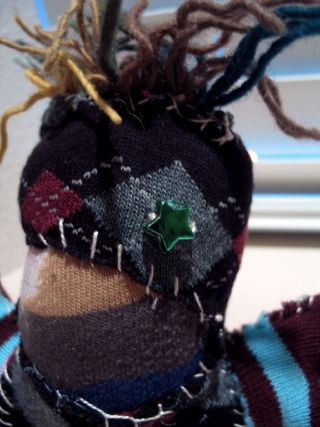
i've never made anything like toby before. i'm not generally good with 3d items and i've never really sewed before. i used an incredibly irregular whipstitch (?), embroidery floss and a blunt tapestry needle.
oh, look, now toby has a friend! toby's already made friends w/ arwen, too.
posted by gl. | permalink | categories: other art, toby
January 1, 2007
the great escape
by sven at 11:59 pm

Happy New Year!
I'm happy... I managed to complete my film on time for the quarterly "stopmo haiku" challenge at StopMoShorts.com! Click on the image above to see it in the context it was intended for...
Or (in case that link stops working at some point in the future) you can watch the film by clicking here. (6.8MB)
My joke du jour: Can we call this an eleventh hour victory if it was only 10:30pm when I got the film done and submitted?
Very proud.
Here's what I wrote about the film for StopMoShorts:
Armature building's been taking all my attention... So I wanted take a step back and do something more holistic. The idea was to embrace "quick and dirty": go all the way through the film-making process and not get hung up on things being perfect.
When brainstorming story ideas, I latched onto "cave" as a tunnel -- maybe a magical tunnel between places. In terms of animation style, I was inspired by Robot Chicken -- intentionally going for "pop" over "smooth."
The pups are standard aluminum wire armatures, wrapped in thin strips of cushion foam, with heads and hands made from Super Sculpey. The eyes are Van Aken plastilina... One of my weirding-outest moments was when an eye fell off and rolled right down into Dad's mouth.
I shot frames with a Canon ZR45 DV cam... Which (curse its metallic soul) insists on auto-adjusting exposure even when I tell it not to. I used FrameThief for my grabber, 15fps. Sound done in GarageBand, final assembly in AfterEffects.
I actually wrote a script, and then translated it into mumblephonics... Perhaps when I get around to releasing the "director's cut" DVD I'll put together a subtitled version.
posted by sven | permalink | categories: exhibits & events, movies, stopmo