you are here [x]: Scarlet Star Studios > the Scarlet Letters > more advice
<< before
ann rogers-williams' "if not now, when? beginning your memoir today"
after >>
a jolly little elf
December 23, 2006
more advice
by gl. at 11:15 pm
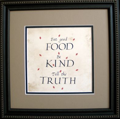
i just completed a housewarming gift for the kindest, most patient client ever. jane saw the "advice" piece i made for shaedra, who was inspired by a piece she saw at jane's house. it's practically a mobius of inspiration, and so jane wanted me to make one for her daughter, who just built a house at lake tahoe.
jane orginally comissioned this piece in june, but she fell off the face of the planet for a while, and then i did, and i finally decided it had to be ready for christmas (and it helped i had a final project due for the mhcc class i've been sporadically attending this term).

[click the image to see detail]
calligraphic exif: about 15 hours; random older paper with a parchment-like texture; speedball C2 & C3 nibs w/ a lot of help from an exacto, repositionable glue stick and a photocopier; sumi ink; basic italic & roman caps; red paper & gold paint-pen.
yep, that's right. a photocopier. words with multiple o's in proximity to each other spell Trouble-with-a-capital-T. "good" was bad enough in italics, but "food" in roman caps right below it was simply dreadful. it's impossible for me to create 4 o's that are reliably consistent. after trying for an hour, and having trouble with some of the other roman caps, i decided to try the photocopy technique again, this time writing each letter till i got one i liked, then adding each individual letter into a coherent composition and photocopying it onto the paper. it took a while, but was much less frustrating than doing & redoing 20,000 pieces. the italics could be done as full words, but each capital is done separately.
another reason for photocopying was because this paper didn't want to accept ink without spreading (argh!). i even tried gum sandarac, the way denis brown taught us. the red diamonds were meant to be ink but couldn't keep sharp edges, so after i tried several different things, sven cut diamonds from a piece of red sparkle paper & then i dotted them in the middle with my favorite gold paint pen. that worked out i think: the paper diamonds give more dimensionality to the piece and and i had more options for trying several different placements.
earlier, i spent over an hour hour trying to work out the right proportions & spacing of the elements, which means a lot of very tedious lining & relining of the page. i finally went back to the house, created three slightly different layouts via adobe illustrator, and put them on the awesome light table we got from freecycle. i used the layouts as guides for my own lettering, which worked great! the fonts are obviously not the same as handwritten calligraphy, but the layout offers good visual parameters for centering, proportion & spacing. it was a trick i picked up for a piece i made for sven's parents years ago.
i hardly ever frame a piece for a client, but this one was so late i didn't want to give her another step before giving it to her daughter, and having the frame really helped me limit the color palette & size. why is the square format so appealing, anyway?
this may be the last calligraphy piece i create for a while. after this i decided i probably wouldn't do any new pieces next year, choosing to spend the year getting the gocco & letterpress (and wordwear) going instead. right after making that decision, i remembered i had signed up for a calligraphy birthday card exhange, and maybe something i cannot refuse will come up, but otherwise, i have no calligraphy commitments next year.
posted by gl. | December 23, 2006 11:15 PM | categories: calligraphy