October 2006 archives
you are here [x]: Scarlet Star Studios > the Scarlet Letters > October 2006
<< before
September 2006
after >>
November 2006
October 31, 2006
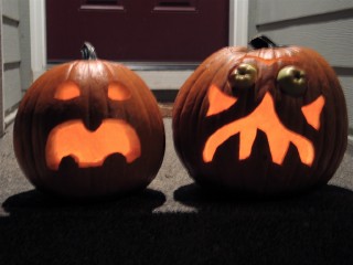
happy halloween from scarlet star studios!
by gl. at 9:38 am
posted by gl. | permalink | categories: miscellany
monster month - 22
by sven at 8:00 am
These are the final sketches for Monster Month 2006. Once again, I'd like to thank my friend Jeffrey Roche for proposing this wonderful event! I've tried to put a little extra oomf into these final critters... Happy Halloween, everyone!
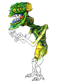
The Disappearing Drax stands nearly twelve feet tall -- bumping up against the ceiling, and smashing your dining room table out of its way.
...What is worse? To see its hideous fangs, set into blue gums, gnashing -- and to see that bioluminescent tongue obscenely thrusting in and out with bloodlust for you, the intended prey? ...Or is it worse watching as color drains from the giant's flesh, and the firefly-like abdomen extinguishes its light, and the huge predator disappears into thin air? Either sight turns blood to ice.
The ability to become invisible must be a precious asset to such a large animal in the wild... However, it's difficult to conceive of what alien dimension this thing must come from, as it invades a muggle's suburban bungalow. The killer's color and substance may drain away into nothingness -- but the impact of its terrible clawed feet rending the shag carpet, and of its wide shoulders bursting through sheetrock -- these effects betray its destructive presence.
We can only guess that the Drax's four sets of eyes must be attuned to parts of the spectrum beyond humans' abilitities of perception. Infrared, ultraviolet, sound waves and cosmic radiation -- what unfathomable realities does this king of monstrosities survey?
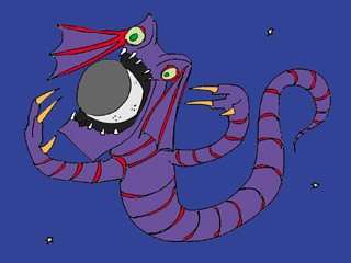
From beyond the stars, a serpentine collosus swirls and swims, cutting through the ether of space toward our unsuspecting eden. This royal, interstellar dragon fills half the horizon as we collectively watch in stunned disbelief...
No mere eclipse, the gaping maw opens wide to swallow loyal Luna. What will the nights be without our silver mirror dancing along with us through our eternal ballet of intertwining orbits? Perhaps we won't have long to grieve, the planet-killer's hunger unabated, attention now turning to the silent chorus of eyes below.
This is the end of the world: To all be wiped out in an instant, falling though the cavernous esophogus tunnel, disintegrating in the digestive apocalypse of The Dragon...
HAPPY MONSTER MONTH 2006!
posted by sven | permalink | categories: bestiary, sketchbook
October 30, 2006
Q&D - 1st pup done
by sven at 11:59 am
(Q&D = "quick and dirty")
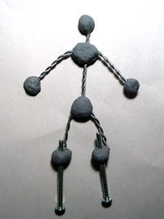
Yesterday I finished making making the first of two pups for my current "quick and dirty" animation project.
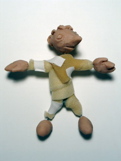
Around the armature, I wrapped strips from a sheet of cushion foam that I found for cheap at SCRAP! -- "The School and Community Reuse Action Project." I think the foam was 3/8" thick. My strips were about 1" wide, and I held them together with athletic tape.
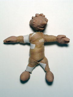
Around the cushion foam, I wrapped McDavid brand underwrap, which I found at G.I. Joe's (a local sports / automotive store). "Professional quality, pre-taping polyurethane foam underwrap. Used to protect the skin prior to taping."
This stuff does a great job of smoothing out the cushion foam... It would have worked even better if I'd taken a little time to first trim the foam more into shape, using cuticle scizzors.
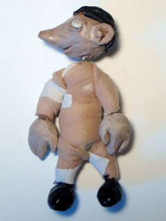
I used cheap acrylic paints to do up the Sculpey bits. For the flesh tone, I used "bambi brown" (a tan), and then painted over it with a thin layer of white. (In general, I've found that tan + white does a remarkably good job of simulating "caucasian" flesh tones.)
I wanted to try a trick I heard about: spraying on a layer of clear gloss varnish, then a second coat of matte varnish. I thought it might give me a stronger surface...
I'm not entirely happy with the results. The finish is still a little glossier than I'd like, after applying that second coat. And worse, a faint orange color has appeared in places. Why? Possible explanations:
(a) I used Kryolan gloss, and Citadel matte -- maybe they interact badly?
(b) Maybe Citadel varnish is faintly orange naturally, and it became visible because I put on too thick a coat?
(c) Maybe the varnishes began to dissolve the cheap acrylics, leaching out some of the pigments?
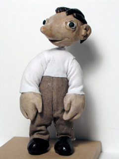
I clothed the pup without making patterns first. I just cut out pieces of fabric, glued them on, and then cut off excess. As with Percy's costume, I used Fabri-tac glue to good effect.
Overall, I'm pretty happy with this puppet. It's pretty seriously lopsided -- but hey, that's part of working "quick and dirty." As a final touch, I added little dots of black Sculpey to the eyes. That'll probably work fine, but today I picked up a small pack of black Van Aken plastilina, which I think will work even better.
The one problem with this pup that I want to be sure to remedy in all future pups is how I've dealt with tie-downs and rigging.
The tie-downs are 10-24, which I'm now realizing will create huge holes in the set floor. I want to move to using 4-40 threaded rod and knurled thumb screws for tie-downs, and make that my standard practice. (Marc Spess shows this approach in the excellent Secrets of Clay Animation Revealed! eBook -- and I've seen it used elsewhere, too.)
As for rigging: I forgot to build any rigging points into the armature, and am not sure as of yet how I might rectify the oversight. The character is supposed to spend some time crawling around on a big comfy chair... Which is essentially the same as having him walk on any non-tie-downable surface: you have to use a walking/flying rig to hold the rest of him in place, as just one part of him moves.
The "dad" pup is almost done -- just needs to get clothed now. More about him soon.
posted by sven | permalink | categories: stopmo
holiday sale nov04
by gl. at 10:58 am
I can't believe it's not even Halloween yet and I'm already announcing a holiday sale! :D Regardless, I am delighted to offer a variety of letter-inspired gifts to share with you this season during the Dinnergrrls Holiday Bazaar on Saturday.
Scarlet Star Studios will provide a joyous selection of unique cards, wrapping paper and bookmarks in addition to other lettersmithed novelties. And because I am a creative advocate who believes in art exploration & creative self-expression, I will also be offering a wide range of creativity products to encourage you (and the people on your gift list) to make more art next year!
What: DinnerGrrls Holiday Bazaar
When: Saturday, November 4th, 1-5 p.m.
Where: 1936 N. Alberta (corner of N. Alberta and N. Denver. Two long blocks west of N. Interstate.) It's right off I5 at the Killingsworth/Alberta exit. Take a left at the top of the Exit ramp onto N. Alberta and go west...
There are also many other vendors, so you could probably get most of your holiday shopping done in one very pleasurable afternoon. Help support local women entrepreneurs while sipping champagne, dunking yummy treats in the chocolate fountain, indulging in massage... and shopping! They'll also have a computer set up so that you can pay us with Paypal/credit cards if you prefer.
(By the way, this is my first holiday-sale-like event. I'm prepping like mad this week to get everything done. Sven is lending his amazing helping hands, too. Please come visit me!)
posted by gl. | permalink | categories: exhibits & events
monster month - 21
by sven at 8:00 am
Further sketches, contributing to Jeffrey Roche's "Monster Month" event.
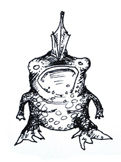
A distant relative of the polycephalic forg-man, the squat, spotted forg is native to the U.S. gulf coast, particularly in the shallows off of Louisiana. Some xenobiologists -- notably the esteemed Professor Ichbonnsen -- have postulated that forg-men may have actually evolved from the marine forgs, after they were swept up by prehistoric hurricanes and deposited inland, whole schools of the amphibians falling from the sky like a squalid rain.
Up until recently, it was thought that this species was entirely extinct. However, in 2005 several intact specimens were washed ashore during the wrath of Hurricane Katrina. While of great interest to the scientific community, news of the discovery of living forgs seems to have been largely superceded by human-interest stories in the American media. Curiously, at the same time, squat, spotted forg-fever has overtaken Japan. A plush version of the amphibian, forg-shaped backpacks, and forg-squonk cell phone ring tones are currently all the rage among the Japanese school girl set.
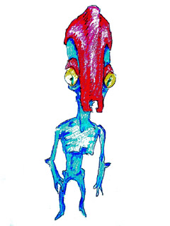
The blue martians -- unlike their green or orange cousins -- live in a profoundly stratefied society, under a complex system of castes and hereditary professions. The "war martians" (as they've come to be known) are noted for grafting helmets and other sorts of armor-plating directly onto their bodies, anchoring them within chitonous protuberances that seem strangely well-suited for this purpose.
War martians vie for ownership of drone male harems through violent head-butting rituals. Indeed, the thunderous cracking of skull against skull has been known to set off small avalanches in the polar regions, where members of the war caste are most common. While the soldiers' thick helmets do provide some amount of protection, significant brain damage is innevitable. Wreckless military offensives initiated by the elder war martian generals, often strategically dubious in the extreme, may be directly attributed to their more enthusiastic displays of cranial fortitude in earlier years.
(Were it not for this self-defeating behavior, Earth likely would have fallen to the technologically-superior martians long ago!)
posted by sven | permalink | categories: bestiary, sketchbook
October 29, 2006
fill 'er up!
by gl. at 11:59 pm
i met a poet at the gas station the other day: oregon is one of two states that don't allow you to pump your own gas, so you get familiar with the gas station attendants at the gas stations closest to you.
finally inspired to ask about trixie, who he's seen at least 10 or 15 times, jerry lit up when i told him it was a poetry car. he says you don't need talent to be a poet, just perserverance. he writes cowboy poetry about "jt carpenter" ("get it?" he says. "jesus the?"). in one of his poems, god rides a harley while the devil rides a honda, while in another poem billy the kid & jesse james share a beer, despite living 80 years apart.
jerry is old & mean. for a while i wouldn't go to that gas station because he'd mutter and scowl and throw my receipt at me. but it was amazing to discover the change in his demeanor when he got a chance to talk about poetry. we all need outlets for creative self expression.
posted by gl. | permalink | categories: trixie
keep the hand moving
by gl. at 11:59 pm
three more things and i'll almost be caught up:
sven & i went to the stumptown comics fest on friday, where i bought a tiny abecedarium & a book of poetry. we made fools of ourselves talking to the amazing & talented erica moen: in fact, we almost made her cry. (we're sorry, erica!)
i'm considering joining an artist support group known as "radix: a circle of women in the arts." it's a splinter from the "no limits for women in the arts" group that encourages self-leadership and a specific kind of paired listening process which asks these four questions:
- what is your greatest vision for your art life?
- what is the next step towards that goal?
- where does it get hard?
- how do you keep it going?
it's not too dissimilar to what i do for artist's way independent support.
- wow, this was almost a month ago: we sponsored an expedition360 vlog. i help them maintain their blog, but we also just like supporting crazy, dedicated dreamers. :)
posted by gl. | permalink | categories: miscellany
monster month - 20
by sven at 8:00 am
Further sketches, contributing to Jeffrey Roche's "Monster Month" event.
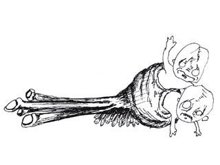
The skree buries its four long eyestalks and many anemone-like legs in the ground, leaving only its waxy posterior protruding in the air. Ugly little mutant babies come and sit on the faux sitting stone -- only to discover moments later that their own posteriors are stuck and sinking into the wax-bottomed skree's trap.
Populations of skrees in disparate locales have evolved several variations on this same tar-baby snare. Some work as a team, presenting themselves as safe stepping stones across a dangerous pit of quicksand (oh the irony!). The ugly babies become encapsulated in the wax like insects trapped in amber; the skrees deposit their baby sacs back in their subterranean nests, where they are stored like gruesome fruit preserves for later devourment. Following a capture, skrees are able to grow their earwax-yellow snares back within a matter of days.
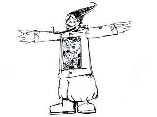
Rah! Rah! Rasputin -- lover of the Russian queen...
Rah! Rah! Rasputin -- Russia's greatest love machine...
(from the album Antler Dance, by Boiled In Lead)
Yes, it's a robotic Rasputin. Perhaps this explains why he could be stabbed, poisoned, shot -- and still live. Ah, but to throw him into the river...? Truly, 'twas a short-circuit that killed the beast.
posted by sven | permalink | categories: bestiary, sketchbook
October 28, 2006
monster month - 19
by sven at 8:00 am
Further sketches, contributing to Jeffrey Roche's "Monster Month" event.
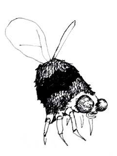
Sure, it looks like a bumbly bee... But did I mention that the buzgah is the size of a raccoon? And that a human head looks an awful lot like a flower to this guy? ("Mmmmmm... Nectar!") And that as he flies from head to head, setting down like a big furry hat, he provides running commentary about what fine, fine flowers he's found? ("Yezzz, quite a tasty treat! A brunette flower for buzzzgah to sip and sup from!")
...I didn't mention? I think you must have just not heard me, over the roar of those two vibrating wings. How does the bumblebee lift its own weight with those, anyway?
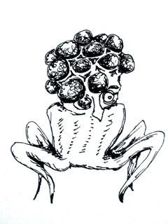
It must have started off as a severed human head. But then genetic modifications and glowing mutagenic serums produced: The Abomination. Many black, multi-faceted eyes erupting from the cranium like bubbles... Like bubbles made by some mad scientist blowing through the bendy straw in his crazy milk. But still with one human eye. (Because the contrast makes it all seem weirder.) A torso that begins from immediately beneath the vestigial nose, shaped like a squat bell pepper, ending in four skittery legs.
This is the sort of thing where you open the door to a darkened lab room and hear something scrabbling across the floor, tipping over metal trays, but you can't see it... And you think to yourself: "Oh, no... I've fallen into a sci fi/horror genre B movie! This is waaay too stereotypical to actually be happening..."
And yet, you can't help but call out (for the sake of irony, if nothing else), "Hello? Is someone there?"
posted by sven | permalink | categories: bestiary, sketchbook
October 27, 2006
denis brown: get rhythm!
by gl. at 10:48 pm
my last denis brown workshop was wednesday! my brain felt full, so i left early. you'd think i'd want to stay for the "gestural movements to music" segment at the end, since it sounds so similar to exercises i do with artist's way, but i was afraid that adding anything more new to my head would simply cause it to leak out my eyes.
during the course of two days, of course he said more than this, but this is what stuck:
if 4-6 items are on this list, then the hand is probably an italic variant:
- slant
- lateral compression
- branching
- "cursive" (economy of strokes)
- rhythm
- speed
i have always considered the "o" to define the hand (though in typography you can often identify the font via the "g"), but for denis, the hand is very dependent on the "n": every letter will change if you change the n.
"any italic can have a clear verbal description in addition to a visual one". is it high-branched, asymmetrical and pointed? if you can describe your variant "n," you can learn to apply those elements to all the other letters.
edward johnston vs hermann zapf: johnston knew what the pen was capable of & approached lettering from the natural abilities of the pen; whereas hermann zapf knew what he wanted the letters to look like and would find a way to wrestle the pen to make those shapes.
"your eye will learn quicker than your hand." the first day, especially, was all about "target practice." i re-learned an old lesson from when i owned a motorcyle: look where you want to end up and you'll go there. the same is true of the pen: as i trained myself to look where i wanted to begin the downstroke, i was able to more consistently end the connector at the right spot.
"i'm trying to get you to forget about the alphabet and remember the basic structural relationships."
i made an interesting self discovery while warming up in my car over lunch one day: i don't think i want to be a calligraphy artisté. i want to be a casual calligrapher: i want to get to the point where calligraphy feels like an easy, natural extension of my handwriting, without a lot of fuss or guidelines or setup/cleanup. i want to be able to dash off calligraphy on nametags & lunchbags. i want to make ordinary things extraordinary with personalization & customization, but i don't need to make large-format framed works of art. some of this comes from my inherent love for ephemera, so you can think of this as "ephemeral embellisment."
having said all that, i got a lot out of this workshop, tried a lot of new things. despite resisting it for years, i became more familiar with using gouache & a loading brush; i tried several sizes of brause nibs, which i still find pretty stiff, but i think i'm beginning to get the hang of them (overloading really does seem to help); marti's fox river pad worked like a charm; i became an advocate for guardsheets (though thin cotten gloves wouldn't be too bad, either); i learned how to use ground pumice stone.
you can especially tell what a difference two days make in the pix below. i'm always rough when i begin a class: stuggling with a new nib (brause), new paper, new space, new ink or whatnot.

[begin]

[end]
i can always find fault w/ my own writing, but on the whole by the end i was vastly more consistent & elegant than the first early attempts.
posted by gl. | permalink | categories: calligraphy
monster month - 18
by sven at 8:00 am
Further sketches, contributing to Jeffrey Roche's "Monster Month" event.
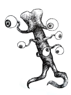
Tall trunk like a tree. Something like the skull of an elephant for a head... But with two elephantine trunks, each ending in a beach-ball-sized eye. Several more enormous eyes sway and twist on prehensile stalks down the sides of the beast. Two long snakes of muscle serve as legs.
This alien intelligence is diplomatic in character... Amenable to joint ventures, should they be in the common interest. Its appearance is tremendously unnerving to human explorers, however, as the over-sized eyes are the only (nightmarishly) familiar aspect of its body. Astronauts encountering the "eye-tree" are apt to act rashly.
(Based on an illustration I did for a short story back in junior high.)
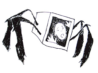
A box with legs. A prison cell... A cell block. The cramped space inside this box traps a single person at a time. The prisoner is transported hither and thither by the thing's surreal spider legs.
Where are the prisoners taken? Are the blocks stacked one upon another, in tall, forgotten aisles of the damned? Are the poor souls deposited in the presence of some higher power? Face and hands pressed against glass, the person inside anxiously calls out for help as they're transported to who-knows-where...
posted by sven | permalink | categories: bestiary, sketchbook
October 26, 2006
press luncheon
by gl. at 7:01 pm
i saw a photography exhibit at the press club this afternoon, a small creperie near clinton & 26 (across from the clinton street theatre). zorn matson's large flower prints are beautiful and interesting as macro landscapes, but they are especially surprising, intriguing & engaging when read in light of his artist statement, part of which is excerpted here:
some miracles become so commonplace that to see them requires a vigilant amnesia... it is as if the flowers themselves had commisioned [these portraits]. as if, in fact, i had been kidnapped by a murderous, flamboyant warlord... and could regain my freedom only after taking revealing portraits of his entirely insane family.
i loved re-examining the flower photos, imaging each as a member of a warlord's insane family. i only wish zorn had a website, but he didn't leave any cards and the waitress could only remember he was "on myspace."
posted by gl. | permalink | categories: exhibits & events
monster month - 17
by sven at 8:00 am
Further sketches, contributing to Jeffrey Roche's "Monster Month" event.
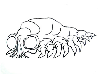
This is the larva of malice. It finds its way into the bully or the "mean girl" on the playground, and slowly wriggles its way into their heart.
At first, perhaps, the bully merely apes the sarcasm of his own parents... Or obliviously delights in the power of taunting his victims, unable to connect to the reality of their hurt... But as he works his misdeeds, an alien force progressively possesses his body. The larva feeds off of his malignant acts, and contributes back an addictive adrenalin-cocktail high. The potential for any other future for the child is inexorably erased.
Over the years, the insect hollows out the child... Growing and growing until, in the human host's maturity, you can almost see its form rippling and writhing, just beneath the surface. Waiting to tear open its false skin.
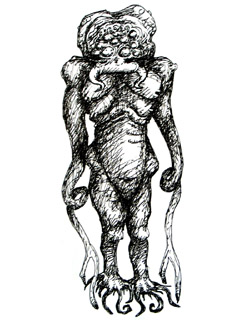
Dozens of jet black eyes. Two facial tentacles (tongues?) that lick in and out laterally from a tube-shaped proboscis (somewhat reminiscent of a gas-mask). Six breasts, each with two separate nipples, for feeding her innumerable young. Gill slits at the top of the creature's belly, indicating that the majority of the thing's life cycle must be spent underwater. Many small toe-like tentacles at the ends of the legs, providing excellent ability to grip slippery, seaweed-covered rocks. The arms drape down longer than the entire body's length, each rubbery arm ending in two prehensile tongs.
The "mother of tentacles" is ancient, having seen eons come and go. Standing more than ten feet tall, the creature moves far slower than one would expect -- giving it a statuesque bearing. Behind unreadable eyes, the thoughts of this unearthly god permute like the passage of uncaring glaciers.
After birthing a litter of its (almost exclusively male) children, the beast pays no heed to them -- rather, letting the infants suckle and crawl about her body without heed. Only once every few centuries does she venture from her midnight crypt in the Atlantic depths... Coming ashore but briefly, the heavy, quick-moving adolescent offspring are traumatized by exposure to the atmosphere, and drop to the ground, where she leaves them convulsing, to fend for themselves.
posted by sven | permalink | categories: bestiary, sketchbook
October 25, 2006
artist's way: week 7
by gl. at 11:24 pm
this week is my favorite chapter and i always enjoy it when it coincides with halloween so that we can make masks, which makes the studio into a glorious chaos. after several weeks of tidy & contained activities i get to drag out the bins of 3d objects and everyone gets to find ways to use discarded lamp shades and broken water faucets and even the keys to the svan that broke at mph's birthday party! now at the halfway point, this is an activity that is both invigorating and kinetic, and begins an arc that moves the participants from primarily solitary, self-reflective activities into self-expression activities w/ group dynamics. for instance, this is an activity that encourages participants to work with each other to share materials & supplies & space, yet remain focused to complete a mask in a fairly short amount of time.
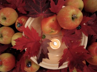
center (abundance): orginally filled with 20 apples overflowing from the bowl, this is a picture after the evening was over and everyone took some apples with them. still, i love the composition, with the leaves gathered from a neighbor's yard and the selection of beads from local glass artists that twinkle in the gaps.
music: delerium's karma.
posted by gl. | permalink | categories: artist's way
monster month - 16
by sven at 8:00 am
Further sketches, contributing to Jeffrey Roche's "Monster Month" event.
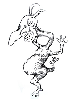
Playful Weeble pirouettes, leaps, twirls. Ever since he saw "Swan Lake," he just hasn't been the same. Not all of his bones actually connect into their sockets at any particular moment... But that's to his benefit. He's rather clumsy sometimes, and would likely hurt himself, were he not so rubbery.
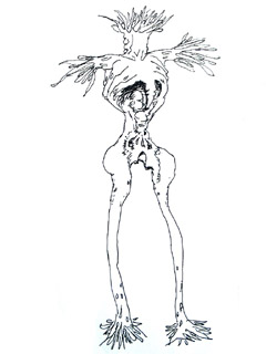
There's a forest you've walked through in your dreams, where all of the trees are you. You -- after you've died, and all your limbs have been flayed into dry, stringy tendrils of meat. These blind tree-beings shuffle about in a crowd, silhouettes in the misty light just before dawn.
Stumbling between them, just below the level of their knees, you wonder how many times you've died before... Or how many times you're going to die yet. Are these of a long series of past lives here? Or, maybe, a collection of all the moments when you've forgotten who you are, during this lifetime?
There must be some way to make them take root... To water them, and watch them turn green again. In your imagination, you can see your own face grow back, large and balloon-like, at the tops of all these giants. They would open their mouths in unison... And with a collectively sigh, inhale.
posted by sven | permalink | categories: bestiary, sketchbook
October 24, 2006
denis brown: flourishing
by gl. at 11:59 pm
on sunday i attended denis brown's flourishing workshop. i sat next to one of the david douglas high school calligraphy instructors, maria, who seems very sweet.
in many ways, this was the "dangerous lines" content, not the speech at aocc the day before. denis exhorted us to think of flourishing like "spilling the ink onto the page into the shape of a flourish rathering than drawing a little twiddly bits." he wants us to pour ink from the pen like cream from a jug. he also crusades against the holy 45-degree standard pen angle recommended for most italics: because our eyes are steroscopic, they read horizontal lines thicker than vertical ones. so lines made at 45 degrees are geometrically equal, but visually, the horizontal lines look too thick. italic is a major monorhythmic hand and needs the vertical lines to be its strongest feature, so he recommends bringing the pen angle to 40 degrees, or even less depending on the context.
he noted that if a flourish isn't flourishing, you should check...
is the ink diluted enough? to the shock and amazement of all, denis would often double the water in an ink bottle to get it thin enough to flourish at high speeds and yet remain opaque & black.
is there enough ink? denis would load his reservoir so full it would blot immediately upon bringing it vertical. he'd counter that by bringing it onto its tip, which allowed the ink to come out at one controlled point.
is there enough pressure? this was my foggiest point, because if i used more pressure my hairlines would go thick, but with less pressure the pen just skipped.
later in the afternoon denis performed casual surgery on my poor black zig marker because it was so dull. using only a scalpel and his iron will, he shaved off the edges of the marker until they were suitable writing instruments again. i tried not to panic.
unfortunately, denis subscribes to the "if you can't flourish, don't prove it" school of thought, which, as a creative advocate, i always find enormously discouraging. lots of blocked artists have heard something similar to "if you can't dance/paint/write, don't prove it," which keeps them from doing anything at all. i subscribe to the "if you fail faster, you will succeed sooner" newsletter. if you can't flourish, then flourish something! in fact, flourish lots of somethings! that's the only way you'll get better.
the one suggestion i have for denis as a teacher is that he needs to watch people actually write, not just analyze the letterforms and demonstrate them. he told us several times to tip the pen onto its edge for the flicks, but after he had come around a couple of times and noted i wasn't flicking right, i asked him to watch me, and it was immediately clear to him how i was holding the pen wrong for the flicks. when he showed me how to hold the pen, ink came out exactly as it was supposed to! knowing that earlier in the day would have been great.
posted by gl. | permalink | categories: calligraphy
monster month - 15
by sven at 8:00 am
Further sketches, contributing to Jeffrey Roche's "Monster Month" event.
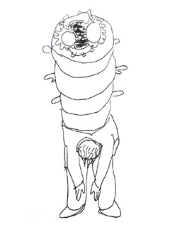
Over dinner, you wondered why you tolerate this arrogant, cruel, racist and sexist man... An uncle you only see once a year? A co-worker or superior from the cube farm? As he drinks, his tongue gets looser -- and your teeth get sorer, gritting, keeping your own tongue in place. A maggot of malice has incubated in this man's heart for so many years... It's grown huge, and writhes just beneath his skin.
No one is really surprised when he flops over -- nearly in half. The back of his spendy coat splits, and the putrid maggot rears up from inside its meat shell. Ironically, everyone in the room breathes a sigh of relief, ugliness at last revealed for what it is. Finally, we can relax and stop pretending.
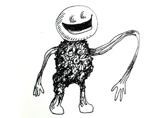
Big lollipop smile. Torso of Halloween candies all melted into a mass. Taffy arms that stretch, and stretch, out to embrace all his happy, smiling friends. With sugar-fueled enthusiasm, Candy Man is delighted to see you!
posted by sven | permalink | categories: bestiary, sketchbook
October 23, 2006
quck 'n' dirty pups
by sven at 11:16 pm
Continuing on with the "quick and dirty" animation project I started Friday, tonight I began constructing some new pups.
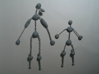
The armatures are 1/16" sculptor's armature wire (annealed aluminum), held together with plumber's 20-minute epoxy putty. The "son" character is small enough that I didn't think I should put in limb bones. On the "dad" character, I'm trying a mix of boned and non-boned limbs. There are 10-24 nuts embedded in the feet.
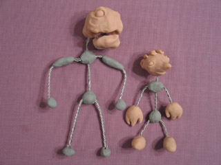
I started adding heads, hands, and feet using Super Sculpey. "Dad" has a lower jaw that moves -- a trick I picked up from Grant Goans.
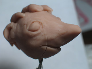
The "son" pup cracked almost immediately. There's a break in the lip that I could live with...
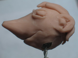
...Unfortunately, there's also a more serious crack at the base of the neck. I should have textured the epoxy putty skull, so the Super Sculpey would have something to grab onto. Because I didn't, the Sculpey has come loose and wiggles on the neck -- and the neck wire has chipped out an area.
Oh well. These pups are going to be crappy -- but I'll get a better idea of what I want to do on the next iteration. I'm thinking that I might do hollow resin heads on a second draft...
posted by sven | permalink | categories: stopmo
monster month - 14
by sven at 8:00 am
Further sketches, contributing to Jeffrey Roche's "Monster Month" event.
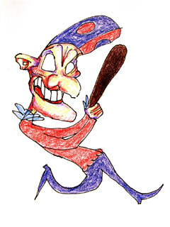
"Huzzah huzzah, I've killed the Devil!"
...Oh! It's that wicked man, Mr. Punch! Whatever has he done with his wife Judy? Where is their tender little baby gone to? And what terrible thing is he contriving to do next?
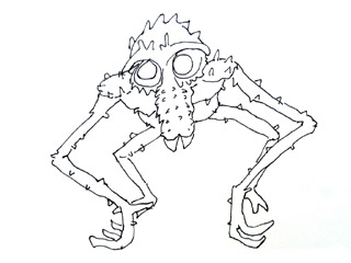
A large Old World ground-dwelling crustacean with a long doglike snout, large teeth, and naked callosities on the buttocks. The species is abundant on many shores, esp. in the tropics, where some have become fully adapted to land. Craboons are social animals and live in troops.
Bastardized from the Mac "came-with-the-computer" dictionary.
posted by sven | permalink | categories: bestiary, sketchbook
October 22, 2006
aocc 2006 review
by gl. at 11:25 pm
yesterday i attended the all oregon calligrapher's conference. we packed a lot into 8 hours, so this will be a long post. :)
aocc general
i had a good time, especially because sven, kristen, colleen & rick also came. but it was too short! alas, we were up an hour early to volunteer and there was surprisingly little for us to do: i ran interference on arrivals to direct them past the harried 4x4 exhibitors, added a couple of signs here & there, did some random errands. i was also surprised to discover the vendors weren't sellilng anything i couldn't live without, though i was oft tempted. (there was a beautiful green box with a stone and a feather, though, that i regret not getting.)
aocc exhibits
the most disappointing thing about aocc was the 4x4 and "show & share" exhibits. it was probably so disappointing because i had been looking forward to it, but there were no signs, no statement or context, and many pieces had been stapled to the backing! *wince* (and not very carefully, either. thank god my piece was already mounted!) some nice pieces, and i do so love the small format, but the presentation was appalling.
denis brown keynote: dangerous lines
after introductions and welcomes and applause, denis spoke about calligraphy. with a topic like "dangerous lines" i had hoped for more rebellion and maybe even a call to action, like the lecture michael & i attended by charles pearce. still, he said many things worth noting:
"all calligraphy is digital, as it's made by the hand." manual's root is "hand" in latin and digital's root is "finger," so how did they become such disparate concepts?
calligraphy is "recording in ink a performance of movements. if you're hesitant when you write, it shows. if you're miserable, it shows."
the difference between an educator and an instructor: educe=draw out of, instruct=put into. this reminds me of when i used to work w/ faculty: my default blanket term when writing documentation was "instructor" because it was the least offensive. every other term had a status associated with it and was guaranteed to make somebody mad.
he made an interesting parallel between art & video game evolution: pac man included a 2d grid, knots, dots & little monsters, just like early illumination; now we have 3d virtual reality rendered games, which are sort of like the renaissance discovery of perspective & reality.
he recommends mitchells at tiny sizes
slunk vellum: the smoother vellum of a stillborn calf, "a calf that died before it was born. a real trajedy. the most innocent thing."
to get oil paints onto paper, write in ink first, then seal w/ pva; layer oil paints over it and then scraffito over the lettering to reveal it.
"the way painting has been liberated by photography," calligraphy can be liberated by printing, allowing it to be more complex, illegible, or expressive.
polyrhythmic calligraphy vs monorhythmic calligraphy: most western writing is monorhythmic, relying on strong downstrokes and repetitive combinations. monorhythmic is techno: a strong, driving, easy beat. in contrast, polyrhythmic is jazz, classical, west african drums: more complex, multiple beats, simultaneous threads. different letters can look different depending on their context, with a desire to create counterrhythms & reverse directions.
he is inspired by bar codes, a rhythmic pattern like italic. "what the bar code lacks is a sense of spirituality."
the interplay between traditional & expressive calligraphy is my favorite. rathering than favouring one over the other, i prefer a combination. he compared a 6th century gospel of st. john that had an elaborate system of abbreviations to sms text messaging.
"you don't want to hear that someone is 'working' the violin. you want to hear them play with it."
this didn't happen during his keynote, but i noticed while he was there that the prints denis has for sale are remarkably fine. i'm fairly critical of self-printed calligraphy, which tends to be grainy, and even some commercial giclee prints are disappointing. but i was impressed: even under a magnifying glass i couldn't discern a dot pattern & the colors seemed true. if i ever start printing my own work, i want to use this system, so according to his website, he uses "an Epson 2100 using Epson’s 7-colour UltraChrome ink system at 2880 x 1440 dpi on Epson acid free watercolour paper, a combination to ensure long lasting quality. Wilhelm Imaging Research (www.wilhelm-research.com), suggest prints using this combination of ink and media will last for over 90 years without appreciable fading , based on indoor display framed under glass. Dark Storage Stability Rating at 73°F/50%RH is indicated to last over 200 years. The detail is super fine at this resolution, being almost 10 times finer than normal commercial printing."
lunch
the lunches were fairly tasty for salads. sven got pushed into line by the irrepressible marti dawkins, who told him they were "merging." the psc meetings are held waaaay over in beaverton, but a guy sitting at my table wanted to start an east-side group, and sven & i nudged him into it. i grabbed meri and we asked her to make an announcement before he could lose his nerve. a small flood of gresham calligraphers immediately signed up. the last i saw he was happily chatting up the teachers at the david douglas school district. :) the creative advocates strikes again!
jaki svaren: concentric italic
kristen thought jaki had a gentle energy. alas, we didn't have much time to actually do italic because we were busy breathing, stretching and meditating. "sipping on a cup of green tea, i stop the war." a very interesting thing i am glad to know is that 5 degrees, the usual italic slant, is the slant of a diagonal line drawn between the inner and outer edge of a broad-edged line. she gave us homemade visors with our names on them to keep out the glare of the fluorescent lighting. as she reminded us of the small miracles of breathing and sound, a white horse walked past our windows.
denis brown: book of kells
ah, michaelmas, you would have really liked this session! first we actually looked at the cathach, the book of darrow, and the lindisfarne gospels before getting to the book of kells.
looking at manuscripts almost always makes you feel better about your own calligraphy: they are beautiful, but the slant, spacing & sizes are often inconsistent, and monks would often forget letters or words and tack them on in unusual or weird ways. also, "the book of kells is like the mona lisa of its time, but it's also the simpsons," he said, pointing out the illuminations containing drunk monks & men pulling on each other's beards.
interesting random fact: he says the cathach was the first copyright case ruling. in 7th century AD: "to every cow its calf, to every book its copy." st. columkille apparently borrowed a book from anothe monk (finnean), then copied it for himself. after the ruling he was forced to return the book to finnean AND its copy.
posted by gl. | permalink | categories: calligraphy
monster month - 13
by sven at 8:00 am
Further sketches, contributing to Jeffrey Roche's "Monster Month" event.
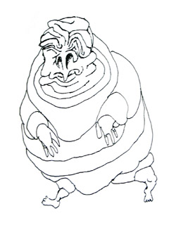
The Sluthering Vag fights vigorously against gravity to raise his eyelids and peek through the cascading folds of flab. The descendent of inbred royalty, this spherical mountain of flesh has remained in power generation after generation by swallowing whole his siblings, grandchildren, and political rivals. With a particular liking for gold rings, this blubberous man (?) has amassed an enormous fortune... Which he has used repeatedly to purchase fresh new legs -- and the transplanting services of unconscionably libertine doctors.
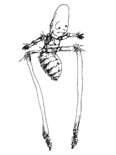
Bee-boy a lula
That horrid monstrosity's my baby
Bee-boy a lula
I don't mean maybe
Bee-boy a lula
It's my baby doll my scabied troll my rabies-infected fall
Let's rock!
My profuse apologies to Gene Vincent...
posted by sven | permalink | categories: bestiary, sketchbook
October 21, 2006
working quick and dirty
by sven at 9:00 am
I've been focused on armatures for a few months. I want to start moving in a more holistic direction. The idea is to jump in and start doing quick and dirty animation... Stuff that's not up to my standards, but that gets me in motion and gives me something to improve on.
Here's what I did yesterday.
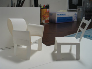
I have an idea for the StopMoShorts challenge, so I'm going to be applying myself to that. The first scene is in a room with two chairs, so I did a quick mock-up using card stock.
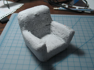
One of the chairs is a big comfy thing. I carved it out of blue insulation foam using "Hot Wire Foam Factory" tools, then some small rasps, then sandpaper. The fumes and dust this foam creates are awful -- but I love how easy it is to work with.
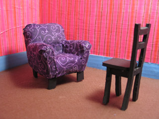
The comfy chair got covered with fabric, using hot glue. The comfy chair's legs -- and the entire other chair -- are made from black foamcore. These props turned out smaller than I'd intended, and they're going to be difficult to affix to the floor of the set. They might not work out for actual animation... But that's OK. Remember: "quick and dirty."
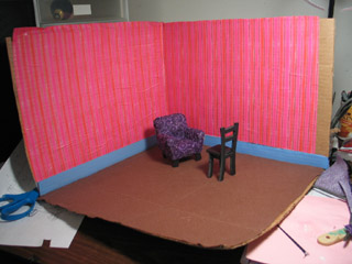
The living room set was constructed out of a cardboard box. The carpet is made from pieces of felt glued down with Elmer's glue. The wallpaper is gift-wrapping paper. The cardboard warped pretty badly... If I wind up actually using this first draft for animation, I may need to staple-gun it to a piece of wood.
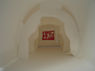
The keywords for the StopMoShort challenge this quarter are cave, sword, and fear. I've got a cave tunnel in my story... And this is the paper mock-up I did for it.
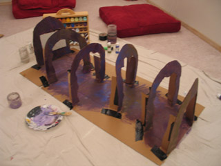
The tunnel is built out of cardboard again... More trouble with warping.
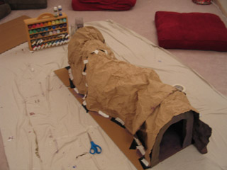
To simulate rocky walls, I painted butcher paper with cheap acrylics, let the paint dry, then crumpled it up. I'm pretty pleased with the look. (Note that the outside of the tunnel is not painted.)
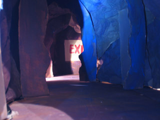
I tried a couple of test photos inside of the tunnel. The idea is that the camera will scoot along toward the end, simulating the main character's point of view.
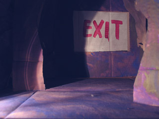
Lighting the tunnel's going to be more difficult than I thought. I initially intended to attach a flashlight to the camera itself -- but it turns out that I'm going to need much more ambient light than that. For these test shots, what I did was sneak a flashlight in behind one of the arches, and then set the camera for a very long exposure.
If I wind up doing a second draft of this set, I think xmas lights (or something that size) hidden behind arches would probably give me the quality of light that I'm looking for.
posted by sven | permalink | categories: stopmo
monster month - 12
by sven at 8:00 am
Further sketches, contributing to Jeffrey Roche's "Monster Month" event.
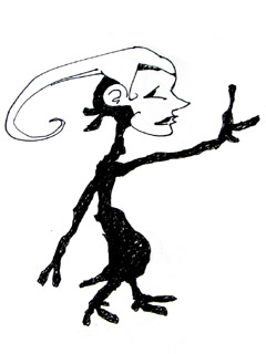
Harlequin Vinny recites Shakespeare and French poetry. He bounces and bounds along at your side during your adventures, a wannabe sidekick. A whimsical little thing, his endearing mask conceals fifteen lidless eyes, and a round maw of one thousand needle-point teeth. Be wary.
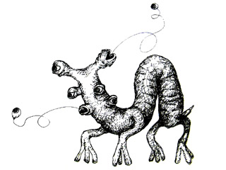
An eyeflit's most alarming feature is the ability to eject all of its six eyeballs from their sockets like projectiles -- whipping them around in several directions at once on long, elastic optic nerves. Were it not for this peculiar and disturbing ability, one might think the beast almost comic in appearance: it bends in the middle as a catepillar does, moving first its front forward, then bringing its rear legs up to the fore. Its stubby tail wags like that of an eager puppy dog.
Another odd feature of the eyeflit is its lack of a defined mouth. Nutrients, apparently, are absorbed through its semi-porous fingertips. With no vocal instruments for grunting or barking like other animals, it is notoriously quiet... It has taken many an unsuspecting zoologist -- including the author -- by surprise when it wanders into their camp. The beast is not entirely silent, however. If one listens carefully, there is a distinctive flitting sound as the eyes shoot in and out -- a sound from which the beast takes its name.
Being not much larger than the domestic cat, an eyeflit might make a fine pet -- for someone with a rather morbid sense of humor. Keeping an eyeflit would be economical; as it subsists off of decaying matter, the animal could easily be fed from a family's household compost pile. For those hoping to bring an eyeflit into their own home, however, it is sad fact that no eyeflit has yet survived long in captivity. Furthermore, recent changes in U.S. law about what may be imported from foreign nations pose a further challenge to the cause of eyeflit enthusiasts. Whether or not breeders can successfully introduce eyeflits into the American pet market, therefore, remains to be seen.
posted by sven | permalink | categories: bestiary, sketchbook
October 20, 2006
denis brown: sharpness in writing
by gl. at 11:41 pm
thus begins the calligraphy marathon: a week of calligraphy classes related to the all oregon calligraphers conference. this year it features denis brown, my favorite calligrapher in the world. he's been brilliant since he was 15, and how can i resist anyone with an irish accent?
he's been in town for a couple of days now; i attended my first session yesterday. i was half an hour late even though i had left myself a 15 minute buffer; the traffic and weather were horrible! i seriously thought about turning around because i hate it when i'm so late, and i think it's disrespectful to the teacher. fortunately (well, or not, depending on how you look at it), other people had the same issue. i wasn't even the last one in.
but before we even got to lettering, he spent a long time talking about the basic components: tools, materials, technique. i picked up some notes worth keeping:
you want rag paper, which is cotton, because the fibers are longer -- but more importantly, because cotton doesn't contain acid. even a lot of "acid-free" paper is simply acid-buffered -- or the surface might be acid-free, but the core is normal acidic paper.
press paper distinctions: hot press=smoother; cold-press=rougher; "not pressed"=cold pressed, "rough"=not pressed at all. got that? light-weight paper is automatically smoother than heavier-weight paper.
denis recommends bk rives (rives heavyweight if possible), arches text wove & saunders waterford hot press (though i personally found bk rives to thoroughly suck in any ink -- but i guess i should try w/ sandarac now).
sizing comes in three flavours: waterleaf, internal & external. waterleaf has no additives, internal is sometimes called "soft sizing" and is often used in printmaking. sizing is often simply gelatin: you can make your own sizing from boiling clear jello and brushing it onto the page. i guess this means most papers aren't vegetarian. ironic, isn't it?
the sounds paper makes when you wobble it is called the "crack" and is affected by the type of sizing it contains.
one of the kindest things you can do for yourself as a calligrapher is have a cushion of (cheap!) paper beneath your piece, at least 10-20 sheets. if your tool is hard, it should be used against something soft (and vice versa: that's why you'll use brushes on metal & wood).
he doesn't use ink anymore, he uses winsor/newton lampblack gouache (or sometimes ivory black, but never jet black, which he says feels greasy). he says shminke & holbein are also good gouaches.
gum arabic & gum sandarac are technically edible!
if you write quickly, use thinner ink. if you write slowly, you can use thicker ink.
he called pollock "jack the dripper."
"some people think calligraphy is about copying shapes, but i think it's about allowing a movement."
upon gazing at freshly drawn letter with a pool of ink still glistening in the arch of a flourish: "the only word for that is sexy." and "it is a luxury of ink."
then he walked around and gave feedback on the sharpness and on letterforms. i was intimidated and anxious, no doubt exacerbated by my late arrival, but also because i was using unfamiliar nibs (brause) and ink (black gouache, and the tubes i brought were unfortunately dry so i had to borrow a dab from my neighbor). i am an intermediate calligrapher at best, but most people at an event like this are much, much better than i am. see? i have my issues, too. :)
after lunch he showed us how to use gum sandarac, which was great. gum sandarac is something i've often heard of but had no idea how much trouble it might be to use or what a difference it would make. it turns out gum sandarac repels water: a drop of water on a pile of gum sandarac forms into a little ball, as malleable and adorable as quicksilver. thus, it keeps ink from spreading when brushed on the page. easy peasy!
he also showed us writing on black w/ white ink (more sandarac & the "flooding in" technique; permanent white=opaque, zinc white=lightfast). he also showed us sharpening a nib on an arkansas stone, though he himself has stopped sharpening nibs, prefering his own technique (namely, speed) to create his ethereal hairlines (so fine that apparently herman zapf himself wrote denis a letter asking about his technique).
posted by gl. | permalink | categories: calligraphy
artist's way open studio (october)
by gl. at 12:02 pm
last night's artist's way open studio was very productive! we produced 16 pieces, which we haven't done since march, which was the event where we were fueled on cupcakes because it was the first open studio-iversary.
i actually made two collages last night! i've never managed to do that before!
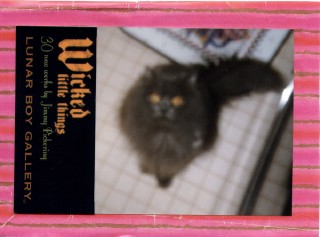
["something wicked this way comes"]
this one just fell into my lap, assembled itself almost instantly, and i was delighted to make one with a halloween flavour. the fuzzy picture is a donation from a collage fairy, while the text came from a lunar boy gallery postcard and the background is wrapping paper. i always decorate the envelopes when i make cards; this envelope had a large fuzzy hot pink feather stretch across the envelope flap. i am amused by fluffy hot pink evil.
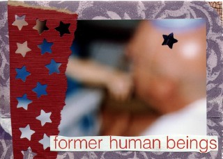
["starchild"]
i have no idea where this one came from, though it's interesting to note it has the same basic layout as the one above. i was intrigued by the part of the headline that read "former human beings" and when i ran across this fuzzy collage fairy donation photo, i knew they had to go together somehow. the background is from a paper bag i got somewhere, and it wasn't quite big enough to cover that upper left corner so i slipped in a little crackle texture in the gap to imply an alienness. i always have star-punched paper lying about, and these are what fell out of the bins i was sifting through.
we tried a new table configuration this time. usually we have a 5-foot folding table paired up with a large extendable table i got years ago from an xbf's parents (the "jacob table"). that set-up provided seating for nine, though the ninth (me) got tucked in this unfortunate nook that was really awkward. i thought if we got two 6-foot tables, we'd easily have room for 10. unfortunately, that proved not to be the case, and i still can't figure out why, so i bumped the rsvp's down to 8 again until i figure out a better solution...
there was some discussion about why i don't charge for collage night, especially since meetup charges oragnizers to run groups. i wrote about this almost a year ago, but there are several reasons why collage night is free:
i believe in the gifting economy. i want to have a range of offerings, including one for people who can't afford to join a creative cluster.
though i think generally artists are undervalued and i want them to be paid for their time and vision, i don't like the idea that every art experience has to be commodified & paid for. i charge for artist's way creative clusters and guided intents because they are a significant investment of time & attention. but collage is something anyone should be able to do at any time. to charge for it seems incredibly counterintuitive.
i don't provide instruction & don't plan to. i simply provide an opportunity, a catalyst. i believe art can be communal without requiring it to be collaborative.
the artist's way open studio benefits me just as much as it benefits the other participants: it provides me with an obligation to create art, as well as the opportunity to broadcast consistent updates about the studio that are more than simply solictations for money. ideally, people who are exposed to the open studio eventually become members of a creative cluster, though there's absolutely no obligation to do so.
so i consider the meetup money to be a promotional cost because google keeps it high in the results, whereas my actual artist's way page doesn't show up until hit 250 or so. and open studio is partially subsidized by the guided intent events. i panicked initially when meetup began charging, and while i may not be happy about it, i think it's turned out well enough. we now have twice as many events per month, and one of them makes money!
posted by gl. | permalink | categories: artist's way
monster month - 11
by sven at 8:00 am
Further sketches, contributing to Jeffrey Roche's "Monster Month" event.
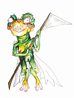
Fairy wings, but a rubbery lizard body. Bug-eyed and toothy, these nasty pixies, the "frogella", are a dangerous lot. The size of small fruit bats, a swarm of the vermin armed with their customary scythes and axes are likely to lop off a grown man's ears, pluck off his nose, and steal all his buttons -- all out of simple mean-spiritedness. While their honey is considered a delicacy by some, it is probably best for the non-expert to avoid their hives entirely.
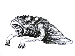
This tube-like entity drags itself forward using two sticky-ended pseudopods. Multiple, nested mouths may indicate a gill-like respiratory system, allowing the thing to inhabit oxygen-deficient environments for long periods. Indeed, it has been suggested that the four opaque white eyes indicate that the slube is most accustomed to dark, subterranean places -- although this has never been proven.
When slubes have made their way into human cities, their route of entry has generally been traced back down into the sewer systems. It is unclear whether this means that they originate from deeper in the Earth, or whether they have used the man-made tunnels to migrate inward from the Ocean bottom. A radical alternative view, advanced by one Professor Ichbonnsen, holds that this is perhaps an entirely new species, arising due to the influence of mutagenic industrial sewage. The supposed similarities between slube and human DNA have been hotly contested by the scientific mainstream... Which, for the most part, is hypothesizing that the slube is an ancient species only coming to light now due to global climate changes associated with the greenhouse effect.
posted by sven | permalink | categories: bestiary, sketchbook
October 19, 2006
monster month - 10
by sven at 8:00 am
Further sketches, contributing to Jeffrey Roche's "Monster Month" event.
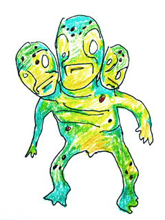
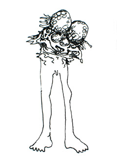
The polycephalic forg-man most likely evolved from the common pond forg. Scientists initially believed there to be several subspecies of forg-man: single-headed, two-headed, three-headed, four-headed... But no. As it turns out, the creature is constantly growing new heads, which it periodically sheds. A clutch of heads has often been mistaken for a nest of eggs by the incautious birdwatcher. Once on the decline, forg populations seem to be on the rise again, following the resedimentation of their native wetland habitats by Hurricane Katrina last year.
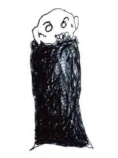
Skull-like face floating atop a cloak of black rags... It skulks, it follows, it stares. Nightmare armies of these silent killers rally in the collective unconscious. As if they were marching through small European countries, they invade our minds while we sleep. During your dreamless nights, you hide with the lights out in your childhood home, hoping not to be caught. The only hope for our waking world lies with the few small cells of guerilla dreamers -- an unconscious underground -- that struggles to resist the enemy's iron grip upon our minds.
(Another character I've been drawing for years.)
posted by sven | permalink | categories: bestiary, sketchbook
October 18, 2006
monster month - 9
by sven at 8:00 am
Further sketches, contributing to Jeffrey Roche's "Monster Month" event.
Bonus sketches today... A series of four monster-ridden heads.
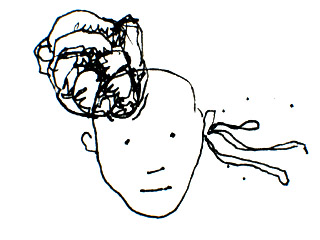
Perhaps an intelligent, parasitic tumor? As it first asserts its independence and reaches out some spaghetti tentacles from the ear?
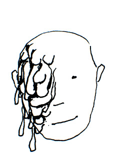
I'm melting! Oh, what a world...
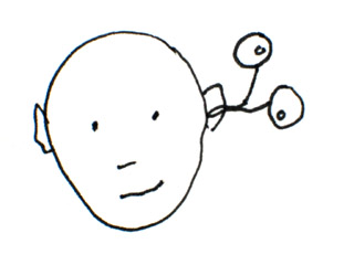
The creature living inside of my head... It sorta tickles.
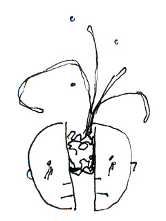
I've got a splitting headache...
(heh)
posted by sven | permalink | categories: bestiary, sketchbook
artist's way: week 6
by gl. at 1:10 am
people started off really tired today but left feeling much more energized. having done the critic transformation exercise a couple of weeks ago, in today's art activity i asked them to write love letters to themselves. writing nice things about yourself is HARD, so we did it in stages: first, i photographed them using an izone camera. they did free writing they knew wouldn't be shared, then created a poem from the writing that was shared. as each poem was shared, everyone responded by writing a couplet about the poem. the izone portraits & couplets were used to create valentines to and from themselves. it all sounds silly, but it really works.
(i'm sad to discover the izone is no longer being made. i kept thinking i should get a few more of them because it's great to have an occasional photography component. but now it's too late, and my camera is turning everything red.)
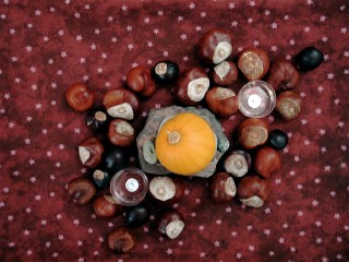
center (possibility): this is almost exactly what we have in the center of our coffee table: we grew that tiny pumpkin, the rocks came from our trip to canada, and the chestnuts are an assortment from this year & previous years. so it's less about possibility than fall, i suppose. unless you want to stretch the growing/traveling metaphor.
music: 10,000 maniacs, love among the ruins. i don't have a lot of music that sounds happy all the way through...
posted by gl. | permalink | categories: artist's way
October 17, 2006
monster month - 8
by sven at 8:00 am
Further sketches, contributing to Jeffrey Roche's "Monster Month" event.
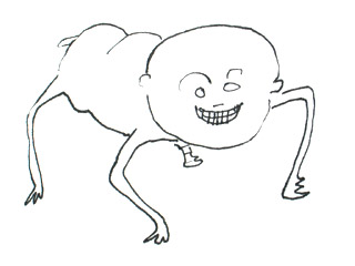
The grinning pig cootie has a bulbous and pink head, too large for its face. A body stolen from swine wags its stubby tail with glee. Improbably spindly legs look too thin to support its weight -- yet propel the nasty thing with speedy strength as it skitters frantically about the room. What sort of unholy union produced this mad abomination?
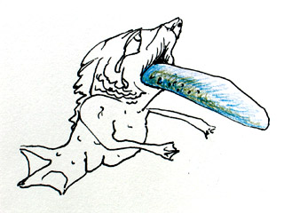
Poor little fish-girl. Her tongue is too big. It is bloated and long, like a giant sea cucumber. It makes her jaw ache, and she weeps piteous tears, in which she swims. The entire world tastes like her own briney sadness.
posted by sven | permalink | categories: bestiary, sketchbook
October 16, 2006
monster month - 7
by sven at 8:00 am
Further sketches, contributing to Jeffrey Roche's "Monster Month" event.
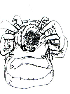
The bloated spider queen is ancient, worshipped by her thousands of progeny, the countless spiderlings that have sucked from her pendulous, poison-filled breasts. She sits at the center of a towering translucent cathedral made entirely from web. Legs having atrophied long ago, she depends upon sacrifices from her army for sustenance.
Think of Magritte's mermaid ("Collective Invention," 1934). Think of that classic horror flick with Vincent Price, "The Fly" (1958) -- and the remake with Jeff Goldblum (1986). Just cross a fly and a guy, and you get... EW!
posted by sven | permalink | categories: bestiary, sketchbook
October 15, 2006
monster month - 6
by sven at 8:00 am
Further sketches, contributing to Jeffrey Roche's "Monster Month" event.
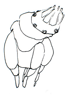
Another favorite...
Black plated armor, inky lidless eyes that encircle an anemone-like maw, elegant insectoid legs that sway like reeds in the wind. Sort of like a milipede crossed with a horse -- but with radial symetry, which allows it to whirl and dance in battle.
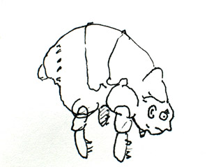
An enormous flea, with the face of a man. 'Nuff said.
posted by sven | permalink | categories: bestiary, sketchbook
October 14, 2006
monster month - 5
by sven at 8:00 am
Further sketches, contributing to Jeffrey Roche's "Monster Month" event.
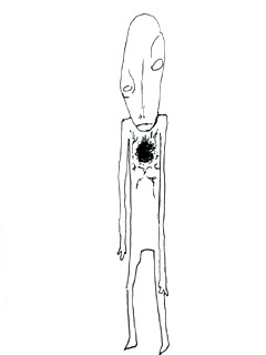
He's a thin man, lop-sided. One arm longer than the other. An eye off-kilter from its mate. An over-large head, difficult to support atop his spindly frame. And in this man's chest, the blackened and cracking hole where his heart has rotted out.
You see him walking toward you in a dream... Then look down in horror to see the front of your shirt bursting into flame, as your own heart erupts. As if pushing through the weight of water, he draws nearer.
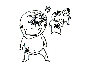
Happy goofy baby things. Oh! They wanna hug. Hug hug hug hug hug! ...How unfortunate for you that they seem to be covered with slimy diseased masses. As if they had been pelted with giant, vomitous spit-wads during some vile and unholy game of dodge ball. Not that they've seemed to notice -- the unstoppably affectionate little buggers.
posted by sven | permalink | categories: bestiary, sketchbook
October 13, 2006
monster month - 4
by sven at 8:00 am
Further sketches, contributing to Jeffrey Roche's "Monster Month" event.
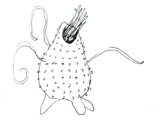
Nubbly plant-thing, wandering on wobbly stubs of legs. Delicate string-tentacles capture its prey, which are then fed -- screaming -- to the writhing maw. From within the stout carapace, muffled screams persist.
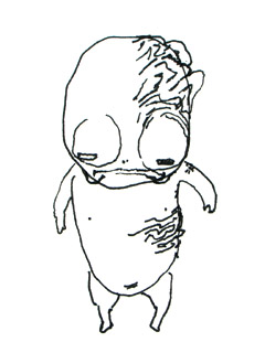
A favorite of mine...
Is it a baby? Or is it ancient? The eyes, peeking through lizard-slit lids, are unreadable. And is its skin still wrinkled from having just slipped out of an amniotic bath? Or are those burn scars from many years ago that mark its moist skin? Either way, the patches of gnarled flesh seem wrong, contrasting with the rest of its frog-soft anatomy. The infant-ancient betrays no secrets by its gait -- rather, it hovers in mid-air, still, a few feet above the ground. An enigma.
posted by sven | permalink | categories: bestiary, sketchbook
October 12, 2006
artist's way: week 5
by gl. at 4:27 pm
we're done w/ media deprivation! hooray! i had 1243 rss feeds waiting for me upon my return & i'm still crawling through them. one of the participants said, "when i don't read, i buy stuff."
the art activity this session was blind contour drawing. first i asked them to use the technique to draw the bah hum bug, a stuffed version from edward gorey's last book, the haunted tea cosy. i like using the bah hum bug because nobody's ever seen it before, so nobody has a pre-conceived notion of what one should look like, which makes you observe it more closely and derails the shortcut instinct between your eye and your brain.
i spend the exercise talking about slowing down and taking their time, but even so they finished the first round so fast i asked them to do another drawing of the bah hum bug. :) then i handed out mirrors and asked them to do self-portraits in the same style. after that i posted large newsprint sheets on the walls and had them draw each other.
then i asked them to write about the process of seeing, then to highlight the word that most appealed to them in their writing. we ended up with the words curve, profundity, burning, soul & magnificence, and i asked each person to create a sentence using all those words (or their roots). mine was "the profound curve of a burning soul is magnificent."
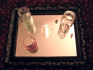
center (integrity): i tend to use a mirror as a center base when i do the blind contour drawing exercise. i must have been influenced by the lovecraft film festival, because i was irresitably drawn to the small bottles of cryptic fillings. i'm especially amused by the bottle of invisble ink.
music: the piano soundtrack, which the cd player only choked on twice.
one of my independent support clients had a funny story about self-encouragment and the perception of quality. as a graphic designer, co-workers would show each other designs and respond to each other, "dude, that's great!" but she would often dislike the designs, so she spent some time working through how other people might think they were great. finally recognizing that everyone values something different, eventually that led her to tell herself, whenever she made something, "that's great!" -- even if she didn't immediately think so, because someone probably would think so. she reinforced that habit so well that once, while she was at the gym, she caught herself in the mirror and automatically thought, "that's great!"
posted by gl. | permalink | categories: artist's way
monster month - 3
by sven at 8:00 am
Further sketches, contributing to Jeffrey Roche's "Monster Month" event.
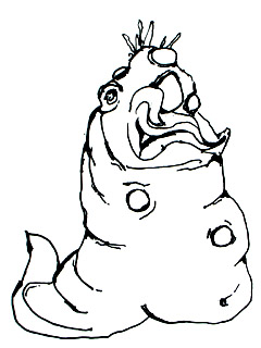
It is a putrescent slug, wallowing within its own mass. Opaque white eyes puncture the slimy surface sporadically. And yet, there are traces of the human in it... An ear, a toothy grin worthy of a Cheshire Cat... Waxy spikes protruding from its "head" in an obscene imitation of hair. My, but the arrogant, unblinking thing seems pleased with itself!
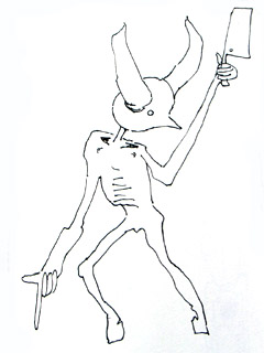
The bull-devil butcher brandishes a meat cleaver and commands its damned wards to the chopping block. Beneath a crown of burly horns, the unreadable face is minimalist: dimly glowing eyes pasted to an anonymous sphere. That, and what might be a nose, or a beak -- the sharpened point of an abstract sculpture. It walks on hooves, and has long rubbery forearms like neoprene gloves. The executioner is all the more unnerving for its lack of details... The sense that this being was summarily created by some other more potent force, which animated the servant without granting even the small mercy of animal features.
posted by sven | permalink | categories: bestiary, sketchbook
October 11, 2006
monster month - 2
by sven at 8:00 am
Further sketches, contributing to Jeffrey Roche's "Monster Month" event.
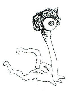
Perhaps some sort of brain that has escaped from its owner, taking one eye with it in the process? Or perhaps an alien species that just happens to have its primary wad of neurons located in a head-reminiscent part of the body? ...Beware those rear feelers -- I suspect they sting!
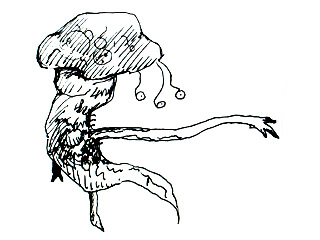
This creature seems to be largely composed of a gelatinous substance, as I'm clearly able to make out organs floating within... Organs that look somewhat like mitochondria. The head is mushroom shaped, and has three eyes waving on spaghetti stalks. The chest seems to be covered with a fine coat of cilia. There don't appear to be feet, but rather pointed pseudopods that stretch and recede as needed. The arm -- that hideous arm -- snaps outward elastically, providing a reach several times the length of the thing's main body.
posted by sven | permalink | categories: bestiary, sketchbook
October 10, 2006
october is monster month!
by sven at 4:28 pm
Stopmo buddy Jeffrey Roche has declared October "Monster Month!" 'Tis the season to draw many horrible things and then share them on your blog. The thought brings a big goofy grin to my face. :-D
The past few weeks have been insanely busy, what with building armatures at Bent Image Lab and then attending the H.P. Lovecraft Filmfest... But I've been doing my part to celebrate Jeffrey's vision. I've drawn dozens of creepy critters in my sketchbook so far -- and have many more yet to birth unto an unsuspecting world.
Today I uploaded the first 20. They're scheduled to appear two at a time on the Scarlet Letters blog, at 8:00am each morning for the next ten days. Enjoy!
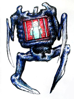
This is a variation on a monster I've been drawing for years: "Spikey." He has knives for legs, praying mantis scythes for arms, a chicken-with-its-head-cut-off neck stump, a barrel-chested ribcage, and an emaciated belly/pelvis. In the center of the chest -- where his heart should be -- there's usually a gaping hole. Sometimes there's a window where you can see someone trapped inside. This time I put a red velvet-lined cell in the chest, where an unhappy prisoner resides.
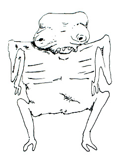
This ghoulish beastie has tiny black eyes set into a bulbous head, a severe under-bite, double-jointed arms, a frame that seems to be stretched twice as wide as a human's, and a scar on its belly where its mother tore off the umbilical cord in terror.
posted by sven | permalink | categories: bestiary, sketchbook
October 7, 2006
strike two
by gl. at 11:31 am
driving last night from class, i was changing the radio station when it suddenly hit me, almost halfway into media deprivation, that i can't listen to the radio! doh! you'd think i had never done this before! :) a car ride alone is much different without music.
posted by gl. | permalink | categories: artist's way
October 5, 2006
strike one
by gl. at 11:27 pm
first egregious & accidental violation of media deprivation:
after catching the end of a creative job club colleague's open house, i tried to slip into pushdot to see erika moen's piece (sven & i have been in loooooove with erika since the first stumptown comics fest a few years ago). but there was no parking to be found anywhere nearby and it was getting late, so i went to see michaelmas and suggested watching veronica mars, which we watch whenever we're together. about 10 or 15 minutes into it it suddenly dawns on me that i'm on media deprivation: "hey! i'm not supposed to be watching this!"
...especially since i'll be spending the next three days at the hollywood theatre watching the hp lovecraft film festival. :)
posted by gl. | permalink | categories: artist's way
artist's way guided intent (october)
by gl. at 4:27 am
the warm, rich aroma of spiced apple cider welcomed arrivals at last night's guided intent. the streets were freshly wet and the moon was smudged behind a tattered cloud, which made it a good night to play with abundant paint and learn new ways to respond to art!
we started later than i would have liked and we were missing two people, which was a real shame because we had such a long waiting list. and when your limit is six, you really feel their absence, as opposed to when you have nine or 10.
i asked the participants to close their eyes and listen to peter gabriel's passion (specifically beginning with "a different drum"). i encouraged them to move to the music, letting the brush dangle freely in their hand until it became an extension of their movement on the page. next time i may do a brief body visualization exercise first (i don't do this for my creative clusters, but they're more comfortable with each other by the time i introduce this activity). they painted blind for 5-10 minutes, wrote for another 5 minutes, then painted more with their eyes open. unfortunately, that cd player is still giving me grief! why don't they make cute ones anymore?
afterwards they shared their pieces and i taught them my favorite form of feedback, which involves three different types of responses:
descriptive response: the descriptive response is a technnical, non-editorial description of everything that's directly observable about the piece. you can talk about what you can see in its format, composition, color, value, texture, proportion, positioning, relationships, repetition, juxtaposition or associations. what you cannot do is assign any judgment or worth to these descriptions. you can't infer meaning or metaphor. you can't guess what the artist wants you to see. the descriptive response is an excellent first technique to use for feedback, as it helps the artist see the piece objectively, with concrete rather than abstract eyes.
emotional response: with an emotional response, you talk about how the piece makes you feel. this is much harder for most people than it sounds. the primary issue is usually differentiating between "it feels" and "i feel." we've been conditioned to say why we like or don't like something, and many of us easily fall into analyzing the piece, trying to interpret what it means or the emotions the artist wanted to convey. but this technnique asks you to examine your emotions: what emotions are provoked when you examine this piece? do you feel scared, calm, angry, intrigued? do you feel like dancing to the moon? sometimes people have trouble if the piece is too concrete, projecting emotions onto fairy forests, campfires, chickens or pinwheels. the more important question is how do these fairy forests, campfires, chickens or pinwheels make you feel in this context? and different people have different emotional reactions to the same stimulus: a piece that feels "lively" for one person may make them feel joyful, but someone else may be feeling claustrophobic or overwhelmed. in some ways this is reflective of the checkins i ask creative cluster & independent support members to do each week, because sorting out how one feels is a difficult task -- but crucial to creating art that is fearless and truthful. and the emotional response is what allows you to return to a piece later and figure out why you respond differently to it.
artistic response: an artistic response to art simply means you create art in response to the piece. this can span the entire range of visual, literary & expressive arts: you can write poety, you can beat out a rhythym, you can create a movement, you can draw something, you can describe the film scene playing in your head, you can build a little sculpture of bottle caps. and it's doesn't have to be a big deal: even something you create in under a minute or less can be fascinating and uniquely insightful to the artist! this is also a very powerful form of response because it moves you away from judgment or analysis and instead asks you to create something, which is, i've found, almost always the right answer. but i find it even better when combined with the previous techniques, as they can often inform and influence your artistic response.
this response process is valuable both to the artist and the viewer. each participant received all three of those responses to help them gain appreciation and associations about the piece they created, and we rotated the roles so everyone got a chance to try responding each way. learning to respond this way to art, rather than focusing on its aesthetics or even meaning, really transformed my ability to enjoy all kinds of art at all levels. it felt good to be able to give feedback that felt gentler and encouraging, or to be able to engage with art i might have initially disliked. and it was a critical component of quieting my inner (& outer!) critic, so i very much enjoy sharing this process with others.
i'm not a neat freak at events like this (i don't think you could really get into a messy event if you were afraid of getting paint on the walls and carpet), but i do lay down sheets & dropcloths, and i tape brown craft paper up on the walls. the studio is small and one wall is windows, so i thought i'd pick up some drywall to put up some temporary "walls" up to paint on. since people could paint on them directly, this would also have the advantage of being less labor to set up.
fortunately, i had a serendipitous meeting with carolyn winkler the week before this event, and i discovered she uses styrofoam insulation panels instead of drywall to create painting spaces, which are much, much easier to set up! thank you, carolyn!
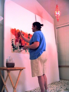
[windows into wall: jen painting on one of two styrofoam insulation panels we used to create a temporary wall. click the image to see other artworks.]
we have just one (!) more spot available at the next open studio event. our free intuitive collage night is all treats and no tricks, with a delicious supply of print materials, found objects, original art scraps and pretty papers for to discover & devour like halloween candy. :)
our next guided intent, though, is going out on a limb for most of the people who are interested in our studio events. in november we will pull light from the early darkness by sharing stories with each other. influenced by the international success of playback theatre, we will find connection & catharsis by recreating theatrical vignettes of past, present & imagined narratives. a process that combines spontaneous collaboration with gentle direction, playback theatre is often touching, hilarious, sad and bold all at once.
this is a little scary for artists who primarily identify with visual or literary arts, which is almost everyone on the meetup group and on the events list. but i strongly believe that exposing yourself to a dynamic range of art forms in a supportive environment fosters creative self-expression and helps you build a richer creative vocabulary. art exploration encourages you to create more fearlessly and truthfully no matter what your dominant art is. i hope they are able to trust the process!
playback theatre has always been a wildly successful activity in the artist's way creative clusters, but it's usually a late-term activity, when the group bond has grown strong and they've experience the power & excitement of exploring mediums they haven't tried before, or activities they haven't dared try in a long while.
posted by gl. | permalink | categories: artist's way
October 4, 2006
artist's way: week 4
by gl. at 12:14 pm
one of the artist's way participants brought scarlet runner beans for us to open last night: lovely things to hold in the hand and rattle. i think i'll try to grow some next year.
now that it's been a month, some of the initial giddiness has worn off, but at the same time, participants are really looking forward to meeting every week. one has had a breakthrough with morning pages, after resisting them (and her art) for years. participants are finding artist dates to be frustrating if they aren't perfect, if they aren't completely inspirational. if you don't make time for art, imperfect experiences will feel like a waste of time. the only way out is through: the more you allow yourself an opportunity to experience art, the ratio will eventually balance out.
this week's art activity was one where you write down every single horrible thing your critic says to you, all the reasons it tells you that you can't write, paint, dance, draw, act, metalsmith, etc. then you highlight the thing that provokes the most emotional reaction and let your hand create a movement based on that emotion. you use that movement to draw a scribble over that page of writing. then you squint & turn it around until you can create something out of it. then you pass it along and other participants contribute to that piece, adding something to it or transforming it to protect you from your critic. this sounds like sort of a silly exercise, but it's amazing to see the transformation, and being able to visibly contribute towards the protection of each other really helps bond the group. though the exercise begins somberly, by the end everyone is smiling in delight and surprise.
this is the week we begin media deprivation: no reading, tv, music, radio or movies for the rest of the week. this is meant to balance out your consumption versus your production. julia cameron thinks you shouldn't read at all, even if you are a student or you're at work, but i don't think media deprivation is supposed to be a punishment or something that makes things worse for you. so i make exceptions for things which are absolutely essential, situations you don't control, and things that can only happen this week that you have already planned.
the goal is to be conscious. awareness leads to progress. so what this means for me is that i'll scan incoming email to see if it's something that needs to be responded to this week, and if not i'll leave it alone. it means i'll go to the hp lovecraft film festival this weekend because i plan for it all year. and otherwise i'll try to be very good about doing more.
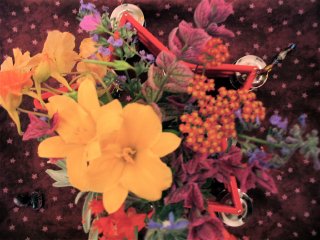
center (power): a scarlet star-shaped tambourine overflowing with flowers donated by a cluster participant.
music: adam hurst's passages, which really is as good as i thought it would be for artist's way. but the cd player doesn't like it much: it skipped sometimes and would randomly stop. it's been doing that more often lately. does anyone else know of a small cute red cd player i could buy?
posted by gl. | permalink | categories: artist's way
October 2, 2006
oregon biennial
by gl. at 12:20 pm
october is national arts & humanities month! alas, i missed the grand opening of portland center stage yesterday at the armoury.
but this is also the last week to view the oregon biennial at the portland art museum, so i guess i'd better write about it now before it becomes too irrelevant...
i've always been a user interface kind of person, and so the first thing i noticed was the the signage is pretty bad -- especially for the 3d objects, which never had a sign near them.
however, my favorites included....
bill will's "reconstitution": a tree on its side made from scrap lumber like windowsills & molding. really, it was quite evocative.
holly andres' "consumables: two lit "advertisements" for pink edibles and pink beautifiers. unfortunately, it was often quite difficult to locate the numbers referencing the items, and there were several typos.
mariana tres' "homespun universe: the wondrous works of anabella gaposchk": i found this to be absolutely delightful; i've written about it before. every piece was a mixture of love and obvious talent, including the audio tour & opera "upon the orange moon: the lunar music of viviana spoikoininich."
also noteworthy...
houston's "rendition/illuminati multivariat": office file cabinet pierced with arrows, false office ceiling hung at an angle with a thicket of dreamcatchers
brittany powell's "donut shop": a wall covered w/ contact paper, then carved out with primitive shapes & detail.
david rosenack's untitled series: tiny b&w oils, exquisite detail, shadow/light, back yards
ty ennis' "your friendship to me is like a kool-aid stain on my favorite keds. you are always there to remind me that i am a fuck up": certainly the best title for a piece, but his whole collection was understatedly interesting. when i checked the biennial catalog, he certainly had the best artist statement. unlike, say, brad adkins, about whom the catalog only says, "the artist declined to provide an artist statement." thanks a lot, brad. very helpful.
chandra bocci's "gummi big bang": i almost missed this; tucked into a large nook, i only found it accidentally as i left the gift shop. the gummi big bang is almost exactly what it sounds like, an explosion of hummi bears (and the occasional gummi shark) strung onto monofilament and fiber optic, radiating from an inner core of light.
videos...
unfortunately, the sound was better outside the room showing the three looped videos than inside it.
pedestal: 5-7 minutes of an empty pedestal on the screen with two stoned guys talking about it: "an empty pedestal is a promise." the point is that nobody notices the pedestal when something else is on it.
holly andres again: a film about her mother's death which includes paper dolls.
vanessa renwick's portrait #2: trojan: i was sad when i realized i missed the demolition of the trojan nuclear plant in washington. the film shows its stature in the nw skies with footage taken from i5 and the lewis & clark railway line. it builds though surreal sunsets, time lapse of the moon & stars rising from the opening, until its eventual implosion & collapse, the dust cloud seeping its way through through the trees, birds flashing in front of camera. obviously political, but still enjoyable.
posted by gl. | permalink | categories: exhibits & events