you are here [x]: Scarlet Star Studios > the Scarlet Letters > a toast to the happy couple
<< before
making cobblestones at bent
after >>
30fps - basic principles
July 31, 2006
a toast to the happy couple
by gl. at 3:47 am
(this is the last post before we go to canada for a couple of weeks...)
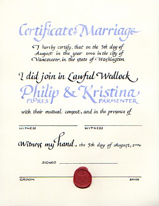
i just finished a commission for a marriage certificate! i very much enjoy creating things for joyous ocassions:

[click the image to see it larger]
exif: about 20 hours; arches text wove; tape .5, 1 & 2 nibs w/ some help from a .03 pen meri gave me to create the lines; sumi ink for black and custom acrylic mix for the periwinkle; basic italic/chancery; wax seal
believe it or not, there's no shiny on this piece! the wax seal was difficult, though: i had to create several emergency ones at the last minute when the one i put on as the last and final step before delivering it broke! aieeee! melting the wax creates noxious fumes and if safety boy had been there he probably would have handed me a mask. i hate using those candle-like wax sticks; they mix soot in the wax and by the time you've dripped enough wax to create a seal, it's already begun to harden. instead, i crushed the wax stick w/ a hammer, melted the fragments in a little spoon and pooled it onto the paper all at once.
the ink is always my nemesis. their wedding color was periwinkle, and i mixed up a great one using a pearlescent purple ink, a couple of drops of random blue ink & a fair amount of higgins eternal white. but when i tried to use it, the ink would separate, leaving the letters outlined in shocking turquoise with streaks of darker purple in the stems. so i thinned a pretty, pale blue-violet acrylic, but by the time it was thin enough to (barely) write with, its color had become far more ice-pale blue than periwinkle. i ended up adding some purple ink to it & a little silver pearlescent, but it was still a struggle to write with.
when the nib is at its smallest size (.5), it takes more effort to keep the nib from skipping over paper fibers & whatnot, so i find my writing in smaller sizes isn't as fluid or consistent as it is at larger sizes.
when i create calligraphy, the layout comes to me in fragments: i knew how i wanted to do their names first, and then i had to go through about 20 versions of the rest of the text before i could begin working on good paper. i had initially thought it was going to be a horizontal layout because the "certificate of marriage" and the names could be so much bigger than they can in this format, but the line length for the smaller text and the signatures was simply too long and i couldn't get a good balance between all the elements.
and now off we go into the wild blue yonders of canada. oh, canada!
posted by gl. | July 31, 2006 3:47 AM | categories: calligraphy