you are here [x]: Scarlet Star Studios > the Scarlet Letters > printmaking party
<< before
artist's way open studio (february)
after >>
unitarian artist's way: week 3
February 19, 2006
printmaking party
by gl. at 11:07 pm
last sunday i got invited to a printmaking party by a woman who attended a previous artist's way open studio, and other than gocco & letterpress i don't have a lot of experience with traditional printing techniques, so i was very much looking forward to it. i expected to use use the large shiny wheeled press more than i did, but really it was simple monotyping that i really enjoyed.
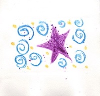
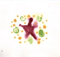
monotyping involves painting a piece of plexiglass with a design, then laying a piece of paper over it and using a rolling pin to apply pressure. using the "get through your first 50 failures as fast as you can" rule, these are the first two monotypes i created while everyone else was trying to create the perfect one:
 2.
2. 
we used Rives BFK for the first batches of prints (and random paper later as supplies began to dwindle), which has a high rag content and is a beautifully creamy, lightly textured, thick, soft paper. we soaked the sheets for 10 minutes because we were using water-based pigment (gouache & watercolor crayons) and it helped lift the print from the small sheets of plexiglass. also, soaking the paper allowed the plate to create a luxurious emboss on the print.
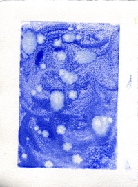
emboldened by the ease & speed of making monotypes, i tried more. i've been wanting to make more stellar-themed art, so i brought out a copy of a star map from 365 starry nights (which i cannot recommend highly enough as a way to learn the night sky, and it's the same map i used in "web"):
 4.
4. 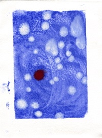
i love these. they didn't come out as expected, but i think they're beautiful. i'd lay the plexiglass over the part of the sky i'd want to print, paint blue first and swirl it around, the paint the stars in. except once the blue is on, it's very difficult to see the stars and monotyping is an imprecise process with a lot of spread. so these are more impressionist than print, but i'd like to think they have the same spirit as van gogh's starry night.
then i tried using two plates w/ the same technique:
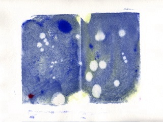
6.
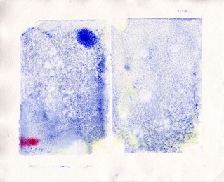
the second one is a ghostprint of the first, printing what was left on the plate after the first print. i like these, too; they have a flavour of those tinted images you see from nasa, or nighttime infrared images.
but i still couldn't identify constellations and chalked it up to the vagueries of the monotype process: i hadn't quite caught on that monoprints are a reverse printing process (that particular detail almost always eludes me because my 3d spatial ability is poor, and positive printing is one of the reasons i love gocco so). so when i made a G on the next piece, it came out backwards and i salvaged it by stamping letters over it.

yes, i know it looks like "kidneys" rather than "kind eyes." i was going for an awkward justification effect where the letters simply fill the space without spaces or punctuation, and it would have worked better if the upper lines were more consistent.
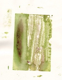
so i tried a backwards G on the plate but then painted over it with another water-based medium, which obliterated it. still, it made a nice texture, and the colour intrigued me enough to try a plant-based print with it:
 9.
9. 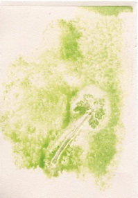
i tried a couple of different plant-based prints i'm not showing here, actually: the others were too thick and i couldn't apply enough pressure to get them to print -- and when i used the large shiny press, i forgot to add my paper, and so printed onto newsprint! (and the print still didn't come out). however, another woman made a simply stunning print of a small pine branch, so i know it's possible.
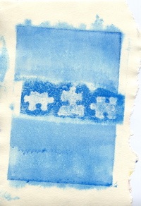
i tried more dimensional objects, and the puzzle pieces below did the same thing: the wide swath of white in the middle is where the puzzle pieces didn't print. so i tried an overprint: i removed the puzzle pieces and printed the swath of paint still left on the plate. i didn't line it up very well, but i like the asymmetry of it. if i can find decent lowercase letter stamps (they're all uppercase or overly quirky stamps), i'd like to print "i want to know" on this piece.
 11.
11. 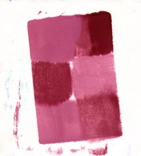
at that point my brain was full, so my last piece was this pink & red checkerboard. check out that spread at the top! sheesh! also, you might notice how incredibly, um, off-kilter these pieces are becoming; it's a trend that begins early enough on that i ought to have corrected for it, but i didn't notice until it was too late and then couldn't figure out what i was doing wrong, so i want to be more careful on the next round.
i can't believe i walked out with almost a dozen prints! now my problem will be deciding what to sacrifice to attempt lettering on them...
posted by gl. | February 19, 2006 11:07 PM | categories: exhibits & events, printing