you are here [x]: Scarlet Star Studios > the Scarlet Letters > test clip: dancing
<< before
3D storyboard: "Stole My Heart"
after >>
the power of the portfolio
December 3, 2005
test clip: dancing
by sven at 1:49 am

Yesterday afternoon I did a really neat film experiment in preparation for my final project in the Super8 class.
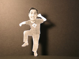
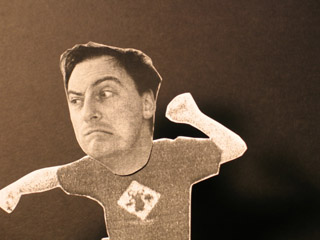
I set up a digital camera on a tripod and used the remote to take some photos of myself: full -body shots and head shots. I printed them out on an inkjet printer, enlarged them on the photocopier, pasted them to black cardstock, and cut out the bits I wanted to keep. On my desk, using my desklamp for lighting, I set up two pieces of black foamcore -- one for the backdrop, one for the ground. I have a scrap piece of wood with drill holes in it, which I put a dowel in. Then I taped the heads and bodies to the dowel and took more photos. I imported 54 stills into QuickTime as an image sequence at 6 frames-per-second...
And thus made an 8 second movie clip!

If you want, you can download the clip.
- Length: 8 seconds
- Format: QuickTime (.mov)
- Size: 2MB

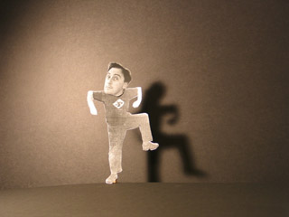
- The shadows are excellent... I could create this same clip (including shadows) entirely in digital space -- but it just wouldn't be as rich.
- There's some fluctuation in the lighting. It seems to be a matter of where the camera is pointing when it takes its light meter reading. The figure changes; the background doesn't. If I make sure the reading's being taken off the background, things seem to be OK. [I could also probably put the light meter on manual.]
- 6fps seems about right. Since Super8 shoots at 18fps (as opposed to normal film's 24fps, and DV's 30fps), I probably want to click three shots of each pose.
- The facial transitions are a bit abrupt. For my brain, my guess is that it takes a minimum of half a second to read an expression. Since the eye really focuses on the face, this is important.
- I could have done with more tweens for the leg movements.
- Cardstock cut-outs bend. This can be an advantage. It allows me to get the foot below the edge of the foamcore that I'm using as the ground. It doesn't look right if the foot is standing right on top of the line.
- The "ground" was at an angle. I like it. It might be useful for some "forced perspective" effects.
posted by sven | December 3, 2005 1:49 AM | categories: movies, stopmo