you are here [x]: Scarlet Star Studios > the Scarlet Letters > mhcc calligraphy: class 9
<< before
the power of the portfolio
after >>
artist's way: week 13
December 6, 2005
mhcc calligraphy: class 9
by gl. at 11:26 pm
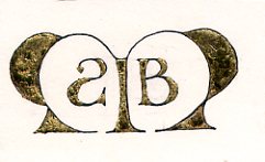
when xmas & blogging collide: we create gilded versals at last week's mhcc class. guess who's getting a gilded versal for xmas? :D fortunately, i'm guessing michaelmas will find the information here interesting & worth "tarnishing" the surprise. the scanner doesn't show shine so well, though. ergh.

this is considered in draft status until i clean up the edges, reoutline it & burnish it. gilding looks easy, but of course it isn't. it's time-consuming & fussy & messy. even with fake gold leaf kits (as opposed to shell gold, which is more authentic and costs proportionally more), there are several laborious steps after you draw your versal:
- bulk up a layer of gesso
- let it dry
- add a layer of adhesive
- let it dry
- no, really. let it dry. or when you add gold leaf, it will come up, and you will have to lather, rinse, repeat.
- when tacky, gently float a thin sheet of gold leaf over your piece, trying to get as few wrinkles as possible
- place a piece of paper over it & burnish w/ a bone folder, trying to get the gold leaf to cover all the adhesive elements
- brush off the leaf excess with a softsoft brush
- scrape up the edges of ragged gold and excess adhesive w/ tinytiny xacto strokes to expose your versal lines
- brush away all the bits
- re-ink
- place a very soft cloth over the piece and use a burnisher (or a bone folder) to make the bits shine.
- keep burnishing
- keep burnishing
- pause
- keep burnishing
- tada! pretty, huh? breathe. try to focus anywhere further away than your nose.
when i created this versal at mhcc, it was originally an asymetric design w/ just an M and a B in its right counter. but i drew it on a separate piece of paper because i don't feel confident enough to draw directly onto an original. i rarely do. then i did a basic graphite transfer -- which reversed the B and became the basis for the backwards S (michael's middle name is stuart). i loved the balance & playfulness this created. sweet, sweet serendipity!
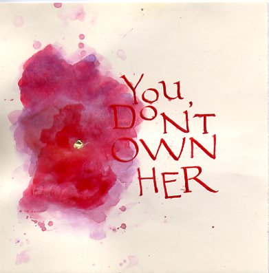
also, i was inspired last week to create an artistic response to a political issue (alas, this is one case i could have done without inspiration, though):

this is also a draft, but i see a lot of potential in it. that's four different colors of red ink.
and we don't usually post links (why not?), but here are two i find totally worth mentioning:
keri smith posts a template for a "magic book," which is how marti has us make the abecedariums at the beginning of each term. i'm thrilled to have the instructions because i can just barely do it when marti's there to show us, and it is definitely a cool technique to know.
the gocco is definitely my kind of cute & convenient, but this "cheap screen printing tutorial" wins super mega bonus points for being clever, easy, cheap & equally non toxic.
posted by gl. | December 6, 2005 11:26 PM | categories: calligraphy, classes & workshops, links, printing