November 2005 archives
you are here [x]: Scarlet Star Studios > the Scarlet Letters > November 2005
<< before
October 2005
after >>
December 2005
November 30, 2005
artist's way: week 12
by gl. at 6:43 pm
this week we did one of the hardest exercises i facilitate in a creative cluster: authentic dance. doing it well hinges on group trust and a willingness to take creative risks. i remember when i first participated in this activity i wasn't sure i could do it. i was positive, in fact, i wasn't going to do it until after i had done it. so facilitating it always makes me a little nervous because i understand how hard it is to commit to and how delicately it has to be handled. even people who have adapted well to exploring visual creativity exercises find creating art with something as intimate as one's own body is a challenging experience. the same is true for music exerices and using one's voice, and to some extent, the playback theatre exercise.
the tuesday night group had it a little rough. one of the participants was having a horrible night and though she began her dancing strong, by the end she was small: better than she had arrived, but not as transformative as last week's exercise. but the beauty of authentic dance is because it's not a performance but an expression of one's own body, not moving at all is still communicating something. authentic dancing is done in pairs, with the other person being your witness. having a witness allows you to remain grounded and pulls poetry from you even when you think the motions will appear to be meaningless.
the wednesday morning group really leapt right in, even the participant who looked at me with big round eyes as i explained the exercise. i could tell she was scared, but she was willing, and people often underestimate the power of being willing to try something in a safe space. and since there were only three of them, and authentic dance happens in pairs, i had to do it, too (and yes, authentic dance still makes me nervous. less nervous than it used to, but as the facilitator there felt like self-imposed pressure to be "good" rather than just expressive).
the wednesday cluster was having such a good time we actually got out 15 minutes late, which is unusual because i'm pretty good about getting them out on time, but some things can't be rushed. and i was surprised and pleased to discover that one of the participants has been influenced by sven, even though she's never met him. but his "witch" and "pajama dreamer" sculptures are hanging in the studio & she was thrilled w/ sven's new pegboard, and everyone asked for copies of "notes on making art." how delightful!
next week is the last week for these clusters. we've started to talk about how to continue artistic development once the clusters end, stressing the use of morning pages, artist dates, and finding supportive companions. after we stop meeting, i'll start promoting the next round of clusters that begin in february. promotion is one of my least favorite things ever, so if anyone has any tips or advice about who & where & what & how, please feel free to say something.
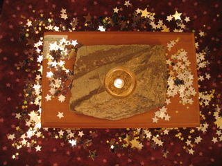
center (autonomy): a wooden cigar box filled with chestnuts, topped w/ a warm slate candleholder. a pool of silver & gold stars surrounds the box & the stone.
music: i began tuesday night with enya's shepherd moons, but one participant wanted something "angrier" for her so i dug around in sven's room till i found patti smith's trampin'. this morning i moved to enya's the celts, which has a little more body than shepherd moons but isn't as angry as patti smith. :)
posted by gl. | permalink | categories: artist's way
November 25, 2005
thanks
by gl. at 7:16 pm
no notable calligraphy projects this week (though i have to figure out my final project for mhcc soon...), but i dashed off some placecards for thanksgiving dinner yesterday:
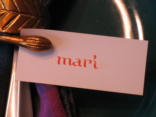
just some simple bookhand w/ three gold dots on either side of the name. i used a harvest-orange french ink i've had for a while that's in a cool wax-sealed bottle and little cards already cut to size that i inheirited from chas' letterpress.
with or without placecards, we had a pleasant meal. but i was glad i actually took the chance to run over to the studio to do these; ordinarily i would think about it but not actually do it.
posted by gl. | permalink | categories: calligraphy
November 23, 2005
artist's way: week 11
by gl. at 11:06 pm
two pretty good sessions this week.
tuesday night finally got their blind painting session. one participant came in crying, but by the end of the night, her mood had lifted and she was excited and smiling. it's just amazing to watch the art process work like that; i don't often use the word "transformational," but in this case there is no other word for it.
this morning's group created a collaborative story using image cards they created, which they enjoyed so much all of them had ideas of how to take it home with them and get others involved. at the end they huddled closer and closer together, waiting for an opportunity to play a card, spinning story so quickly i could barely keep up! it seems more common than not that the collaborative stories begin in a magical forest. before the cluster began, one woman confessed privately, at the risk of seeming maudlin, that she admired me and was very grateful to get the chance to get to do artist's way with me. and if that isn't the perfect thanksgiving present, i don't know what is.
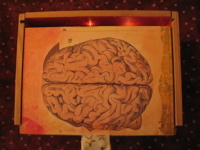
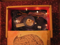
center (self-protection): the "flesh & spirit" box i created for the "outside the box" show in san diego. the outside very clearly shows the box "skeleton" and its panels are oversized limb & organ pictures from a victorian anatomy book that have been painted & gilded. the warm interior is a heart twinkling w/ light, filled w/ shimmery, gauzy materials, stars and hidden treasures.
music: the ambient cd of moby's hotel.
posted by gl. | permalink | categories: artist's way
November 22, 2005
mhcc calligraphy: class 8
by gl. at 10:07 pm
we did some versals in this session, but i was much more interested in seeing how the pastepaper we made in the last session turned out.
pastepaper is just acrylic paint mixed into cellulose-based art paste and applied to paper: in this case, arches text wove, which i find frustrating for calligraphy but excellent for pastepaper. pastepaper is often designed to be used in bits & pieces, but i find i am fondest of the ones that seem to be complete pieces in and of themselves.
it turns out i made 16 pieces. i can't scan three of the blue ones because i made the mistake of adding a copious amount of glitter to them, which makes them sparkle like a frosty winter twilight (the intended effect), but also gets on the other pieces and the scanner and the floor and the table and my clothes (the unintended effect). in fact, the pieces you see here all had some glitter shed on them, and since it was large salt-flake sized glitter, often it would pool, creating tiny dark rings and light spots where i wouldn't want them. and then they'd flake off and i would have to dust the scanner between each piece.
none of these were planned compositions; i just mixed colors and put them on the paper to see what happened.
yellow wave (excerpt): this was the first piece i made and the paper is probably 4-8 times bigger than this. interesting note: all the pieces below were done with the same red, blue & yellow you see here.
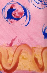
purple noodle (excerpt): this is another excerpt before i began tearing the paper into smaller pieces to be able to experiment faster. ("get through your first 50 failures as quickly as possible."). the pattern is just fingerpainting with some plastic fork happening in the lower left corner.
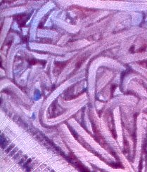
greengold center: that's gold leaf in the middle. i was surprised to discover it stayed on remarkably well with just water & art paste.
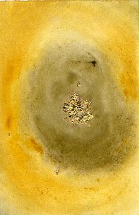
red flowers: i wasn't tearing the paper especially carefully. :) if i could make changes to this one i would remove the odd brown streak angling from the blue swirls, because otherwise i'm quite fond of the composition. another experiment in gold leaf at the bottom, though the red spots have gold paint centers.
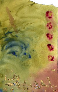
flag: i brought some silver ink and wanted to see what it would do.
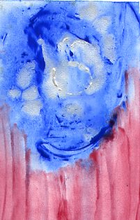
fish stamp: marti brought some stamps so i played with them. i used something called "colorblock" on top of the fish, hoping it would let me paint on top of it and later peel off like frisket. alas, that didn't work, and when we used the hot press to flatten the pieces, it melted and stuck to the press padding. so what's colorblock good for? i have no idea.
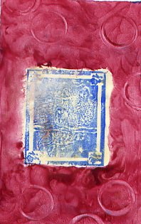
secret: more playing w/ stamps, this time a letter block i used -after- put color down, trying to achieve a subtle tone-on-tone effect. then i tried writing a word in it, then i tried drawing a heart and adding gold leaf to it. none of these effects worked as planned, and it was especially embarassing to discover i had drawn the heart upside down.
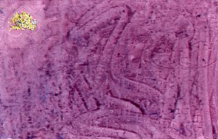
noise: undaunted, i tried laying the alphabet stamp block down first (using leftover paintpaste from "secret"). much better. there's a subtle gold wash in the center.
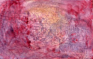
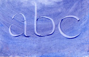
abc: i wanted to try writing in the paste again. much better. this is bookhand, btw. i know the "b" is a little wide & the bowl is sloppy.
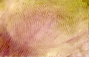
soundwaves: i decided to try a traditional pastepaper tool: a notched comb with squared teeth. i don't usually like the texture it makes, but in this case i'm quite fond of the overlapping ripples.
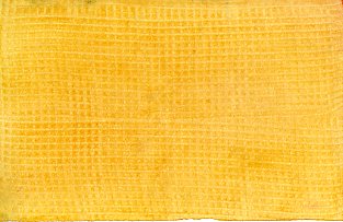
yellow weave: another "traditional" pastepaper approach, i was charmed by its sunny simplicity. somebody set their dark blue piece to dry too close to mine, so it has some bluegreen edges.
yellow stripes: one last try with the comb. eh.
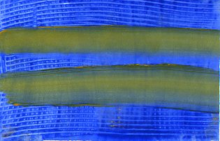
raspberry swirl: nothing special here: i think i used a plastic fork for the swirls but it wasn't as pretty as i'd hoped.
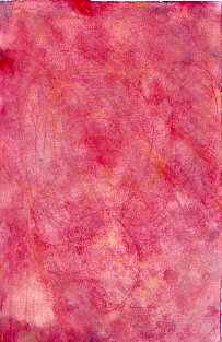
of course, now i have to use all this somehow; i still have three pieces of pastepaper from when i first made pastepaper in san diego. i'm hoping that because i made much more this time, i won't feel each piece is as precious and i'll be able to find interesting ways to use it.
posted by gl. | permalink | categories: calligraphy, classes & workshops, other art
November 21, 2005
studio gets pegboard for tools
by sven at 11:19 pm
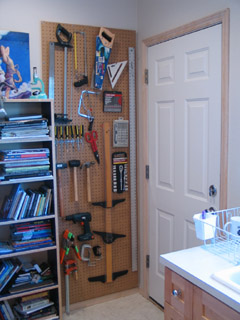
For a long time we've been talking about putting up a pegboard for carpentry tools in the kitchen... Saturday I finally got together all the materials I needed and did the job.
The new pegboard resides by the backdoor and holds nearly all the tools we have. The powertools don't fit -- but that's OK: the cords look like hell when you mount them on the wall. It's 30 inches wide, and 7 feet tall; an inch up from the floor molding, and an inch over from the corner of the wall. I'd intended to have it crammed right into that corner, to maximize space -- but there's wood immediately behind the drywall there, so I had to move it over.
Creating this thing was a little tricky. First you build a frame out of 1"x2"x8' pieces of wood, matching the size of the pegboard exactly. Remember: you need space behind the pegboard so the hooks have somewhere to go! Drill supports into the wall, then attach the frame to them. Next you attach the pegboard itself to the frame. Put hooks in, and you're done!
Hm. When I write it out, the job sounds easier than it actually was...
Total work time (including buying parts): about six hours.
posted by sven | permalink | categories: studio space
November 17, 2005
artist's way open studio (november)
by gl. at 11:25 pm
we had a full house of rsvps with people who were excited to come (and even turned away several prospects), but in the end, it was just me & sven. after that whole "collage night wants to be free!" speech, i'm considering instituting a paypal "rsvp fee" in january to staunch the attrition rate, or maybe just overbook. we'll see what happens next month.
i cheated and didn't actually even collage: i glued a large image onto a card and played w/ the gocco some more (edging toward the two-screen process). but sven created three collages, this one being my favorite:
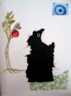
[sven's "monster": click the image to see the other collages]
posted by gl. | permalink | categories: artist's way
November 16, 2005
artist's way: week 10
by gl. at 11:49 pm
blind painting is always a fun activity and it allows people who are afraid of paint to try it because they can't see it! :)
after a tearful reunion last week, last night's group had the weird vanishing act again, so i had unexpected time to play w/ the gocco, but it was a little rough on the morale. the wednesday group, however, was chatty and excited and playful & brave. one of the participants has been a member of a previous cluster and has said the last two chapters really resonated for her -- which was good to hear because she really didn't have a connection to the book the last time 'round. but her life has shifted in some fairly dramatic ways, and this illustrates my theory of the artist's way process being a spiral one: not all the chapters will work for you, but at least one of them certainly will, and different chapters will mean more to you than others each time you read it.
i've been asked the same question now twice in two days: why do i host a free collage night? the job club for creatives asked it first, implying that if i want to use it as a recruitment tool for creative clusters, i need to target people willing to pay for collage night. today one of the participants asked about it, worried i was undervaluing my time & attention.
there are several reasons why collage night is free:
i believe in the gifting economy. i want to have a range of offerings, including one for people who can't afford to join a creative cluster.
i don't like the idea that every art experience has to be commodified & paid for. i charge for artist's way creative clusters because they are a significant investment of time & attention. but collage is something anyone should be able to do at any time. to charge for it seems incredibly counterintuitive.
i don't provide instruction & don't plan to. i simply provide an opportunity, a catalyst. i believe art can be communal without requiring it to be collaborative.
the artist's way open studio benefits me just as much as it benefits the other participants: it provides me with an obligation to create art, as well as the opportunity to broadcast consistent updates about the studio that are more than simply solictations for money.
besides, who would come if i charged? i don't know how others do it, but it still feels like pulling taffy to get the studio to fill even when it is free. :P
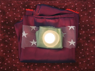
center (compassion): layers of shimmery fabric folded into comfortable pillows, cradling a frosted glass candleholder. a gossamer ribbon of stars is tucked between the layers. i've been wanting to do something w/ fabric, and compassion seemed to be a nice way to use it. the first layer of fabric is a sort of dichroic or interference fabric: it drastically changes colors as you change the angle of the light, moving from dusky rose to plum twilight.
music: pink martini's hang on little tomato because i referenced it in the weekly email i send out between sessions.
posted by gl. | permalink | categories: artist's way
November 15, 2005
go go gocco!
by gl. at 11:12 pm
i succumbed! the charming little gocco has won mon coeur and a spot in the studio's kitchen & printing shelf. i bought little miss gocco (or as sven calls her, "baby") at last night's portland society of calligraphy meeting, since the woman who owns letters and print (and who has been a calligrapher for years) was demonstrating them. i walked away with an embarassing number of inks & supplies, but i began printing tonight after artist's way!
i began with our logo and immediately hit a snag: though you can print multiple inks on one screen, it's a lot easier to do when your bits aren't so close together, like the stars next to the text and the streak behind the scarlet star. this is especially difficult when working with the logo at a reduced size, like one would want to print on the back of those cute blind contour cards i just created. :) i get about 10 out before the red or the silver really begins to creep into the wrong places. i bought some ink block, but i can't cut the foam finely enough to wedge between some of the spaces and instead just end up blocking bits of the screen.
in the blind contour drawing print, the migration of colors is part of its charm. the logo, though, suffers when silver stars become scarlet and vice versa. i suspect i will have to create two screens for the logo (one for silver & one for scarlet), which is a shame because it will require drying time between screens and careful attention to registration to print the logo on anything -- which likely means i'll be less inclined to do so. meh. this is, of course, my curse: to take something that is incredibly easy and immediately discover its limitations. :)
the good news is that creating the screen was super easy. none of it is difficult; in fact, it's amazing just how easy it is. and i still love the tiny explosion.
posted by gl. | permalink | categories: calligraphy, printing
November 14, 2005
pan: holiday gocco printing
by gl. at 4:04 pm
eeeeee! yesterday i finally got to take a gocco class w/ shu-ju wang, something i've been wanting to do since the portland open studio tour. she even recognized me, due also in part to my subscribing to her gocco print test lab, pudding. (mph, why do all the best things have "pudding" in them? maybe sven & i should rename ourselves "scarlet pudding studios.")
print arts northwest hosted the workshop and fortunately (for us) there were few enough students so that we each got our own gocco press. i took a gocco workshop at the iprc several months ago, and as much as I (heart) the iprc, shu-ju's class had a lot more hands-on time and i walked away with a more complete picture of the whole process (but then, it cost 4 times more, too).
i totally missed that this was supposed to be for "holiday cards." i wanted to use the einstein piece to create cards, but its subtle tonal variations make lousy photocopies & therefore lousy gocco screens (i could play w/ the contrast in photoshop or iphoto, though, i think). so instead i used my blind contour self-portrait, leaving enough room beneath for a little calligraphy. when i used just black ink, it didn't look much different than a photocopy, but when i used three colors it was much better. (using different inks on the same screen is one of gocco's many advantages compared to traditional screenprinting.)
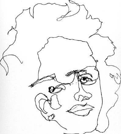 | 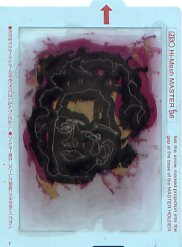 | 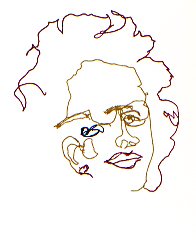 |
| [original] | [gocco screen] | [gocco print] |
so now i have 21 small cards in white & mustard (the gold ink disappears at the right angles on the mustard card, making most of my face disappear) and 12 small portrait-sized pieces i don't know what to do with yet. (though i suspect my parents will get one for xmas. good thing they don't read this, right? ;)
gocco competes with letterpress for my attention (and my limited $ for supplies): i adore handling type and the feel of letterpress pieces, but gocco is much quicker, easier, more versatile, and more importantly, a lot less toxic to use & clean up. i suspect gocco will win, at least in the short term.
posted by gl. | permalink | categories: classes & workshops, printing
November 13, 2005
art marketing workshop by Marty Rudolph
by sven at 9:54 pm
This weekend, both yesterday and today, I was at a two-day art marketing workshop. It was presented by marketer-extraordinaire Marty Rudolph. Overall evaluation: excellent -- well worth the money.
I went into this knowing that I don't yet have a body of work that's ready for marketing. But I wanted to understand the big picture now, so if/when I do get to that point I'll know what to do.
I was pleased to discover that the overall strategy for marketing is nearly identical to fundraising for non-profits -- something I already have a decent grasp on. You have a story to tell; you get people excited about that story; you throw special events; you get them on your mailing list.
I get the sense that there is a three-step ladder to becoming a well-recognized artist: (1) start with a home show, (2) move on to street shows, and then (3) get shown in galleries. Marty made the process for getting into a gallery seem very tangible, very doable. Go to all the galleries, figure out which one you fit in, then make a pitch to the owners. Getting shown in galleries in other cities seems to be an outgrowth of doing roadtrips to do out-of-state street shows -- when you're in another town, you check out all of its galleries, just like you would on your home turf. Apparently there's a must-buy periodical called "art calendar" that collects all of the street shows' dates. Don't go to a gallery until you've sold on your own.
Galleries and agents both seem like things I'll want to avoid. Galleries take a lot of the profit, and they're not necessarily going to work hard to sell your stuff; they want an easy sell. In that sense, they sound a lot like book publishers. Agents, apparently, are only interested in representing you when you're already doing well selling things. It makes sense: both galleries and agents are all about finding someone who has a sellable product, bargaining control of it away from them, and selling the thing for their own profit. If they actually saved me labor it might be worth enlisting their help -- but it sounds like even when you get a deal, you still have to be your own best publicist. No thanks!
Repeated messages:
- You are your art; you're selling you, not just objects; you become the brand name -- just like "Oprah" or "Martha Stewart".
- You have to be prolific; there has to be a constantly renewing body of work; you have to have "inventory" to replace what sells.
- What people want: personal connection, authenticity, trust.
- When people see your work, above all present consistency -- twenty pieces that all look like they belong to a set.
- Set a price and stick to it; never discount, or people will wait for you to lower the price, hoping for a better deal.
- Don't mix marketing time and creating time. Commit to regularly spending time on the business end of things.
I tend to look at workshops of this sort as meditations... During the whole time there'll only be a few insights that really go "click" in my head -- but I'm forced to spend two days grappling with a particular problem. Being forced to really think about marketing, I'm beginning to see who I could sell some of my stuff to...
The "witch" and "pajama dreamer" style could appeal to folks doing collaging, art dolls, and scrapping. I think it would do well in cafes. Possibly Lunar Boy gallery in Astoria, the Angry Fairy gallery in Portland, or shops that deal with urban vinyl / designer toys. Folks who like Dave McKean, Maurice Sendak, Winsor McCay. Marty suggests that divorced women may also be a target audience for this sort of whimsical stuff...
At the same time, I think I also sort of flummoxed Marty. I'm enough on the boundaries of existing art forms, doing my own thing, that I'm going to have to create my own markets. That means starting with people I know, and trying to enlist them as "evangelists" who'll help connect me to other people. [To be fair, I probably didn't have enough examples of work for Marty to really evaluate, either.]
Besides the fine art thread of my work, I also showed the Let Sleeping Gods Lie teaser and my "elder hat" sculpture. I'm beginning to realize that there's a pretty good market out there for this project, once it's done. H.P. Lovecraft is a thriving niche. Plus there are all the sci-fi and gaming conventions to go to. The folks who did a silent film version of "Call of Cthulhu" this year are marketing globally -- translating the title cards to Portuguese, Korean, etc. I could certainly do that too, if I got ambitious.
Unfortunately, coming home from this workshop, another take-home message was that I'm too diversified right now. Do I want to focus on sculpture? filmmaking? essay writing? I don't want to just dump any one of my talents -- but without sacrificing something, how am I going to build the necessary body of work? get to the point where I have an inventory of product that's ready to push?
Sigh... Such a dilemma...
posted by sven | permalink | categories: classes & workshops
November 12, 2005
mhcc calligraphy: class 7
by gl. at 5:23 pm
we didn't have class yesterday because of veteran's day, but marti offered a pastepaper workshop today to make up for it. she supplied most everything, but i brought most of the rest of my arches text wove and donated it to the cause. i want people to have stuff they'll use if i'm not using it, and not having it around means i can find other paper that works for me without feeling guilty about not using the stuff i have.
i started off doing larger designs & patterns, but inspired by sven's "notes on making art" (especially "get through your first 50 failures as quickly as possible"), i tore the sheets into 16 smaller bits so i could try more techniques more quickly, which felt much more creative and made me much less invested in any particualr piece. pastepaper should have a subtle pattern one could write on later, but my favorite pastepaper tends to be the ones that look like finished pieces on their own.
[update 11.22: i've added pastepaper pix & comments on a separate post.]
posted by gl. | permalink | categories: classes & workshops
November 9, 2005
artist's way: week 9
by gl. at 10:23 pm
everybody was at both clusters this week! we worked in clay today, which is a deliberately ephemeral & sensory exercise: the only exercise where we don't write or share or document or respond. we just do.
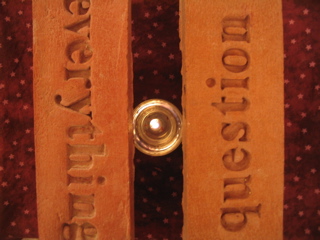
center (strength): taken from above, this picture is misleading, as from most other angles, the candle is hidden below the bricks, mysteriously illuminating them and shining through the ink bottles elevating them. i used to make these bricks when i lived in california, but it's a messy process & we don't have a space to make them inside, and leaving them to dry outside in the rain hasn't seemed very viable. :)
music: loreena mckennitt's the visit (thanks, michaelmas!)
posted by gl. | permalink | categories: artist's way
November 8, 2005
west side stories
by gl. at 11:45 pm
last night i attended, rather than hosted, a collage night! after travelling towards a studio buried in the west hills, it was nice to create without feeling like i was neglecting my hostess duties, as well as glean ideas & tips about supplies and structure. but it wasn't worth $20, though, which is what i paid to be there. scarlet star studios hosts an equally good (if not better) collage night for free. and the facilitator, who seemed pretty nice, had a disturbing tendency to interrupt me and tell me what to do or not do with my collage, even going so far as to remove an element (!), which i view as a fairly appalling facilitator violation.
i kind of like the collage that came out of it, though. it's larger than my normal size and collaged onto matteboard:

["wanting more"]
the star in the middle is mars at its spectacular 2003 perihelic opposition, which is very appropriate as that's the star & event scarlet star studios is named for. :)
posted by gl. | permalink | categories: classes & workshops
November 5, 2005
lost and found in the stacks
by gl. at 1:30 pm
i think i would cry at this exhibit, i would be so delighted.
posted by gl. | permalink | categories: exhibits & events, links
mhcc calligraphy: class 6
by gl. at 1:19 pm
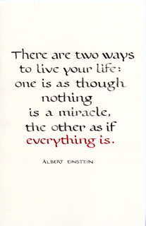
below is a bookhand layout using color for emphasis. the ink is actually much greyer than the scan makes it look: i watered down sumi fairly heavily to make the red stand out more. (and i like the whole grey/red thing. can you tell? ;)
[click for a larger verion]
my least favorite thing about calligraphy is struggling with materials. and i hate doing projects for classes which aren't actually functional -- why put in all that work if i can't actually display it or give it away as a gift or sell it? that's why the artist's way open studios have been working well for me, because at the end of the night i have created not just art, but a card i could give to someone.
i struggled w/ "two ways" because my typical card stock proved to be troublesome with the size of nib i had to use (a tape 1). the nib skipped and shook and wavered more than a nib even a half size larger. even turning the card inside out to use the hot press side didn't help. so the time i'd rather be spending tweaking layout and lettering got swallowed by debugging instead, making a 4-hour process 8 hours long.
so i frantically scrambled through all my papers for a smoother grain. what i should be using because i bought it specifically for this purpose is arches text wove, which i bought because the amazing teri martin recommended it during the sdfc coloring books workshop. i think teri uses gouache & acrylic, though: every single ink i've tried to use on arches text wove has feathered & spread: even sumi spreads a little. it's part of the trouble i was having with joanne's wedding comission earlier this year. i have about $75 worth of arches text wove in the flatfiles but if i can't use it, what's the point? i ended up using cheap paper from a strathmore drawing pad.
the sdfc did a paper sample workshop which was really interesting, but at this point, though i still have the samples, i don't what they are anymore (though i have some sort of vague memory that i was impressed w/ fabriano). and really, all i want is a good off-white text weight and cardstock/envelopes that work w/ inks & a variety of pen sizes. i got recommendations from the advanced calligraphers in the backof the class (aquarius 2 & fox hill), and i think i may be due for a paper & ink or daniel smith shopping trip.
we won't be meeting next week or the week of thanksgiving, though we may be doing a pastepaper workshop on saturday.
posted by gl. | permalink | categories: calligraphy, classes & workshops
November 4, 2005
Our Halloween: "the making of Let Sleeping Gods Lie"
by sven at 11:24 pm
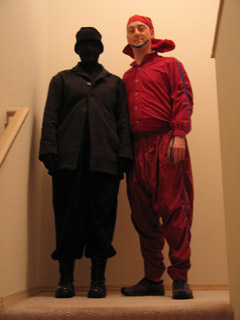
What did we dress up as for Halloween? We dressed up as "the making of Let Sleeping Gods Lie"!
After I got it into my head to dress up as one of the Elder Things, Gretchin was inspired to dress up as Andrew Stout -- one of our actors...
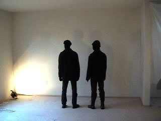
The actors were real heroes, wearing heavy black coats and stockings over their heads on the hottest days of summer. This was my DIY strategy for a kind of bluescreen technique: If there's enough contrast between the white walls and the black clothing, I can use that to digitally "punch out" the people from the shot. Over and over I said "one more time!" -- and the sweaty boys again pretended to see horrible creatures that weren't there.
Here's a picture of the stalwart actors. Andrew's the one in the knitted hat on the right.
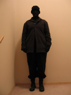
And here's a picture of Gretchin, doing her homage to Andrew. --See? She's also wearing a knitted hat! ...And suffering for my art!
...So now it's 5:30 on Oct 31st, and I finally have to admit defeat. I can't get the Elder Hat done in time. What I wanted to make was this:
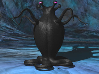
But all I could get done was this:
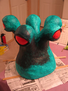
I set the Elder Hat on the dining room table, paint still drying, as... um... decor. But when I look at what a fantastic job Gretchin has done with her costume -- and how sweaty she's getting -- I realize that I must come up with an alternate costume. She shall not suffer alone!
I ruffle through my closet, furrow my brow, and -- ah-ha! -- it dawns on me: if Gretchin is going as a bluescreen actor, then I must go as the bluescreen actor's special effect! Thus, I attempt to become one of the "lavamen". Here's a shot where the actors have been replaced with the "lavaman effect":
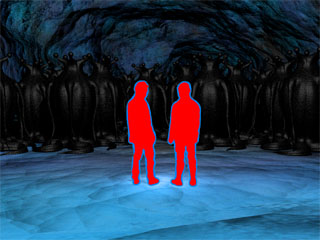
And here I am, in my attempt to look like one of them:
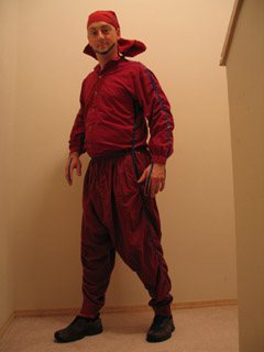
See? I'm all red. And I've applied blue electrical tape around my outline. ...Not nearly as cool as Gretchin -- but not bad for a half-hour's frantic brainstorming.
And it also (rationalize, rationalize) explains why the Elder Hat's not done: just as Gretchin and I are steps in the movie-making process, the Elder Thing is presented as a work-in-progress!
It all makes sense!
P.S. Thank you Michael for taking the photos of us! Hope your cold is getting better...
posted by sven | permalink | categories: let sleeping gods lie, miscellany
Elder Hat
by sven at 9:25 pm
On Thursday Oct 27, I got a crazy idea for a Halloween costume: I should dress up as one of the "Elder Things" from Let Sleeping Gods Lie!
I started with an old bicycle helmet. In the garage I found some squares of styrofoam that I've been hanging onto for years -- possibly from the dining room chairs' packaging? I cut holes in the styrofoam and then layered it around / on top of the helmet. I adhered everything together with sprayment.
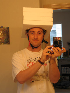
Luckily, I didn't run out of sprayment until just as I was adding the final bit of foam. To sculpt the Elder Thing, I used a flexible blade -- the sort that folks who work with polymer clay use. Cutting, rather than scraping, minimized foam dust -- but foam dust is innevitable, and it got everywhere. The glue was slow to dry, and badly gummed up my blade. But hooray for latex gloves! It would have been much worse if the glue was all over me. Still, I got a blister from using the naked blade.
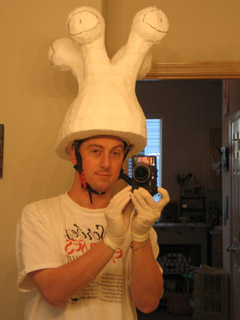
This is where I made a mistake. I've been so obsessed with sculpting techniques that layer stuff over foam, I moved on to the next step without thinking. What I should have done, was just use papier mache at this point. That would have been light-weight. Instead, I applied a thin layer of clay to the entire exterior. I'd scrape a bit of clay onto a wooden sculpting knife, then press it onto the foam like a small bandage. The thickness of this layer was only about 1/8"... Even so, I estimate that I used at least 10 pounds out of a 25 pound bag of clay. D'oh!
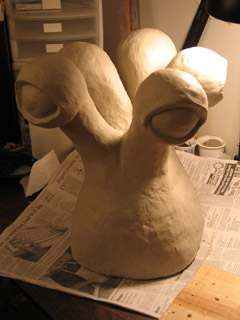
For this project I used a paper clay that I recently bought at Georgies. I anticipated cracking: clay shrinks as its water evaporates, and I was applying it to a solid core. My hope was that paper clay would shrink less and be stronger than typical clay... Even if it did help, though, the cracks were severe -- between 1/16" and 1/8" wide in some places.
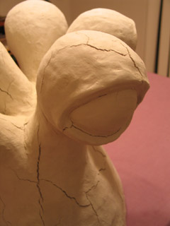
I waited about 48 hours for the clay to dry completely, anxiously watching cracks develop. The clay visibly turned a lighter shade of gray when it was done drying, and it no longer felt cool to the touch. ...Curiously, three of the eye-stalks didn't crack. I'm wondering if I put the clay on thicker on these -- like 3/16" or 1/4" thick?
To help bind the whole thing together, I decoupaged tissue paper over its surface. [This had been part of the plan even before the cracks appeared.] I applied pieces that were approximately 6" square with watered down Elmer's glue, using a 1" wide brush. The tissue paper innevitably has some small wrinkles in it. It's acceptable -- but to an extent, defeats the intent of the clay, which was mainly to create a smooth surface. Still, the clay gives the tissue paper something really firm and well-shaped to cling to...
I painted on a layer of gesso. I mixed acrylic red with clear tar gel medium to make the eyes glossy. [The eyes were the one part of the critter that I didn't cover with tissue paper.] I gave the rest of the skin a wash of acrylic phthalo green. I started to sponge on a mottled layer of black... And then I ran out of time! Ack!
I worked right up to 5:30 on Halloween night. Then I admitted defeat. I brought the Elder Hat over from the studio, to display it as a work-in-progress. --And frantically looked around for something else to wear in its place...
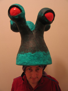
Here's a photo of me modeling the unfinished Elder Hat on Halloween night. Mysteriously, all of the bicycle helmet's padding fell out while I was working on it -- so in this shot you can see that I've got a towel between my scalp and helmet. With the clay, this thing was very top-heavy. It wasn't bad on my neck -- but I had to strap the helmet on tightly so the thing wouldn't start leaning -- and that was no fun.
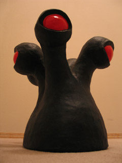
I finally got around to completing the piece this afternoon. I finished sponging on black acrylic, and gave the whole thing another glaze of phthalo green, to help mute the black. ...I'm kinda disappointed, though. It turned out much darker than I expected. Up close you can see that there's real depth to the color; but in anything less than bright light it just looks black.
Despite my mistake in using clay, and my disappointment with the color, I'm actually quite pleased with this project. It turns out that it's really going to be a sculpture, and not a costume... But as a sculpture, I finally got to do a completed piece using some of the techniques I've been exploring with little tests during the past few weeks. And it feels solid.
Total time spent on project (not including checking to see if it was dry, cleaning up, or blogging about it): 20 hours 15 minutes.
posted by sven | permalink | categories: let sleeping gods lie, sculpture
November 2, 2005
artist's way: week 8
by gl. at 11:14 pm
a very emotional cluster on tuesday night as members created day of the dead altars for people they had lost: in this case, they had both lost their fathers. the wednesday morning cluster members created altars for friends they had lost, which required a lot fewer tissues.
one of the wednesday morning members shyly asked if i could copy a demo CD she only had one copy of and had been afraid to let anyone listen to for years. another wednesday morning member is so thrilled with her artist's way experience she's planning on teaching it in salem herself in 2006, "and i'm just going to copy you," she says. certainly i've adapted pamela's excellent techniques, and thus the cycle continues.
center (connection): i made a feeble attempt at an altar for amelia using an izone picture i took of her a long time ago and her ultrasound images. but it didn't communicate what i wanted and hence no picture. that's the beauty of the "quality through quantity" ethos: i don't have to love or share everything i make. i just have to keep making. :)
music: cowboy junkies' the trinity session because boy, is it sad.
posted by gl. | permalink | categories: artist's way