October 2005 archives
you are here [x]: Scarlet Star Studios > the Scarlet Letters > October 2005
<< before
September 2005
after >>
November 2005
October 31, 2005
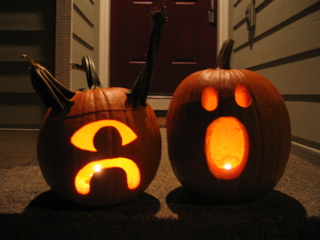
happy halloween from scarlet star studios!
by gl. at 2:02 pm
posted by gl. | permalink | categories: miscellany
October 29, 2005
mhcc calligraphy: class 5
by gl. at 5:06 pm
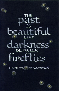
we must be about halfway through now, though we won't be meeting for two weeks in november. as promised, a layout w/ bookhand & roman caps:
[click the image for a much larger version]
after weeks of using zig markers for practice, i was happy to discover that tape nibs give me lovely hairlines when using sumi. here i've used higgins white and it very much sucks, immediately absorbing into the black card stock. in this case, i liked the ghostly & faded historical metaphor effect (which is actually sort of mitigated in the scan), so i kept it. the lettering required three different nibs: tape 2, tape 1 & a random pointed pen. the fireflies are three different colored pencil and you probably can't tell, even on the larger version, that the fireflies have tiny gilded centers. i like using gold dots on things, but they never scan well. i embossed the background lines this time so they are even more invisible than the pencil lines i used in "born": great for ink, but not for colored pencils, which explains why the fireflies look like they have black lines through them. oops.
if anyone reading this also reads dooce, yes, it's that heather armstrong. when i read that line on one of her posts, i knew i wanted to use it in a piece somehow.
next week: a layout using color as emphasis.
posted by gl. | permalink | categories: calligraphy, classes & workshops
October 26, 2005
artist's way: week 7
by gl. at 11:03 pm
since halloween is monday (!), this week we created masks, which transforms the studio into a glorious mess of paints & paper plates & found objects & glue guns & heat guns & beads & ribbons & raffia. one of the wednesday morning participants sent a great checkin from new york city. one of the tuesday participants was gone again, and she worried it would be "inappropriate" to return. so i asked the rest of the cluster what they thought, and their thoughts echoed mine: when you begin a cluster, you matter. you belong. there's a space for you. as ursula le guin writes in a poem i read at the beginning of each cluster, "return with us, return to us, be always coming home." unless, you know, you choose to drop, in which case we totally respect your decision. :)
this morning i got to the studio at 9 a.m. to get ready for the cluster at 9:30, and by 9:45 i was pretty mad that nobody had shown up until i remembered the cluster didn't begin until 10. :) it gave me some time to work on the layout for the mhcc calligraphy class that's due friday, though: i started sketching some ideas while the tuesday night class was assembling their masks.

center (abundance): 30 apples spilling out of a bowl, w/ three apples cored enough to place tealights in (to represent the three participants in each group. awwww....!). the picture you're seeing is from the wednesday group, who added a dramatic winter-blooming camilla & tucked ocean stones among the apples.
music: delerium's karma
posted by gl. | permalink | categories: artist's way
October 22, 2005
mhcc calligraphy: classes 1-4!
by gl. at 1:17 am
yi! i can't believe i've forgotten to mention i've been taking another mhcc calligraphy class. in fall they do bookhand, which i've never attempted, but it is pretty nice, really, and very legible. it's hard not to want do spanish round gothic, especially for some of the lovely combined letterforms.
one of the biggest changes this term: to keep my packing simple, i bought myself a slew of the best available calligraphy markers and carry them and a folder for my handouts & practice sheets, as opposed to the largish bag w/ inks, nibs, pen holders, large notebook, tsquare, pen holder, rubber backing, eraser, handkerchief, etc., etc. carrying markers instead of ink also means i don't have to change into special clothes in case of spills. the zig markers have both 2mm and 5mm ends, and the 2mm more-or-less is the size of a speedball c3 nib, but i still have to create my own lined practice paper because the instructor rules for a c2 nib, which is bigger. the zig 5mm is really, really big. i have no idea what i'd use it for.
this week we threw in some roman caps, too, though i preferred the ones i learned in san diego. the limitations of the otherwise competent zig markers become apparent at a 15-degree angle and crossbars look remarkably flat. but there's so much pen twisting, anyway (since bookhand is at 30 degrees and many of the roman caps diagonal strokes often change to 30 or even 45 degrees), it shouldn't phase me. next week i have a layout due, so instead of subjecting you to pictures of practice sheets, perhaps i'll just scan that instead.
today was such a beautifully blue & blustery autumn day that i walked on the path behind the college to the creek. the cottage-style art studios are especially charming surrounded by blazing trees and glowing golden carpets of fallen leaves.
posted by gl. | permalink | categories: classes & workshops
October 21, 2005
trip to georgie's & to w.c. winks
by sven at 8:31 pm
Today I squeezed in a visit to Georgie's Ceramic and Clay Co (756 N. Lombard). Within five minutes of walking through the door, the thought that went through my mind was "I'm in heaven." ...After a longer browse, I think I'd downgrade that sentiment -- but still, it was really thrilling.
See, I've only ever been to general art supply stores, such as Art Media. I haven't been to a store that specifically deals with clay and sculpture. Until now. There were potters' wheels, and a billion glazes, and wax in bulk, and sculpting tools, and wiring for electric lights, and books... I can hardly wait to go back and take another look around.
Perhaps the best discovery: I'm not crazy! I found a book about sculpting styrofoam and then smearing paperclay over it! The book is Easy Sculpted Foam for Your Home: 25 Fantastic and Fun Accent Pieces by Koren Russel. ...The projects aren't very appealing to me -- but the technique is exactly what I've been trying to invent by myself. It even talks about something I just figured out last night: that you can fix cracks in your clay with spackle -- since spackle (unlike clay or plaster) doesn't shrink.
The book passed the "Will I regret not buying this if I never see it again?" test, so I bought it. I also purchased a copy of 500 Figures in Clay: Ceramic Artists Celebrate the Human Form, edited by Veronika Alice Gunter. I've come to realize that I'm most interested in art that has a human form of some sort in it. This book is just up my alley -- it's going to be great for inspiration.
On a separate errand, trying to get some specific metric screws with which to fix our couch, I found my way to WC Winks Hardware (200 SE Stark). Wow -- this is a really interesting and extensive hardware store! I came right as they were about to close, so I didn't get to look around much -- but the staff were extremely helpful, and I saw things that I wanted to spend more time exploring. Like a very small hand-held rotary saw (yum). ...I did, however, manage to pick up a little tub of spackle before checking out.
Wow! How often do you discover two great new stores in one day?
posted by sven | permalink | categories: sculpture
artist's way open studio (october)
by gl. at 12:34 am
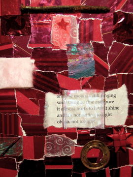
tonight's open studio went pretty well, considering we turned away three people thinking we were full, but then two rsvps never showed. those who came were welcomed w/ spicy apple cider warming on the studio stove. shaedra returned, a newly married woman w/ photographs and the speaker sven lent her in august. we also got a last-minute inquiry from a printmaker and former tech writer from mary lansing's 8-week group who was both kind and conversational. it made for a very pleasant autumnal evening, and when we returned home, a copper-rimmed moon was rising above powell butte while fog gathered on the streets below.
["not yet": click to see the other intuitive collages]
you may not be able to tell, but this is a very dimensional piece: i got out the hot glue and added a rusty nail at the top, a tufted pink fuzzy scrap, a round metal bit with tiny little sharp points, and a folded paper star. ordinarily i gather collage pieces i think will work together before the open studio to get a head start, but this one was truly intuitive, simply using whatever appealed to me, and i can tell the difference. it's much less carefully composed, but much more expressive of my mood.
posted by gl. | permalink | categories: artist's way
October 20, 2005
sculpture experiments
by sven at 9:43 am
I want to sculpt. It's an idea that's been in my head for years. I've got a pretty clear idea about how I want to work -- but I'm still wrestling with how to get the media to do what I want. Here's what I know about the process I want to use:
- I want to start with a core of polystyrene foam. It's lightweight, inexpensive, and you can work very fast with it.
- On top of the polystyrene, I want to be able to smooth out the texture and create details by adding a thin layer (~1/4 inch) of clay, or something very much like clay.
- I want to finish the sculpture with some kind of paint or latex -- or I-don't-know-what -- that will create the impression of skin.
- I'm thinking about these layers basically as "skeleton", "musculature", and "skin" -- with one exception: rather than have the core be made out of stick-like bones, I want to rough out volumes.
In addition to this general vision of process, I have several criteria for what kinds of materials I don't want to be using. Here are some notes I wrote out for myself on Monday:
- no toxic fumes (e.g. resins)
- minimal dust
- no baking / firing / use of flame (e.g. sculpey, ceramics)
- carving doesn't require hammering with chisels, or a significant amount of grinding hard stuff away (e.g. wood)
- doesn't require making molds and casting
- not a battle with drips (e.g. plaster)
- not a race against time, drying-wise (e.g. foam latex)
- less that 24 hours drying time (if possible)
When you go through the list, I think you're pretty much left with clay and papier mache as the main options. [Although it's been disturbing to read about silicosis -- "a chronic and debilitating lung disease resulting from exposure to clay and silica dust (...) a known threat in the ceramic studio." (from The Spirit of Clay: A Classic Guide to Ceramics by Robert Piepenberg).]
...Things have been stuck at this point for a long time. New inspiration came while Gretchin and I were on the Portland Open Studios tour this weekend. Looking at the ceramic figures of Katy McFadden, I suddenly realized three things:
- I've been working too small. The scale appropriate for the level of detail I'm interested in is about two feet tall.
- I've been too focused on smooth -- rough surface textures may be more interesting.
- A body can be implied with very little. A cylinder plus a sphere equals a body. A sphere with two holes reads as a face.
...It sounds like I know exactly what I want -- but the devil's in the details. This week I've dedicated myself to trying to finally nail those details down. How? Experimentation! Here's a photo of what I've done so far:
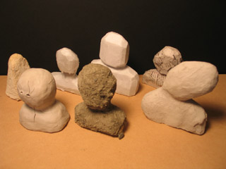
Back row, left to right:
- A snippet of polystyrene foam coated with celluclay. Clumpy and not fun to work with when wet. Took about three days to dry. Seems to be sandable, but with effort.
- A foam bust carved with the sort of flexible razor favored by folks who work with sculpey. I tried dripping parafin over it, using a brulee torch. The parafin is too watery for my tastes, and would have to go on in several layers to be of much use. Dipping might work better.
- A foam bust with a tissue paper veneer, papier mached on using Elmer's glue mixed with water. It provides a pretty fine surface, with only minor crinkling. I'll have to try painting a model like this -- when I tried painting tissue paper that wasn't bonded to something, it started to fall apart pretty quickly.
- A foam bust with newspaper papier mached on one side, craft paper on the other. This basically just confirmed what I already knew -- that both of these two papers are too stiff for fine detail.
Front row, left to right:
- Clay applied directly over a foam bust. Serious cracking.
- Foam bust papier mached with paper towel, then coated with Elmer's glue and dusted with concrete. This isn't the texture I've been imagining -- but it's a great discovery nonetheless. My one mistake here was that I didn't get all the concrete wet, so some areas remain dusty. A spray-bottle works well to make sure everything is moist, and a final coat of glue seems to do a good job of sealing while still keeping the overall look intact.
- Foam bust (more expressive pose) covered in a mix of clay and pulped toilet paper. This one is still drying, and seems to be cracking too -- though perhaps not as severely. I'd read that with paper clay you can apply wet to dry -- and that seems to be true. The texture is impacted by the pulp... I need to see if I can find a finer grained source of paper fiber.
The paper clay seems to be the most promising direction -- although the tissue paper and concrete options deserve further exploration, too.
...In addition to the sculpting experiments, I put in two hours last night experimenting with paints. I tried using sponge application for the first time -- which I'm totally sold on now. I also tried adding things directly into the paint in order to get more texture: concrete, celluclay, and dryer lint. Dryer lint was the most interesting, the most organic. Celluclay particles were a bit too regular for this purpose. Concrete looked best with its natural colors.
So, for the sake of getting my own head clear about this, here's what I've learned this week:
- Polystyrene foam can be cut with a razor rather than shredded with a serated knife, avoiding making that terrible static-clingy dust.
- Flat sheets of clay can be created by using a rolling pin and two rails, which determine its thickness.
- Adding paper fiber to clay helps prevent cracking.
- Paint can be sponged onto a surface, rather than brushed.
- I can use Elmer's glue plus concrete or dryer lint to create interesting textures.
And here are my next steps:
- Find an easier way to mix paper pulp into clay. (And a source for fine-grained fiber.)
- Go to an actual clay store to see what they carry.
- Actually try making a full-on sculpture!
- Figure out how to attach a foam-core sculpture to a base / armature.
- Try juxtaposing a clay-skinned sculpture with other elements. (In general, I like assemblages better than single-media sculptures.)
- Sketch out some sculptural ideas.
- Clean up the damned work area!
Ah -- lists, lists, lists...
posted by sven | permalink | categories: sculpture
hangable shelf
by sven at 9:06 am
Oh, yes, we enjoy the art on the Portland Open Studios tour. (But really it's the storage space ideas that we're after.)
Something we've been talking about for quite some time is the need for small shelves in the studio that we can display sculptures and knickknacks on. One of my personal hang-ups about this has been that I'm loath to commit to installing a shelf permanently in any one place. In a studio, you need to be able to move things around, rotate the art.
I didn't see anything on the tour that was what I wanted -- but the creative stimulation/fertilization did the trick nonetheless. I got it into my head that one could build a hangable shelf. Monday night I dove into the project... Three hours (plus drying time) later, this is what I got:
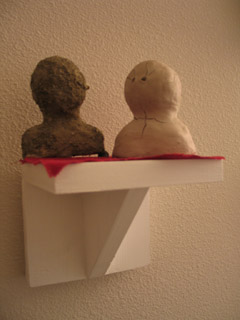
In the initial design I was connecting two eyebolts directly to the picture-hanging hooks on the wall. The problem there was that you have to get your hooks perfectly level with each other, or the shelf will tilt. So I added two more eyebolts and looped a bit of wire through them. Now the shelf hangs from the wire -- since it's a loop, there's a tiny bit of slack and you can adjust. Placing the hooks on the wall can also be done by eye-balling now, rather than having to measure. Here, take a look:
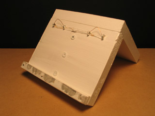
Since the shelf hangs out from the wall, I also needed to add a little lip on the back at the bottom to make it hang even with the wall. That's the other bit you're seeing here.
...Not bad! I didn't want to get too fancy on this first attempt -- but now that I've got proof-of-concept, I can see potentially making a longer shelf to keep around, too. Three feet wide, maybe?
posted by sven | permalink | categories: sculpture, studio space
learning about toxic fumes the hard way
by sven at 6:46 am
This has been a good week for exploring sculpture. But it has been a very bad week with regards to toxic fumes.
Being all inspired after the Portland Open Studios tour, Saturday night I went to the studio to experiment with some new techniques...
One idea was to bend a snippet of acrylic "glass" by heating it with a brulee torch. I figured this was likely to release fumes, so I did it outside, and tried to be careful not to breath anything in. The technique worked very well...
But 15 minutes later something odd happened. I had a shooting burning stitch in my armpit, almost as if a bee had stung me. I tried to disregard it at first, as one of those occasional mysterious body pains that can never be explained. But then I woke up in the middle of the night. I felt faint and a bit nauseous, and the stitch was back. For maybe half an hour it felt as if there was something seriously wrong with the artery -- touching or stretching it would cause shooting fiery pain. I was worried that this was a sign of a heart attack, or something similar, and enlisted Gretchin's help to look up the symptoms online. Fortunately, the symptoms didn't match up; and as they subsided, I decided to wait and watch for the time being.
Sunday afternoon the stitch showed up again, but less intensely. Now it seemed like it was perhaps a ligament, rather than an artery, that was the source of trouble. During the course of the day I noticed mild burning sensations slowly circulate through my body -- showing up in my right leg, then my right arm pit, and finally a little in my neck. My sense was that whatever toxins I'd breathed in were traveling outward from my heart, depositing in artery/ligament areas.
On the one hand, this was a big relief -- to now believe it wasn't my heart that was in trouble. On the other, it's pretty unnerving to think that these acrylic toxins are probably now deposited within me.
On Monday I may have felt a few very mild burning sensations -- but nothing since. Phew!
Ah, but the story doesn't end there... Monday night I built a shelf for displaying sculptures. I painted it with a glossy white latex house paint, outside and trying to be careful not to inhale the fumes. ...Nothing as serious as the acrylic incident happened -- but I did wake up in the middle of the night again, this time with the feeling that my skin was cold and slightly numb. Once again I had the feeling that I had chemicals inside my body.
To what extent was I really feeling these things -- versus imagining them, because I was worried and in a suggestive state? Hard to say. ...That's the thing about this body information: it's often indistinct -- and there's a considerable amount of self-doubt that goes along with trying to focus on it and identify its nature.
And so is that the end of the story? No! ...Last night (Wednesday) I was working in my studio room, trying out a bunch of ways of working with acrylic paints and gel medium. After two hours, I had a headache and was feeling sick. Again, the feeling of having chemicals inside my body.
It cleared up pretty easily... But I'm getting downright paranoid now about chemical fumes. Trying to be proactive, I purchased a book on Tuesday titled "The Artist's Complete Health and Safety Guide" and flipped though it. The emphasis, it appears, is on ventilation... Which, unfortunately, I think is going to be a fairly unwieldy problem in my art room.
...Looking back on 2005, this has been a pretty unhealthy year. I've been sick a lot more frequently than in past years -- and when I think about it, most of my colds followed on the heels of a big art project. To an extent, you can blame it on the stress -- I tend to be somewhat kamikaze. However, I'm increasingly convinced that one or two of those colds were the result of breathing in toxins -- wood dust from glue-based particle boards, in particular. This is, to say the least, a very disturbing revelation.
Not to mention ironic: I think probably most of the food we buy is organic. Granted, that has a lot to do with helping the environment, rather than health-minded reasons... Still, there's a comic contrast between what I seem to be willing to put into my mouth with a fork, versus what goes in via the studio.
posted by sven | permalink | categories: sculpture
October 19, 2005
artist's way: week 6
by gl. at 9:31 pm
so we're about halfway through the fall sessions and the tuesday night cluster has had a rather large and embarassing snafu: nobody showed up yesterday. i've never seen anything like this happen before. after two members called and said they didn't feel like coming that night for various reasons, i scrambled to find a solitary exercise for the member remaining, but then i didn't hear from her at all, even though i sent her a follow-up email today to ask if she was okay. i'm struggling w/ how to approach this. i want to be flexible about the way life works, but i also think it's inconsiderate to the other cluster members and of me. this is not a large lecture class. in a cluster, you matter. creative clusters are not inconsequential committments, and most people join a creative cluster because they can't get through the book alone.
the wednesday morning cluster members make up for it a bit, though: they're independently rearranging their conference schedules and plane flights in order to make it to sessions. today i thought i was going to have them try the "love letters" exercise, but something told me to try the playback theatre exercise instead, and i'm glad i did. at this point i want them to be moving from self-contained projects to more group/trust based ones (of course, as you'll see, that won't be very true the next two weeks. all the more reason to get one in now!).
playback theatre involves a "storyteller" and the "actors" who renact the story in various forms (e.g., as moving scupture, as a "play," as dance). everyone rotates through the roles. it's more fun than it sounds, even if you're not a theatre person. it gets the blood moving, involves a lot of laughter and often helps people work through situations. even people who are normally afraid of improv do well w/ playback theatre.
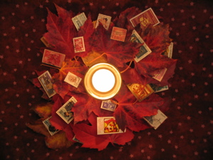
center (possibility): a candle in a glass votive surrounded by a pile of blazing autumn leaves (picked at nw 18/glisan) and layered with stamps from foreign countries.
music: bela fleck's ufo tofu, which is an energetic, cheerful album (though "sinister minister" from their first album is my favorite song, i think ufo tofu is probably their best album). bela fleck was the first concert i ever saw (hi, matt!), and they were great.
posted by gl. | permalink | categories: artist's way
October 18, 2005
customizing clay?
by sven at 2:19 pm
I've been doing a lot of experimenting with sculpture techniques lately. I've been creating roughed-out figures using polystyrene insulation foam -- and am very happy with the results. Now what I want is an air-dry, non-toxic clay-like substance for fine work on the surface... Ideally, y'know, clay -- but I've had problems with cracking.
So far I've tried surfacing with air-dry clay, parafin, concrete, and paper mache (craft paper, newspaper, paper towels, toilet paper, and tissue paper). The concrete created an exciting surface that I'll be experimenting with more. I'm also going to be trying encaustic-style wax. ...But really, these options are more about creating an interesting "skin" than the "muscle"-level sculpting.
I re-read the How to make a Noah's Doll website, and got really curious about why these folks mix sawdust with their clay. As I Googled further, I think I've figured it out. This site on paperclay explains that paper fiber creates microscopic straws that allow clay to dry without cracking -- and that also allow you to adhere new wet bits to dry. Wow!
This fellow, Ian Gregory, claims to be one of three folks who invented paperclay... He recommends not exceding 25% paper pulp in your clay. ...I'm guessing sawdust serves the same function -- though Noah's Dolls mix 50% clay and 50% sawdust.
Ah, now what else could we mix into clay? There are several websites out there that give formulas for making "sawdust clay" (2 parts sawdust, 1 part flour, add water). These sites tend to be geared toward schoolroom settings, rather than fine arts... I'm also finding a bunch of interesting customized clays at the level of housebuilding: cob, papercrete, paper adobe. Whether we're looking at sculpture or housebuilding, though, the principle seems to be the same: add fiber to clay, and you get something that's more lightweight, less brittle, and dries more easily.
So: What should I start mixing into clay? Toilet paper? Straw? ...And what products exist already? I know that there's a product marketed as "Paperclay" -- I should try that, for sure. There's also a good clay shop in town, Georgie's Ceramic and Clay Co. (756 N. Lombard), that I'll have to visit. I doubt they'll have much with fiber mixed in -- but I should get a sense of what a real clay shop looks like.
posted by sven | permalink | categories: sculpture
October 16, 2005
portland open studios tour: westside
by gl. at 5:56 pm
the portland open studios tour eastside conflicted with the hp lovecraft film festival last weekend, so we made up for lost time on the westside this weekend. the westside tour is always a difficult trail to follow because you invariably end up getting lost in multnomah village or the west hills around beaverton & tigard.
saturday
dave & toby graham: glass beads & jewelry. he talked while he melted & swirled the beads to keep them round. foos ball for display table. i picked up a couple of small beads because they were beautiful and so cheap. tiny art for $6!
sharon geraci: collage
shu-ju wang: a smart, welcoming, talented gocco printer! as if i wasn't already lusting over the gocco, i've now had the chance to see more types of pieces made with it, including 4-color process! and we were encouraged to handle the books! (nothing makes me sadder than book artists who have a hands-off policy.) i also met jennifer there, another young book artist. shu-ju teaches a gocco class in november i am almost certain to take. ee!
tupper malone: watercolor and former clay artist. giclee prints.
kitty wallis: sven called her brilliant, but she also had an acerbic edge and someone was quite angry at sven for taking pictures.
susan foley: a pastel artist who has been to an artist's way open studio & who we introduced to the church of art! but we didn't know she was in the tour because she never told us her real name. :)
phil seder: fish & metal, grinding a shower of sparks
katy mcfadden: clay sculpture garden and the best treehouse! sven was especially inspired and made discoveries about his own work as relates to scale, texture & figures.
willam rutherford: african american sculpture, painting, ink. sven found the plexiglass/acrylic interesting.
sunday
lucas klesch: a vaguely creepy guy who did pretty decent urban photography, but his collage, painting and nude portrait photography were uninspiring.
katherine kramer waters: along with shu-ju's gocco stop, this was one of the best places on the tour! an exciting, well-organized space w/ friendly people doing interesting collage, acrylic & photo collaborations.
molly torgeson: interesting sculptures made from rusted metal strips, friendly. the building also houses a "G. Laird," who turns out to be a lawyer named gregory.
ryan birkland: sven wanted to see his reverse glass painting on discarded windows. it was an interesting process, but didn't really grab us. howEVER, his studio is right next to the montgomery park east parking garage, which was a fascinating place to explore! it was creepy but solid at the same time. and we had a couple of horror-movie moments, including picking up the phone to a voice on the other end. it would be a great place to film.
ruth waddy: the picture in the calendar doesn't indicate enough how dimensional these paintings are, several of them with multiples frames painted over frames. inside a charming 23rd ave converted studio apartment lived a bandsaw and a dust tent, a HUGE cat and a friendly artist who created these multi-level acrylic pieces. alas, when we returned to trixie, we had a $50 ticket waiting for us. i hate parking in nw.
barbara gilbert: a book artist we saw two years ago, which was sven's introduction to tunnel books. i saw some pieces i recognized from then and she had some new stuff, too, but i was too bonky from sleep dep by then to be able to get much out of it. she had two collage books i think i want to pick up: collage discovery workshop and its sequel, beyond the unexpected.
jane levy campbell: last stop! a watercolorist with a simply phenomenal house who did a hoyt arboredum series i found quite pleasing.
afterwards, we went to an ostentatious open house (over $850,000!) and explored a couple of other houses w/ unusual construction. then we came home, ordered pizza, and watched nausicaa.
what a busy week we've had! and i haven't begun to write about many of our other artistic adventures. i'm a little heartened that it seems to be getting easier to talk about ourselves as artists, although after pushing myself to have my artist's way spring schedule ready for the open studios, i only gave away 2 cards. :P
sven & i have discussed applying to the open studios tour ourselves, and we get stuck at "but what's the point?". neither of us necessarily feel compelled to sell art, especially sven. i'd want to get participants for clusters, but the tour is unlikely to be a big source for that. we like talking about our work and inviting people to the space -- is that enough?
posted by gl. | permalink | categories: exhibits & events
October 15, 2005
LSGL teaser kicks off 2005 H.P. Lovecraft Filmfest
by sven at 6:08 pm
Last weekend (Oct 7-9) we attended the H.P. Lovecraft Film Festival at the Hollywood Theater. My one-minute teaser for "Let Sleeping Gods Lie" was the very first item in Shorts Block One... Thus, kicking off the festival! (Or so I'd like to think. There were three screens, after all.)
Thank you Laura G., Leopoldo, Michael B., Philip F., Alex R. for coming to the show! --And a special shout out of apologetic gratitude to Jacque & Mari who came, but got turned away at the door because Saturday night sold out. I appreciate your support!
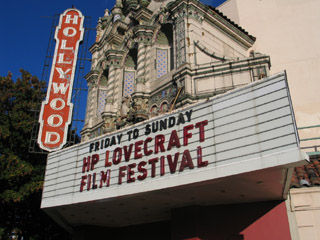
The teaser showed three times: twice on the upper left screen, and once on the main screen (Saturday). Getting to have something on the big screen -- even if it was just a minute long -- was a dream come true for me. During the third screening, the sound system was wonky; but I didn't care. It was great just to be shown -- and every night, the theater was packed. Here's a photo of the the blizzard sequence actually playing on the upstairs screen:
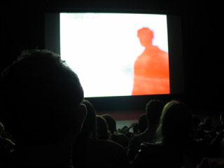
Going into the fest, I was most worried about how the colors would turn out. Happily, they worked out just fine. The super-saturated red can be problematic on a regular television screen -- but projection dulled it down just enough. ...Color-wise, I think I had one of the prettiest clips in the show.
I talked to five or six of the other filmmakers and gave away freebie copies of the teaser DVD as good will gifts. They're excited to see the final product when it's done, and commiserated with/lauded me regarding the insane time commitment that producing this animation requires.
A few reviews of the shorts block have gone up online. Here's the feedback I'm getting... Folks are confused about what kind of animation they're seeing. [It's a variety of rotoscoping.] They're wondering how long the final piece will be. [Between 7 and 15 minutes.] One commented that the lavamen effect could get pretty old pretty quick... Which makes me think that I really need to make the "body heat fading away" sequence at the end sing, as a payoff for my strange visual premise. Folks said that the teaser was really too short to be able say much about it.
My big worry now: My notion that I could merge experimental art film with gothic horror might not make sense to a lot of people. This idea that the creatures are eternal, thus more real, thus photo-realistic -- whereas the ephemeral humans are blurry -- also may not communicate. There's not a lot I can do about it now; I'll just have to make my peace with the potential for blank looks. But me -- I still think it's a really cool concept. And in the end, since this isn't particularly a money-making venture, that's what counts -- right?
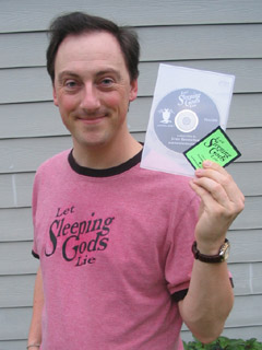
Oh, I almost forgot to mention: I spent the two days before the fest doing promo materials. I made two t-shirts (see photo above), a new sticker-label for the DVDs, and seventy snazzy little business cards / flyers. All of the flyers were gone by the end of the fest. And I think I gave away about 20 DVDs. ...Now that I've figured out how to use Disk Utility to burn .img files, it only takes about 15 minutes to produce each disk. I had a frenzied little DVD factory going on in the studio... [Thanks, mph, for the last minute iChat help with the software!]
posted by sven | permalink | categories: exhibits & events, let sleeping gods lie, movies
October 14, 2005
"pajama dreamer" sculpture
by sven at 11:50 pm
Just finished a new sculpture this afternoon: "pajama dreamer". Here's a photo...
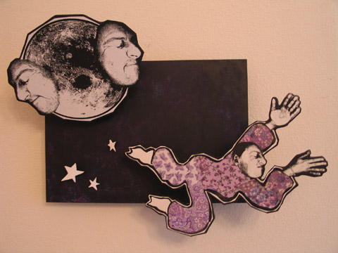
The darn thing took me more than a month to complete... Been busy with other things, had to keep setting it aside. But I'm pretty happy with the results.
I'm building upon the style I used with the "witch" sculpture and "nature god" collage. Improvements: the backdrop is masonite, rather than foamcore; the stars are more irregularly shaped; everything is set at angles to the backdrop; the figures are also attached to masonite, rather than museum board. Why? Angles are artsy. And masonite is more durable. ...Though in future pieces, I think I'll use a thinner masonite (like 1/8 inch).
The backdrop was a real evolution for me. I painted it flat black, and it looked awful. So I wire-brushed a bunch of paint away -- giving it a very tortured look -- and then layered on some purple and blue. It's not as visible as I'd like in the photo, but there's a lot of depth to the backdrop now. ...I feel like I just grew a notch, as an artist!
Here's another photo, so you can get a better look at how things jut out:
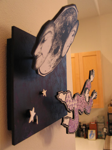
...I fussed and fretted for a long time about whether or not I should put hair on the figure. I decided not -- but did a test head with yarn hair that is looking mighty fine fixed to a flea's body right now. [Look for that in a future piece!] ...I'm going to need to set sculpture aside for a while, to be working on other projects -- but when I return to this, I think I'm going to work on making new heads and bodies and backdrops all separately and in parallel -- so I can mix and match "dolls" and their "worlds", and not be as linearly start-to-finish as I was on this piece. Working within a recognizable style allows this.
An interesting observation: All you need to make a plausible doll is a head. Or a head and hands, if you really want to go wild. Give the audience that much, and any kind of blobby body is passable.
posted by sven | permalink | categories: sculpture
October 13, 2005
artist's way: week 5
by gl. at 11:40 am
the tuesday and wednesday clusters did different activities again: a tuesday participant couldn't come and so i scrambled to find an additional solo or pair activity, since the critic transformation really needs at least three people. so tuesday got an activity using only shape, colour & line to create a portrait of positive & negative traits (based on an exercise i did during one of the creative arts therapy workshops i attended the year before last). wednesday got to do blind contour drawing, which worked out well, i think, even though we were missing a participant, too.
the wednesday cluster also got an impromptu image transfer workshop at the end because one of the participants mentioned in passing wanting to know more about image transfers, so during the writing portion of the activity i grabbed a photocopy of the blind contour drawing i created in artist's way years ago, a scrap of paper, and citrisolv (a tip i picked up from the iprc transfer printing workshop -- citrisolve works like a dream). afterwards, we ended up in the kitchen playing with various transfers & papers.
in both clusters, i was interested to note that during media deprivation, participant partners were suspiciously alert for what they considered to be inappropriate behaviour: "are you reading?" "is that really an artist date?"
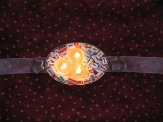
center (integrity): a small shaker-style wooden lid w/ three candles clustered in the center, surrounded by poetry beads. a gossamer ribbon runs beneath it, anchored by glass stars. the candles don't look centered, but they were on tuesday night. when i had to replace the candles on wednesday morning, i coudn't get it all back together again. :)
music: amelie on tuesday night, but since one of the participants remembered me playing it before (and this is one of the reasons why i wanted to write this stuff down), i played the mirrormask soundtrack for the wednesday cluster, because as sven pointed out, it was very unlikely anyone had heard it before. :) he also recommended the balafón marimba ensemble as a good post-media deprivation album, but alas! the cd player i bought is just a cd player. and sven's copy of balafón is a tape. so mirrormask it was! which, as it turns out, is often a little too frenetic to be a good artist's way cd.
posted by gl. | permalink | categories: artist's way
October 12, 2005
trixie fish
by gl. at 1:53 pm
trixie also attended the hp lovecraft film festival! here's proof:

posted by gl. | permalink | categories: trixie
October 10, 2005
psc monthly meeting
by gl. at 9:58 pm
i brought pens & little handmade books to the portland society of calligraphy calligraphic recycle sale, and walked away with two books, one of which is an art journal book i plan on referencing in artist's way. i had my eye on another art journal but the fluid dynamics in the tiny room were odd and someone else walked away with it just inches before i could.
later, they briefly talked about artist trading cards, mainly via cyberscribes, which i realize i ought to probably join again. (i set myself to "no mail" after burning man last year and never changed my subscription.) the speaker knew there was a group in town, but it was small and she dismissed it.
this meeting was attended by a lot more people (26 instead of 10). still, i'm a little disappointed because the room isn't set up for anything other than sitting around in a circle, talking to people you know. it's a much less educational environment than my experience w/ other calligraphy guilds, and the only way to change that would be to changes spaces, i think.
aocc, which i missed this year because i stayed home sick, will be hosted in portland in october 2006. that'll be nice. :)
posted by gl. | permalink | categories: calligraphy
October 8, 2005
two quick news items
by gl. at 11:22 am
finally! we have a scarlet star studios logo! what a relief: i've been trying to be inspired enough to do that for months and months. haven't decided how i want to transform the blog to match, but piece by piece, it will all come together.
also, and more importantly, sven premiered the "let sleeping gods lie" teaser at the hp lovecraft film festival last night! it was the first thing shown -- what a way to open! i heard murmers of approval behind us, especally when the music cue signaled "this can only end well." special thanks to laura grant, who appeared especially to see this!
(and i'm sure sven will write about this later, but it seemed too important to keep quiet about it! if you want a chance to see it on the big screen, shorts block one also shows tonight and tomorrow... :)
posted by gl. | permalink | categories: administrivia, exhibits & events, let sleeping gods lie
October 5, 2005
artist's way: week 4
by gl. at 3:15 pm
we did our first split exercise between the tuesday & wednesday groups because one of the participants couldn't make it to tuesday night and the exercise i had planned requires at least three people. so tuesday night did blind contour drawing and wednesday morning did the critic transformation exercise. next week, they'll swap.
and thus also begins the ever-popular media deprivation exercise, which is one of artist's way's most frustrating and rewarding experiences. i even emailed the sacred circle list in case anyone wanted to try it again, the germ of which may very well lead into the "artist's way spiral" (?) concept i want to implement someday (where artist's way graduates have an opportunity to review previous tasks, often synchronously with the current clusters).
one of this morning's participants says she'd like to start a similar cluster in salem. hooray, i say! and one of last night's participants named the getty travertine block i use as a speaking stone "sebastian."
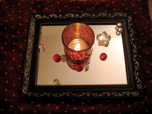
center (power): a mirror beneath a red mosaic candleholder, surrounded by small glass spheres, red glass stones, and a glass star.
music: michael's nyman's the piano soundtrack. it may have been a little early to pull this one out (i could say the same about passion), but these have been fairly emotional exercises and deserve dramatic music. i'd like to play the akira soundtrack, but it's got too many quiet/loud spikes (and that one superweird song i always have to forward past) to be a very good background album.
posted by gl. | permalink | categories: artist's way