July 2005 archives
you are here [x]: Scarlet Star Studios > the Scarlet Letters > July 2005
<< before
June 2005
after >>
August 2005
July 31, 2005
the last shot
by sven at 12:50 am
Nine hours today. A lot of compromises, but I finally got something I can live with. After I finish this post, I'll render out the very last shot I'm doing for the teaser.
I'm going to splurge and use "radiosity".
Light doesn't just hit a thing and stop. It bounces off and illuminates the surrounding area, too. In the animation world, this effect is called "radiosity". It can be subtle -- but everyone raves about how much added realism it can give a scene.
It's also very time-expensive. A frame of this last sequence takes 10sec to render without radiosity. It takes 194sec per frame with radiosity turned on. [Interpolated, 1x3, shading noise reduction.]

Here's a test frame without radiosity. Look particularly at the eyeball.
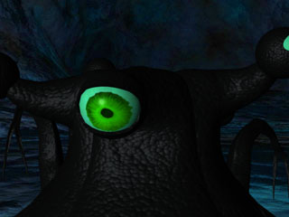
Here's the same test frame with radiosity. ...Like I said: subtle. But hey -- I can set it rendering and go to bed, so no real problem.
My morale has been better today -- though it was tough getting moving in the morning. The regimen of walks every two hours has been good, too. No more little chest pains.
Tomorrow I pull it all together and call it done.
...And there's a present from Gretchin waiting for me, for after I finally deliver the teaser to Andrew Migliore. It's in a blue box with red rafia -- to echo the lavamen colors! And there's a little star-shaped hole for the tag, with red around it -- because we're Scarlet Star Studios! It reads: "for sven, when he finishes the movie trailer".
Ah, I am loved.
posted by sven | permalink | categories: let sleeping gods lie, movies
July 29, 2005
*snap*
by sven at 9:30 pm
It didn't work.
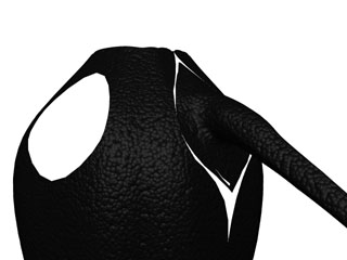
Today's lesson: When you turn on subpatch, your geometry smooths out. If there are corners, they become rounded. You can't keep that corner from getting rounded by adding a bone. Bones will keep geometry from being deformed by other bones -- but the rounding is created by subpatching, not bones.
Translation: If I cut my critters into pieces, there will be seams. If my seams are good, I can prevent gaping... But I don't get to have an absence of seams. Not unless I want to deal with a 350 bone armature.
I give up.
I'm quitting for the night. I can't take it anymore. Tomorrow I'll work on this shot some more, but just to get the most egregious problems out of the way.
I'm not one to swear in print, but: fuck it. This weekend -- Saturday tomorrow, and Sunday the day after -- are all I have left to finish this teaser. And I've hit the point where I don't care anymore. No more fudging with details.
It's good; I'll live with the imperfections that only I'm going to see -- but will always see, when I look at the trailer.
After the "evil eye" shot is done, I'll re-edit the sound (which will be easy), and burn a DVD. If all goes well, I'll drop the disc off on Sunday. A day before the real and final deadline, Monday Aug 1.
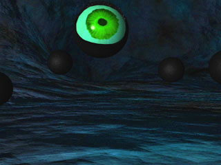
Because it amused me, here's another error shot. ..."Where'd my torso go?"
posted by sven | permalink | categories: let sleeping gods lie, movies
What Would Ray Harryhausen Do?
by sven at 3:55 pm
Actual totals this week: Tues 8hrs, Weds 11hrs, Thurs 8hrs. This morning I started having little chest pains. ...Didn't I say walking is mandatory?
New regimen: 10min walk to the top of the big hill and back every two hours. Mustn't get hurt by throwing myself pendulum-style in the opposite direction, doing a huge 5 mile walk when I've let myself get this out of shape. Incentive: there are blackberries on the final descent. ...And I've got a second kitchen-timer running now to remind me to go.
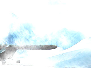
Did a smart thing yesterday: had a LightWave scene ready to go, and set it rendering while I ate breakfast. I'd only had 2 seconds of the exterior establishing shot, which I looped. Now I've got a 5sec clip to work with.
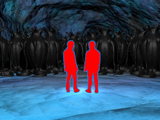
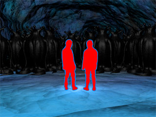
The 4hr render of the hive that I ran Thursday night came out great! It was the right decision to not wrestle with the distortion around the lavamen just then, too. Friday morning I got the solution: What I needed wasn't transparency around the explorers, but rather a "clip map".
A clip map actually deletes bits of the image where you specify. Transparency (apparently) works differently. The way I figure it, transparency's algorithms are built to blend a semi-opaque foreground image with its background. So, even if the image is 100% transparent, the machine is still trying to do blending. That's where my distortion came from!
Now I've got better arms on the critters, the lavamen's feet don't slide on the floor, and there's not a lick of distortion. Excellent...
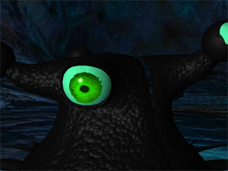
In the evening I moved on to working on the "evil eye" shot. Notice in my first draft that there's gaping to the right of the foremost eyestalk.
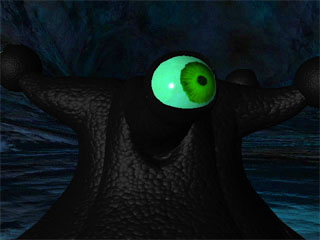
In this second draft I had some initial success, followed by a bunch of frustration.
I got the gaping to stop. What I did was to take all the points along the seams of the one-fifth critter and transform them into tiny little bones in a second layer. When I import those bones into Layout, they act like little pins, keeping the sides in place. ...Ah, but if you look below the eyestalk, now it's not bending as smoothly. Too much is being held in place, so there's creasing.
[In the second draft I also explored having the eyes rotate in their sockets. Too crazy, too much motion. I'm thinking that the eyes should be able to rotate in their sockets, but have very limited motion. It makes sense to me that if you have movable eyestalks, your actual eyeballs wouldn't have a lot of range on their own -- I mean, where would the musculature go? It's like a slug's eyes... But there are eyelids, so not exactly.]
What to do about the creasing? My first idea was to try to take the skeleton and put it inside another skin -- a full creature, rather than just a fifth. Problem: you can replace a skeleton's skin with another skin, but you can't just delete the skin altogether and do what you want with the bones. As Layout so eloquently states in its error message: "bones must remain under object they belong to". Sigh.
That failure led to me exploring what would happen if I created a full armature for the complete creature. I get a nightmare of 350 bones to keep track of -- that's what happens. Let me tell ya: it's difficult managing just a leg, arm and eyestalk at the same time. Trying to keep track of 15 wiggly bits is really impossible. You keep accidentally selecting the wrong bone and screwing up the whole scene when you move it. Layout (grrr grrr grrr) doesn't seem to have an "undo" button.
I went online and hunted for how other animators have dealt with tentacles. Three hours later my discovery: everyone who has attempted tentacles is flailing and begging for help. Lightwave 7.5 may not even be built for the task! ...There are a few plug-ins that may or may not help. There's a new book on character animation that claims to have a discussion on different types of tentacle motion (must find that!), there's a strategy for animating snakes that involves using "wind" to make them billow.
No silver bullet, though. What I'm left with is my previous conclusion: tentacles shouldn't just wiggle wildly -- they should be articulate, and they should roll in waves. That means articulating each of the ~25 bones in the arm or leg individually. Which, y'know, is what the old masters had to do.
But then it hits me: In working with the octopus from "It Came From Beneath The Sea", Ray Harryhausen cut off two tentacles, just to simplify things. Ray balked at eight.
...Oh. My critters have not six, but 15 wiggly bits. And everyone seems to agree that tentacles are the just about the toughest thing imaginable to animate. And this is my first ever attempt at 3D animation. WHAT AM I THINKING??
Called it quits and went to bed. ...At which point inspiration strikes.
Really, I've got three issues that I'm trying to work out simultaneously:
- I don't want there to be gaps between segments of the critter
- I want the motion of limbs to be reusable
- I need an easy way to choose bits of the limbs and grab them for posing
Well, I had a partial solution with my "pins" strategy. What if I took it farther? What if I chopped the one-fifth critter in three: leg, arm, eyestalk? Each critter would be made out of 15 pieces, each saved with its motion in a lws file. I could mix and match motions, assembling a a whole creature out of 15 bits, all parented together.
The torso wouldn't be able to bend. But -- and this is the second half of the inspiration -- I should be able to manage creasing issues with weight maps! Except for the seams, I should be able to make everything flexible.
Furthermore, I've been bothered by how the one-fifth critters seams look too sharply... Maybe I can create a full critter, and then chop it into bits to pose? If I stagger my cuts, they don't have to fall in the creases between fifths. Hopefully the pins will keep subpatch from making the edges of my critter pieces too wacky.
Wow... I might even be able to create a special waist-down rig with IK legs that would allow me to lift the body off the ground. Seeing the Elder Things stand up: that's what I want for Christmas!
Moral of the story: When people advocate "thinking outside of the box", they seldom talk about how you have to thoroughly explore every corner first, and then knock your head against the cardboard's weak spot repeatedly until you break through.
Now, on to today's work...
posted by sven | permalink | categories: let sleeping gods lie, movies
artist's way open studio (july)
by gl. at 11:22 am
i lost the post i made about this last night, damnit. :( here is my attempt to recreate it.
--
wow! this was a fantastic event! even the heat couldn't keep them away. we had a full house of people digging through bins of delectable collage materials, good conversations, and lots of newcomers. (i even had to turn someone away for lack of space!). sven, alas, worked on the movie in "the lab" while we all played in the main room, but even he was visited by curious folks.
three people from the "create the world" event came, one person from the free monthly artist's way group that just got started, and colleen, who has just been dogged about getting flyers into libraries and then checking them to make sure they're still up and replacing them if they aren't. hooray, colleen!
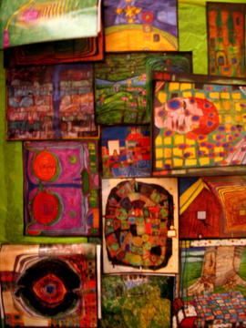
[colleen's collage: outside cover. click the picture to see the other collages]
(still wish i could adjust the red on the images; i think the star lamps give everything in the studio a red cast. iphoto's "enhance" feature usually just makes the pieces look bizarre, so rather than going to another photo program, i just post as they are.)
everyone is always surprised when i say i like cleaning up after an event. to me it feels like a proper conclusion, sort of like a zen meditation. wax on, wax off.
posted by gl. | permalink | categories: artist's way
July 27, 2005
arm wrestling 2
by sven at 11:59 pm
Right now I'm in today's 11th hour of work. Before I go to bed I'll start a sequence rendering that will take more than 4 hours to output.
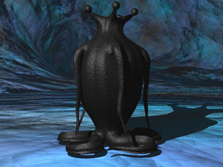
I wanted better arms on the critters before showing the teaser to the world. These ones are an improvement. The arms are posed to slant down naturally, and merge into the shoulders more organically. The dorsal side of the arm is peaked, the ventral side is flattened. In this version the arms lay flat against the body when the critter's at rest.
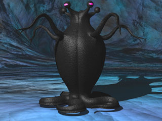
...And here's what it looks like when the critter's awake and writhing! I threw on some eyes, just to see what it would look like. They're supposed to be green, but got hue-shifted along with the cave.
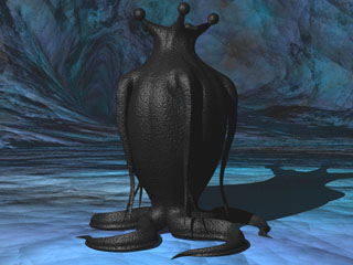
This is the second draft of today's sculpt. I thought the arms should be just a hair beefier and longer, and the hands should have longer fingers. The shoulder isn't perfect; and the arms look almost too tight against the sides this time.
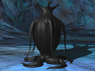
...So I tried posing the arms in a slightly more relaxed pose. Not bad! Good enough, in fact, that I'm ready to call this model done for the teaser. Will I do more tweaking before releasing the full, final film? Maybe. But let's not think about that just now, eh?
[Oh, another thing to notice: I finally figured out how to get the legs to lie flat on the floor!]
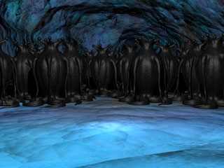
Here's the hive. Actually, it's a good thing that I have this sculpt of the critter in two poses. The first version of this shot had everyone's arms in the same position -- and it was really obvious. The arms are the most ideosyncratic part of the individual critters; we should see variation, I think.

Finally, here's the shot that I'm working towards. Those lavamen are actually in LightWave -- quite an achievement for me (see yesterday's post). But alas! I've just discovered that viewing the backdrop through the alpha channel portions of the lavamen clip causes distortion! These pics may be too small for you to be able to tell -- but the critters' skin doesn't shine correctly where the invisible rectangle is in the way. No idea what that's about yet.
Worry about it tomorrow.
posted by sven | permalink | categories: let sleeping gods lie, movies
fall promotional status
by gl. at 10:43 pm
my goal was 50 flyer locations and as of today i have 52, assuming those who took them placed them. yay! that's less than 2 weeks! 3 inquires so far, no registrations.
posted by gl. | permalink | categories: artist's way
July 26, 2005
rough day animating
by sven at 11:59 pm
An amusing error:
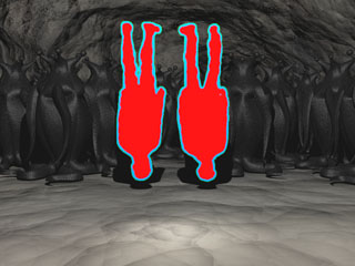
Looks like it's going to be more than 9 hours today. Work has felt haphazard. I've been jumping around between tasks, not entirely satisfied with my results most of the time. The image above sort of distills what it's been like.
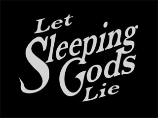
I started with the title card, thinking it would be simple. The original version, I now realize, looks too much like a fish tail when it wiggles. I took the serif off -- much to my sadness. I liked the serif. I used the bone structure from the previous animation for the new rendering... But it looks too stiff to me. Time permitting, I want to play with the logo in Illustrator some more -- and then see if I can't reanimate it, a bit more smoothly this time.

The last shot of the trailer "coming 2005" was in too-jaggy a font before. Taking a suggestion from Gretchin, I tried re-doing it in the wavy "font" I established with the title. I don't know if I like it. On the one hand, the "2006" looks pretty cool. On the other hand, I kinda think the last thing we see should be simple.
One pertinent observation: the "coming 2006" bit has to be a good deal smaller than the title logo; otherwise it feels like we're seeing another title.
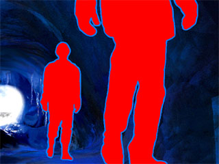
Probably the most successful accomplishment today was putting the blizzard in the entryway of the cave. To create it, I rendered a blizzard over a still shot in LightWave; then in AfterEffects I put the original cave in a layer over that, and masked out the cave entrance so just the snowy exterior could show through. Feathering the mask nicely simulated the glare of the snow and some flurries crossing the threshold.
My one sadness with this shot: Having all that motion outside makes the interior seem far too still -- we want to see moving shadows on the cave wall, some kind of interaction with the light. It would be nice if I could come up with a way to do that. Unfortunately, it's probably more than my timeline will permit right now.
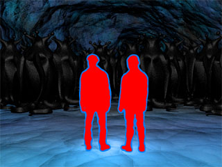
My project for the last few hours has been trying to figure out how to fix the shot where the camera pulls back, revealing the critters for the first time. Feet that "skate" across the ground are a hallmark of a novice animator -- so I really want to get this right.
The trouble is that rather than having the camera itself move backwards, I used a zoom. I don't know exactly what the math is (I suspect logarithms are involved), but this means I can't simply use scale on the lavamen layer in AfterEffects. Nor is it a matter of scaling them at the same time that I move them. Physics at work: Visually, a point attached to the ground does not recede at an even pace if you're walking backwards and your focal point is directly ahead of you.
So I've been exploring putting the lavamen actually into the LightWave set. This involves creating a flat panel in Modeler which uses a QuickTime movie as its surface texture. However, because you don't want to see the whole rectangle, just the lavamen, you have to work with the alpha layer. When rendering the lavamen from AfterEffects, make sure that you are saving RGBA. You'll need two copies: one that will be fed through the color setting in the Surface Editor, one that will be fed through the transparency setting. Before you can use the alpha channel as a transparency map, however, you have to use the Image Editor to make the clip "alpha only".
Sound confusing? It is.
However, it's really cool that I'm finally figuring out how to do this -- it gives me a lot more power for future projects where I'll want to composit 3D animation objects into live-action settings.
Notes for further work on this shot: The flat screen object only needs to be composed of one polygon. The QuickTime clip I'm working with should be applied to the screen's surface in Modeler -- that way I can put the actors' feet on the X-axis, which will save lots of pain in LightWave. In LW, the screen object will have to be burried in the floor exactly where the actors are supposed to be standing; if you try to use a trick of perspective, when you pull back the lavamen will seem to be floating in midair. Due to the tricks I've pulled with color correction, I'll have to (1) get the lavamen set up in the space they're meant to exist in, (2) render the scene without them and color correct it, and then finally (3) use the new clip as a background, and render just the lavamen over it.
Ack! So much to do!
posted by sven | permalink | categories: let sleeping gods lie, movies
mhcc fall calligraphy registration
by gl. at 9:47 pm
after what i consider to be the smashing success of the spring mhcc class (i worked on calligraphy regularly, learned a new hand i like, created a beautiful finished piece, and got to be in an art show), i went ahead and registered for the fall course, which is bookhand and roman caps. it starts & ends about the same time as artist's way, so it looks like my fall will be busy again.
posted by gl. | permalink | categories: calligraphy
teaser-trailer: one week left
by sven at 10:50 am
One week left to get the trailer done. I'm going to be cutting out several of the activities I would normally have done this week, to give myself adequate time / breathing room. I'm feeling pretty good about being able to get it done. Sunday night I spent two hours wrestling with the blizzard sequence at the beginning, and finally decided that cutting my "showing off" shot would best serve the film. With that out of the way, most of the work feels pretty doable. It's just the bits with modeling the critters that could expand to take up too much time -- if I let them.
posted by sven | permalink | categories: let sleeping gods lie, movies
July 25, 2005
artist's way @mac: week 7
by gl. at 11:55 pm
well, that went very well! i got a little teary & chilled at the end, even, with everyone talking about how much they'll miss the group. only the three core group tonight, too, which was disappointing mostly because the fourth said she would definitely come to the final class. the labyrinth was wildly popular, and though they had to take an elevator to get to it, the room was suffiently big and open, with enough natural light i didn't need the lights on at all, so i could keep it dimly lit with candles.
two unforseen labyrinth issues:
- the participants kept stopping to read the art bricks the candles were sitting on!
- i used a single orante kesler gothic initial for each of the small labyrinth gifts and they couldn't tell whose was whose, so the "create an artistic reponse based on the labyrinth gift" didn't happen quite as planned, but it all got straightened out.
and one forseen labyrinth issue i'll need to fix before the next one:
- the print is too small for older eyes in a darkened room. i'll need to learn how to play with the margins & bump up the type to get the "print two per page" option to come out more usefully.
sven came to help set up the labyrinth and then hung around the mac to help clean up afterwards. he's such a sweetheart! i took him to burgerville afterwards, where we debriefed about the class.
posted by gl. | permalink | categories: artist's way
July 23, 2005
first fall inquiry
by gl. at 10:35 pm
yay! i got my first fall inquiry today! via email, even!
and i'm up to 41 flyer locations out of my goal of 50. this might be doable! unfortunately, some are also already disappearing: at the art show in gresham, for instance, where the small flyers disappeared between one day and the next for no apparent reason; and at powell's on hawthorne, where someone posted a large flyer of a large man w/ a naked woman draped in his arms right over it. flyer maintenance is painful.
posted by gl. | permalink | categories: artist's way
July 20, 2005
on word and art word: reception
by gl. at 3:58 pm
it was a fairly good reception, as receptions go. certainly i've said before that i am missing the mingling gene that powers most receptions, but enough people i knew came to keep me busy. colleen was there when sven & i got there, even wearing the labyrinth gift calligraphy! then a current mac student stopped by. rob & kyrie got there just a couple of minutes before the reception ended and the gresham city hall meeting began. michaelmas was late; we had to slip in and whisper and point. alas, my calligraphy instructor was apparently hit w/ a golf ball and had to stay home.
btw, i've already had to reprint both batches of artist's way flyers! that's a milestone i didn't hit for the spring classes. being out & about in gresham yesterday allowed me to hit a couple of places there and give flyers to people who stopped by the art show (thanks, colleen, rob & michaelmas!).
posted by gl. | permalink | categories: artist's way, calligraphy, exhibits & events
Carl's boots...
by sven at 3:53 pm
...just arrived!
posted by sven | permalink | categories: let sleeping gods lie, movies
big decisions
by sven at 3:10 pm
G & I went to lunch with Carl... Carl! Ah, how I look forward to the day he moves back to Portland.
Following the up-to-dating about how New York and San Fran have been treating the boy, we all had a big pow-wow about the movie. Conclusion: We're not going to try to film next week after all.
The stress of a visit from my mom & stepdad, G's stepmom the day after they leave, getting Carl's books moved into our garage -- it's too much as is. We've got 10 days left til the submissions deadline, and I only get maybe five of those for actual work on the teaser trailer. Resolving my script problems, drafting new storyboards, and prepping the house for shooting? Stress Vesuvius.
This was the deciding question: Is there a 75% chance that Carl will be back in town again before the end of February? The answer was yes, so the three of us agreed that there will be no filming next week.
I don't need the footage for the teaser, anyway. It's for the film proper. We can't talk specifics about when Carl will be back just yet -- but going on the assumption that he will come back, I can start planning now, really do things right. [Which also means that I have a better shot at getting Andrew here, who suffered most from the heat the last time we shot...]
A shout out to Leopoldo, who was willing to lend me his portable air conditioner for the day of filming.
Oh, and the boots Carl's having mailed to my house? They're supposed to arrive today. Apparently they were at his sister's place, down in California, not on the east coast. Even so -- I remain humbly astonished at Carl's goodness, having them sent up here so abruptly.
On the topic of "I don't know how to be grateful enough for this": At our pow-wow, G said that if it came down to it, in February she'd fly Carl to Portland for me. By the eldritch gods I serve, it won't come to that. But still -- I have no words for that kind of good will and support. It is wholly new to my world; thank you.
I have good friends.
OK, then. Next task: prepare for the visiting family. And then, do the best job on the teaser trailer that I possibly can -- by August 1st.
posted by sven | permalink | categories: let sleeping gods lie, movies
the blizzard effect
by sven at 1:09 am
Well, I still need to tweak the shot where the explorers first enter the cave so that you can see the blizzard outside behind them -- but other than that, I've got blizzards everywhere else I need them.

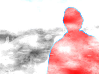
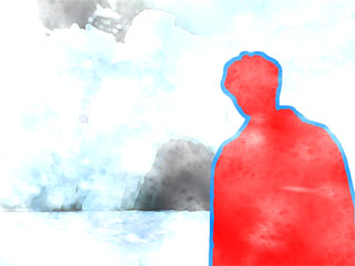
Now I can start fretting about whether I should start instead with the shot of Carl stepping from the mists. And about whether the levels of blizzarding in each shot match each other. Ugh!
...But before I get into that tizzy -- let me pause and tell you about how I accomplished the blizzard effect.
The blizzard effect involves setting up a partigon emitter, and then having it spew hypervoxel sprites across the screen. Ah, but we don't simply want it to occlude everything -- now do we? The snow in the background should be thicker than the snow in the foreground.
In my trickiest blizzard shot, I want to have the lavaman step out of white-out conditions into the foreground, where he's less occluded by blowing snow. Here's what it took to do that:
Step 1: In AfterEffects, I have a background shot and the lavaman footage in two separate layers. Render out a clip where the lavaman steps forward from the background.
Step 2: Import this first movie into LightWave, and use it as a backdrop. Run the partigon emitter and render out a second movie. Now you have the whole thing partially occluded by blowing snow.
Step 3: Import this second movie back into AfterEffects. Use it as your new back ground, and put the lavaman layer on top of it. As he steps forward, fade the lavaman from 0% to 100% opacity. This will make it look like the lavaman moves from being behind the blizzard to entirely in front of it -- and outside of the blizzard entirely, in fact! Render.
Step 4: Import this third movie into LightWave, use it as the new backdrop. Tweak the emitter and hypervoxel settings to create a less dense, more flakey snow. [That in itself is something of an art!] Render. Now you have the lavaman stepping forward from dense blizzard into the lighter snow of the foreground!
...Nifty trick -- but the devil's in the details. With two layers of snow, it's easy to totally obliterate the original background. You still want it to show through enough that the audience can still interpret what's back there. Also, creating different textures of snow for the foreground and the deep field -- pretty challenging.
Worth noting: As is, the skies in my landscapes are too blue for a blizzard. I applied the blizzard effect in LightWave to create a new still, then merged this with the original in PhotoShop to create a whiter, cloudier sky. My sense is that the modified landscape image now gives an adequate sense of snow hanging in the air when the blizzard's blowing across the foreground. At least, that's what I hope.
Guh... Even if I get the process streamlined, it's probably going to take at least five hours to assemble each blizzard shot I do. And that's presuming I like my results on the first try.
Ouch.
posted by sven | permalink | categories: let sleeping gods lie, movies
July 19, 2005
hurry and wait
by sven at 11:59 pm
The movie-making work has a new rhythm: hurry and wait.
For the past two days I've been working on the opening exterior shots, creating the blizzard. Typically I'll work for maybe an hour at setting up a shot, and then I'll go away for 90 minutes while it renders.
Based on how long it takes to render single frames while I'm doing tests, I make an estimate about exactly how long it'll take to render out the whole sequence. Example: The shot I'm rendering out just now is a hair under 7 seconds, and moves at 15 frames per second. Thus, with 86 frames, each taking about 23 seconds to render, I've got 33 minutes to kill. It was 11:26pm when I started the sequence rendering, so I'll come back at midnight.
(Yes, I'm blogging from the other computer, "Confessor".)
Keeping a pocket calculator next to the workhorse has proved really handy. I've been multi-tasking like mad today, running back and forth between the studio and the house -- sometimes even putting an alarm clock in my pocket to tell me when to switch tasks. Can't complain too much, though. With my parents arriving for a visit on Thursday, "hurry and wait" is really helping me get the house in order.
...And this is only the beginning. I've spend enormous amounts of time thus far in the movie-making process creating the lavaman effect in AfterEffects, or constructing the Elder Things in Modeler. When I get down to the end of the movie, where I have to actually animate the creatures in Lightwave -- then I'll be dealing with this rhythm constantly.
One trick is to try to always set something rendering before going to bed, or before leaving the house, or when you take a break for lunch. Still, I can see that I'm going to have to learn how to do batch processing soon. That should allow me to spend more daytime setting up shots -- let the workhorse do boring stuff while I'm asleep.
posted by sven | permalink | categories: let sleeping gods lie, movies
where you go when you know
by gl. at 12:41 am
weird trixie moment at the burgerville drive-thru tonight:
"hey, are those magnets on your car?" says the cashier.
"yeah, like the ones on refrigerators," i say, smiling.
"and you still have a stereo?" he says, mystifying me.
"yeah....." i say, uncertainly, but smile.
"huh." he says, and walks away to make a milkshake.
i have no idea what to make of that.
posted by gl. | permalink | categories: trixie
July 18, 2005
artist's way @mac: week 6
by gl. at 11:30 pm
finally! a successful session despite some substantial roadblocks! when i brought in my four bags of paint materials and destructable clothing, i discovered the activities classroom was locked and we had been moved to a dining room. "uh, oh," i thought, because they had specifically put me in the activities room so i could get paint on things. the dining rooms have carpet and nice fabric walls.
i checked in at the member events office even though i thought they might be closed, and found the manager writing an email to me to tell me the room had been changed. then we scrambled to make the room more paint-friendly, just in time for my first participant to walk in.
it was a good thing we went through all that trouble, though: only three participants tonight, but this turned out to be a very successful exercise for them. i was so relieved. only one tense moment where a participant decided she was done and then tried to make everyone else done, but it was handled quickly enough. this group still has trouble with the aesthetic response when evaluating pieces: they can speak articulately about what things are in the piece and how those things feel, but not how it makes -them- feel.
posted by gl. | permalink | categories: artist's way
visiting: Carl & his boots
by sven at 2:00 pm
I just talked to Carl Caputo on the phone -- one of the two actors in "Let Sleeping Gods Lie". He's going to be coming back to Portland for about a week and a half, arriving tomorrow.
I've been worrying about the end of the movie... I don't think I have enough footage of the explorers dying. Nothing of them actually dead, in fact -- which somewhat undercuts of the point of the lavaman effect. The red, in part, is symbolic of body heat in a cold environment. I have to show that body heat dissipate at the end, in order to really get the point across. Pay-off, y'know? ...There's also just not enough shots of the explorers struggling. The movie, as it stands, ends too abruptly.
But I haven't wanted to ask my actors for another shooting day. Two summers in a row they've done me the huge favor of wearing heavy black costumes on our hottest days.
I floated the concern past Carl -- and he volunteered. What's more, he's going to ask his mother in (Georgia? Florida?) to overnight him the boots that he's worn for the shoots. That wasn't my suggestion -- that was his initiative.
Wow... Carl is the coolest!!
Uh-oh... Now I have to get the new storyboarding together, pronto!
Eep!
posted by sven | permalink | categories: let sleeping gods lie, movies
July 17, 2005
LSGL: painful errors
by sven at 11:47 pm
After another 5 hrs 15 min, I've finished cleaning the digital spatter off that shot I was working on yesterday.
Soon after sitting down to work today, I discovered that I'd made a terrible mistake yesterday. Instead of cleaning up the clip that was stretched and cut to the right length, I'd been at work on an earlier stage of the material. I wouldn't have thought that would be a problem -- but when I stretched it, my correction layers didn't stretch correctly.
It probably has something to do with stretching 250%... How do you stretch a single frame to 2.5 times its original length? You don't. Frames are the smallest unit of animation -- when you ask AfterEffects to stretch a thing 250%, it mixes and matches duplicating the frames you have by 2's and 3's. And since the source footage runs the whole length of the clip, but the correction layers are often very short, sometimes their stretching doesn't match up.
Give up 7 hours of work and start over? I don't think so.
My work-around was to render out what I'd done yesterday, reimport that, and stretch the new QuickTime movie appropriately. Unfortunately, you can't render out without a background. [At least I don't know how to do it.] So I had to color key the default black background out. This left little traces of black around the blue outline, where the pixel colors had mixed. I had to change the tolerance setting, which meant the blue lines shrank some. Meh. It's an imperfection I can live with, though.
That's one painful error.
The second was the computer's fault. AfterEffects crashed.
Fortunately I hadn't saved that long ago, so I didn't have to re-do too much work.
Guess how many layers it took to clean up the shot... 20? 50? 100? Nope. For Carl, it took a total of 133 layers. For Andrew, it took 146 layers. A total of 279 layers?!? No wonder why this shot took more than 12 hours to clean up. Guh!
Tomorrow's my house-cleaning day. But the next time I get back to the studio: work on the blizzard shots.
posted by sven | permalink | categories: let sleeping gods lie, movies
distribution center
by gl. at 6:03 pm
so i've just finished printing some artist's way flyers: 30 full-size w/ tags (pdf) and 60 half-size flyers (also pdf). they probably look very similar to the spring flyers, but a lot of input has been taken into account from the job club people, former artist's way students, and the call a while back for feedback about my marketing plan -- some of the language and focus is different, and text has been cut, which i can't pretend doesn't give me hives. :)
for the linkophiles among us, i have finally cobbled together a portland artist's way page you can point to -- it's not much, but for now, it's enough. :) i plan on hitting the electronic distribution channels next month.
maybe for spring i'll have gocco flyers.... metallic lettering on darker paper. i'm very fond of the the sandstone-with-sparkles paper i'm using for the fall flyers, but the text will always be black and betray its inkjet roots.
posted by gl. | permalink | categories: artist's way
July 16, 2005
roll 2d10
by sven at 11:15 pm
...to determine San loss.
["Call of Cthulhu" roleplaying game reference.]
Another seven hour day. Spent on one shot. The shot where the lavamen walk into the cave. There's digital "spatter" I have to clean up, where simple contrast controls weren't enough to eliminate shadows.
When you see this movie, you'll probably think that the lavaman effect was out-of-the box, apply a simple command. Not so. It has been extremely -- almost insanely -- laborious to produce. See, the lavaman effect is created in AfterEffects. AE isn't like PhotoShop, where you can just smudge or erase something out of existence. AE is all about moving layers around. So, if I want to selectively remove a bit of spatter, I have to create a solid green layer that covers it it up. Then, nesting that composition in a second, I can color-key out everything green. In this one shot, I've got easily 40 layers. Just for Carl.
Now realize that for most of those layers, I'm moving around my little square of green for each frame, so it will cover up the spatter as it moves.
And there are little patches of red, too, if there's a bit of blue spatter on the lavaman himself.
It's an important shot -- entering into the cave -- and one that will definitely be used both in the teaser and in the final film. Still, a full day of working on this one shot bends even my persistent psyche pretty far.
A friend of mine, Leopoldo, who used to work at Will Vinton studios has often said that there are two types of animators: those who are insane, and those who are willing to go insane.
Let me tell you firsthand: the man is right.
[btw: This is the 100th post on the Scarlet Letters blog. A very happy "pointless-yet-emotionally-significant marker-iversary" to you, SL!]
posted by sven | permalink | categories: let sleeping gods lie, movies
July 15, 2005
LSGL has sound!
by sven at 10:30 pm
Mood: building excitement.
Yesterday I drove around town all afternoon, ransacking 6 branches of the Multnomah County Library system, looking for sound effects CDs. Three and a half hours later, I was back home with a stack of 23 discs. The most important one I found -- it includes "Antarctic white-out". Perfect!
The night before, I had started looking at issues of sound... I had a few sound effects in my iTunes library, leftover from "Madness from the Sea" -- so I played a joke on Gretchin. I brought her over to see the silent rough cut of the teaser... Silent, except for the very last scene where the creature howls: there I pasted in the sound of an angry cat growling. Hee hee! Good surprise!
Today I got to work on sound design for real. It turns out that I need to have iTunes, GarageBand, Deck, and QuickTime all running at the same time in order to juggle my sound files around appropriately. It took awhile to refamiliarize myself with Deck in particular, which has been gathering digital dust since even before GarageBand came out.
And now it's done! Well, at least a rough cut. After four and a half hours, I've got sound all the way from the "scarlet star studios" logo to the "coming in 2006" screen at the end. And, all in all, it's pretty good as-is. I doubt I'll have to change much at all, after I'm done tweaking the visuals.
The screaming Elder Thing: I don't know if I'll use the sound I created tonight in the final cut -- but it's pretty cool. I took a howling African baboon, pitch-shifted it up, and applied guitar distortion. It's pretty indescribable. But appropriately appalling, I think.
Ee! On to tweaking! I may just have this teaser done in time to show my folks when they come a'visiting at the end of next week. Heck, I may even turn in the teaser before the submissions deadline!
posted by sven | permalink | categories: let sleeping gods lie, movies
July 14, 2005
Unfilmable.com announces "Let Sleeping Gods Lie"!
by sven at 12:55 pm
I should have blogged about this a while back. Craig at Unfilmable.com (a site dedicated to H.P. Lovecraft Cinema) discovered my film project -- and asked if he could do a write up!
I sent him a bunch of info, and he put together a really nice description on the June 2005 news page. For your convenience (and in case the original page ever disappears), I include the text here. ...But do go look at Craig's site -- it's amazing!
June 14: Let Sleeping Gods Lie
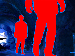 Animation seems to be perfectly suited to H.P. Lovecraft's indescribable horrors, so I was very excited when I stumbled across news of an animated adaptation of "At the Mountains of Madness*". Director/writer, Sven Bonnichsen filled me in on all the latest news for this ongoing production...
Titled, "Let Sleeping Gods Lie", the film was inspired by "At the Mountains of Madness". The story concerns a pair of explorers (deep in the white wastes of Antarctica) who happen upon an unknown cave system. Inside they discover a sleeping hive of ancient, alien creatures -- and their doom.
The project is a work of digital animation with the "elder things" and locations (sets) being rendered with 3D animation software.
The actors will be added later using a form of rotoscoping. The style is described as "Neon-Gothic", which uses hyper-saturated colors. The Scarlet Star Studios production will have an anticipated running time of about 15 minutes.
The two actors (Carl Caputo and Andrew Stout) completed principle photography in Sven's own home, and he notes that they were good sports about being filmed in heavy black winter coats with stockings over their heads on the hottest day of summer...
Sven's first film, "Madness from the Sea" (inspired by "The Call of Cthulhu"), was shown at the 2002 H.P. Lovecraft Film Festival. He hopes to have 'Sleeping Gods' done in time for the 2006 festival, but may have a teaser-trailer ready for the 2005 HPLFF.
For further information and official progress reports, visit the Scarlet Star Studios blog.
(Thanks to Sven Bonnichsen and Edward Martin III)
[There's also a brief mention of LSGL on the Forthcoming Terrors page...]
Let Sleeping Gods Lie ~ new ~
Producer: Scarlet Star Studios
Directed by: Sven Bonnichsen
Written by: Sven Bonnichsen
Cast: Carl Caputo and Andrew Stout
Plot: Deep in the white wastes of Antarctica, a pair of explorers happen upon an unknown cave system. Inside they discover a sleeping hive of ancient, alien creatures -- and their doom. Inspired by the story "At the Mountains of Madness". Read the story here.
Release date: TBA
Website: http://www.scarletstarstudios.com/blog/archives/movies/letsleepinggods_lie/index.html
IMDb: NA
Source: Personal correspondence with Sven Bonnichsen.
posted by sven | permalink | categories: let sleeping gods lie, movies
I want to be animated, too
by sven at 11:54 am
Exhaustion is setting in. This morning I felt like a zombie digging myself out of my own grave. I had a milkshake for breakfast just to bribe myself to live another day.
Animation is a uniquely insanifying process -- almost not hyperbolically speaking. At the end of the day you stand up from the desk and think: today I traded seven hours of my life for nine seconds of screen time. There are lots of jobs where you feel like you're selling your soul; animation hands you the receipt.
Two things are a must: get exercise, and "fill the well".
Doing reasonably well on the exercise front: took a nice two and a half hour walk up on the butte with Gretchin yesterday to see the crazy daisies. And I've been getting out for solo walks pretty regularly; but often after pushing myself to the brink, where I feel like my lungs are atrophying. Or there are little pains in my head making me paranoid that I'm going to have a stroke because I haven't stretched my brain arteries recently enough. Must keep the blood circulating...
"Fill the well" is a Julia Cameron term, which in this case means (to use Snicket-speech): take in some entertainment. All work, no play makes Jack a Stephen King character. Been taking in movies with a new video rental rountine, and I've finally started into reading "I, Robot". Gotta look at things that inspire me in order to stay inspired --y'know?
A little break. Then back to work on sound design.
posted by sven | permalink | categories: let sleeping gods lie, movies
July 13, 2005
scarlet star logo for LSGL
by sven at 11:16 pm
Another 7 hour day -- that's three in a row. Today's big chunk: a "scarlet star studios" logo for the beginning of the film.

The title swings into place. The star comes spinning down into its spot. And then the stars gently illuminate. That's five seconds. Then the blizzard effect crosses the screen, whiting everything out. That's another four.
3D letters are inherently cheesy. I know. But I wanted to show off, and couldn't think of anything better. The star looks communist. Meh. But I like the little white stars illuminating. The overall layout of the logo is based on an idea Gretchin came up with months and months ago. It was a really good idea... And I enjoy getting to make the communal vision of Scarlet Star Studios a little more real.
It looks like I've got a rough-cut of the teaser now. One minute, two seconds! Unfortunately, it looks like I really need to rework a few bits. I don't like how the first shots of the lavamen in the blizzard look. I'm thinking that maybe Carl will emerge alone at first, then signal to Andrew. ...It's worrisome; I don't know if going that route will mentally commit me. Is it what I want in the full-length film?
Also, I'm thinking that I need to have a shot of the camera moving through a tunnel, to really convey that the explorers are traveling through a cave.
I had an idea yesterday to change the script for the teaser, break it up with text. First break is after the cave is sighted: "Uh-oh." Second is when they stop and read the inscription on the arch: "You were warned." Third is after they see the hive: "Let sleeping gods lie." ...I dunno.
At the end of the night I started looking at sound design. After a few initial experiments, it looks like foley work is going to be far more important than music. Music might not even work out. Footsteps are going to be a terrible problem. I may need to go foraging in the library's sound effect CDs again.
And here's an issue I didn't think of until tonight: room noise. How am I going to convey big empty, echoing silences?
Tomorrow: haven't decided. Either work on the outdoors shots, or on sound effects. Sound effects may be more crucial -- but I'm also more confused about where to start.
posted by sven | permalink | categories: let sleeping gods lie, movies
July 12, 2005
"Let Sleeping Gods Lie" logo
by sven at 10:46 pm
Another seven hour day, it looks like.
Today's big project: creating the "Let Sleeping Gods Lie" logo for the title card.
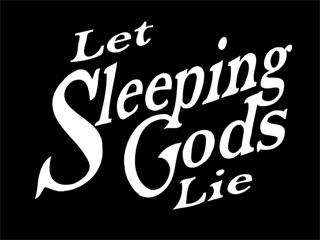
...What's really nifty is that I found a way to animate it -- the tail of the "S" starts slithering like a tentacle. (Yee-haw!)
Next on the to-do list: do a "scarlet star studios" sequence for the beginning of the trailer; create a shot of the lavamen stepping out of the blizzard's mist. Once those shots are created, I'll have stand-ins for everything in the trailer!
Looking ahead:
- adding blizzard effects to all the outside shots
- cleaning up the lavaman process (when the explorers enter the cave)
- finalizing the critters' arm sculpt
- finalizing the eye, eyelid, & eyestalk design
- music
posted by sven | permalink | categories: let sleeping gods lie, movies
July 11, 2005
artist's way @mac: week 5
by gl. at 10:31 pm
we did clay tonight but the participant who requested it wasn't there and didn't tell me she wasn't going to be there. in fact, out of a class of six, only two were there tonight, and one of them didn't want to participate (one of the ones from last session). i've always said, and still believe, that though you should attempt to stretch yourself while in artist's way, you shouldn't be forced to participate in an exercise that makes you truly uncomfortable. i remember my first session w/ pamela went badly because she insisted i name my collage and i really didn't want to. i'm unsure how to manage outright rudeness though, and i don't want it to rub off on the others; even when i was resisting pamela, i didn't roll my eyes or sigh heavily or glare.
two more sessions to go.
posted by gl. | permalink | categories: artist's way
strawberry fields of vision
by sven at 10:30 pm
Looks like I'm going to wind up with 7 hours of LSGL work today. Today's big project: eyes.
Lots of frustration -- but at the end of it all, I did manage to render 3 seconds of flailing eyestalks. Here's a still.
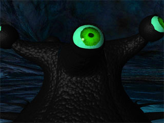
The eyestalks can move. The eyes can rotate. The eyelids can open and close. The iris is great; I'm less happy about the white of the eye; and I think I made the eye too glossy. The eyelid should be thicker; the endomorph lets green show through when subpatching is turned on, which isn't OK. The texture transition between the eyelid and the eyestalk is too abrupt.
The eye needs to be parented with the last bone in the eyestalk. The eye and eyelid objects have to have their center at the origin, so they rotate correctly; therefore they have to be saved as a separate file from the torso. The coordinate system has to be "local", or I run into gimbal lock.
It looks like a single eye should be rigged with a single snake; then I can "load object from scene" four times to pull together a full critter. I haven't solved the issue of gaping between snakes yet... It'll probably involve creating several specialized rigs.
My biggest grief: because I'm doing major color correction in AfterEffects, the eye will change color if I process it along with everything else. My best solution so far is to render the background and process it, then use that .mov file as my background in the compositing window -- rendering a second file, with the critter in front of the new backdrop. Ouch.

How'd I make that killer iris? Strawberries! Last summer Gretchin was making strawberry shortcake. As she was cutting up the berries, she suddenly exclaimed that they'd make good eyes for the critter. Brilliant! She cut a bunch up, asked which ones I wanted, and then even photographed them for me. Thank you, gl. :D
A year later, a little PhotoShopping, and... ta-da!

(I said a post or two back that that I'd done a new render of the interior of the hive. Well, here it is.)
posted by sven | permalink | categories: let sleeping gods lie, movies
July 9, 2005
teaser assembly, more blizzard
by sven at 11:14 pm
I put in 5 hrs 15 min on LSGL today. My goal was to put together a quick'n'dirty cut of the teaser-trailer. Mission accomplished! I put together about 45 seconds of footage: from leaving the plane to first sighting the creatures.
I put together three new shots inside the hive; rendering from LightWave, but doing color correction and the addition of lavamen in AfterEffects. I used the latest Elder Thing models -- high-poly versions in the front of the crowd, low-poly versions in the rear -- and it looks pretty darned good! This is the most advanced version of the hive interior that I've rendered to date, and I'm feeling happy about the results. [Pictures tomorrow, probably.]
I also did more with the blizzard outside. It looks great! No -- really!! It creates a great contrast with the cave interiors: noisy and chaotic outside, then creepily still inside.
I feel like the look of the film just took a big step up. ...In fact, I may be reaching an "uncanny valley" issue because of it. Previously, the film had an amateur look to it -- but it was going to be better (allow me the hubris) than anything else at the fest. Now, however, I have some footage that almost looks pro -- in which case, I'm competing with a higher standard, and all my flaws are suddenly less forgivable.
["Uncanny valley" is a robotics term -- between mechanical robots and truly life-like simulacra, there are automotons that are creepy in how they imitate humans. Like the robot Abe Lincoln at DisneyLand, y'know? I use the term here to mean "good enough that the bad bits really show".]
On that note, G has raised an issue with the blizzard: why do the explorers get out of their plane in it? That's a good question. I'm not sure that I can do anything about it, though. I'm just thrilled that I've solved the problem of "why do they suddenly act like they're discovering a cave if they're camped by it?" -- which seems like the more aggregious flaw. Me, I can generate excuses like "their plane was forced down and they're looking for shelter", or "they stay in their plane until the blizzard lightens up". Hopefully the audience will join me in rationalizing.
[G also points out that it would be nice if we could see the explorers shivering and rubbing themselves when they get into the cave. Sigh. More re-shooting than I'll allow myself.]
Using the blizzard concept, I could fade out and then have folks wake up the next day, the weather totally clear... But I think just having the storm merely lessen will be more compelling. That'll require futzing with a few shots I thought were in the can -- including the signature shot where the camera's inside the cave, looking out.
Although I really like the still of the camp I PhotoShopped, I may wind up cutting it. I could probably just go from the parked plane to the cave. But, you have to give up favorites when editing. I'm almost decided to give up the shot of the plane flying overhead -- but I don't think I can give up the plane entirely yet. It establishes that the explorers are a long way from civilization. And... And it looks cool!
Big lesson that keeps thwacking me on the head: work these issues out while you're still writing the script -- not in production. ...It's just hard to think of this project as even having a script -- y'know, when there's no dialogue. You miss stuff like "why are they here?" when all there is is storyboard.
Tomorrow: work on the title card, and on modeling an eyeball for the critters. ...Possibly fiddle with a "Scarlet Star Studios" logo for the beginning.
posted by sven | permalink | categories: let sleeping gods lie, movies
July 8, 2005
Ah-ha! A blizzard!
by sven at 9:16 pm
New idea. Start the film with a blizzard. Use hypervoxels in LightWave, I think.
We start with a white-out... I'd been thinking it would be neat to start with white, rather than fading up from black, anyway. Howling winds. The blizzard parts... Maybe we see a mountain briefly. Or maybe base-camp. And then, the lavamen step out of the mist...
This solves a bunch of problems all at once. Previously I've been going a stock-footage route, but sending the shots through Photoshop so they match the outdoors-painted look. The trouble is, I've been uncomfortable with not having created that footage myself. I want the whole project to be mine, this time around. Also, if the plane is right by the cave, why do the lavamen act as if they're just discovering it? ...Ah-ha! Because they landed during a blizzard!
The white-out also allows me to do the subtle homage to Kurosawa that I've been wanting. That segment in "Dreams" that's about hikers in a blizzard -- that's been at the back of my mind all this time.
Sound effect ideas: In the opening white-out, we hear the scream of one of the Elder Things. That sets up the question "what the hell was that?" in the audience's minds. I mean, of course they have to know what's coming -- but it's foreshadowing, anticipation. It might also make the ending a little less corny. (Something I've been worrying about.) The ending isn't just "boo!" if it's a bookend.
We could also hear the sound of the airplane through the blizzard -- but that might cause more problems than it's worth. I don't want to have to create spluttering plane sound effects.
If I can get the mist/fog effect to work, then I think I can salvage the shot that introduces the lavamen. The airplane in the background in this shot hasn't looked right to me. But if it's occluded by whiteness, it might be good enough. Plus, having the glowing red figures step out of the fog -- that's much more powerful than introducing them with a simple cut.
So, script-wise, I think I've really just hit on something. Special-effects-wise, I've just created more work. I'll spend a little time testing the concept immediately -- but for the teaser-trailer I should probably start after the blizzard has abated.
Unless, y'know, I get really lucky and the blizzard effects just work right off the bat. (Ha!)
Addendum @ 11pm:
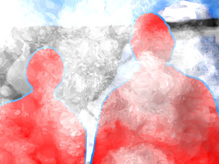
Well, I took an hour and took a stab at blizzarding. The results are promising. It looks like I need to set up a particle emitter in LW, then turn those particles into volumetric hypervoxels. It'll take a while -- particularly since it'll involve rendering time -- but I'm hopeful.
posted by sven | permalink | categories: let sleeping gods lie, movies
do the hustle
by gl. at 12:07 pm
think of this as a word problem:
if...
emet has 7gb of space free and planet camino has under 1gb of space free and almost 28gb of movies live on camino when they should really live on emet and carl has deposited 25gb of music between camino & emet
and...
planet camino is the scratch disk, beginning to throw messages about not having enough room to breathe and you're in the middle of a movie project you've been working on for years and even your 7gb is looking a little tight
and...
new moon is specifically for music but you're afraid to add all this unknown music to it because it will mess with your perfectly arranged music library.
what do you do? you have 25 minutes.
okay, put down your pencils.
yes, i know, the answer is obvious, but i procrastinated about it. finally i imported all carl's music into new moon and created two different playlists: one w/ just carl's music to be reviewed at leisure, and one with everything except carl's music to be kept clean and nice. and itunes has that nice "find duplicate songs" command which will come in handy later. to fill the vaccuum left behind, i moved the movies onto emet where they belonged, which still left more than 8gb of space on emet and over 30 gb of space on camino. everyone wins!
(yes, 8gb on a 200gb drive is still a little tight. but it will do until sven figures out how he wants to handle longer-term storage for film projects.)
posted by gl. | permalink | categories: administrivia
July 7, 2005
trixie's been gifted
by gl. at 9:16 pm
btw, i haven't yet mentioned that some time in the last couple of months, someone left a magnet for trixie!
how very kind! trixie loves you, mysterious koan magnet!
posted by gl. | permalink | categories: trixie
July 6, 2005
arm wrestling
by sven at 10:40 pm
Oof. Over 7 hours working on LSGL today. I did another sculpt of the Elder Things -- this time meticulously piecing together my favorite bits from past versions, then sewing the geometry together... one. polygon. at. a. time.
Here's what I had done by dinner:
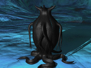
Ugh. The seams between "snakes" have come unfastened by my transformations. The arms, which looked so cool in Modeler, don't look organic at all. And straight lines really show if you forget to make the arms bendy on one axis.
Even though I've figured out how to make splits in the arms look more organic, animating these things is going to be a nightmare. And the shoulders still don't look as organic as I'd like. Back to the single-arm concept.
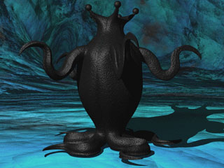
So I started casting about. Here, I took the leg-tentacles and tried using them as arms. Not bad! They may be a little too beefy, but they do look organic. I see from this trial, too, that the arms primarily want to wave up and down -- not so much side-to-side. Good to know, when I start having to make these things move.
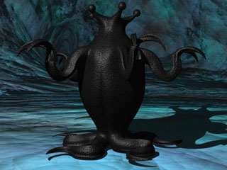
Maybe I could still have a little hand-like split at the end of the arms, I thought. ...Nah -- it makes things too cluttered.
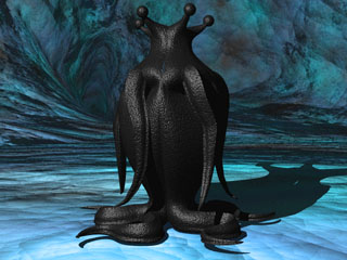
The arms looked good when they were up and waving; but I need to know what they look like at the critter's sides, too. So here I took the straight version of the leg, positioned it where the arm should be, gave it bones, posed it in Lightwave, reimported the transformed object back into Modeler, applied "radial array", and uploaded the thing into the empty scene I'm using as a backdrop for these tests...
The armpits bend badly. But that's something I can probably fix with weight-shading. Beefier arms impact the silhouette -- something I hadn't forseen. But overall, I think I'm pretty OK with how the silhouette turns out.
I'm not quite committed to the beefy arms yet, but I'm guessing now that I'll wind up using some version of them in the final sculpt.
My brain's burnt out on sculpting. I think I'll take a few days off from this part of the project now. I'll turn my attention to figuring out what shots I want in the teaser-trailer and creating a title card. The thing I'll really have to be careful about is sound. It could really bite me in the ass if I don't leave enough time to assemble the music, sound effects, and foley.
Eep. August 1st. That's how long I've got.
posted by sven | permalink | categories: let sleeping gods lie, movies
July 4, 2005
Portrait of Shield Albright
by sven at 8:05 pm
Today's my brother's birthday. ...Happy birthday!
Going with my 2005 gift-giving theme, I decided a few months back to paint him a portrait. As with the portraits of Michael and Alison, I started from a source photo.
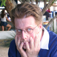
It's a graduation picture, and bro is doing one of his traditional Boris Karloff mugs for the camera. I'm really quite fond of this shot, actually. Both my bro and I are a little... odd. This shot captures his... uniqueness ...rather nicely.
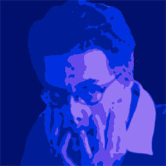
I was going to do a 5"x5" posterized painting. But after hours of fiddling, this was the best image I could put together. It's not so bad -- rather reminds me of a "Misfits" album cover. But it's just too complex for the scale I was after.

So, throwing up my hands, I started fooling around in new directions. When I came up with this next image, I fell in love. Notice, compositionally, how the frame of his eyeglasses creates a circle at the very center of the image. I thought that was neat; very powerful. It also gave me this Rembrandt / Francis Bacon vibe that I really wanted to capture.
I imagine giving this picture a title like "anxiety"... Yeah, it's macabre for a birthday gift -- but like I said, we're both kinda unique.
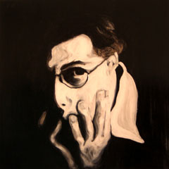
Now here's the painting I did. It's 2'x2' on gessoed masonite, charcoal and acrylics, covered with clear tar gel medium. Those rich blacks -- they're all charcoal. I had intended to do the whole thing only in charcoal, but I couldn't get the whites I wanted with just erasing. I wound up going in with white acrylic to work the highlights.
It's a bit distorted, but I'm OK with that aesthetic. It's free-hand afterall. The forehead isn't quite what I intended -- but I'm pleased with the hands. And the completed results look very painterly.
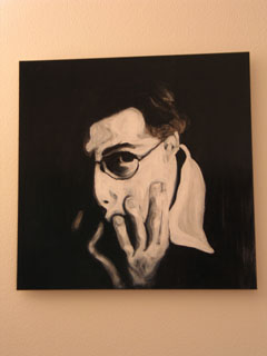
It seems like a very raw piece, so I didn't want to frame the portrait. Instead, I hot-glued wooden rails to the back, and used them to attach a wire for hanging. The intent is to avoid putting anything between the viewer and this presence in the room.
This was a good project: it didn't go in the direction I expected -- but it helped me transition to working on a larger canvas, and more expressively. It took forever to complete, and how I got it packaged for mailing is a whole story in itself. But hey -- here's a gift like nothing else you'll ever receive, something with some magic that will live with you (or haunt you, as the case may be) for years to come.
posted by sven | permalink | categories: painting
July 3, 2005
Elder Things evolve again
by sven at 10:30 pm
I'm back at work on "Let Sleeping Gods Lie". I want to get a final sculpt of the Elder Things soon...
The model I finished today is the fourth major revision. I built it from scratch, attempting to learn from the mistakes of the previous versions. Let's review.
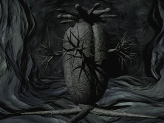
Part of what I like about Lovecraft's critters is how they seem to be built out of geometrical bits. The trouble is, if you take the author's descriptions too literally, then you wind up with something that looks like this. The measurements are pretty literal -- but it looks all wrong.
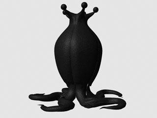
This one is much more organic; it looks plausible. I'm very pleased with the overall shape of the body and eyestalks here. However, at this point I hadn't figured out what to do about the arms. There are also problems with the geometry of the leg-tentacles -- they crinkle instead of bending smoothly.
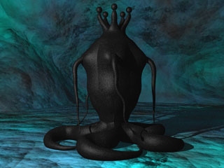
In some ways this one is a step backwards. The organic models are built out of five "snakes"; each "snake" includes a leg-tentacle, a torso lobe, and an eyestalk. The basis of the "snake" in June/July '04 was two cones attached end-to-end. For the model in October, I started with two cones connected by a cylinder. I didn't realize until just the past few days that that decision is what led to the lumpier torso. ...I also sized the texture incorrectly, so the skin here is smoother than intended.
However, I wasn't trying to be perfect with this one. The point here was that I figured out how to attach arms. I also got better at posing the leg-tentacle in LightWave, then saving the transformations back into Modeler.
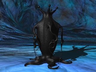
Here's today's new model. The arms turned out too long -- although they're awful creepy this way. There are forked "hands" at the ends of the arms, but you can't see them... I fretted over the arms on these things soooo long. I held onto the hope of having 125 writhing tendrils, as "At the Mountains of Madness" describes, til the bitter end. I tried endomorphs, I tried parenting, I tried writing equations. It was just too crazy of a task.
The leg-tentacles are better here, too. The bottoms are flat, and the tops are slightly peaked -- like a slug. You don't want tentacles that are just plain cones; they look all sausagey.
...It's amazing how every single step in creating this model has been a puzzle to solve. It's like making a series of sketches, over and over again, until you really understand how to draw a thing. I'm hopeful that the next model may be the final draft.
posted by sven | permalink | categories: let sleeping gods lie, movies
trixie's current poetry catalog
by gl. at 2:52 pm
here's a catalog of trixie's current poetry fragments (maybe they can be used as writing prompts or as a poem-writing challenge):
- this thing that has no symphony
- run and embrace enormous woman butter nectar
- for she is easy & dreamy
- fly together day & night
- desire this world
- difficult sweet delights
- we need to worship plastic
- go yes go not
- give us more plastic
- he likes rust
this world longing
for home - watch and we recall
- make time for hair
- he has fire
- have a butter day
- fly where the nectar is a garden
- like my blue hair
- more work
- i have but to ask
- ask through night
- but is it home
- you sad thing
- the perfumed watch
- garden our time
- make sizzled love music
- let the
rust on a pig
want
our swift
delight - recall how with glass
- lick my face
- smell me at work
posted by gl. | permalink | categories: trixie
July 2, 2005
another scarlet star studios member
by gl. at 12:12 pm
it's about time for trixie the poetry car to have her own page, don't you think? i created an email address for her the other day, but she should definitely have her own blog, too, or at least a blog category. (i never thought i would do something like this for a car, but then, i never thought i'd have a poetry car, either!)
[trixie says, "hi!"]
this is one of the poems someone has composed atop trixie:
celebrate that sizzle
of rust & easy skin
taste the glass day
so as to
make us want
posted by gl. | permalink | categories: trixie
July 1, 2005
on word and art word: artwork delivered!
by gl. at 6:38 pm
i dropped my four pieces off at the show today & got a handful of postcards featuring two of my works verso! ee! i've never had that before. i am painfully aware that the "a grace it had, devouring" picture is the wrong resolution, but "born" sure looks good. :D
details:
the show's mistaken official title is "onwards & artwards."
the real title is "on word & art word." 'cuz it's a calligraphy show, get it? apparently all the publicity people didn't.
the exhibit runs july 5-august 18 at the gresham city hall visual arts gallery (fair warning: the page looks, um, awkward in safari).
open monday-friday 8 a.m.-5 p.m. and the first and third tuesdays of the month from 8 a.m.-7 p.m.
the reception is july 19 (i'll be there! come visit!): 5-6:30 p.m.
posted by gl. | permalink | categories: calligraphy, exhibits & events