you are here [x]: Scarlet Star Studios > the Scarlet Letters > Portrait of Alison Dunfee
<< before
iprc: gocco printing
after >>
LSGL setback: harddrive failure
May 12, 2005
Portrait of Alison Dunfee
by sven at 7:03 pm
Last month I painted a portrait of Michael Hall for his birthday. His wife Alison liked it so much, she asked if she could have one too. How could I say no?
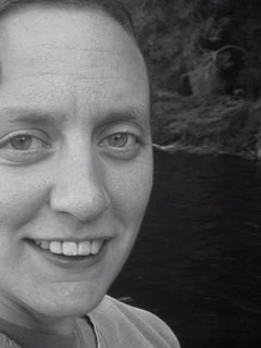
Michael passed two photos on to me, as possible references. The first:

And here's the second:

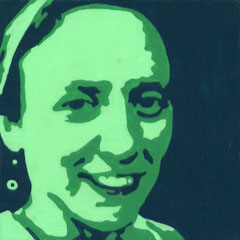
I liked Alison's expression in this second one -- but I needed to have a full shot of her head, like in the first. I wound up stitching the two images together in PhotoShop. The angles aren't a perfect match -- but I don't think anyone will ever really notice. Here's what the image looked like after posterizing and a lot of tweaking:

Alison and Michael liked the image at this stage. They gave me the go-ahead to do the painting.
...It took longer to do the actual painting of Alison than it did for Michael: 6 hours. This was largely due to the paint itself. I hadn't realized just how much different colors of acrylic can vary in terms of coverage, runniness, etc.!
Phthalo green is my mortal enemy. It's all gloppy -- whereas the white-ish color was pure joy, rolling off my brush. Phthalo also winds up looking like black, except in bright light. I might recommend that this painting be hung in a breakfast nook.

Since I wasn't doing this painting for a birthday, I got more of a chance to sit and look at it...
I think there's maybe a bit too much contrast in this one. If you put lightness/darkness on a five-point scale, then Michael's colors were 2, 3, & 4 -- whereas Alison's colors are 1, 3 & 5. Michael's is the more subtle of the two pieces.
I also sort of wish I'd compared the sizes of Michael's and Alisons faces in the source photographs more carefully -- so that the paintings would be a better match when hung side-by-side.
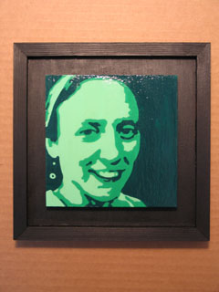
Oh well. Here's the finished piece framed:

As with Michael's portrait, the side rails are simply hot-glued onto the base. I used a better mitre-box this time... But figuring out how to get the perfect lengths for the sides of the frame is still eluding me.
Bottom line: More time-consuming than I'd expected, and there are minor details I can quibble about -- but all told, I'm pretty darned proud of this one. Half an hour from now I'll be at Michael & Alison's and I'll present it to them...
posted by sven | May 12, 2005 7:03 PM | categories: painting